

dot-font was a collection of short articles written by editor and typographer John D. Barry (the former editor and publisher of the typographic journal U&lc) for CreativePro. If you’d like to read more from this series, click here.
Eventually, John gathered a selection of these articles into two books, dot-font: Talking About Design and dot-font: Talking About Fonts, which are available free to download here. You can find more from John at his website, https://johndberry.com.
Fred Smeijers’s fascinating book Type now, published last year by Hyphen Press, is a hybrid: partly a showcase of the work of one of the most creative Dutch type designers, and partly an essay by Smeijers about the state of type today. It’s well worth getting hold of.
The book is a consequence of Smeijers’s being awarded the Gerrit Noordzij Prize in 2001, for playing “an important and internationally acknowledged role in type design and typography.” Although the prize comes with no money attached, its sponsors (the Royal Academy of Art and the Meermanno Museum, both based in the Hague) mount an exhibition of the winner’s work, and publish a book or other publication about it. Although the exhibition is past (it opened at the Royal Academy last year), we now have the book.
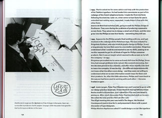
Fred Smeijers at work on the design of a typeface.
A Designer of Text Faces
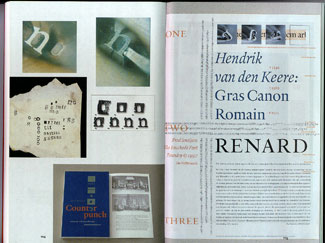
Smeijers made a big splash in the ’90s with the remarkable text faces that he designed, released by FontShop (FF Quadraat & Quadraat Sans), the Dutch Type Library (DTL Nobel), and the Enschedé Type Foundry (Renard). Along with his friend and former classmate Martin Majoor, Smeijers identified himself for a while as a “new traditionalist,” creating new typefaces for new technology based firmly in the long tradition of practical typography.
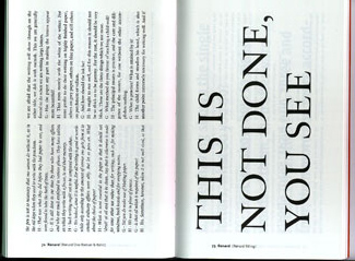
The type samples are run at a right angle to the rest of the book, in varying sizes and styles (here, text and display versions of Renard).
The central section of this book shows samples of these faces, along with newer text faces such as Arnhem and Fresco (both issued by OurType, the new company that Smeijers is a partner in) and a variety of special projects and fonts done for corporate clients. The samples take an unusual form: the running text of a “dialog” published in 1567 by Christopher Plantin about writing and printing (one of a series of “dialogs for young children,” here in Ray Nash’s 1964 English translation). The typeface changes from page to page, and so does the size and arrangement—sometimes straight paragraphs of prose, sometimes big display settings of a phrase or two. The choice of text is fitting, given Smeijers’s historical awareness.
Everything in the book is set in Smeijers’s own typefaces, of course. The primary typefaces are the serif and sans serif families of his recent Fresco. Oddly enough, he chose (or book designer Françoise Berserik chose, though certainly not without Fred’s acquiescence) a very bold weight of Fresco serif for the text of his main essay, and an equally bold weight of the sans serif for the chronological section in the back. To make a strong statement?

The main text of Type now is set in an unusually bold weight of Smeijers’s typeface Fresco.
Clarity in a Murky Field
Smeijers calls his essay a “manifesto,” and concludes it with a “code of conduct” for users of digital type. For a manifesto, it’s a somewhat rambling essay, without a single arc or trajectory, though he makes quite a lot of good points along the way.
Essentially he is talking about how the nature of type has changed, and what implications that has for how we use it; he also explodes a few cherished ideas about the selling of digital fonts, such as the notion that they can be treated like simple commodities. (“To survive in the market, commodities have to be wanted by the general public, to be easily accessible, and be based on a clear and uncomplicated ‘business model.’ This is not the case with typefaces.”) Although digital fonts can be bought quite easily over the Internet, they are not ends in themselves; they are tools—and the only reliable way to judge them is to see them in use.
He makes the distinction between true industrial standards, which are hammered out by committees and organizations in an official capacity (“traditionally with offices in neutral Switzerland”), and “commercial items that may or may not become ‘de facto’ standards,” such as the PostScript Type 1 font format. The newer OpenType format may well become a “de facto” standard, given its usefulness and the influence of the companies that developed it, but only its underlying basis, Unicode, is truly a new industrial standard.
In a section called “Artisan or designer,” Smeijers delves into the murky question of creation vs. design. It’s obvious that there are fundamental differences between the two modes; it’s also obvious that those differences can never be wholly pinned down. Smeijers doesn’t try to elevate one over the other, but he neatly pinpoints one of the essential distinctions: “You might as well ask yourself: is haute couture design? No, it is not; it is creation… What differs is not so much the level of creativity between the designer of haute couture and the designer responsible for a dictionary; what differs is rather the question of social responsibility.” One, whatever its worth, is a luxury item that exists for its own sake; the other exists for a useful purpose. Bringing the argument back to his principal topic, Smeijers says, “Type design is loaded, soaked with responsibility.”
Responsibility in Action
Smeijers introduces the term “font-tweaking,” which he clearly doesn’t think very much of, to describe the currently common process of simply taking an existing typeface and ringing a few obvious changes on it, then turning around and presenting it as a new design. Some of the results are simple rip-offs; others fall into a wide gray area—where does influence give way to plagiarism? He talks about the tricky question of making a revival of an earlier type design, and how this differs from just copying; part of it is in the awareness and acknowledgment of the sources, and part of it, of course, is in the quality of the result.

Smeijers makes use of his own typefaces to demonstrate that “font-tweaking” isn’t the same as real type design.
In that same section (entitled “Fifteen years of democratic type?”), he says, “A typeface is of course never an end in itself, not even for type designers… A font used within the boundaries of present-day typography is in many respects nothing more than just a tool which enables you or anyone else to communicate visually.” Since this is an essential tool (how, he points out, could you use your computer without some kind of fonts?), it has to be practical; it has to be able to do the job. “The only truly adequate typefaces,” he says, are those that are “globally useful”: that come with a full complement of characters for setting a variety of common languages in multiple scripts, and that are hinted for use at varying resolutions on various devices. This means that type design—real type design—is not as simple or easy as it has been for the past decade, when anyone could whip out a quick font and release it on the world. That’s still possible, but perhaps inadequate.
“Type design evolves unevenly,” he says, “and the much proclaimed freedom of recent years seems to have a clear limit here. Whether this is a real problem is hard to say, but I think that type designers should try to cross this border.”
Moving Forward Together
Despite this rather stern view, Smeijers regards the design of type today as an activity worth doing and filled with opportunity. “Type design stands with both feet in the middle of our society. It is more than ever an applied art that is there to serve all the other applied arts; a design discipline that is there for all the other design disciplines. And it is certainly not a static phenomenon.”
If the designers of type have responsibilities, then so do the people who use it. That’s the crux of Smeijers’s attempt at a “code of conduct.” I’m not sure that he has come up with a concise answer (which is why I’m not trying to summarize his slightly amorphous conclusions here), but he raises all the right questions. Basically, information is not free—but what does that mean in practical terms for people who deal with digital fonts? Aye, there’s the rub.

Several spreads show the variety of Fred Smeijers’s typographic work, and his researches into how type is made.
Almost incidentally, this book includes several lovely color spreads of Smeijers’s lettering and typography, just to remind us that he is a graphic designer as well as a type designer. These, presumably, loomed large in the exhibition in The Hague, but they’re almost an afterthought in this book. Type now, like so many of the books published by Hyphen Press, is a book of ideas, which talks about how those ideas get communicated. Nothing could be more central to our life today.
This article was last modified on February 18, 2022
This article was first published on September 13, 2004
Commenting is easier and faster when you're logged in!

Recommended for you

dot-font: A Few Preconceived Notions about Type
dot-font was a collection of short articles written by editor and typographer Jo...
dot-font: Font Bureau’s Ample Scope for Typography
dot-font was a collection of short articles written by editor and typographer Jo...
dot-font: Avant-Garde Page Design
dot-font was a collection of short articles written by editor and typographer Jo...