

dot-font was a collection of short articles written by editor and typographer John D. Barry (the former editor and publisher of the typographic journal U&lc) for CreativePro. If you’d like to read more from this series, click here.
Eventually, John gathered a selection of these articles into two books, dot-font: Talking About Design and dot-font: Talking About Fonts, which are available free to download here. You can find more from John at his website, https://johndberry.com.
This is a very good book. Unlike a design annual, which it resembles superficially, “Surprise Me” is coherently organized by a single person, and its text, although short, contains a large amount of clear thinking and useful advice about how to approach the design of a magazine.
Horst Moser is an experienced art director in Germany, whose practice focuses on “editorial design for magazines and books as well as corporate design.” He must also be a packrat with a lot of storage space, since the illustrations in the book were selected from his collection of more than a million individual magazines. The careful structuring of the book suggests that his collection must be very well organized.

Figure 1: Horst Moser’s “Surprise Me” deals with the dramatic and the detailed in magazine design.
“Surprise Me” is a study of editorial design: that is, the design of magazines and similar publications. Moser’s focus is contemporary; all of his images are chosen from magazines published since the turn of the millennium, except where he needs an older example to illustrate a particular point. “Surprise Me” is not a how-to manual, with charts and schematics of abstract concepts; it’s a book that will help a casual reader or a general graphic designer understand how magazines get designed the way they do, and will give anyone involved in publication design a systematic way of approaching their next project. It is also, of course, a browser’s delight: chock full of well-reproduced spreads and covers and details from scores of European, American, and sometimes Asian magazines.
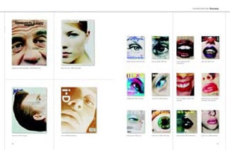
Figure 2: A two-page spread from “Surprise Me” showing different magazine covers that use extreme close-up shots of people’s faces.
Analytically Entertaining
Moser doesn’t just describe the way magazines are put together; he looks at the purpose of the design and the elements at the designer’s disposal. For instance, in the section called “Introduction to Inside Design,” he analyzes how an article usually opens: “The vital typographic element at the beginning of any article or story is the combination of headline and standfirst [the short paragraph after the head]. This form has found favour all over the world. Ideally, the headline should be exciting, but it must tie in with the opening without merely duplicating what’s about to be said. The standfirst, which forms a link between headline and text, will be more informative, but again it must arouse curiosity without telling the whole story.”
He then talks about possible variations: “The headline/standfirst format is both binding and liberating, and can also be supplemented by other forms of heading. Where justified, the author and photographer can be given due prominence after or even in the standfirst. Whether the actual text should begin on the opening page or not depends on the overall composition, but it’s certainly better to launch the reader into the feature straight away, rather than having a break in continuity before they turn the page.”
This is the North American edition, released in the United States by Mark Batty Publisher, of a book first published in Germany by Verlag Hermann Schmidt in 2002. (Full disclosure: I also have a book coming out from Mark Batty Publisher in the near future.) “Surprise Me” a large-format book (9-3/4 x 12-3/4 inches) of 288 pages, almost all of them heavily illustrated. The translation by David H. Wilson from the German is fluent and skillful (in UK rather than US inflections), and the text reads well.
One small exception: Wilson has streamlined the language so much that he has lost the distinction between what ought to be and what is. Here’s a sentence from a section about style manuals for publications: “There may still be elements that need modification or extension, and it’s important that the experiences and suggestions of those who work daily with these sample pages are taken into account.” Excellent advice, but the way it’s written, it implies that the experiences and suggestions of the people who’ll have to use the design already are taken into account; what Moser means to say is that these should be taken into account. The sentence should have read: “… and it’s important that the experiences and suggestions… be taken into account.” Clarity requires precision.
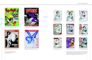
Figure 3: A spread from the book, from a discussion of variations on a theme in magazine covers.
Inside and Outside
One part of the book deals entirely with covers—portrait covers, typographic covers, illustrated covers, covers with multiple pictures on them, covers that reflect a running joke or constant reference from issue to issue—but the greater part of the book deals with interior pages—the different kinds of page, the elements on the page, the large and small aspects of the typography, the myriad possible variations of style and theme. Moser even talks about the design of the spine, though he only touches briefly on the problem of designing with the gutter in mind, in our present world where so many magazines are perfect-bound.
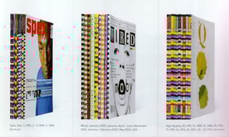
Figure 4: A few examples of how perfect-bound magazines may design their spines to work together.
“Compared to books,” says Moser, “magazine design is more flexible, often more elaborate, more expensive, and more experimental. Photography, typography and illustration all work together.” Photography gets a lot of attention here; after all, photography and color are the two biggest things (along with economics) that have changed in the nature of magazines over the past hundred years.
Moser doesn’t spend a lot of time on history, but he does start off his book with a spread on the influence of Alexey Brodovitch, who “laid the foundations for modern magazine design” in the pages of “Harper’s Bazaar” in the ’30s and ’40s and into the ’50s. (The book’s title is an allusion to Brodovitch’s famous directive to the designers working for him: “Astonish me!”) Moser touches on more recent star designers, such as David Carson and Neville Brody, but for the most part his focus is on what’s happening now, or very recently. His knowledge, his experience, and his extensive personal collection give the subject a rich and knowledgeable context.
This article was last modified on July 18, 2023
This article was first published on February 2, 2004
Commenting is easier and faster when you're logged in!

Recommended for you

dot-font: Type for All Cycles
dot-font was a collection of short articles written by editor and typographer Jo...
dot-font: Working with the Logo
dot-font was a collection of short articles written by editor and typographer Jo...

dot-font: Type that’s Tight but not Touching
dot-font was a collection of short articles written by editor and typographer Jo...