

dot-font was a collection of short articles written by editor and typographer John D. Barry (the former editor and publisher of the typographic journal U&lc) for CreativePro. If you’d like to read more from this series, click here.
Eventually, John gathered a selection of these articles into two books, dot-font: Talking About Design and dot-font: Talking About Fonts, which are available free to download here. You can find more from John at his website, https://johndberry.com.
Type design has always been an international phenomenon, and the explosion of small digital type foundries in recent years is not limited to the United States, or even to the English-speaking world. While the fonts that ship with new computers, and those that come with software packages from Microsoft and Adobe and other major vendors, are usually of high quality and often provide as much variety as many users need, professional graphic designers are always on the lookout for new designs and new sources. Here is a range of useful URLs for the curious. Some are well known, some aren’t.
Starting Close to Home
The two traditional biggies, aside from Adobe, are Linotype and Agfa Monotype. Although neither company is under the same ownership it started out with (and Agfa Monotype is an amalgamation of at least two type companies, Monotype and Compugraphic, plus the later-acquired type library of ITC), they both continue to market the type libraries that they began developing a hundred years ago, in the early days of machine typesetting. Agfa Monotype sells a lot of typefaces developed by independent type designers, alongside their traditional library. Linotype has recently been developing new, updated versions of some of their most respected older typefaces, adding the term “Next” to the typeface name.
I still think of FontShop as a “small” foundry, but in fact it has to be considered one of the major players, too. Not only do the various FontShops around the world sell almost everybody’s type libraries, but their own FontFont line of original typefaces is one of the largest. The FontFont line was responsible for introducing a more European aesthetic to American use of type, especially through the many excellent type families from young Dutch and German designers that they sell; the latest promotional material from FontShop San Francisco suggests that they’re still pushing the envelope.
Font Bureau, based in Boston, has great name recognition at the high end, especially among magazine designers—and, as I have described in an earlier column, Font Bureau makes some very useful, very well-designed catalogs of their fonts. Similarly talented, and almost as prolific, the New York–based Hoefler Type Foundry grows out of the same area of graphic design; magazine designers love Hoefler fonts, too.
Exploring the Reaches of the Type World
Now we get a little farther afield. Jeremy Tankard Typography, is based in London but has almost the same internet address as Hoefler: “typography.net” rather than “typography.com.” Otherwise, the only thing they have in common is quality; Tankard’s typeface designs range from all-purpose families like Bliss to the very peculiar Shire Types (see figure 1).

Figure 1: Jeremy Tankard’s Shire Type family
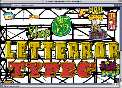
You may already be familiar with LettError, the collaborative design studio of Erik van Blokland and Just van Rossum, in The Netherlands (the two men work out of their offices in The Hague and Haarlem, respectively). Many of their typeface designs are sold as part of the FontFont line, but some are also sold independently and directly. And the website is a delight (see figure 2).

Figure 2: The home page of LettError.com
Peter Bilak’s Typotheque, also based in The Hague (despite the French name and the founder’s Slovak nationality), is the source of typefaces from a variety of independent designers, from several countries (see figure 3).

Figure 3: Peter Bilak’s Holy Cow typeface
From Berlin, Dutch type designer Luc(as) de Groot sells his own highly focused line of fonts, including the popular Thesis family.
In Paris, Jean-François Porchez runs a very prolific type foundry—Porchez Typofonderie—and his typefaces can be found on several of the country’s major newspapers. He also produces inspiring type specimens (see figure 4). And, since the Porchez typefaces are less well known in this country, using even the older faces can give a designer the cachet of newness.

Figure 4: A sample type specimen from Porchez Typofonderie
Check out the variety of Czech typefaces available from Stormtype, the studio run by Frantisek Storm. (If this weren’t the web, you’d see haceks over both of the s’s in his name—but there is none in the name of the foundry.) Some are digital revivals of early-20th-century Czech faces from well-known designers like Preissig (see figure 5); others are new. The styles are original and lively.

Figure 5: Stormtype’s revival of the Czech designer Vojtech Preissig’s 1925 typeface
In Mexico City, Gabriel Martinez Meave designs typefaces prolifically. A couple of them have been marketed by Adobe, but far more of them are available directly from the type designer at his own extensive site.
The most authoritative source for contemporary Russian type design is ParaType, in Moscow; besides original designs, they have a long history of creating Cyrillic complements (under license) for many typefaces in the ITC library. (Paratype offers fonts in Arabic, Hebrew, Greek, and Georgian as well.) What a lot of Western graphic designers don’t realize is that most of the original Cyrillic fonts available include a Latin alphabet—so if you like the design, you can often use it for typesetting in English (see figure 6).

Figure 6: Blagovest 1, designed by Double Alex Font Studio and one of the Cyrillic typefaces available from ParaType
My favorite Russian digital type foundry is Letterhead, a Moscow-based design studio with a fresh approach; their own site is only in Russian, but many of their fonts are also available through ParaType.
Although I can’t read Hebrew, I find the variations from font to font in Oded Ezer Design Studio’s recent digital type catalog fascinating. And of course if you’re in the market for Hebrew typefaces, this would be a good place to start.
There’s Always More
There’s absolutely nothing definitive about this list; it’s only a beginning. I could probably do another column equally long with an entirely different set of small type foundries. My purpose is to point you to a few potentially useful resources that you may not be familiar with, and to encourage every graphic designer to think globally.
This article was last modified on March 9, 2022
This article was first published on September 23, 2002
Commenting is easier and faster when you're logged in!

Recommended for you

dot-font: Kerning Chads
dot-font was a collection of short articles written by editor and typographer Jo...
dot-font: The Foibles of Font Substitution
dot-font was a collection of short articles written by editor and typographer Jo...
dot-font: The Man Who Launched 1,000 Fonts
dot-font was a collection of short articles written by editor and typographer Jo...