dot-font: Front-Page Fonts

dot-font was a collection of short articles written by editor and typographer John D. Barry (the former editor and publisher of the typographic journal U&lc) for CreativePro. If you’d like to read more from this series, click here.
Eventually, John gathered a selection of these articles into two books, dot-font: Talking About Design and dot-font: Talking About Fonts, which are available free to download here. You can find more from John at his website, https://johndberry.com.
The recently formed Ascender Corporation has done something useful: They provided us with a snapshot of the fonts in current use on the front pages of American newspapers. In a report called “Fonts on the Front Page,” based on a study of the top 100 U.S. papers (by circulation), Bill Davis of Ascender summarizes the most frequently used typefaces, who designed them, where they came from, and whether they were custom designs or not. This is a practical reality-check for type designers who aim to supply fonts for the newspaper market, and also for newspaper designers.
Ascender Corporation was founded by former type designers and type marketers from Agfa Monotype (now Monotype Imaging), several of whom have specialized in developing fonts for the screen, so it’s not surprising that in this report Davis gives some attention to online editions of newspapers, and the challenges of reproducing the “brand” image of a paper onscreen when the typefaces (and the layout) were designed for the printed page. Just as typeface designs for the screen are developed with that particular use in mind, typefaces for newspapers—especially text faces—are developed for the particular conditions of fast presses and ink on newsprint. Each is a very specialized kind of design.

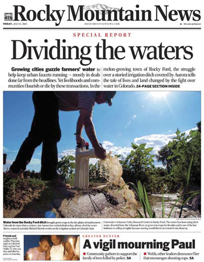
Figure 1: A front page from the “Rocky Mountain News”; the primary typeface is a custom design, called Rocky, by Matthew Carter.
Big and Small
The study makes no distinction between text faces and display faces, although in many cases it’s easy to sort them out. (It seems unlikely that Interstate, for instance, is being used as a text face. Though I could be wrong.) There’s also a third category: symbol and dingbat fonts, including barcodes. These are easy to identify.
There are a few inconsistencies in the classification of typefaces. Helvetica and Helvetica Neue are listed separately, as they should be, but there’s no distinction between ITC Franklin Gothic and other versions of the face. “Swiss” is not a typeface or a family but an entire category of typefaces, in Bitstream’s naming system. The Poynter Series is lumped together as though it were a single typeface super-family, instead of three families that work together. And any time I see the typeface name “Garamond” without qualification, I get suspicious; there are too many different typeface families with this name, and they’re not interchangeable. But what the study’s data does tell us is how often these retail fonts have been renamed or modified for individual newspapers—quite often, it turns out.

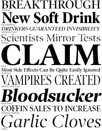
Figure 2: Poynter Old Style Display, one of the several typeface families that make up Font Bureau’s Poynter Series of faces designed for newspapers
One of the most interesting bits of information in the report is the number of newspapers that use custom fonts, designed specifically for them. As Davis puts it, “Each of the top seven newspapers analyzed used custom fonts produced for them by leading type designers and foundries. But custom fonts are not just the domain of the leading papers, as medium- to large-circulation newspapers were also found to use custom fonts.” Since the study tracks the designers and sources of the fonts used, Davis can conclude, “The Font Bureau was the leading source for custom fonts, followed by Carter & Cone, Jim Parkinson, Gerard Unger, and Christian Schwartz.”
Font Bureau also comes in first in the list of most popular type foundries or designers (including both custom and retail fonts). Second is Adobe, counting only its Adobe Originals typefaces (not all the fonts from other foundries that they sell or have sold). The next three are Linotype, ITC, and Bitstream, but after that you start finding much smaller type foundries, such as Hoefler & Frere-Jones, Carter & Cone, and ShinnType. (Jonathan Hoefler pointed out to Davis that his foundry’s typefaces are more often used on the interior pages of newspapers, rather than the front page, so this study doesn’t necessarily give a comprehensive view. Specialized typefaces such as Retina, designed for the small print of financial listings, are rarely used on the front page.)
Top Ten
Most of the information in this study was garnered by analyzing the fonts embedded in PDF files of each newspaper’s front page. This can skew the results, however, because of default fonts or fonts that are left over in the digital file but don’t actually appear in print. Davis explains the problem: “The analysis of PDF files revealed that Helvetica, Times, and Zapf Dingbats were among the top five typefaces. This is not surprising, as these fonts are standard on Macintosh/PC systems with Adobe Type Manager and in Adobe Acrobat. Helvetica or Times appear as the default font in many publishing software packages, so it can appear on a page that has an empty text box. In our review of the PDF files, we found half of the occurrences of Helvetica and Times to fall into this category.” Once they had corrected for the inflated appearance of Helvetica and Times, as well as for extra sightings of Zapf Dingbats and other Pi and Bar Code fonts, Ascender came up with a list of the 10 most popular typeface families in American newspapers.
And what are they? In order:
- Poynter Series
- Franklin Gothic
- Helvetica
- Utopia
- Times
- Nimrod
- Century Old Style
- Interstate
- Bureau Grotesque
- Miller

Figure 3: Nimrod, designed in 1980 for Monotype by Robin Nicholas, which has been used almost exclusively for newspaper text
Extending the Brand
It would be interesting to see a comparable study of the usage of typefaces on the front pages of newspapers in Europe, and elsewhere in the world. Some type designers whose names don’t show up here would undoubtedly be prominent in a European study (Lucas de Groot and Jean-François Porchez leap to mind), but my impression is that, except in a handful of very large newspapers, custom fonts are a much rarer thing in Europe. On the other hand, many newspapers use retail fonts that began life as custom typefaces before they were released to the general market. And then, there are simply differences in taste.
The point that anyone selling or studying typefaces for the newspaper market makes is that the typefaces are part of the “brand” image of the paper. This is obvious in the headlines, but it’s true of the text types, too. How they are used, of course, is as important as what typefaces they are; together, the fonts and the typography make up the look, and they are the medium through which we absorb information from a newspaper page. It’s no wonder that this highly specialized field of endeavor, which everyone sees on a daily basis but very few ever notice, keeps drawing in new practitioners and blossoming with new and ever more ambitious type families.
As newspapers straddle the boundary between print and the Web, the need for new fonts will increase. Whether it’s slightly tweaked versions of the printed typefaces, optimized for viewing onscreen, or entirely new families designed to complement but not to imitate the print faces, the challenge will be to present readers in wildly different media with a comparable reading experience.
So far, these efforts have usually meant either a Web site that makes no attempt to duplicate the look of the printed paper, or PDF files of that day’s paper or its front page, which is a straight imitation in pixels of what you’d see in print. I have yet to see anyone use the PDF format (or any other with comparable control over typography) to produce pages that are meant to be displayed on a screen instead of a piece of paper. This is a surprising lack, and a huge area for growth.
This article was last modified on February 16, 2022
This article was first published on January 10, 2005
Commenting is easier and faster when you're logged in!
Recommended for you

dot-font: Working with the Logo
dot-font was a collection of short articles written by editor and typographer Jo...

dot-font: Twenty-five Years of Type
dot-font was a collection of short articles written by editor and typographer Jo...


