


dot-font was a collection of short articles written by editor and typographer John D. Barry (the former editor and publisher of the typographic journal U&lc) for CreativePro. If you’d like to read more from this series, click here.
Eventually, John gathered a selection of these articles into two books, dot-font: Talking About Design and dot-font: Talking About Fonts, which are available free to download here. You can find more from John at his website, https://johndberry.com.
House Industries, the Delaware-based digital type foundry with a flair for promotion, is celebrating 10 years in business with a big new book, “House Industries” (Berlin: Die Gestalten Verlag, 2004). The tone is set right from the start, in the initial credits: “Book completely overdesigned and profusely illustrated by House Industries.” That’s been their style since they began in 1993.

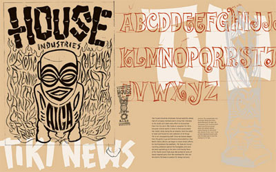
Intense use of the techniques of print production such as overprinting multiple inks and working directly with the producers of packaging materials characterizes the House Industries approach. They got their start when Andy Cruz and Rich Roat landed a commission from Calumet Carton for a promotional piece for the company’s CD packaging. The two young designers immediately started their own firm in a cramped back room, and they worked wonders with the rough, brown Kraft material that Calumet wanted to promote.
Since then, House has made its mark through promotion and packaging not only for design clients but, more importantly, for itself. The 10th-anniversary book is a sort of culmination of this progress. Many of the best House Industries designs, both typefaces and presentation, are shown here in vivid color, and the book itself is a polished example, featuring overprinted finishes and washes and metallic inks; according to Rich Roat, they were on the press check in Berlin for two weeks as the book was being printed. Some of the pages actually glow as you flip through them, if the light is right. (This is not always a good thing. There are a few places—but not many—where the silver ink overprints on bits of the text, which makes it hard to read.)
Enthusiasm and Style
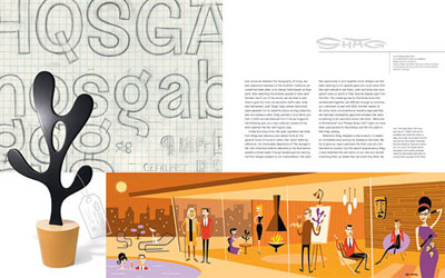
I’ve written before about House Industries’ flair for self-promotion; it’s on full display here. I’ve also written (and so have others) about House’s love affair with early-Sixties visual culture, from the trappings of high Modernism to the excesses of Ed “Big Daddy” Roth’s muscle cars. Although Rich Roat says that they hate to be called “retro,” it’s not surprising that the term gets applied to their work quite often. But unlike those graphic designers who just borrow the visual styles of a period and use them again, the House homages are re-thought and re-worked and extended, not just copied or imitated.
On your first time through the book, you notice the work: all the intricate, over-the-top printed pieces and the highly styled layouts and the perfectly straight-faced allusions in the typeface samples. A second look makes you aware of the book itself, of how well it’s put together, of the elegant page spreads that combine text and illustrations seamlessly, of the pacing as you flip through. Their graphic work is so outrageous and elaborate that they’ve taken a classic path of presentation: letting it stand in contrast to a very simple, straightforward typographic treatment of the running text. There are no pull-quotes or big splashes of text treated as display type; the words run along at their own pace, in neat, ragged-right columns of simple sans-serif type, not trying to compete with the lavish illustrations. Although pictures must cover at least three-quarters of the page surfaces, text and art looked well integrated and well balanced. This is not just a picture book; these designers respect their text.
Content Meets Design
The text is written and edited by Andy Cruz, Ken Barber, and Rich Roat, in a snappy, smart-aleck, self-deprecating verbal style. They present themselves as though they were under-achieving layabouts, flipping burgers and occasionally conning someone into giving them money for some design work.
It’s a pose, but an entertaining one. They describe, for instance, grabbing some fast food at Taco Bell and noticing that “all of the signage as well as our Nachos Belle Grande packaging included a first-rate application of Coop Latin. (The House Industries trending and forecasting department has always depended heavily on fast food collateral to spot the next type fashions.)” They then go on to say, “The work of the Taco Bell designers was not without precedent,” and give a lucid description of the background to this style of lettering.
There’s actually quite a lot of text in this book; it may be a browser’s delight, as you’d expect, but it also documents and catalogs a decade’s worth of type and design trends, initiated by House Industries. And it’s done in a way that makes it all fun—a hallmark of everything that the House gang does. In a sense, their approach is to turn graphic design into show business (as anyone who has heard them speak at a design conference can confirm); but it’s not hype, it’s fun. They manage to be high-energy self-promoters and still not take themselves too seriously—a difficult dance that requires that you never stop moving.
Sure, the “House Industries” book is a self-promo piece. A wonderful one. Enjoy it.
This article was last modified on July 18, 2023
This article was first published on July 5, 2004
Commenting is easier and faster when you're logged in!

Recommended for you

dot-font: Serifs from the Portuguese
dot-font was a collection of short articles written by editor and typographer Jo...

dot-font: Stop Stealing Sheep—Again
dot-font was a collection of short articles written by editor and typographer Jo...

dot-font: Big Pages, Flamboyant Typography
dot-font was a collection of short articles written by editor and typographer Jo...