

dot-font was a collection of short articles written by editor and typographer John D. Barry (the former editor and publisher of the typographic journal U&lc) for CreativePro. If you’d like to read more from this series, click here.
Eventually, John gathered a selection of these articles into two books, dot-font: Talking About Design and dot-font: Talking About Fonts, which are available free to download here. You can find more from John at his website, https://johndberry.com.
Mark van Bronkhorst is a typographer in the best sense: someone who designs with type, who is intimately concerned with both the form and the content of whatever he is designing, as well as the intersection of the two. He is also a designer of typefaces—some sold by various major type foundries, others available directly from his own site, MVB Fonts. Of the latter, one of the most recent, and possibly one of the most useful, is an old-style text face called MVB Verdigris.
Deep Roots, New Branches
What van Bronkhorst was after in designing Verdigris was a sturdy text face that would work at small sizes under modern-day printing conditions. Verdigris is not a revival of a particular Renaissance typeface, but its roots are clearly in the flowering of French type design and punchcutting in the 16th century—the time of Claude Garamond, Robert Granjon, Robert Estienne, and Pierre Haultin.
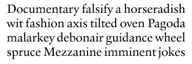
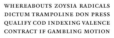
Verdigris roman
“It’s based on Granjon proportions,” says van Bronkhorst, “but not following Granjon in style (to do so would be to appear to imitate Galliard). I drew it more basic, sturdy and simple, along the lines of Sabon. It has a bit more density (my pet peeve about many digital faces): holds up as text nicely at 9pt imaged to plate digitally and printed offset.”
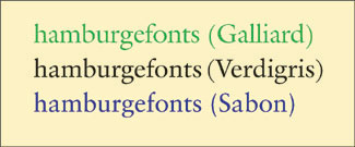
A comparison of Galliard, Verdigris, and Sabon
Too many digital “book” faces don’t hold up at the sizes we commonly use for text these days. Many of them are revivals of older, metal typefaces, but are based on a model size that’s much larger (12pt or 14pt) than the size at which they’ll actually get used. The result is fine, light, wispy text type, instead of the solid, easily-read black type of classical book printing.
Van Bronkhorst took much the same approach to the italic of Verdigris as he did to its roman: “The italic, based on Haultin, is sturdy, and simple. Nothing flowery. I wanted a face that was handsome, legible, basic, but not pretty (swash italic will not happen).”
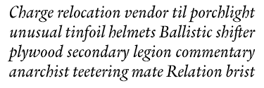
Verdigris italic
The italic may be Verdigris’s most striking feature. It has a liveliness of curve and weight distribution that reminds me of some of the early Dutch typefaces (and certain more recent revivals, such as those by Fred Smeijers). Its slant is not pronounced, but within that shallow angle the letters wiggle enough to make them easy to distinguish from each other. As with the roman, the italic’s hairlines are thick and don’t get lost at small sizes. At large sizes, when used for display, Verdigris italic shows its strong character.
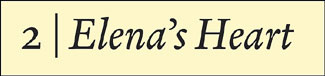
A short title set in Verdigris italic
Text Features for Book Work
Verdigris is designed as a text face, with an eye to its use in books and periodicals. For all its digital freshness and its appropriateness to technology, Verdigris is resolutely old in style. In its current release, the numerals are all old-style (“lowercase,” with ascenders and descenders), which harmonizes best with text. Van Bronkhorst promises a version with lining figures (“uppercase,” all the same height as the caps), along with “other goodies,” for a future release. The present version does, however, feature both traditional old-style figures, whose widths vary to suit the shape of each numeral, and tabular old-style figures, which are all the same width and will line up in neat columns when used in a price sheet or a financial report.

The Verdigris family and some of its features
The way van Bronkhorst has arranged the fonts is also considerate of the needs of book typographers. There’s a complete family of styles and weights (regular, italic, bold, bold italic) with the old-style figures, and a whole separate set of fonts, comprising the same styles and weights but with the tabular figures—so there will be no need for switching back and forth between fonts to get the numerals you want. Verdigris includes small caps (roman only, alas) and an “alternate” font for each style and weight, containing Euro symbols and a full set of f-ligatures.
Other Verdigris variations include small caps.
There’s one feature that bothers me in Verdigris: the roman lowercase “a.” It simply looks too wide, when I peer at it up close or use it at a large size. Yet this very same feature helps the typeface work well in very small text, so perhaps it’s appropriate.
Promising Typography
Although so far I’ve only had a chance to use Verdigris in a couple of sketches and mock-ups for projects that haven’t yet seen the light of day, it’s a very promising typeface. It’s interesting to wonder whether Verdigris roman might make a suitable companion for notes and other fine print where the main text is set in Galliard; they might complement each other, or they might be too alike and clash. In any case, I welcome Verdigris for its own sake, and applaud the creation of new text faces that have some robustness and heft.
This article was last modified on February 18, 2022
This article was first published on May 10, 2004
Commenting is easier and faster when you're logged in!

Recommended for you

dot-font: The Human Side of Sans Serif
dot-font was a collection of short articles written by editor and typographer Jo...

dot-font: From Russia with Type
dot-font was a collection of short articles written by editor and typographer Jo...

dot-font: Front-Page Fonts
dot-font was a collection of short articles written by editor and typographer Jo...