Dot Dot Dot . . .

A few months back, in a column entitled “Check, Please,” I recommended that one thing to scan for before considering a job done was the presence of badly formed points of ellipsis, those series of dots used to indicate missing text, also known as ellipsis points, points of omission, or points of suspension. This begs the question, though, what exactly is a properly formed ellipsis?
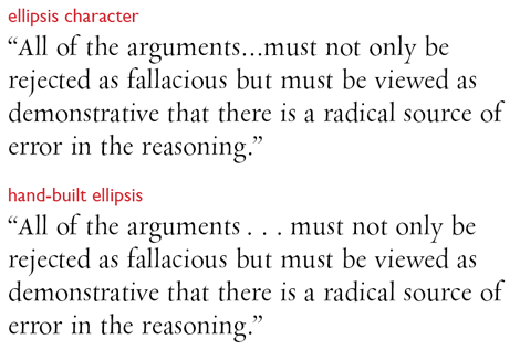
Let’s start with what constitutes a badly formed ellipsis. Unfortunately, the worst ellipsis is also the easiest to create, and it comes from using the ellipsis character built into virtually every text font you have (Option-; on the Mac, Alt-0133 in Windows). Its problem is that it’s too small, constrained by the physics of font design to be only one em wide. Three periods in a row look about the same. If the idea of ellipsis points is to indicate an omission, they have to open a space wide enough to visually communicate a gap, and as you can see here, a one em–wide opening in the text just doesn’t cut it:

Tradition based on centuries of settings using metal type dictates that the spacing of the dots of an ellipsis be much wider. These days, the spaces used for ellipses are the equivalents of the fixed spaces found in Adobe InDesign’s Type > Insert White Space menu and QuarkXPress’s Utilities > Insert Character menu. Fixed spaces differ from word spaces in that their widths can’t be altered when lines of type are justified. Which spaces you should use for your ellipses, though, depends on whom you talk to.
The revered manual Words into Type, for example, recommends en spaces. The Chicago Manual of Style prescribes closer spacing, using one-third em spaces (a.k.a. three-to-the-em spaces). Oxford University Press’s Hart’s Rules prefers “spaces of the line,” which is to say, the equivalent of word spaces.
Computerized typesetting has allowed type to be much more tightly set than in the metal-type days, and an aesthetic based on tight spacing rules the roost. In this regime, it’s most common to opt for quarter-em spaces, which are very close (indeed, often identical) to the widths of standard word spaces.
The spacing you choose for your ellipsis points depends on the overall spacing of your text, as well as your taste in ellipses. The following three examples show the most common spacing configurations.

Points of ellipsis must always stick together as a group, and the sequence of dots can’t be interrupted by a line ending. Consequently, the dots of an ellipsis have to be bound together with nonbreaking spaces.
In this type from a newspaper website, the ellipses were created using simple word spaces. This works fine in mid-line, but here the ellipse comes to grief when it’s divided at the end of a line.

Points of ellipsis can appear anywhere on a line, even the beginning. However, their spacing relative to the text around them depends on the meaning of the text.
Ellipses in Mid-Sentence
A three-dot ellipsis appearing in mid-sentence is a stand-in for material omitted from within that sentence. The sentence continues on after the ellipse to end with a period. Such ellipses are preceded and followed by a space whose widths are the same as those between the dots.
An ellipse can occur anywhere on a line, as long as all its dots stick together.

To allow these possibilities, the spaces adjoining the text have to be legal line-breaking points. This is generally easier to accomplish if you use QuarkXPress because the program has two varieties of all fixed spaces: breaking and nonbreaking. [Editor’s note: InDesign CS2 also includes both breaking and non-breaking fixed-width spaces.]
For a three-dot ellipse, you use breaking spaces between the text and the first and last dot, and nonbreaking spaces between the dots themselves. This keeps the ellipse intact in all situations and allows it to appear anywhere on a line, just as if it were an unbroken word.
In InDesign, all fixed spaces are nonbreaking, so an ellipse built using fixed spaces will be bound to the text before and after it, preventing line breaks that would allow an ellipse from either starting or ending a line. To allow a line containing such an ellipse to break correctly, you have to insert discretionary line breaks (Type > Insert Break Character > Discretionary Line Break) after the first and last spaces in the sequence.
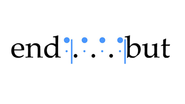
With InDesign’s Show Hidden Characters turned on, you can see how the discretionary line break characters have to be positioned to get this ellipse to break correctly. The ellipse is built using one-third em spaces (indicated by a big blue dot over a smaller one), and the discretionary breaks are indicated by the blue vertical bars.

Whatever your preference for spacing your ellipses, this is an unnecessary headache. Here’s a simpler path: Create your ellipses using word spaces.
The first and last spaces can be normal word spaces, and the spaces between the dots, nonbreaking spaces (Type > Insert White Space > Nonbreaking Space: Fixed Width). If you don’t mind the widths of the spaces of your ellipse varying a little in justified text, you can make things even easier by using simple nonbreaking spaces (as opposed to fixed-with ones), for which there’s a keyboard shortcut: Mac: Alt-Cmnd-x, Windows: Alt-Ctrl-x.
To create a word space–based ellipse in QuarkXPress, you can find an appropriate non-breaking space at Utilities > Insert Character > Special (nonbreaking) > Standard Space.
Ellipses at the End of a Sentence
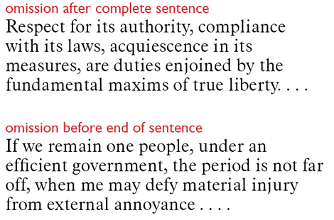
All complete sentences end with some form of terminal punctuation—sometimes a question or exclamation mark, but usually a period—and the same is true for those ending with points of ellipsis. In the case of a direct quotation consisting of a sentence that has been truncated, the ellipsis points indicate an omission before the original text’s sentence-ending period. You indicate this by preceding the ellipsis with a space (just as if it were in mid-sentence) and add the sentence-ending period at the end, as a fourth dot, using the same spacing as for the other periods. As with any other sentence-ending period, the fourth dot of such an ellipse is followed by a normal word space.
If the quotation ends with a complete sentence, but the setting needs to indicate that the original quotation contains additional, omitted text, the period follows the last word of the quotation, in its usual closed-up position. That period is followed by a three-dot ellipsis and separated from it by a breaking spacing or discretionary break character to allow the ellipse to begin a new line if needs be.
In the upper sample, the sentence-ending period appears before the ellipse. In the lower sample, the ellipse is part of the sentence, and the fourth dot is the sentence-ending period.

To allow a line to end before the first dot of a four-dot ellipse, you again have to make sure that the space between text and ellipse is a breaking space or that it’s preceded by a discretionary line-break character (in InDesign).
Do It Yourself
It would be nice to think that whoever prepares the manuscripts you typeset could do some of this legwork for you. In Microsoft Word, Alt/Option-space creates a non-breaking space, so it would be easy for an editor or author to create good-looking word space–based ellipses that will work correctly when imported in InDesign or QuarkXPress. XPress will import the non-breaking spaces by default, but in InDesign you should make sure Show Import Options is checked in the Place dialog box and choose Preserve Styles and Formatting before importing the file.
If you have uncooperative or unreliable authors, or if you want some spacing scheme other than word spaces, it’s DIY time.
For web pages, fortunately, the HTML code for the non-breaking space ( ) is widely supported by web editing programs. Nevertheless, as in printed text, the ellipsis character is used far more often than traditionally constructed ellipses, and usually to much worse effect.
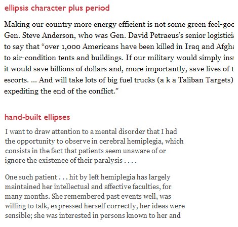
In these online samples, the ellipsis-plus-period in the upper text block is not a pretty sight. As the properly constructed ellipses in the lower sample show, this doesn’t have to be the case.

The preceding illustration shows another problem with using the ellipsis character: It often spaces badly when combined with a sentence-ending period.
Nevertheless, the ellipsis character isn’t a total loss. It can be useful in display type, because spaces look bigger when set in large point sizes. The result is that an ellipse that’s ineffective at text size can look properly proportioned when set very large. But again, if you use a period with the ellipsis character in display type, pay close attention to the kerning between the two, as any variation in spacing among the four dots will be magnified just that much more.
This article was last modified on July 11, 2023
This article was first published on September 2, 2010
Commenting is easier and faster when you're logged in!
Recommended for you

Type Designer Mark Simonson: The Inside Story
Mark Simonson has created many memorable typefaces; one of my favorites is the s...

Typophonic Showcases Great Record Cover Typography
Once upon a time, vinyl record album covers were a major form of artistic expres...

Introducing Peristyle by Hoefler&Co.
Jonathan Hoefler of Hoefler&Co. is at it again! He and his enthusiastic and...


