
 Jonathan Hoefler of Hoefler&Co. is at it again! He and his enthusiastic and talented team of designers have created Peristyle, a family of condensed typefaces designed to restore the effortless chic of the high-contrast sans. A little background: H&Co is renowned for creating typefaces that are marked by both high performance and high style, H&Co’s print, web, and mobile fonts help shape the communications of the world’s foremost publications, institutions, and brands. In 2009, H&Co became the first type foundry ever to be recognized by the National Design Awards at the White House, an honor they received again in 2011. H&Co typefaces are in the permanent collections of both the Smithsonian Institution and the Museum of Modern Art in New York.
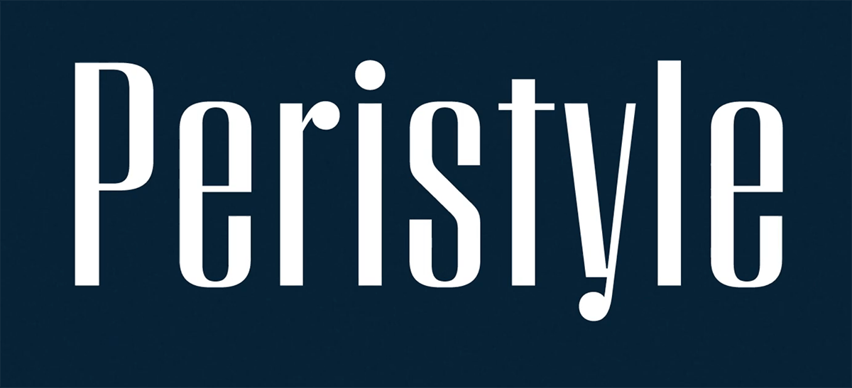
Peristyle is a stylish yet practical typeface family that is different from other high-contrast sans serif designs of the recent and distant past. As Jonathan explains, “there are high-contrast faces that buzz with high-tech sparkle, using unexpected geometries to look futuristic, and others that feel old-fashioned, employing all the details of thirties Art Deco or sixties funk. But what if a typeface worked to avoid looking forward or backward, and instead summoned all the energy of contrasting darkness and light to create a typeface for today? Peristyle is a family that dodges eccentricity, to ?nd drama, elegance, and style.”


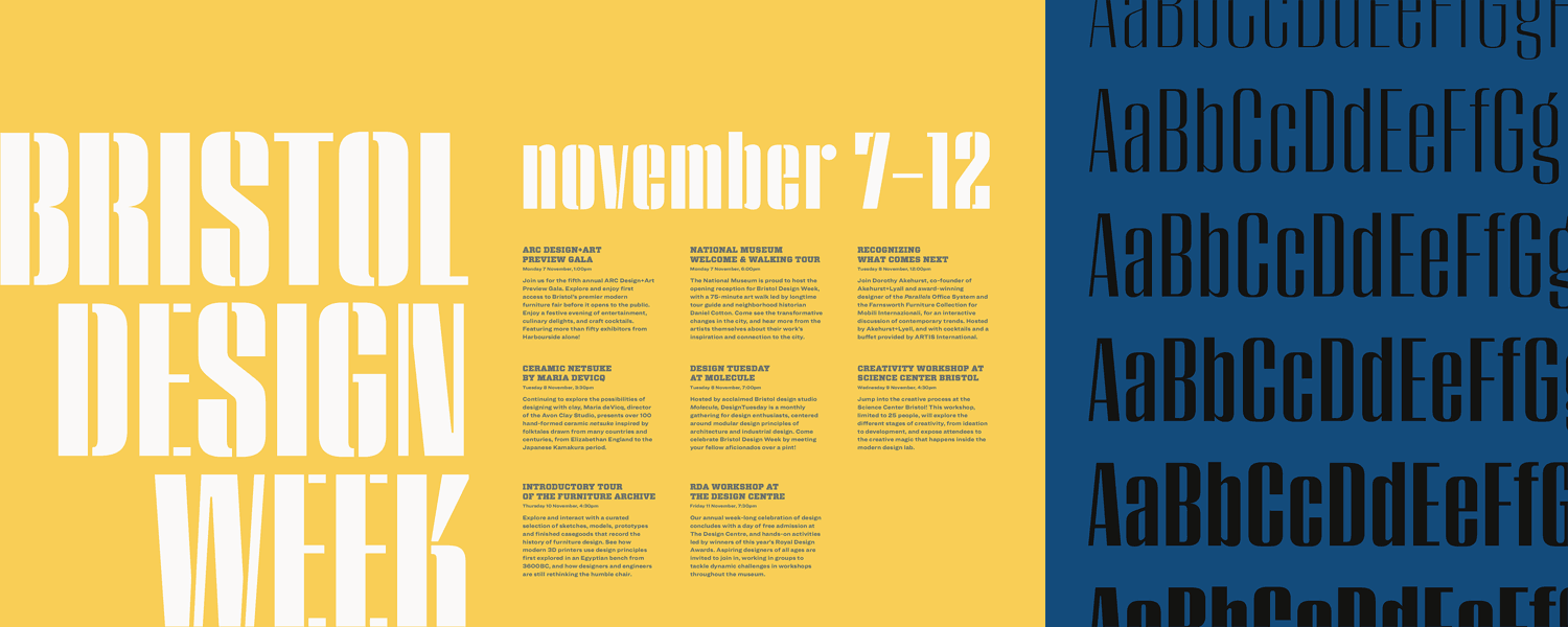
The Peristyle family contains six upright weights, from Light to Black. The team also created a stand-alone stencil version, as well as a pair of layered fonts to alternate the application of color. In order to keep the typeface from having an overly repetitive color and texture, they’ve added a couple of supplementary motifs to keep the design engaging and upbeat. Circular ball terminals on letters like y and r help drive them apart from their cousins u and n, and vigorous wedges on letters like k and g help distinguish them from the h and q. These dynamic shapes recur throughout the characters, and across the full range of weights, creating an effervescent rhythm everywhere the font is used.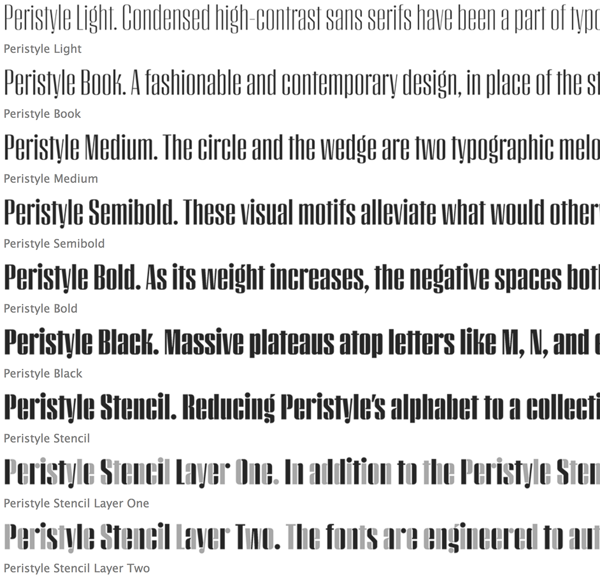


H&Co has put together an informative, engaging video explaining how all the subtle yet important design decisions of Peristyle were made. This includes an explanation of its reoccurring design characteristics (or themes, as Hoefler calls them) such as the circle and the wedge.
The three-minute ?lm also introduces the team behind Peristyle. Troy Leinster and Hoefler worked on the typeface together from its earliest stage, and H&Co’s Sara Soskolne provided valuable insights along the way. Other participating designers – Andy Clymer, Colin M. Ford and Graham Weber – helped complete the typeface. And throughout the project, no one was more enthusiastic about Peristyle than Creative Director, Brian Hennings. Brian found in Peristyle some unexpected affinities with a few truly far-?ung species of typeface, and takes the time in this film to share the useful perspective of someone who uses fonts, not just designs them. Viewing this brief film gives us all a rare look into the process of designing a typeface, especially one like Peristyle that includes much teamwork, brainstorming, and cooperation.
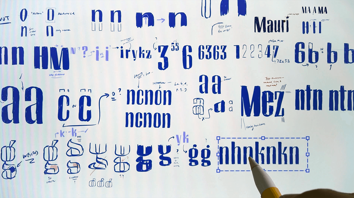
Frames from the short film on the making of the Peristyle typeface family.


When used alone, Peristyle makes a very dramatic, eye-catching statement. Yet when combined with other typefaces, it becomes somewhat of a chameleon, and looks good with a wide range of typestyles. But no matter how it is used, this highly-styled design is not just practical, but up-to-date, elegant, and smart.
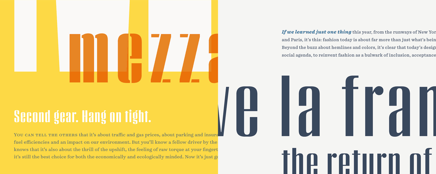
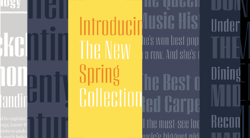
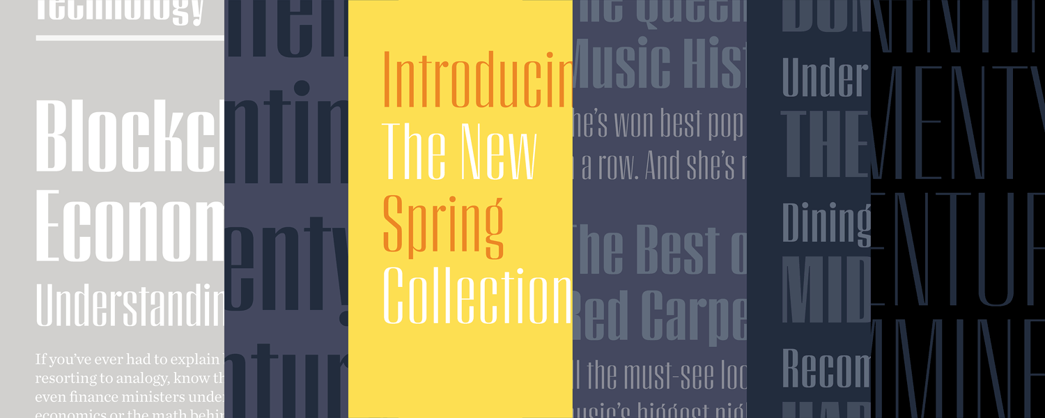
Examples of Peristyle combined with Archer.
This article was last modified on January 16, 2023
This article was first published on November 22, 2017
Commenting is easier and faster when you're logged in!

Recommended for you
TypeTalk: DIY Accented Characters
TypeTalk is a regular blog on typography. Post your questions and comments by cl...
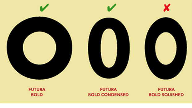
TypeTalk: Why Distorting Type Is a Crime
Ilene Strizver explains why not to distort type and what to do instead.

Introducing Between: A New Typographic Triumvirate from Monotype
Between might seem like an odd name for a typeface – until you learn what is beh...