Don’t Apply Baseline Shift to Move a Paragraph Up or Down

Here’s another installment in a series I like to call: Please, for the love of all that is pure, don’t do this in InDesign!
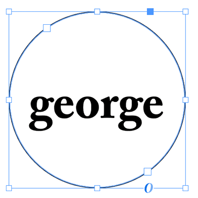
Today’s topic: applying baseline shift to an entire paragraph. I know it’s tempting… your text just isn’t in the right place on the page and you need the whole paragraph to move up or down a little—or perhaps a lot. A common example of this is when placing text inside a circle and then setting it to “Center” in the Vertical Alignment section of the Text Frame Options dialog box:

See how the text is sitting slightly below the the centerline of the circle? That’s because InDesign uses the height of the “slug” of the font (including the space from the descenders to the ascenders, if there were any) to figure out where the text should sit. You can see this easier if you select the text:

So we want to move the text up a little, right? But how? The natural inclination is to reach for the Baseline Shift feature. And, okay, I guess if it’s just this little bit of text and you’re just going to move it a little bit, it’s not the end of the world. But I want to strongly recommend that you avoid Baseline Shift for anything more than a few characters.
That is, the Baseline Shift feature is designed for moving a character up or down a little bit—and it’s great for when a bullet is too low, or a trademark symbol needs to move down, or something like that. But it was not designed for setting the vertical position of a whole line or paragraph!
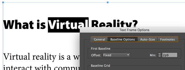
The biggest problem with using this feature on a whole line or paragraph—especially when you move it more than just a very small amount—is that it becomes difficult to select and format the text later, because… Well, here’s an example… look what happens when I double-click on the word Virtual:

You can see that InDesign actually “thinks” the text is above, at the top of the frame. But it appears down below. That’s because that first heading was moved down with baseline shift.
Honestly, the worst part about doing this that if you give this file to someone else to work on, they will quietly (or not so quietly) curse your name.
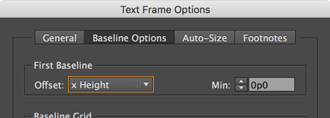
So don’t do it. Instead, if you need to adjust the vertical position of text in a frame, use other features. For example, the First Baseline Offset feature, inside the Text Frame Options dialog box:

In the case of the text in a circle, changing the Offset pop-up menu from Ascent to “x Height” fixes the problem immediately, because InDesign measures the text position from the top of the x-height (the height of a lower-case x) instead of the height of the ascenders.
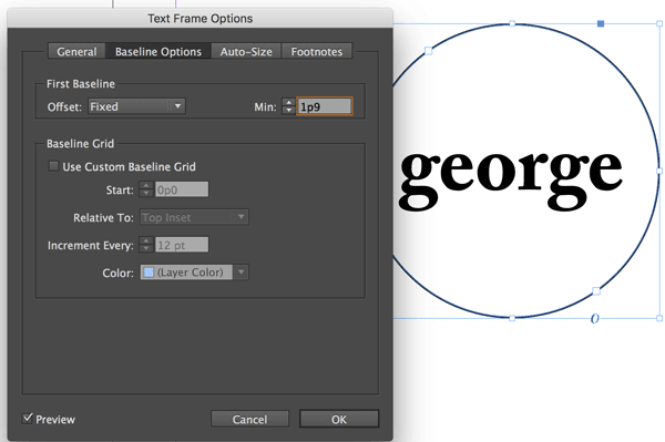
If you want even more precision (and you usually do), then change the Offset popup menu to Fixed. Then change the Min field to move the text up or down. (In this case, you should also probably set the Vertical Alignment in the General tab back to Top.)

In the case of moving the first headline down, you can see that the Fixed offset lets us set exactly where the text should sit in the frame:

If you’re trying to adjust the vertical position of text that isn’t the first paragraph of a frame (that is, it’s in the middle of a story), then you should probably use the Space Before or Space After feature. For example, I added space between the headline and the following paragraph (in the image above) by selecting the heading and adding Space After in the paragraph formatting controls of the Control panel.
Baseline Shift is great for making wacky effects, or adjusting where superscripts and subscripts sit, or fixing the vertical position of a bullet or inline object. But you should avoid using it for larger amounts of text, as it will only get you (or your colleagues) into trouble down the line.
This article was last modified on July 25, 2019
This article was first published on November 14, 2016
Commenting is easier and faster when you're logged in!
Recommended for you

The Case of the Missing Placeholder Text Contest Answer and Winner
Solve this InDesign mystery for a chance at winning a great prize.

Color By Frame
Officially text frame attributes can control the fill and stroke of the frame, b...

Recipes for Applying—and Ignoring—Text Wrap in InDesign
Learn when to apply and when to ignore Text Wrap in InDesign.


