Do You Know Etaoin Shrdlu?

17

This 1956 ad for A&P showed terrific prices, but not-so-terrific proofreading.

Chances are that you deal with Lorem Ipsum on a regular basis. But you’ve probably never met his second cousin, Etaoin Shrdlu.

Allow me to introduce you.

Etaoin Shrdlu was born of the Linotype machine. Before Macs, before PCs, before Adobe Suite and Aldus PageMaker, there was the Linotype. This behemoth (approximately two tons of metal standing about seven feet tall) was invented in Baltimore in the middle of the 1880s by a German clockmaker. His name was Ottmar Mergenthaler, and his revolutionary machine reigned supreme as the typesetting solution for about 100 years.

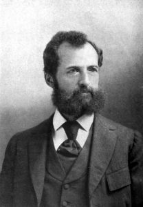
Ottmar Mergenthaler c. 1912.

A Linotype operator at work at the Swedish Tribune, Seattle, Washington, February 1904.

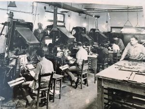
Lots of Linotypes, c. 1950.

The Linotype was a radical improvement over setting type by hand. (Thomas Edison, apocryphally, called it the eighth wonder of the world.) Rather than having to gather minuscule pieces of type, one letter at a time, and arrange them meticulously in a composing stick (a portable type holder), a Linotype operator would simply press keys on a keyboard, brass molds of letters would fall into place, and the machine would form a beautifully justified “line o’ type” using a molten lead alloy.

I’ve heard that this liquid metal was 550ºF; I’ve heard it was 530ºF. I can confidently say that it was frighteningly hot, especially on those occasions when, due to misaligned matrices (molds of letters), it would suddenly spew out toward the unfortunate operator.

Linotype keyboard. Copyright 2006 Marc Dufour for Wikimedia.

The Linotype keyboard was not the “qwerty” situation we’re all accustomed to. On this 90-key arrangement, the uppercase keys sat on the right side and the lowercase keys on the left. And—rather brilliantly, if you ask me—the keys were arranged according to how commonly they were used. The first column of both the uppercase and lowercase sets, from top to bottom, were e, t, a, o, i, and n. The second row contained, from top to bottom, s, h, r, d, l, u. (Keep these most-common letters in mind for the next time you play Hangman.)

There was no backspace on a Linotype. No delete key. And certainly no screen to identify any mistakes you might make. You just had to proceed with extreme attentiveness, caution, and dexterity.

To err is human, however. When a mistake was inevitably made, all that could be done was to remove the bungled line in its entirety. This would happen when all the slugs (pieces of lead) were assembled and arranged for the press. So if the Linotype operator noticed he’d made a goof while typing (chances were better than 95% that the operator was a man), he’d call attention to that goof. To convey, “There’s a mistake here,” he’d give the line the ol’ etaoin shrdlu treatment. He’d run his  finger down the first one or two rows of keys, which would spell out “etaoin” or “etaoin shrdlu.” That was the red flag that commanded, “remove this line.”

Well, as we all know, publication deadlines can lead to rushing, and rushing can lead to mistakes. And sometimes, even though an “etaoin” or “etaoin shrdlu” had been thoughtfully typed out, the messed-up line would not get removed and would end up getting printed.

Readers came to notice these bizarre inclusions, and “etaoin shrdlu” earned something of a mythical status. The two words have been used to name characters in books, comics, and music.

I thought it would be fun to hunt down these words in the wild. So, using the Library of Congress’s “Chronicling America” collection of digitized newspapers, I searched for the word “etaoin” in print during the Linotype years. I found countless examples. Here are just a few—each offers its own anachronistic charm.

An ad in the El Paso Herald, 1911.

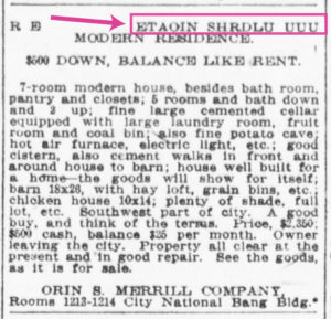
A bit blurry, but worth squinting for so you can see how far your real estate dollar went in Omaha in 1911. Also, Potato Cave would be an excellent name for a band.

From La Sentinella (Port Chester, NY), 1923. Italian! “Etaoin shrdlu” transcends languages.

So, if you’ve ever accidentally left a bit of “lorem ipsum” text in a layout, know that you are part of a long history of such oversights. And feel a connection to the remarkable Ottmar Mergenthaler and his wondrous typesetting machine.

Check out this clip from Linotype: The Film for more on etaoin shrdlu.

etaoin shrdlu from Linotype: The Film on Vimeo.

Sara Rosinsky is an independent copywriter working under the banner of Shiny Red Copy. She writes advertising and packaging copy, names companies and products, and helps businesses articulate their branding and positioning. She’s the author of Unflubbify Your Writing: Bite-Sized Lessons to Improve Your Spelling, Punctuation, and Grammar and posts daily about language and advertising on social media (particularly on LinkedIn).
  • Brian Lawler says:

    Dear Sara,
    This is a nice article, and it was smart of you to search for etaoin shrdlu! I have a working Linotype machine in the Shakespeare Press Museum at Cal Poly, San Luis Obispo. It’s a 1941 Model 31 machine with four magazines and a Star Quadder. It’s a fascinating machine to run, and it does cause a lot of trouble for the operator.

    If you ever want to see one run, please stop by. It’s exciting to see all those marvelous moving parts conspire to make a line of type.

    I run our machine’s melting pot at 535° F, which seems to deliver type metal to the mouthpiece without bubbles or voids in the slugs.

    Best wishes,
    Brian P. Lawler

    • Sara Rosinsky says:

      I’d love to see (and hear) one run! There’s one in Saguache, Colorado, which is a little closer to me, and I hope to make a road trip down there while it’s still operational.

  • Hi Sara
    That’s a great little article you have put together and right on the button. It brought back a lot of memories. I was a 16 year apprentice in 1968 in a local newspaper that had five linotypes in the north of England. Doing the changes to the ‘galleys’ (trays) of ‘slugs’, (lines of cast type) of new set linotype matter was difficult. The new shine of cast metal was always hard to read and of course the text was backwards for letterpress printing, compositors always read it upside down. Of course good proofing is always needed! The other memories of linotype though. The noise of the machines! The heat in summer! The fumes of smelting old used text and casting new ingots and carrying them back to operators. Lubricating the individual brass character matrixes with graphite powder to aid them travelling through the machine. What a long way we have come with technology in the last 50 years!
    Regards
    Frank Hodgson, New Zealand

    • Mike Rankin says:

      What a great comment! Thanks for sharing those memories, Frank.

    • Sara Rosinsky says:

      Thank you for sharing! I admire anyone who worked in pre-computer printing. Seeing linotypes junked for scrap is painful. But yes—we’ve come such a long way.

  • Ruben Ramirez says:

    My second job in a newspaper was in 1972. They were in the transition from Lynotipe to offset. I was designing ads for cold type, and in some stage final artwork was converted to metal. Classified ads pages were still formatted in lead. One day, one wheel or the cart carrying the final page to form the plate, failed and the hundreds of lines of 8pt. type fell tothe floor. It’s very sad to see an old man cry like that.

  • Annette Desrosiers says:

    I am so happy to have seen and read your article on the Linotype. I took graphic arts in high school and graduated in 1972. It was a requirement to learn and run the Linotype. I loved it! I often had to slow down because I was faster than the machine, as I’m sure many experienced operators were. Whenever there was a job in the house that required being done on the Linotype I was pulled from wherever I was in the shop and put on the it. I earned a departmental award in graphic arts because of that. I now work for a weekly newspaper using Creative Suite. I wish I could say I was as proficient with CC as I was the Linotype, but unfortunately I am just a novice. Thanks for the article. Oh, by the way, I don’t recall learning about etaoin shdrlu. I can relate to putting in unreadable text as a placeholder and it being printed erroneously.

  • The Yiddish Book Center in Amherst, MA has a Yiddish Linotype machine, in addition to their collection of thousands of rescued Yiddish language books.
    My own first typesetting job was at a small press setting type by hand and printing each page on a letterpress machine. Then I went directly to computerized typesetting (punching out coded tape) before the Mac II came along. I never got to use a Linotype machine.

    • I didn’t know about the Yiddish Book Center, and I lived in Massachusetts for close to 20 years! I’m so impressed that you set type by hand. You must be very patient, meticulous, and dexterous! Thank you for sharing. :)

  • Julien Hofberg says:

    Nice article. I grew up in the family typesetting business, learned to proofread, set hand type, linotype, ludlow—hot metal. After college, returned to the business and converted to the new “computerized” type setting, or photocomposition. Continued through Ventura, PageMaker, Corel, Freehand, Quark, InDesign, Illustrator, Photoshop, and some software that didn’t make the grade. It still is fun, and Etaoin Shrdlu along with his buddy Bodoni Dash are still making me smile.

  • Jan Petersen says:

    But why didn’t they not simply remove the line as soon as it was cast? I know the Linotype, was sitting for several years behind the keyboard in Denmark.
    But becoming a Linotype operator demanded that you were skilled typographer, a position that required 4 years of training in a print shop and god skills in danish language.
    Every workday we finished half an hour before end of workday to do the cleaning of wedges and the lead cooker to ensure a smooth run of the machine. And if we had spare time we cleaned the trays that contained the molds (one for each type that contained the roman and the italic style).
    All my skills on good graphic is used when I am designing today.

  • Susan Culligan says:

    And it would be tons of fun living in the National Bang Building! Sign me up!!

    • Sara Rosinsky says:

      It took me a while to find what you were referring to. But I found it, and good point! Second only to the National Interrobang Building. (Check out my CreativePro article on the interrobang.)

  • >