
Designing with Grids
Maya P. Lim shows how working with a grid opens up all kinds of creative design possibilities.

This article appears in Issue 110 of InDesign Magazine.
Using a grid to design may sound confining and boring, but the structure of a grid can actually bring clarity and beauty to your work, and provide surprising inspiration for new layouts. Conveniently, InDesign has tools that make it easy to try different grid options quickly.
Let’s walk through a few examples showing how a grid can be used flexibly to create a beautiful layout. The examples here are two event posters with different types of images. Event posters often feature multiple layers of information, and a grid can help to keep these engaging and easy to navigate. But the general techniques and principles of grid-based design can, of course, be transferred to other types of projects, from book covers to brochures, online banner ads to magazine spreads.
Start with a simple grid. Play around with a few options that seem reasonable based on the final production size and context of your work (for example, a billboard, typically seen from a distance and in a moving vehicle, might work better with a simpler grid with fewer units; an online shopping catalog may work better with a finer grid).
InDesign makes this process easy. With the Rectangle Frame tool (keyboard shortcut “F”) or the Rectangle tool (keyboard shortcut “M”), start dragging out the area for your grid (Figure 1).
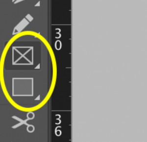
Figure 1. Use the Rectangle Frame tool (above) or the Rectangle tool (below) to drag out your grid.
While you’re dragging, with your mouse button held down, use the arrow keys on your keyboard to set rows and columns. Tap the left arrow to add columns; tap the right arrow to remove them. Tap the up arrow to add rows; tap the down arrow to
remove them. When you release your mouse, the grid will be composed of individual objects, though they will be selected together initially. Apply a fill or stroke to the selected objects so that you can see them even when they are deselected (Figure 2).
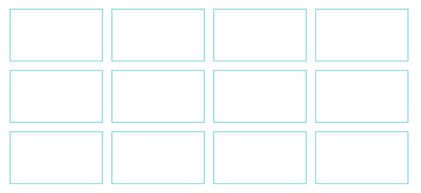
Figure 2. A simple grid, with a stroke added.
A few more advanced tricks: Hold down Option+ Command (Mac) or Alt+Ctrl (Windows) to adjust the spacing between the grid units as you drag: left and right arrows adjust the spacing between the columns; up and down arrows adjust the spacing between the rows. Holding down the Shift key at the same time constrains the units to perfect squares (Figure 3). You can move your mouse to adjust the total area of the grid.

Figure 3. A grid with wider rows and columns and with square grid units.
I suggest you create your grid on a separate layer in InDesign. That way, you can easily click the padlock icon in the Layers panel to lock the grid, preventing yourself from accidentally clicking on it as you work. You can also click the eye icon in the Layers panel to hide or show the grid as needed.
When drawing your grid, you should keep in mind that the more columns you add, the more flexibility you’ll have in deciding on item placement. (But if you use too many columns, you risk defeating the purpose of having a grid!) In general, odd numbers of columns or rows can provide even more flexibility and dynamism in a layout because they immediately create an asymmetrical underlying structure.
In Figure 4, I started with a photo of the night sky in portrait orientation, and created a grid of four columns and eight rows to set over the image.

Figure 4. Setting a basic grid of four columns and eight rows.
Add the Content
For this event poster, I have four main types of information to work with: the name of the event series, a tagline, the series of talks, and a sponsorship credit. We can start to set the information in that order, simply by making a series of text frames aligned to the top of the grid boxes (Figure 5).
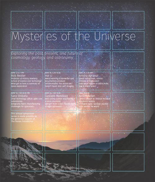
Figure 5. Creating text frames to conform to the grid gives you the necessary parameters along with the flexibility to move content around.
Once you have all the text frames on the grid, you can move them around to create different sorts of designs.
For example, tucking in the tagline and the series of event information by one column adds dynamism—at a distance, the poster now no longer looks like one chunk of text. Placing the credit at the bottom right helps to balance the layout, since the title is anchored to the top left (Figure 6).
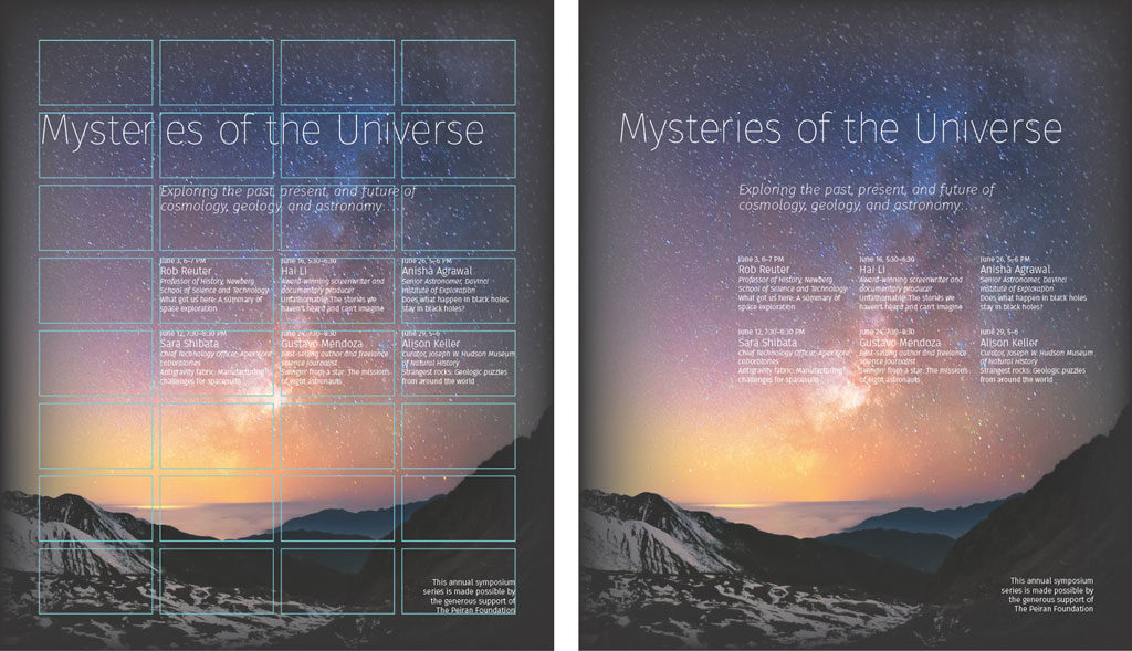
Figure 6. The final result is an inviting poster that clearly lays out the information.
If you find that placing detailed text directly upon a complex background image is problematic, you can use a grid to restructure the information.
In Figure 7, the underlying grid is the same as before. Here, I’ve bled the image off the left and bottom, and set the event series in the remaining right column. The top of the event series text column aligns with the top of the image. Notice that all of the photos and text consistently align with the grid.
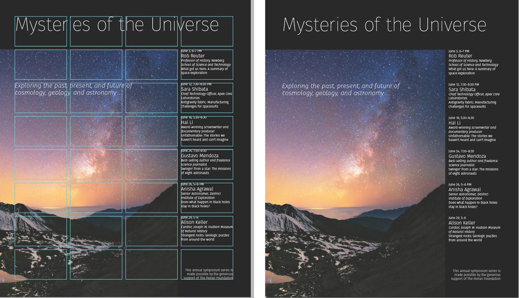
Figure 7. Same grid, different look.
If your image is better in a landscape orientation, the grid can accommodate that too. Figure 8 is one example.
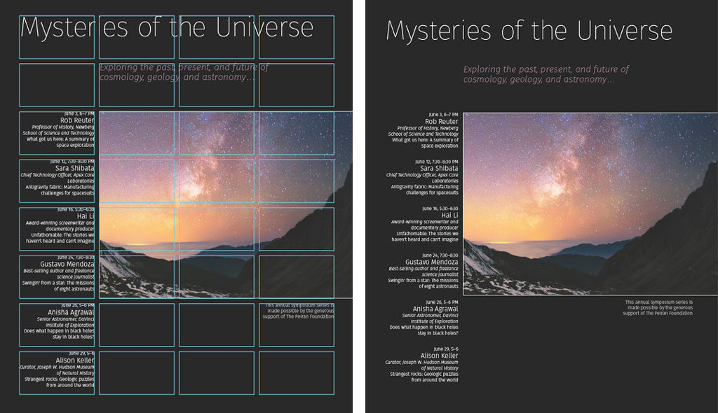
Figure 8. This landscape-oriented layout is based on the same grid.
Add or Remove Elements
One way to emphasize critical information (and improve legibility if the background is challenging) is to place it on a colored band. Here, the eye leads naturally from the word “Universe” to the events list (Figure 9).
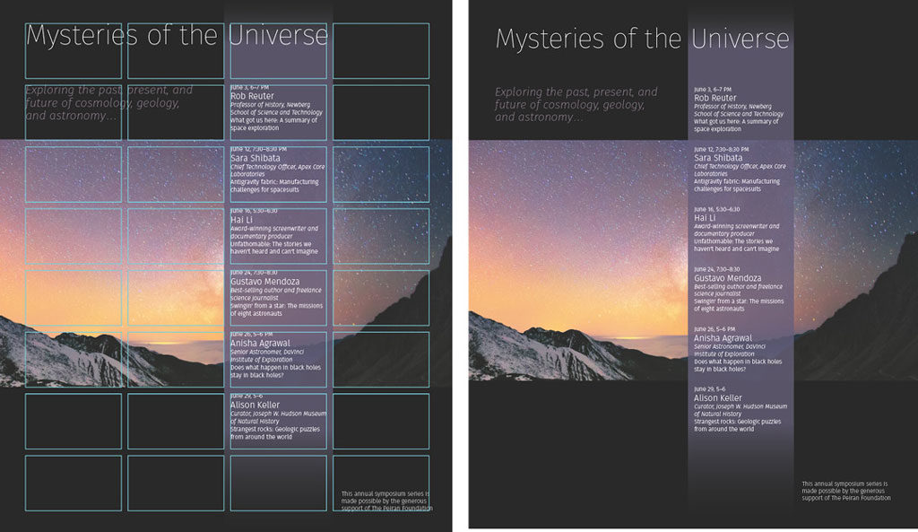
Figure 9. Surprise, surprise, it’s the same underlying grid.
You can make a grid-based design without bleed (Figure 10), which is handy if you can’t print with bleed.
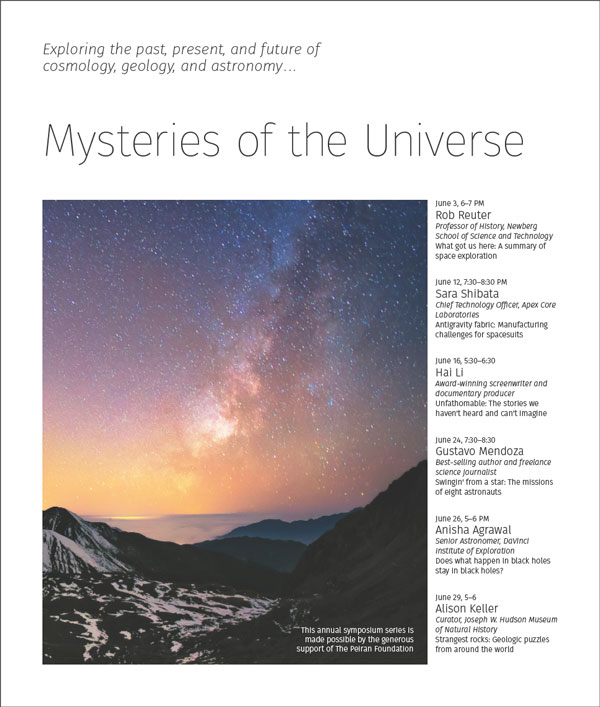
Figure 10. Grids are not just for fancy high-end printing with bleeds; we can all use them!
Use Focal Points
If your image has an obvious focal point, you can use it as inspiration for building your grid-based design. In our next example, let’s try a grid of six columns and six rows, and place the image so that it is somewhat contained by the grid (Figure 11). Remember the words of Josef Müller-Brockmann, a founding master of grid design: “The grid is an aid, not a guarantee.”
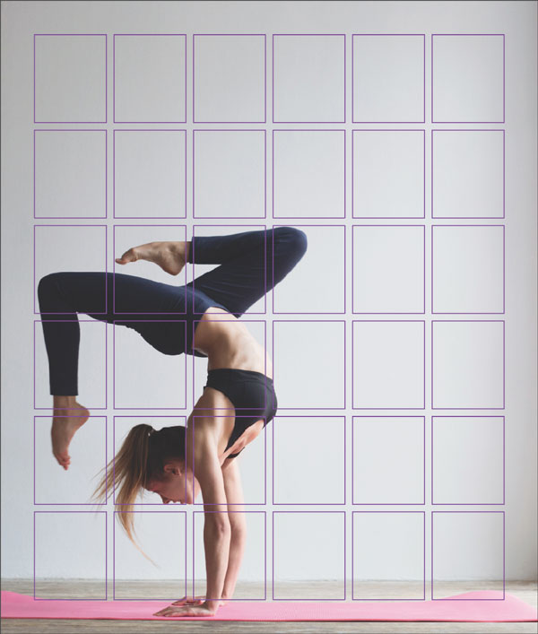
Figure 11. Start by placing your focal image in a place that feels interesting.
Then, set the text in around the image, using good typographic sense with color, scale, and style to create hierarchy (Figure 12).
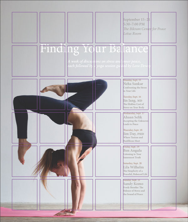
Figure 12. Don’t be afraid to play around with the placement of the text.
You can see the final result in Figure 13.
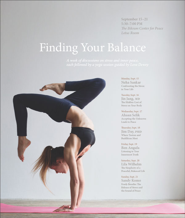
Figure 13. The resulting layout based on a six column, six row grid.
As shown before, a colored bar can add a touch of elegance (Figure 14). The transparency on the bar prevents it from looking too heavy next to the focal image of the woman.
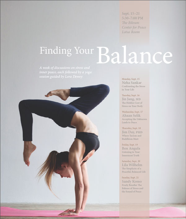
Figure 14. An alternative arrangement, based on the same grid, with a color accent bar
Sometimes it might make sense to match the layout with the message of the content. Since the poster is about finding your balance, a centered layout can emphasize that. In Figure 15, all of the information, and the image of the woman, are centered, with the event series arranged in a horizontal bar. The effect is more calming than the previous options, which conveyed energy and motion with their dramatic angles.

Figure 15. Unlike before, here we’re using a different grid: an extra column and row are added, allowing each of the events a grid unit of its own.
Grids are anything but constraining… they can help you to design more creatively and with greater communicative efficacy. With one simple grid, you can create hundreds of different layouts.
Get the goods on grids
If you’d like to learn more about grids, look for the classic work by Josef Müller-Brockmann, Grid Systems Raster Systeme. More recent publications on designing with grids include Timothy Samara’s Making and Breaking the Grid and Kimberly Elam’s Grid Systems.
And for more articles on mastering grids in InDesign, check out Issues #14, #35, #37, and #40.
Commenting is easier and faster when you're logged in!

Recommended for you

Tip of the Week: Gridify Magic
This tip was sent to Tip of the Week email subscribers on November 19, 2015. Sig...
InType: High-Contrast Fonts
InDesign Magazine issue 113This article appeared in Issue 113 of InDesign Magazi...

How to Control Stacking Order with Step and Repeat in InDesign
Frustrated by the stacking order of objects being the opposite of what you want?...