
There are a number of typographic techniques that can help draw attention to the content of an article, book, web page, or any important text. The use of a lead-in is one of them. A lead-in is the setting of the beginning of text in a different style or manner from that which follows it.
Lead-ins can be used in conjunction with initial letters or symbols, or entirely on their own. They are commonly used in magazines, journals, brochures, annual reports, books, and chapters, but can also be effective when used in announcements, advertisements, and web sites. This technique not only helps to emphasize the beginning of text, but can also serve to attract and engage readers by increasing the “skimmability” of the content and the overall design.
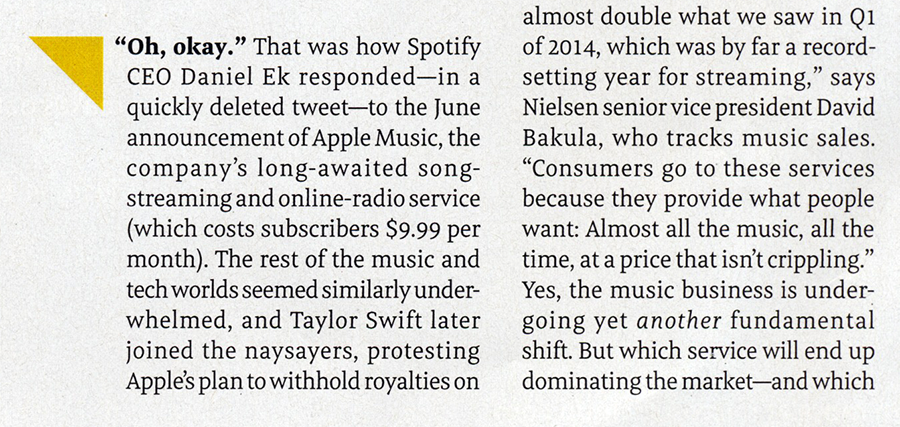
Lead-in approaches can go from more traditional treatments that are typeset in the same weight and style as the neighboring text, to those that can vary either subtly or greatly in style and placement. The actual lead-in text can consist of the entire first line, a sentence, a phrase, or in some cases, just a single word set to stand out from the rest.
Here are a few tips to keep in mind when using lead-ins:
- Consider different weights, versions, and typefaces, including calligraphic and handwriting styles.
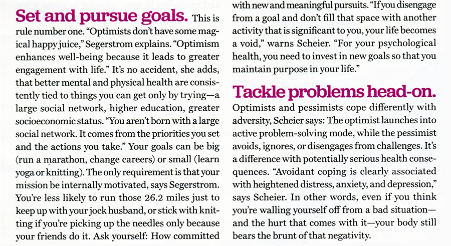
- A change in size and color can add additional emphasis.
- Experiment with horizontal alignments, such as extended or indented lead-ins.
- Play around with the baseline, even curving the lead-in into the body text.
- When small caps are desired, be sure to use true-drawn small caps, not fake, reduced caps that will look too light.
- When using a lead-in phrase, try to use one that makes contextual sense.
- Lead-ins can be used several times on a page or section in order to help the reader stay engaged, as well as aid in the navigation of the content.
- Balance the appearance of lead-in treatments with the rest of the design.
The use of lead-ins can add sophistication and polish to a layout, while simultaneously creating a visual cue that signals the beginning of an article or a section. This seemingly small element can have a substantial effect on the readability and overall attractiveness of a project as long as it is executed tastefully, and with regard to the rest of the typography and overall design.
Here are some examples of the various approaches you can take when using lead-ins:

This is a typical editorial treatment in which the lead-in follows a drop cap, followed by the entire first line set in matching small caps. Men’s Journal.
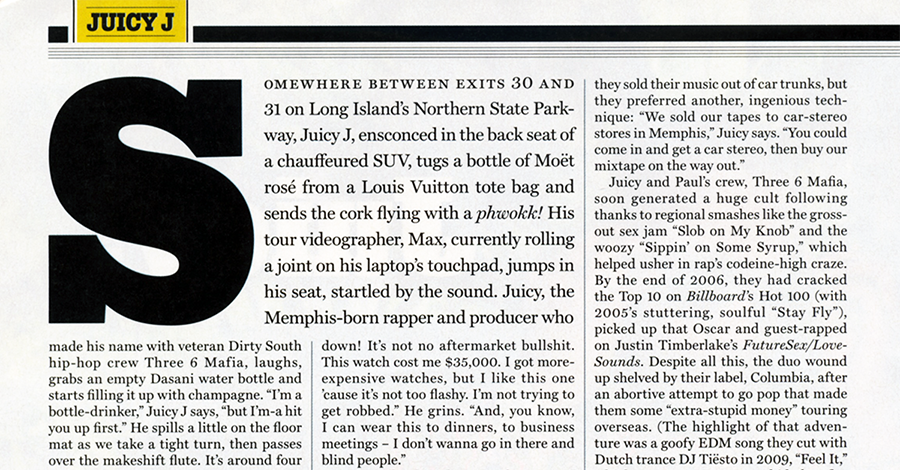
A similar lead-in style with a chunky initial creates a more dramatic appearance. Rolling Stone magazine.

In this example, a phrase is set in full-sized caps that match the text. Radar magazine.

Lead-ins don’t have to follow initials. This lead-in phrase that is set in matching small caps draws attention to the beginning of the article without disturbing the hierarchy of the headline and deck (subhead) above it. Real Simple magazine.

This first line, small cap lead-in is set in a bolder weight of the same typeface as the text, creating slightly more emphasis. The red arrow at the end balances the weight of the lead-in and draws the eye through these two paragraphs. Money magazine.

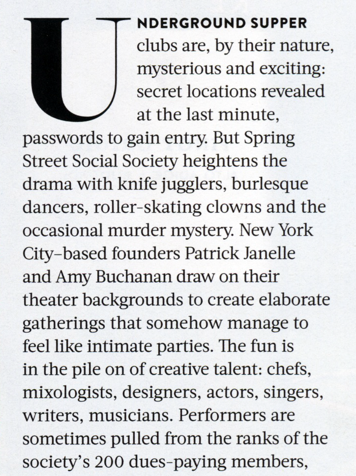
This lowercase drop initial followed by a bold, small cap lead-in phrase was located mid-article. AARP magazine.
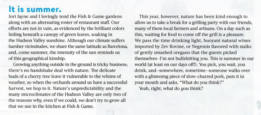
This lead-in is set in a completely contrasting font—a bold sans serif—and is a smart design element that is repeated throughout the magazine. Food and Wine magazine.

An assertive lead-in that matches the initial letter rather than the text creates a strong pairing. Money magazine.

This oversized, all-cap lead-in creates visual continuity by matching the typeface of the pull quote to its right. The New York Times Magazine.
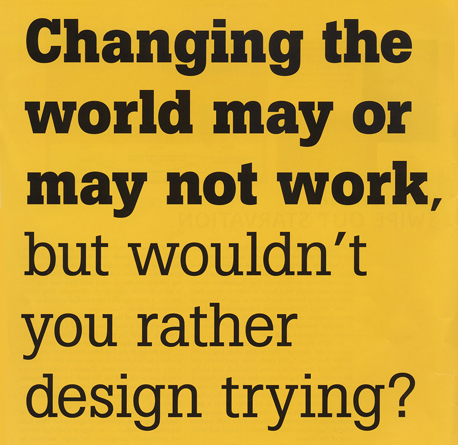
The addition of color creates even more emphasis to any lead-in. This brief, standalone sentence is set in a different font and color, and is a larger size than the text—all of which serve to entice the reader into the text. Food and Wine magazine.
Highly contrasting lead-ins can be repeated on a page to help highlight important information, as can be seen in this excerpt from a page containing a total of five of them. Redbook magazine.

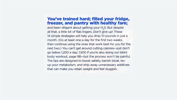
Some magazines contain pages consisting of several short articles. Strong, contrasting lead-ins can help organize and inform the reader what each is about. Shape magazine.

The addition of a shape or symbol next to a lead-in can enhance its noticeability and overall effectiveness. Fast Company and Shape magazines.

One might call this a drop lead-in, as this oversized opening phrase has characteristics of both. A more traditional lead-in can be seen in the column to its right. The New York Times Magazine.

This contoured type displays a very creative take on lead-ins, and accomplishes the same objective by engaging and inviting the reader into rest of the text. Food and Wine magazine.
Lead-in treatments can also be used effectively in ads, such as this one for AIGA.
This article was last modified on September 26, 2022
This article was first published on September 2, 2015
Commenting is easier and faster when you're logged in!

Recommended for you
Teaching Typography to Toddlers
One of the most fun aspects of parenthood is that you get to introduce your kids...

TypeTalk: Choosing and Using Swash Characters
Want to enhance and spiff up an otherwise ordinary or lackluster type treatment?...

Typographic Discipline, Part 1
In the coming weeks I will be writing and illustrating essays that describe how...