
Designing for Neurodiverse Audiences
Make your work more accessible for neurodivergent users—and stronger for everyone else too.


This article appears in Issue 40 of CreativePro Magazine.
Have you ever become physically sick from taking an online class or viewing a video? Unfortunately, it’s a regular occurrence for me. Many designers don’t consider neurodivergence or neurological differences when they’re creating content. And some design choices can cause harm for many users like me. Yet we make up about 25% of your audience. In this article, you’ll learn how to ensure your designs are usable and accessible for people of any neurotype (type of brain).
What Is Neurodiversity?
First, let’s clarify some terminology. Neurodiversity refers to differences in how our brains are wired. The term neurodiverse refers to a group of people who are neurologically different from each other. A neurodivergent person is neurologically different from those who are neurologically typical, or neurotypical (Figure 1).
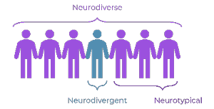
Figure 1. A visual guide to understanding key terms
Neurodivergence is not a clinical term. When it was coined back in 1998, it referred to people with neurotypes that affect how they perceive and understand the world (right side of Figure 2). Using this commonly accepted definition, approximately one in seven people is neurodivergent.

Figure 2. The Neurodiversity Umbrella
In recent years, the definition has expanded to include mental health disorders, brain injuries, tic disorders, epilepsy, and other conditions (left side of Figure 2). Using the broader definition, at least one in four of the global population is neurodivergent.
Understanding Your Neurodiverse Audience
The first step in good design is to know your audience. So, we’ll start with a few key things you need to understand about some of the most common types of neurodivergence.
Autism: At least 1% of the global population is autistic. However, the number could be much greater because it often goes undiagnosed—like mine did for more than 50 years. Autism affects how people process sensory input and interact with others. The autism spectrum is not a line from “a little autistic” to “severely autistic.” It’s more of a wheel (Figure 3). The size of each spoke varies based on individual challenges in different areas. It’s hard to generalize about autistic users’ needs because we’re all different. But typically, autistic people are more sensitive to sensory inputs.
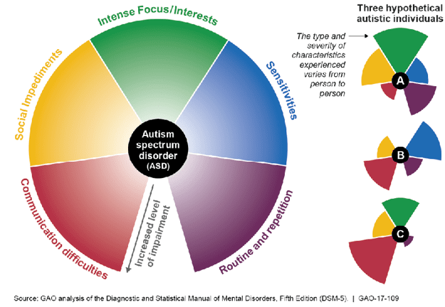
Figure 3. Autism Spectrum
ADHD: If you have a friend who’s always losing their keys, forgetting appointments, or interrupting others, they might have Attention Deficit Hyperactivity Disorder (ADHD). At least 3 to 5% of the population has ADHD, which affects things like focus, memory, and planning. There are three types of ADHD (inattentive, hyperactive-impulsive, and combined), so it looks different in different people. But in general, people with ADHD may need more sensory stimulation and novelty than neurotypical users.
Dyslexia: When someone mixes up they’re, their, and there, it doesn’t necessarily mean they don’t understand the difference academically. The person could be dyslexic, with challenges related to reading, writing, and spelling. Dyslexia is the most common form of neurodivergence, affecting about 20% of people.
Dyscalculia: I was an honor student, yet I often have trouble doing simple math in my head. That’s because I’m part of the 3 to 6% of the population with dyscalculia. This affects my ability to process numbers and math-related concepts.
Dysgraphia: Know someone with messy handwriting? They might have dysgraphia, which affects up to 20% of the population.
Dyspraxia: If, like me, you’ve always been clumsy and uncoordinated, you might have dyspraxia, which affects up to 10% of the population.
Neurodivergence likes to travel in groups. In other words, most neurodivergent people have multiple types of neurodivergence.
Now let’s talk about what all this means for design.
Creating User Personas for a Neurodiverse Audience
Inclusive design requires us to design with empathy—thinking about how a variety of people will perceive and use the design. Beginning your design process by building user personas helps you keep your users at the forefront of your mind. A user persona is a description of a sample user, including details like their demographics, attitudes, motivations, and accessibility needs. In most cases, three to five personas are enough. But if you have a wide range of users, you might need more. Just be sure to include neurodiversity in your user personas.
Figure 4 shows an example user persona for a meditation app. This user has several intersectional identities, including being autistic.
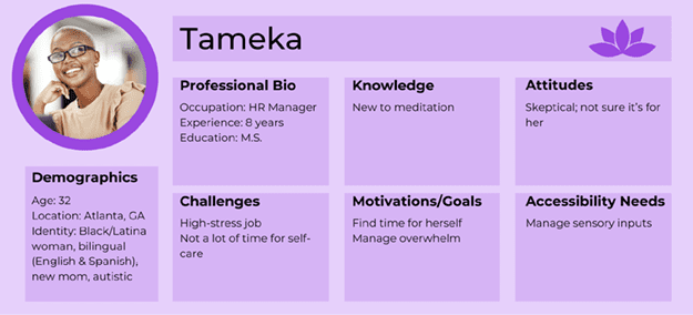
Figure 4. User persona example
If you’re not sure how to think from the perspective of neurodivergent users, get to know some! Talk to your users. Follow people who talk about neurodiversity on social media. Read books by neurodivergent authors. Listen to neurodiversity podcasts.
Some types of neurodivergence are highly stigmatized, often misunderstood, and misrepresented in media, so it’s important to learn directly from neurodivergent people.
Use Mayer’s Principles to Address Sensory Needs
One characteristic many neurodivergent (and some neurotypical) people have in common is sensitivity to sensory input. Some are hypersensitive (over-reactive)—prone to sensory overload when processing too much input at once. Others are hyposensitive (under-reactive) and may become bored or agitated without enough sensory input. Designing with both extremes in mind can be quite a balancing act.
As a learning and development professional, I use Mayer’s Principles of Multimedia Learning to manage this balancing act when I’m designing instruction. These principles are based on extensive cognitive and neuroscientific research into how our brains process and remember information.
Here’s a summary of the principles that are most helpful for anyone designing content for neurodivergent users:
- Cut out unnecessary details. Remove nonessential information, imagery, or music to help your users better understand your content. This is known as the Coherence Principle.
- Highlight important information. Include cues such as headings, contrast, or icons that draw attention to essential terms and concepts. This is the Signaling Principle.
- Don’t duplicate narrated text on the screen. Use images instead. For most people, our brains work most efficiently when our auditory and visual channels work together. For example, we view imagery in a video while listening to an audio explanation. Repeating information through both channels, such as narrating on-screen text, is less effective. This tip comes from the Redundancy and Multimedia Principles.
- Put elements together that go together. It’s easier to make sense of content when words and related pictures appear near each other or when narration is timed to visual inputs. This concept is related to the Spatial and Temporal Contiguity Principles.
- Use a conversational tone. People find it easier to learn from material when we use informal language and speak directly to them using “you.” That’s why almost every article you’ll find on CreativePro contains the word “you.” This is the Personalization Principle.
Be Mindful of Neurodivergent Users’ Needs
Let’s look at a few areas that need special consideration when designing for a neurodiverse audience.
Minimize movement
Onscreen movement can be very distracting for neurodivergent users. In some cases, it can cause physical harm, as I mentioned earlier. For example, quickly repeating GIFs can trigger migraines or even seizures. Moving backgrounds behind text can cause nausea and vertigo.
Always provide a way for users to stop any onscreen movement, and be careful not to use flashing, flickering, or strobing effects.
Choose colors carefully
You probably already ensure sufficient color contrast so users with color vision deficiency can differentiate between the foreground and background (especially for text). But did you know that for some users, ultra-high contrast can be problematic? Instead of using pure (100%) black-and-white color combinations, choose very dark gray and off-white instead.
Some neurodivergent users are sensitive to bright or saturated colors. Certain color combinations (such as highly saturated red and blue) and high-contrast patterns (such as neon pink and green stripes) can cause seizures, migraines, and other debilitating health effects in some viewers. Mute highly saturated colors by adding gray, white, or the color’s opposite on the color wheel. Also, avoid placing bright colors next to each other.
Design multimedia with accessibility in mind
Narration is helpful for dyslexic users, and human voices are best. Avoid adding background music behind narration, as this causes problems for people with auditory processing disorder. If you do include it, be sure the volume is very low so users can focus on the narration.
Include captions for any synchronized media. Also provide transcripts, which are helpful for users with memory problems and other disabilities. Include audiovisual controls that allow users to pause, rewind, and speed up the audio or videos.
Keep your writing simple
Use plain language, including simple word choices, short sentences, and the active voice. If you’re not sure whether you’re using the active voice, try inserting “by zombies” after the verb. If it still makes sense, you’re using the passive voice, which can be harder to understand.
Passive voice: “Mistakes were made.”
Active voice: “We made mistakes.”
Use short paragraphs with plenty of white space and avoid jargon, unexplained acronyms, and idioms. Provide very explicit instructions with specific steps. Neurodivergent people often will not read between the lines to find implied meaning.
In addition, minimize numbers and math vocabulary unless essential to your content. For example, instead of creating an invitation for 1400 on 04/15/2025, list the time and date as 2 pm on April 15.
Reduce stress
Stress reduction and sensory management are critical for many types of neurodivergence. Do whatever you can to minimize stress and sensory input, such as streamlining processes like logins.
Timed interactions can cause anxiety for many neurodivergent users. If you need to use them, consider providing a no-timer option.
Refer to the Cognitive Accessibility Guidance
If you’re familiar with the Web Content Accessibility Guidelines (WCAG), you may have noticed that many of the design tips in this article aren’t mentioned there. The World Wide Web Consortium (W3C) recognized this gap and created a task force that developed supplemental guidance for making content usable for people with cognitive and learning disabilities, including neurodivergence.
The Cognitive Accessibility Guidance includes eight objectives.
- Help users understand what things are and how to use them. Make the purpose clear, using a familiar hierarchy and design, and be consistent with your design.
- Help users find what they need. Make it easy to find the most important tasks and features. Break media into chunks to simplify use.
- Use clear and understandable content. Clear words, simple and literal language, and white space are essential for understanding.
- Help users avoid mistakes and know how to correct them. Design forms and other inputs so it’s clear what users should do. Allow them to go back to correct mistakes.
- Help users focus. Avoid distractions and extraneous content. Also, provide the information users need to complete tasks.
- Ensure processes do not rely on memory. Simplify login processes and reduce the need for users to remember information or perform calculations.
- Provide help and support. Provide an easy way to get human help or give feedback. Provide reminders if needed. Clearly state what will happen if the user selects a button or makes a choice.
- Support adaptation and personalization. Give users control over when content changes, and don’t override their user settings or assistive technology.
If you explore the guidance for each objective online, you’ll find user stories, user personas, and other information that can help you understand how to design for the needs of your neurodiverse audience.
Takeaways
About 25% of your audience may be neurodivergent, so it’s critical to consider their needs. Develop your design superpower—empathy—by listening to neurodivergent perspectives.
- Use Mayer’s Principles to manage the balancing act of designing for differing sensory needs.
- Be mindful of neurodivergent needs related to movement, colors, multimedia, and language.
- Refer to the Cognitive Accessibility Guidance to ensure usability.
By considering the needs of neurodivergent users, you will strengthen your designs for everyone.
Commenting is easier and faster when you're logged in!

Recommended for you

The Fabulously Talented Louise Fili
All designers have their own list of the creative professionals they admire and...

Before&After: Design a Panoramic Booklet
The wide, linear format of a panoramic booklet is excellent for narrative-style...

5 Tips for Designing for Neurodiverse Audiences
How to be mindful of neurodivergent users’ needs in your designs