


This article is the second in a series in which I’ll use business cards to show how features in photographs can cue design decisions that more powerfully combine image with text. Don’t miss part 1 and part 2.


Example #3: The car dealer
Even photos without faces or hands provide cues for layout and typography. This business wants to communicate the allure of sleek, modern cars. Here, we can start with a car in black, placed roughly to fill half of the page.

The headlights pop, so we can balance that with white text on the opposite site, framed in that area.
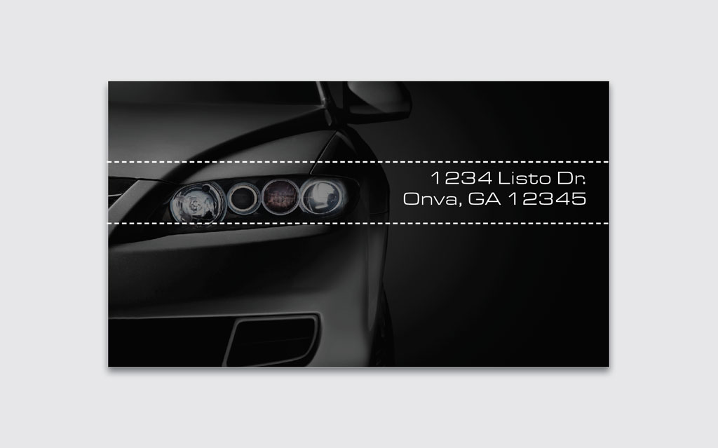
The grill of the car also creates a horizontal line that we can further tap by placing copy next to it, and, an accent color bar above it. Here, the fade-out color creates an illusion of speed, and this red looks powerful and modern.

Contrasts in typography can distinguish different types of information in the band: the name of the dealer, and their phone number. The typeface is sleek and modern to fit the company’s brand.

Finally, the name of the company can be placed at the top. The final effect…

Designing with photos and text shouldn’t be a random process. By paying closer attention to the cues given in each image, you can weave designs that not only look good but also work well.
This article was last modified on May 18, 2021
This article was first published on May 21, 2018
Commenting is easier and faster when you're logged in!

Recommended for you
InDesign Magazine Issue 81: Publish Online
We’re happy to announce that InDesign Magazine Issue 81 (January, 2016) is now a...

Ten Essential Books on Typography & Design
Ilene Strizver shares her must-have list of books to inspire and inform you on a...
CreativePro Week 2026 Preview: 5 Immersive In-Person Sessions
Come to Nashville for these amazing in-person experiences at CreativePro Week 20...