

Designing with photos effectively goes far beyond choosing a nice image. Every photo presents unique features, which translate to unique opportunities for integration with text and other graphics. Knowing how to detect design clues from photographs is a useful skill. Not only will this strengthen your design results, but it will also hone your ability in selecting and taking photographs for future projects.
This is the first in a series of articles in which I’ll use business cards to show how features in photographs can cue design decisions that more powerfully combine image with text. Using one “palette” of elements (image, business name and contact copy, an accent color bar), we can create a diversity of communicative voices.
Example #1: The dog walker
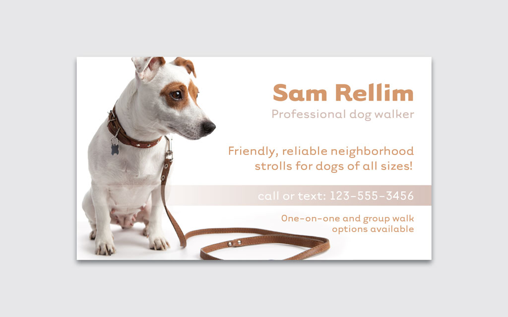
For this dog-walking business targeting busy pet owners, the goal is to convey a simple, fresh, airy, clean, and professional yet playful look. Start with an image that speaks to some or most of these goals. This dog on a white background hits the mark for most of these. So far, so good.
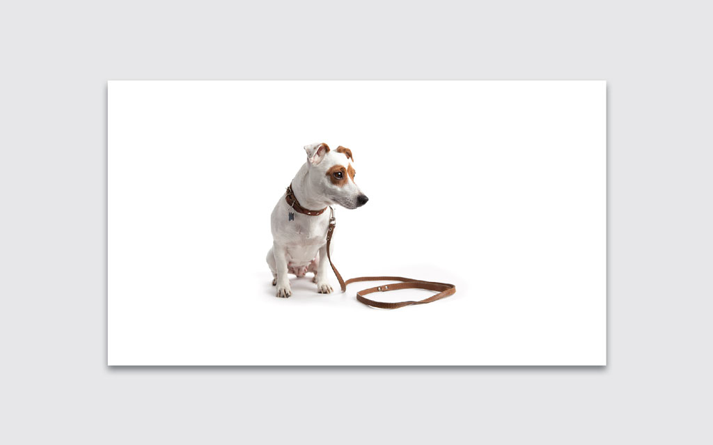
But the dog looks distant and lonely in the center of so much white space. Cropping the photo tightly creates more intimacy and placing it to the left works well because the dog’s gaze points to an area we can fill with text.

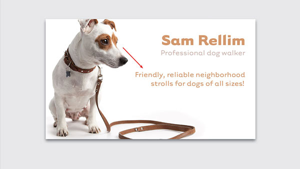
The dog is looking to the right, which is intuitively suggests a forward-looking gaze, at least in cultures where the reading direction moves from left to right. This suits our subject well; walking is generally a forward motion. (A left-directed gaze can be useful in a design about reflecting on history.) But the gaze also does something else: it directs our own gaze in the same direction. The face area is always a strong area of focus; as humans our brains are hard-wired to notice faces. Information placed in this area will be invisibly framed by this key feature—in this case, the profile of a dog. We can add a name and tagline here.
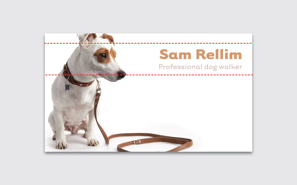
Some faces have direction, and this dog’s long snout points our eye downwards. This is a perfect location for some professional, yet playful copy.
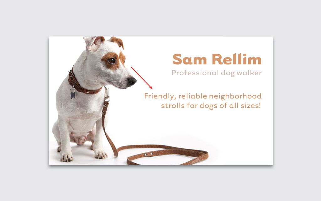
Next, we need to add the contact information in an eye-catching way, since the card is for busy pet owners who may not have the time or patience to search hard for this information. A colored band provides a smart setting for the number. A busy pet owner can now easily see the contact information, which is, in effect, highlighted.

But adding a colored band also does something else—it divides this layout into sections of content. This can help the viewer to navigate the card quickly. The bar sets the primary information (the name and business description) clearly in its own space.
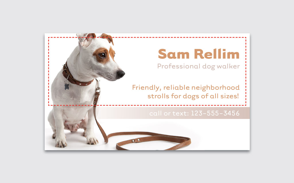
The details of the business, which someone would read only if the primary information is appealing, can be smaller and is tucked underneath. Skillful typography can help to highlight this information hierarchy.

Notice that the size of the text balances against the figure of the dog. The middle line pokes past the midline of the page slightly, into the curve created by the dog’s body.

The final effect…
This article was last modified on May 18, 2021
This article was first published on May 2, 2018
Commenting is easier and faster when you're logged in!

Recommended for you

InDesign Magazine Issue 122: Cross-Media Color
We’re happy to announce that InDesign Magazine Issue #122 (June 2019) is no...
Building a Strategy for Your Design Portfolio
Your graphic design portfolio is the single most important marketing asset you w...
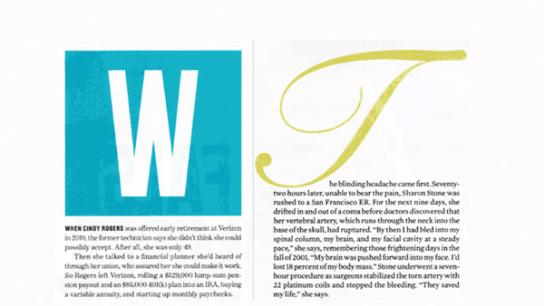
Be Creative with Initial Letters
An initial letter is the first character of a sentence that is enlarged, positio...