

Designing a typographic logo, or word mark, isn’t as simple as coming up with one, single solution. Although a logo’s primary usage may well be at a relatively fixed size, such as for restaurant signage, packaging, or a business card, in time it can potentially be used for a much broader range of sizes, surfaces and resolutions. All potential uses need to be taken into consideration for the final design.
Most logos will be applied to anything from small ads and business cards, to large signage, displays, and even billboards. In addition, they might be used for digital applications at a range of sizes and resolutions, such as web sites, smart phones, e-readers, as well as presentations on large screens. Another use that can affect the appearance of a logo is applying it to different surfaces that can either spread (glass) or absorb (fabric) the ink, resulting in a blobby, unreadable mess, or disappearing thin strokes or serifs. If ever used in reverse, all spacing and legibility issues should be examined and adjusted as necessary.
In order for a logo to work well for this very broad range of applications, it will usually need to be tweaked and/or reworked so that it is readable, legible, and visually in proportion for all intended sizes and applications. Refinements may involve the spaces within and around the characters, words, and lines, as well as the actual letterforms themselves.
This reworking can include:
- adjusting the letterspacing, making it more open as the logo gets smaller, and tighter for larger settings
- adjusting line spacing as needed (if the logo is multi-line)
- adjusting word spacing, once again, reducing it for larger settings, and vice versa
- increase or decrease the weight of thin strokes
- slightly opening the counters (enclosed negative spaces within a character) of very heavy characters that tend to fill in at smaller sizes
- or, even changing the weight and version of the font or glyph used as the logo gets smaller, especially if they are narrow or condensed.

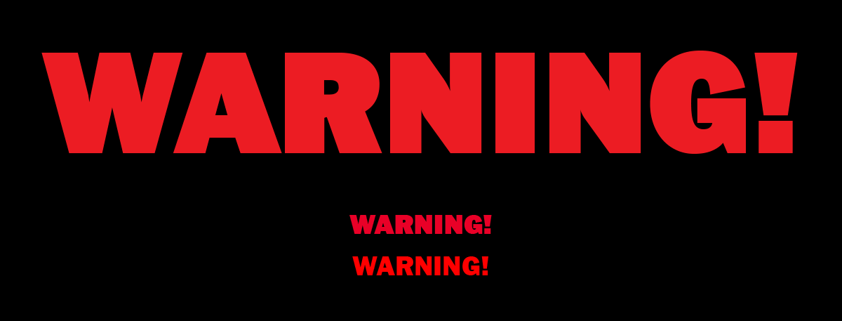
The top word mark spacing is balanced, but needs slight tweaking when scaled to other sizes that are dramatically different. When reduced (center left), the letterspacing looks a bit tight, so opening the tracking will improve it (center right). Conversely, when enlarged (lower top), it appears too open – especially the heavy weight – so tightening the tracking is required (lower bottom).

This logo works well at the original size (left), but when reduced, the letter spacing as well as the line spacing has been opened for better legibility, especially when reproduced digitally in a lower resolution.

This more complicated logo looks good at the original size (upper) but needs several adjustments when reduced: a) the letter spacing for ‘Heaven’ and ‘Earth’ is slightly tightened, the word ‘ON’ is enlarged and made a bit darker, and the tag line is enlarged.
Although not a logo per se, this is a good example of what can happen when using a very heavy font for a word mark and then reducing it. In this case, a straight reduction makes the counters in the ‘A’ and ‘R’ almost disappear, reducing its legibility. In order to improve it at a small size, it was actually reset in a lighter weight.

This is another example of a logo that looks great at a larger size, but begin to disappear when reduced. This would be difficult to amend if it were not for two slightly heavier weight to choose from.
While many of these edits only involve spacing, some will have to be made to the actual outlines of the letterforms, so if you are not experienced in editing outlines, get outside help or advice. Just remember, a little goes a long way. Resizing type or a logo can optically change its appearance, so any modifications should be subtle and gradual to give the illusion of the logo looking the same at all sizes. The objective is to make the alterations so that it looks like nothing was done.
Supplying multiple versions of a logo is a frequently neglected aspect of logo design, and one that can divide the amateurs from the pros. Note that it is not unusual for a company to have three to five versions of the same logo for usage at a range of sizes. Therefore, before you begin a logo design project or when bidding on a job, it is important to ask your client about the current and potential size range and applications for its final usage, and quote on and deliver versions for each use. Your deliverables may include several subtly-altered versions to help maintain readability and recognition of the logo, as well as to preserve the integrity of the brand. The resulting versions are often included in a client’s or company’s style guide. And don’t forget: including an example of scaled logos in a portfolio can be a game changer, as it illustrates a more sophisticated understanding of typography – something many employers are looking for.
This article was last modified on June 29, 2021
This article was first published on August 13, 2019
Commenting is easier and faster when you're logged in!

Recommended for you

CreativePro Tip of the Week: Matching Zoom and Location in Photoshop
This CreativePro Tip of the Week on matching zoom and location in Photoshop was...
Scanning Around With Gene: It's a Wonderful Typeface
A look at the graphic design in and around this Christmas classic

Top CreativePro Articles of 2015
What a year 2015 has been for us at CreativePro.com and for you, our readers! Th...