Designer Imagines Beer in Pantone Swatches

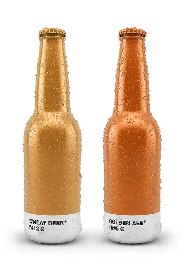
Spanish designer Txaber imagines a world where beer lovers choose their brew by Pantone color. Wrapping the suds in cans and bottles with nothing more than a field of color paired with the brew type and Pantone number, the designer lets the product inside speak for itself.
The design features a striking contrast between the color field—which takes up a majority of the container—and the silver rectangle imprinted with the Pantone color. The Pantone and brew names are displayed in the Hipstelvetica typeface, available as a free download on Behance. I feel like the modern typeface was used to bring an unneeded edge to the products, but maybe I’m just a Pantone chip purist.
I’m not a beer drinker, but being from Colorado I’ve made a hobby of beer label appreciation, and even I think the beer looks enticing in this simplified approach to packaging. In fact, I’ve set aside my beer aversion and chosen Golden Ale because of its Pantone 1595C hue. Delicious! I can imagine shopping for other products this way as well, “I’ll have the Pantone 440C chocolate, please!”
Leave it to my favorite Belgian to point me toward this beery find. And to get me thinking about chocolate!
This article was last modified on September 23, 2014
This article was first published on September 23, 2014
Commenting is easier and faster when you're logged in!
Recommended for you

ALAP Releases InEffects 1.0.1
A Lowly Apprentice Production, Inc., (ALAP), announced today an update of InEffe...

InDesign Magazine Issue 135: Use With Caution
We’re happy to announce that InDesign Magazine Issue #135 (July 2020) is now ava...

Acrobat How-to: Traditional Proofreading in PDF
It is interesting to note the advances that have been made in the concept of sof...


