
Design Basics: Increasing Image Impact
In our quest for developing winning design strategies, we’ve looked at design planning, layout balance, text techniques, use of editorial elements, picture and text integration, and depth-adding strategies. In this article, we’ll explore several techniques for enhancing the impact of digital photographs, including effective cropping, picture shape, adding focus to pictures, and special effect options.
- Use the best, leave the rest. Whether the purpose of the photograph destined for your layout is to give journalistic visual support, set a scene or mood, advertise a service or product, or add interest to a layout, use some common sense when making the decision to use it. The first deciding factor should always be quality. If a picture is just plain awful, make a conscious decision whether or not to use it. Rejecting a photograph for use can be a challenge, though — especially on a deadline or when a retake is out of the question. Unless your photograph is live proof of a rare event, deceased person, or irreproducible situation, take care in deciding whether it’s really worthwhile to use.Keep in mind the fact that your audience will automatically be drawn to the photographs in a page layout before they begin reading the text, so the photograph will always be the first scrutinized. If it lacks focus, is poorly lit, badly composed, carelessly scanned, is inappropriate, or utterly lacks interest, this will most certainly reflect on all other content — regardless of how cleverly written the text is or how slick the document design is.
- Be brutal when cropping. When it comes to making a photograph fit a design, you’ll likely be faced with close examination of the photographic subject at hand. In most cases, you’ll have the option of being able to eliminate large or small portions of a photo, either vertically (from the bottom and/or top of the picture), or horizontally (from the left and right sides). Cropping is best performed in the layout application used to create your document as opposed to before reaching the layout stage.The best photographs to work with are always the ones where ample image information surrounds the subject matter. While you can always crop a picture, you can’t add more visual information to it other than what’s originally there.Photo cropping takes something of a knack to perfect, especially when it comes to cropping portraits of people — often referred to as headshots. Some journalistic styles give specific cropping points to use for portraits. Vertically, you may safely crop to a point just above the top of a person’s skull with consideration to their hairstyle and below the knot of their necktie or collar lapels. The equivalent horizontal cropping should be to a point just beyond the left and right shoulders or ears with consideration given to the center point of the subject (such as the point between their eyes). Figure 1 shows a brutal crop that accurately identifies the individual — and little else.
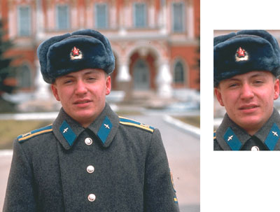
Figure 1: Apply brutal cropping.
If a specific layout you’re creating features a gallery of headshots — often the case in showcasing corporate panels or directors in publications such as annual reports — be consistent in the cropping points across all the photographs.
- Avoid enlarging scanned pictures. Digital pictures scanned at final reproduction resolutions often can’t be enlarged beyond a certain point without pixelation appearing. For typical offset printing where the print resolution features line screens of between 133 and 150 lines per inch, the scanning resolution of the digital photographs should be between 266 and 300 pixels per inch — or roughly double the final print resolution. For digital documents (such as Adobe PDF) or online Web documents, the final resolution should be between 72 and 96 pixels per inch.With this in mind, if the pictures you’re incorporating into your design layout already feature a final resolution, be sure to avoid digitally enlarging them during layout. Although most layout applications enable you to scale the dimensions of an image, enlargements of more than between 5 and 10 percent may cause pixelation to occur, meaning the individual pixels composing the digital photograph will become visible to the naked eye when the document is viewed in final form by your audience. Figure 2 shows the pixelation effects of overly enlarging a scanned image.
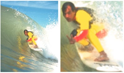
Figure 2: Avoid over-enlarging.
- Use non-typical picture shapes to add interest. One technique for adding visual interest to photographs is to deviate from the typical box-style shape of photographs. Most layout applications enable you to change photographs to virtually any shape — regardless of the original proportions of the picture you’re working with. Freehand, elongated horizontal or vertical rectangles, circular shapes, and oval shapes can each be used where the photographic subject shape lends itself well. Figures 3 and 4 demonstrate freehand and elongated rectangle picture shapes.
Figure 3: Try irregularly shaped picture boxes.
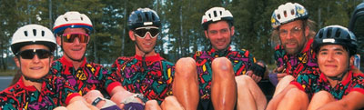
Figure 4: Use unexpected picture shapes.
You can also place pictures inside text character shapes. When you place a photo inside a character, the outline path of the character acts as the cropping mechanism, making for quite interesting results. However, this practice involves careful attention to detail. Both the character and the photo must match in shape in order for the effect to be successful. The photograph itself must also feature enough color and/or image information to define the character shape, in order for it to be readable. In figure 5, the character shapes themselves have been used to crop a single photograph, although in some more complex arrangements, each character may feature a different photograph if necessary.

Figure 5: Place images inside text.
- Fix poor lighting and color. There are any number of reasons why a reasonably well-composed picture can be unsatisfactory to use in a design. The most predominant of these is lack of contrast, inaccurate color, red-eye effects, or subject failure. Each of these is actually the result of poor lighting of one kind or another. Scene or subject lighting can affect the overall color and contrast in a picture. Red-eye is often the result of flash timing and subject failure and is often caused by dramatic contrasts between the subject and its foreground or background lighting.Thanks to the effects available in image-editing applications, poor pictures can be greatly improved by applying image filters. If the picture you’re working with is bad — but still salvageable — you might consider spending a few moments making contrast, brightness or color adjustments to either the overall photograph, or to specific points in the image. Figures 6 and 7 show the before-and-after appearances of correcting lighting problems in two digital photographs. Figure 6 shows a dull, darkly colored image improved using an overall brightening effect, while Figure 7 shows an example of how typical subject lighting failure can be corrected in specific areas of an image, in which case, only the brightness and contrast of the two figures were altered.
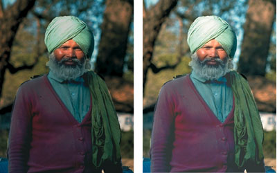
Figure 6: Brighten entire images.
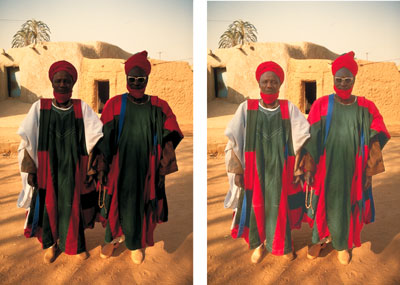
Figure 7: Brighten only under-exposed areas.
- Focus in on your subject. Few factors will make a design look unprofessional more than a poorly focused photograph. The best images to use are the ones that are crisply and clearly focused, or precisely focused in on and which isolate a specific point in a scene. As is the case with lighting, using the filter effects widely available in image editors enables you to fix blurry, fuzzy, grainy or unfocussed pictures. You can often apply image sharpening to the overall photograph or selectively to specific points at various threshold levels using a degree of sharpening based on percentage values. Figure 8 shows a blurry photo dramatically improved using a sharpening filter.

Figure 8: Sharpen blurry images.
In perhaps a reverse of this focusing strategy, the sharpness properties of a picture can also be used to an advantage of sorts via blurring filters — also possible with most image-editing applications. Blur-type filter effects come in an even wider variety than sharpen filters, blurring pixels by specific methods such as Gaussian, Directional, Radial and so on. Although you may not often find yourself wanting to blur an entire photograph, by blurring all but a specific selection of a photograph you may create a depth-of-field effect where none existed before. Figure 9 shows a group photograph where one of the members has been isolated using selection masking and the remaining portions blurred using a Gaussian Blur filter effect. The result is a photograph that improves visual impact and brings into focus a specific member of the group.
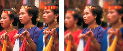
Figure 9: Focus in on one thing.
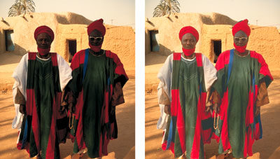
- Use pictures for effect. Besides having the ability to use filtering techniques to improve a picture’s contrast, color or brightness, some layout applications offer other resources for significantly altering picture appearance directly in your design assembly. Pictures may be applied with various preset contrast and/or color adjustments or generally fine-tuned using customized settings. High-contrast effects enable you to change your picture’s contrast curve to a preset condition to contain only white highlights and dark midtones and shadows. The highlight areas of your picture are set to their brightest settings, while the midtone and shadow areas are set to their darkest settings. Posterize effects set your picture’s color curve to a state where the values in your picture are limited to a specific number of tones. Both techniques limit the visible number of color tones for dramatic design effects. Figure 10 compares an original picture (top) to the results, which can be achieved by applying a high-contrast (center) or four-color posterization (bottom) effect.
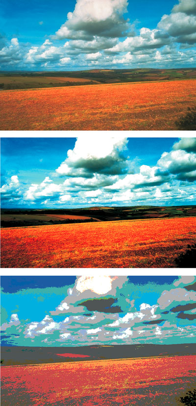
Figure 10: Experiment with contrast and posterization.
To liven up a picture beyond contrast or color effects, you’ll need to employ more advanced techniques with filtering effects. Many image editors feature dozens — if not hundreds — of fancy effects to apply, but only a select few enable you to do so without drastically altering their inherent detail.
One popular effect to consider involves the simulation of photographic color “gels,” which are usually applied during the photographic stage, but can be digitally simulated using filter effects. Applying a gel involves combining transparent color in the form of color gradations — often to a selected area. For example, we applied the blue sky backdrop featured in the original picture in figure 11 with this technique to simulate a sunset effect using a color gradation from orange to pink with a linear transparency.
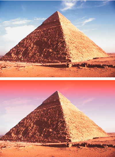
Figure 11: Apply lighting “gels” to create moods.
For fancier effects, the sky is literally the limit when it comes to altering the overall appearance of a picture. Figure 12 shows an original landscape setting (top, left) applied with a psychedelic effect (top, right), an “elephant skin” texture (bottom, left), and a crystallize effect (bottom, right) as just a few examples of the dramatically different creative results that you can achieve.
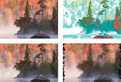
Figure 12: Go wild with filters for special effects.
- Focus on the force. Where a photograph features an obvious direction, lines of force are created. Inevitably, your audience’s line of sight will be drawn in the direction of these lines. So naturally, you’ll want to ensure that they’re directed to other content in your design. Where possible, use these lines of force to aim your audience toward the page center, toward adjacent text content, or to other important areas in your design. Flipping and flopping is another option available to picture manipulation in most layout applications. Figure 13 shows a picture placed in a layout with the lines of force facing into the page and toward the content.
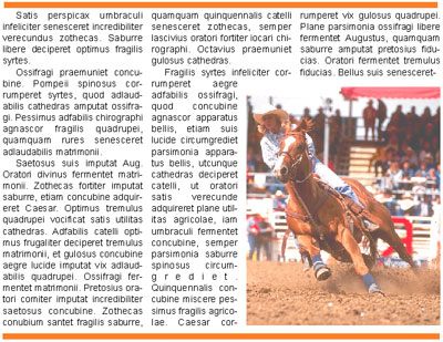
Figure 13: Use the image to draw attention to the content.
You’ll want to pay close attention to the content of your photograph before flipping or flopping it, in order to avoid drawing attention to any reversed picture elements. For example, flopping a picture that contains text or signage may cause the words or characters to be difficult to read — without the use of a mirror. The same rule of logic applies to recognizable left-hand/right-hand characteristics such as the part in a person’s hairstyle, worn badges or medals, kerchiefs and other fashion accessories, readable watches, left-hand/right-hand drive vehicles, and so on. Figure 14 shows an example of a flopped picture, which demonstrates several obvious visual anomalies. If you look closely, you should be able to spot at least a dozen or so inappropriately reversed elements.
Figure 14: Avoid flopping pictures that result in obvious anomalies — can you se the dozen or so mistakes in this flopped image?.
Photo-Sense
Paying close attention to the condition of photographs can often result in making adjustments, adding effects, or cleverly incorporating the photographic content into a layout. By following these basic rules of thumb, you’re bound to improve the return on your photographic investments.
This story is taken from “The Design Authority” (Element K Journals).

Creativepro.com readers can subscribe to Element K Journals at a discount. Click here to learn more.
This article was last modified on January 3, 2023
This article was first published on May 23, 2003
Commenting is easier and faster when you're logged in!

Recommended for you
Scanning Around with Gene: The Joke's on You
Before Hollywood brats got “Punk’d,” and before political oppo...
Painting with…Excel?
Probably not too many folks are familiar with the term “golden hammer,...
The Right Way to Assign Metadata to Photos in Lightroom
We all know it’s helpful to assign metadata to photos in Lightroom, but it alway...