


In this how-to video, Mark Heaps shows off a super simple way to choose a color’s complement in Illustrator. He also demonstrates how simply choosing the inverse of a color can bring about unexpected—and often undesirable—results.
Subscribe to the CreativePro YouTube channel for more helpful design tips!
This article was last modified on August 29, 2025
This article was first published on December 11, 2019
Commenting is easier and faster when you're logged in!

Recommended for you

How to Create a Pencil Drawing Effect Quickly in Photoshop
In this Three Minutes Max video, Tony Harmer demos an easy way in Photoshop to c...

How to Adjust Image Scale and Crop in Illustrator
Learn some quick tricks for re-sizing and cropping images in Illustrator, includ...
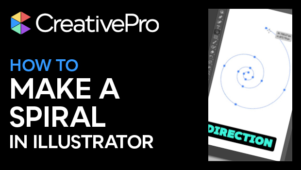
How to Make a Spiral in Illustrator
Learn how to make spirals of all sizes and varying depths with Illustrator’s Spi...