


Unless you’ve been living under a rock the size of a cave troll, you’re probably well aware that The Hobbit is in theaters now, dazzling the eyes and numbing the backsides of audiences worldwide. To mark this “precious” occasion, Deke McClelland has created mini-epic of his own showing how to use Photoshop and Illustrator to create the chiseled and weathered metallic type of the film’s title.

It’s a great example of how the two applications complement each other’s strengths, and the eye-popping results you can get when you’re well versed in both apps.
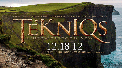
For more Photoshop and Illustrator wizardry, check out Deke’s Techniques.
This article was last modified on July 29, 2021
This article was first published on December 21, 2012
Commenting is easier and faster when you're logged in!

Recommended for you

25 Gorgeous Typographic Experiments
Ah, typography! Is there anything that inspires print designers more? No? Then g...

Tips for Shooting and Editing in Camera Raw
Why Shoot in Raw Format? Whether you realize it or not, if you are using a DSLR...

TypeTalk: Know Your Hyphens, En and Em Dashes
Hyphens, en and em dashes are three visually similar yet significantly different...