


Konichiwa from the Tokyo InDesign Conference.

Japanese trains and subways are filled with print ads (as well as soundless video ads on monitors in the train walls), and each time I’ve come here over the past 16 years I’ve noticed that much of the text is outlined. As you know, you don’t have to convert text to outlines in order to stroke it in InDesign. But it’s quite common in ads here to have double outlines — as though someone drew a line around an entire word. Unfortunately, you cannot apply any of the cool Stroke palette features (such as custom strokes) to text! So it appears that to achieve this effect, you need to convert text to outlines (Type > Create Outlines)… or do you?
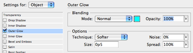
On one particularly long subway ride the other day, the answer came to me: Use a regular Paper stroke around the text and then (here’s the trick) use InDesign’s Outer Glow effect. The glow effect is usually a soft, blurry, edge, but you can force it to become a hard edge by setting its Spread value to 100%.
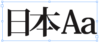
Here’s before:
Here’s the Effects dialog box:
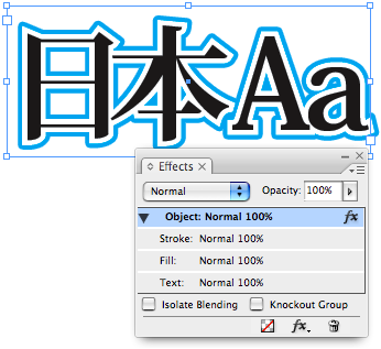
Here’s after:
Of course, these glows are always bitmapped, not vector, so they will be slightly pixelated on the edge. However, it’s my understanding that when a drop shadow or glow has a Spread of 100%, InDesign’s transparency flattener automatically doubles the resolution of the raster output, so you get a relatively clean edge, especially when you use the High Resolution flattener.
Here’s a closeup of one corner, with High Quality display turned on:

If you need a pure vector outline, you’ll likely still need to create this in Illustrator, or by converting text to outlines in InDesign. But in many cases (particularly when putting this on top of an image), this trick should work pretty darn well.
Of course, you can also add additional effects to the text. For example, in the little thumbnail at the top of this story, I added a drop shadow for more excitement.
This article was last modified on February 10, 2026
This article was first published on September 13, 2007
Commenting is easier and faster when you're logged in!

Recommended for you

Setting up Numbered Lists that Jump Frames in CS3
Most people, I think, can figure out the basics of InDesign’s Numbered Lis...
Discretionary Line Breaks
There are so many new features in InDesign CS3 that it’s easy to lose trac...

I Should Have Known That
Sometimes you learn something that is new to you, but obvious to others. I compi...