
The trouble with clean signs is that they can sometimes a bit too clean, and thus unrealistic. Here’s a way to make signs look as if they’ve been aged over many years by rust and decay.
Step 1: Choose your sign
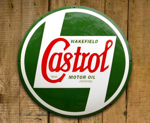
I’ve started with this old Castrol Motor Oil sign, which I’ve cut out and placed on a different background. But you could use anything – even a sign you’ve created yourself from scratch.

Step 2: Add a shadow
Use the Layer Effects dialog from the button at the bottom of the Layers panel to add a soft drop shadow. This gives the sign some distance from the background.
Step 3: Start painting rust
Make a new layer, choose a soft-edged brush, and set the foreground color to brown. Set the mode of the brush from Normal to Dissolve by Control-clicking (macOS) or Right-clicking (Windows). Set the opacity to just 10 per cent (shortcut: press the 1 key on your keyboard). Now, when you paint on the new layer, you’ll get a scattering of individual pixels. Use Command+Option+G / Ctrl+Alt+G to make a clipping mask with the sign layer, so it only shows up where it overlaps that layer.

Step 4: Blur the rust
Use Filter > Blur > Gaussian Blur to add a 1-pixel blur to the rust layer, which will soften it and make it look less pixelated.

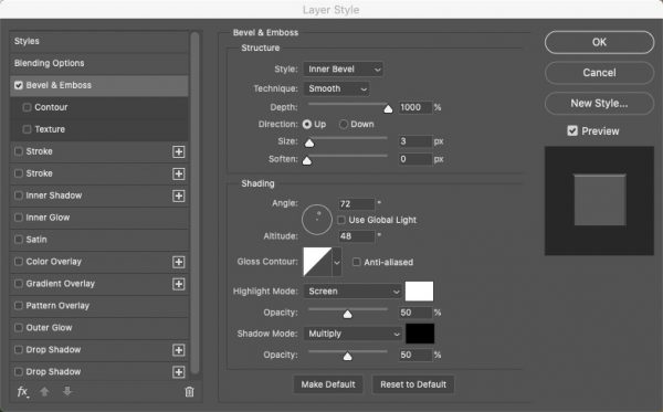
Step 5: Add a bevel
Open the Layer Style dialog, and set the style to Inner Bevel (it will probably be on that setting already). Set the depth to its maximum value of 1000%, and make the size small – around 3 pixels will work well.
Step 6: The bevel result
Here’s how it looks after adding that bevel. The rust has taken on a three-dimensional quality, and looks as if it’s raised from the surface of the sign.
Step 7: Make the cutaway
Make another new layer, and once again set it to use the layer beneath as a Clipping Mask. Choose a mid-gray as the foreground color and, with the brush still set to Dissolve mode, change the opacity to around 70%. Now when you paint you’ll cover a lot more of the area, but still produce a dotty effect.

Step 8: Add a bevel
No need to blur this layer. Instead, add an Inner Bevel, but this time change the Technique to Chisel Soft for a stronger result. You may want to reduce the Depth value as well if it looks too strong. Set the Direction to Down so it’s recessed.

Step 9: Add a contour
Check the Contour button under Bevel & Emboss, and choose a U-shaped contour from the pop-up Elements menu. Feel free to try other contours as well, to see how they look. Also, add an Inner Shadow from the Layer Style dialog to accentuate it.

Step 10: The cutaway result
Here’s the image after adding the Bevel with the Contour, and the Inner Shadow. With the direction set to Down, it’s a much stronger version of the effect created earlier.

Step 11: Mask the cutaway
Those fuzzy edges of the cutaway look unconvincing. Choose Layer > Layer Mask > Reveal All to make an empty mask, and paint over the edges in black – having first set the brush mode back to Normal – to limit the visibility of the cutaway area.

Step 12: Mask the sign
Go back to the original sign layer, and add a Layer Mask here as well. With a hard-edged brush, paint in black to eat away the sign in the cutaway areas. Note how the shadow will automatically follow the new visible part of the layer as you do so. Important note: if you do ever paint in Dissolve mode, always remember to set the brush back to Normal afterwards or it will drive you crazy next time you want to paint.

Step 13: Desaturate the sign
The sign so far looks too bright for something that’s supposed to be old and weathered. One solution is to add a Gradient Map Adjustment Layer, which you can choose from the Adjustments pop-up menu at the bottom of the Layers Panel. Click the preset to set the gradient to black and white, and make a Clipping Mask with the sign layers beneath.

Step 14: The Gradient Map result
Here’s how the Gradient Map looks – it knocks all the color out of the sign. To desaturate only a little, change the mode of this Adjustment Layer from Normal to Hard Light.

Step 15: After the mode change
Here’s how it looks with the Gradient Map set to Hard Light mode. It knocks the color back a lot, and also strengthens the rust effect. Too strong? Then just reduce the opacity of the layer.

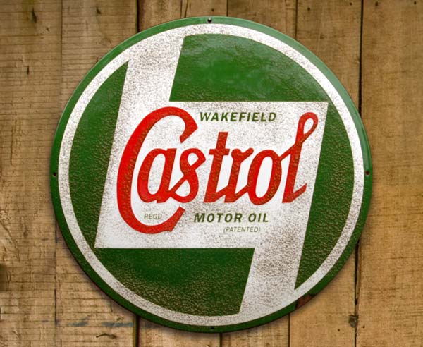
Step 16: The finished result
This is the result with the Gradient Map layer set to 50% opacity. It dulls the colors to a lesser degree, but still produces a more weathered appearance.

This article was last modified on October 20, 2020
This article was first published on March 24, 2020
Commenting is easier and faster when you're logged in!

Recommended for you
How to Copy Shape Formatting in Photoshop
The easy way to reuse fill and stroke formatting applied to a shape layers in Ph...


Learning about 3M VAS: A CreativePro Conversation
CreativePro Network CEO David Blatner chats with 3M's Sean Springer about the ne...