


The following excerpt was taken from Learn Adobe Illustrator CC for Graphic Design and Illustration: Adobe Certified Associate Exam Preparation, Second Edition by Chad Chelius with Rob Schwartz. For a PDF version of the full chapter containing this lesson, click here.
***
In this chapter you’ll create a mockup for a mobile application. Adobe Illustrator CC offers several advantages for this type of work, namely the fact that by using vector content you can easily make adjustments to elements without loss of quality. In addition, Illustrator gives us several tools that we can use for exporting that vector-based content to web graphics for use during web development.
Creating a Document for a Mobile Device
We’ll begin by creating a new document in Illustrator at the size of a mobile device. Illustrator offers several presets in the Mobile category when you are creating a new document. If you don’t see the mobile device size that you’re looking for, you can enter custom values in the Width and Height fields in the New Document dialog box.
1. With Illustrator open on your computer, choose File > New or click the Create New button in the Start workspace to open the New Document dialog box.
2. Click the Mobile category at the top of the dialog box to view all presets based on the Mobile profile, and select the iPhone 6 Plus preset. Click the Create button and save the document as Mobile Mockup.ai (Figure 1).
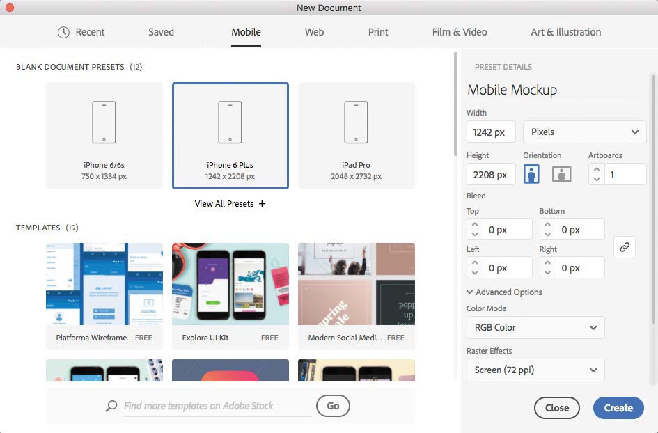
Figure 1 Creating a new document using the specifications for a mobile device
Because you’re creating a document based on a Mobile preset, the units of measurement are set to pixels, the color mode is set to RGB, and the Raster Effects resolution is set to 72 ppi.
3. Open the Layers panel. Double-click Layer 1 and rename it Interface.
4. Make sure the Align Art To Pixel Grid button is selected in the Control panel; then select the Rectangle tool and click anywhere on the artboard. In the Rectangle dialog box, enter 1242 px and 200 px in the Width and Height fields, respectively. Click
5. Set the fill color of the Rectangle to black and the stroke to None. Move the rectangle to the top of the artboard and align it to the top and
6. Using the Selection tool, hold down Option (macOS) or Alt (Windows) and drag a copy of the rectangle to the bottom of the artboard (Figure 2).
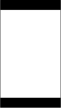
Figure 2 Setting up the interface of the mobile design
Creating the Icons for the Mobile Mockup
As you’re well aware by now, the major strength of Adobe Illustrator is drawing vector artwork. Icons most definitely fall into this category. In this chapter, you’ll see how Illustrator makes this process relatively easy. Beginning with some basic shapes, we’ll create some useful icons for this project.
Creating the Hamburger Icon for the Mobile Mockup
The mockup for our mobile application uses a few unique icons that we need to create for the design of this piece. It’s useful to know that you can also download existing art by selecting a template in the New Document dialog box or by downloading artwork from stock.adobe.com (purchase required for access to stock photos and artwork).
1. Open the Layers
2. Create a new layer called Icons on which you’ll be drawing the icons for the mobile
3. Using the Line tool, drag to draw a short horizontal line about 150 px long in the upper-left corner of the mobile In the Stroke panel, set the stroke weight to 20 px and select Round for the cap. In the Color panel, set the stroke color to 156 Red, 193 Green, and 0 Blue.
As stated before, it’s a good idea to add this color to your Swatches panel and set that swatch to be a global color. That way, it’s easy to reuse the color later, and if you should decide that you want a different color, you can edit the swatch and every object with that swatch applied to it will update instantly.
4. Using the Selection tool, Option-drag (macOS) or Alt-drag (Windows) the line to make a While dragging, add the Shift key to keep the copy of the line aligned with the original line. Release the mouse to create the aligned copy.
5. Press Command+D (macOS) or Ctrl+D (Windows) to repeat the last transformation so that you have a total of three lines stacked on top of one another, creating the hamburger icon (Figure 3).

Figure 3 Drawing the hamburger icon for the mockup
Drawing the Icons at the Bottom of the Mockup
Like most mobile applications, ours uses a row of unique icons at the bottom of the interface. Let’s draw those icons now.
DRAWING THE FAVORITES ICON
1. Using the Star tool, click once on the artboard to display the Star dialog Enter 80 px for Radius 1, 40 px for Radius 2, and 5 for Points. Click OK to create the Star.
2. Position the star on top of the black rectangle at the bottom of the interface, set the fill color to the green color swatch that you created earlier in the chapter, and set the stroke color to None.
DRAWING THE LOCATION ICON
1. Using the Ellipse tool, draw a circle that is about 75 px in diameter. Fill this shape with the green
2. Switch to the Pen tool and Option-click (macOS) or Alt-click (Windows) on the bottom anchor point of the shape to convert the smooth anchor point to a corner
3. Hold down Command (macOS) or Ctrl (Windows) to temporarily access the Direct Selection tool. Drag the bottom anchor point down until this icon is the same size as the star shape (Figure 4).

Figure 4 Dragging the anchor point down to reshape the object
4. Draw a smaller circle on top of this shape and position it in the center but toward the top of the larger
5. Select both of the shapes and choose Object > Compound Path > Make
DRAWING THE HEART
This technique is a great example of achieving the desired result using a method that you might not expect would produce that result.
1. Using the Rectangle tool, draw a square and then rotate the square shape 45 degrees.
2. Draw another rectangle that overlaps the square covering the top but revealing a triangle shape at the top but revealing a triangle shape at the bottom.
3. Select both shapes; then select the Shape Builder Hold down Option (macOS) or Alt (Windows) and click the top two shapes, leaving only the triangle shape remaining at the bottom (Figure 5).
Figure 5 Using the Shape Builder tool to produce a small triangle
4. Using the Direct Selection tool, click the top line segment of the triangle to select it, and then press Delete or Backspace to delete the top line segment, leaving an open path that is still the same
5. Set the stroke color to the green swatch we saved earlier and the fill color to None. In the Stroke panel, set the cap to round and increase the stroke weight until the triangle looks like a heart
6. Choose Object > Select Fill and Stroke and click OK. Scale the heart shape to the desired size.
DRAWING THE ADD ICON
We don’t have to reinvent the wheel to draw this icon. As a matter of fact, if you wanted to, you could grab the Type tool, type a + character, pick a font that you like, and just convert it to outlines. There’s no wrong way to do this! Explore, enjoy, be creative! We’ll take a more primitive approach and draw the Add icon using some basic shapes.
1. Using the Rectangle tool, draw a rectangle that is tall and skinny but the height of the other icons at the bottom of the
2. With the rectangle selected, choose Edit > Copy, and then Edit > Paste In Front to put a duplicate copy right on top of the first one.
3. Rotate the copy of the rectangle 90 degrees based on the center of the
4. Select both rectangles and drag across the shapes using the Shape Builder tool to merge the two shapes into one (Figure 6).
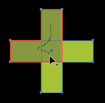
Figure 6 Using the Shape Builder tool to merge the two rectangles together
DRAWING THE INFO ICON
The last icon we have to draw is the Info icon. You see this in a lot of apps; it’s the icon that people tap when they want to know more information.
1. Using the Ellipse tool, draw a perfect circle that is the height of the other Fill this circle with the green color as well.
2. Using the Type tool, click once on the artboard to create a point type object and type the letter i. Adjust the font and size of the i so that it fits within the
3. Select the i character using the Selection tool and choose Type > Create Outlines.
4. Position and size the i character inside the circle. Select the character and the circle, and then choose Object > Compound Path > This punches the i character through the circle shape (Figure 7).

Figure 7 Creating a compound path for the Info icon
5. Distribute the space between the icons at the bottom of the document by positioning the left- and rightmost icons where you want Then select all of the icons and click the Horizontal Distribute Space icon at the bottom of the Align panel.
THE PATHFINDER PANEL
Although this chapter and the accompanying videos use the Shape Builder tool to create new shapes from existing shapes, the tried-and-true Pathfinder panel can also be used to achieve the same result. At the top of the Pathfinder panel, you’ll find buttons that activate four different shape modes, each of which performs a different action based on the stacking order of the selected objects (Figure 8). The stacking order of the objects is very important when using the Pathfinder panel, so if you don’t get the result you’re expecting, oftentimes adjusting the stacking order will address the problem.

Figure 8 The Pathfinder panel
The Shape Mode buttons in the top row of the Pathfinder panel are
- Unite: Combines the selected objects into an object
- Minus Front: Removes the overlapping objects from the bottom shape
- Intersect: Removes everything except where all of the selected overlapping objects intersect
- Exclude: Similar to Intersect except the overlapping area of two objects is removed, leaving everything else intact
In our mockup, you could have used Unite to make the plus icon, and Minus Front to create the Heart and Info icons.
It’s worth noting that you can also use these shape modes to produce editable effects by holding down Option (macOS) or Alt (Windows) while clicking a shape mode button. Shapes created this way are called compound shapes.
Not to be overlooked, the bottom row of buttons in the Pathfinder panel allow you to apply Pathfinder operations as effects. Pathfinder effects can be applied to any combination of objects, groups, or layers.
Pathfinder operations can also be applied from the Effect > Pathfinder menu but can be used only on groups, layers, and text objects. See the Illustrator User Guide at https://helpx.adobe.com/illustrator/user-guide.html for more information.
Adding Text and Photos
In this section, we’ll add the finishing touches to the project by adding some text and photographic elements to represent the appearance of the app in its final form.
1. In the Layers panel, create a new layer called Photo Elements. This is where you’ll put the imagery for the
2. Choose File > Place and navigate to your exercise files folder and select the file called psd. Make sure that Link is selected, and then click Place. Position the subject of the photo in the main area of the app between the top and bottom rectangles in the document.
3. Temporarily hide the photo, and using the Rectangle tool, draw a rectangle in the main area of the artboard between the rectangles located at the top and bottom of the page.
4. Make the photo visible, and using the Selection tool, select the photo and the rectangle and choose Object > Clipping Mask > You’ve made a clipping mask that clips the placed image to the bounds of the rectangle (Figure 9).

Figure 9 Placing the Butterfly.psd photo in position on the mockup and cropping it with a clipping mask
Creating the Divisions of the Main Screen
On the main screen of the mobile site, there will be three sections that a user can tap to navigate to a particular area of the site. In this section we’ll create those sections by simulating the appearance of the main screen being divided into three different areas.
1. Using the Rectangle tool, drag out another rectangle the size of the main This should be the exact same size as the previous rectangle that you drew.
2. With the rectangle selected, open the Transform panel and deselect the Constrain Width And Height Proportions icon so you can adjust the width and height of the object independently. Now click one of the top points of the Reference point icon and in the height (H) field, type /3 after the current This sets the height of the rectangle to 1/3 of the original height.
3. Hold down Option (macOS) or Alt (Windows) and drag to create a copy of the rectangle below the current one. Be sure to align the top of the copy to the bottom of the original rectangle. Fill the rectangle with black.
4. Make another copy of the rectangle and position it below the second rectangle to create a third rectangle. Fill this one with black as well.
5. Select the second rectangle and open the Transparency panel. Set the blending mode to Color and Opacity to 70%. This gives the second section a desaturated look yet still with some color to the photo.
6. Finally, select the third rectangle, and in the Transparency panel, change the blend mode to Color with an Opacity value of 100%. This completely desaturates the image, giving it a black and white appearance (Figure 10).
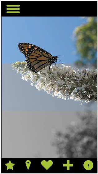
Figure 6.10 After dividing the image area of the mobile mockup into three sections
Adding Text to the Mobile Mockup
We’re almost finished with the design; we just need to add some text for the title of the mobile design and then some additional text for the individual sections of the design.
1. Using the Type tool, click to create a point type object and type the text The Insectarium. Change the font to one of your choosing and adjust the size to fit in the rectangle at the top of the screen. We used Clavo Medium at 107 pt. Change the text color to white.
2. Using the Rectangle tool, drag to draw a thin rectangle that is as wide as the artboard and about 120 px tall. Move this rectangle to the bottom of the first section and set the fill color of the rectangle to black and the opacity to 50%.
3. Using the Type tool, add some point type with the text Butterflies and set the color to white and adjust the font and size to fit within the rectangle. Align the text visually within the rectangle.
4. Select the text and the rectangle and duplicate them to the second and third sections of the design. Change the text for section two to Insects and section three to Other (Figure 11).
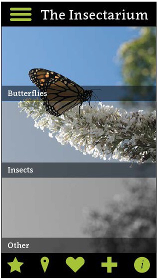
Figure 6.11 Adding the text and rectangle to each of the three sections of the design
This article was last modified on March 26, 2019
This article was first published on March 26, 2019
Commenting is easier and faster when you're logged in!

Recommended for you

How Resolution Affects Image Proxy Quality
When working with images into your InDesign layouts, did you ever notice how som...

3 Ways to Make Die Lines in Adobe Illustrator
Best practices for defining the shapes of custom die cut stickers.
Illustrator Downloadable: Fancy Fans Art Deco Patterns
12 gorgeous vector patterns to add a sleek and swanky style to your designs