
Big Design
Learn techniques for creating huge layouts for banners, billboards, and other mega-displays.

This article appears in Issue 121 of InDesign Magazine.
“It would be great,” one anonymous user on indesign.uservoice.com recently wrote, “if there weren’t size limits on documents.” This person was working on “a very large design for a trade show booth. … I have to do it in Photoshop due to the size limits of InDesign. It is taking so much longer than it needs to because every time I try to transform or resize something, it takes 20 minutes to complete a small task. Doing this in InDesign would be way better.”
No kidding!
I’ve seen this kind of question often, usually from someone who is trying to design a mural, billboard, or similar mega-display. As you may know, InDesign has a page-size limit of 216 inches (18 feet, or 5.49 m) per side. But the problem is not the size limit; the problem is an unspoken (and wrong) assumption that “I have to create the layout at full scale.” This is what leads the user to a “solution” that immediately becomes a new problem.
Avoid Solving the Wrong Problem
Here’s a good rule of thumb that works both in life and in InDesign: if a problem seems to have nothing but bad solutions, or no solution at all, take a step back. Examine your basic assumptions and check whether you’re asking the right question. That goes double if, as in this case, other people seem to have handled it just fine. There are thousands of trade shows every year, and designers create tens of thousands of backdrops and giant displays for them. They must be doing something right.
As I said, the problem is rarely InDesign’s document size limit. Even if a giant billboard display could be created at full size in InDesign, it would be too big to
export to PDF—Acrobat has limits, too.
There are three common mistakes that can lead to this user’s problem. Each one involves a wrong basic assumption.
Mistake #1: Too High a Resolution
Beginners are often told that “print resolution is 300 dpi.” Unfortunately, they are rarely taught that this only applies to items that are meant to be seen at reading distance. Reading distance is generally accepted as 16 inches (40 cm). It applies to books or magazines, not something people are going to view from 50 or 100 feet away. “Anything for print is 300 ppi” is one of the Great Myths of design.
You should instead base your final resolution on several factors, including the intended viewing distance. For anything meant to be viewed from a distance of a meter (three feet) or more, you never need 300 dpi. There is a simple rule of thumb for working out what resolution you need: Start at 150 dpi for a distance of 1 meter, and cut the dpi in half each time you double the distance. I’m calling that a “rule of thumb” for a reason: there are other factors that affect the resolution you need in a given image (more on this later).
Figure 1 shows a large vinyl banner I photographed on a trip to Anaheim, CA. At the expected reading distance, it looks quite acceptable.
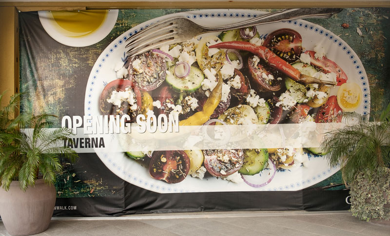
Figure 1
Get too close, though, and it’s a different story. Figure 2 shows a part of the same banner from a distance of about 18 inches. The coarse pattern of ink dots partially obscures the image pixels.

Figure 2
Figure 3 shows a large poster from the same shopping center. The winsome and ever-helpful Lea agreed to stand beside it to give a sense of scale and distance. Viewed from the walkway, it looks fine, but if you get much, much too close (Figure 4), you can see those giant pixels.

Figure 3

Figure 4
Of course in real life, nobody but a design fanatic or a print nerd is going to look at this kind of display from “reading distance,” and the grande format printing process is coarse anyway (the printers used to create these banners aren’t even capable of 300 dpi output). So there is no reason to try to achieve an unreal and unattainable “print resolution.”
Look around: giant documents are everywhere
Next time you visit a chic clothing store or hipster coffee house, get up close and personal with those murals that look so great from across the aisle. Do the same when you’re at the mall or a movie theater. As the clickbait headlines say, “Take a deep breath before you see this.”
Those giant billboards you see along the highway (known as “bulletins” in the outdoor-advertising biz) are designed to be read from 200 feet away or more. If you’ve never seen one up close, you may not realize that the actual print-ready resolution is around 12 ppi. That’s not a typo: twelve pixels to the inch is a normal image resolution for super-large formats such as Figure 5.

Figure 5
Mistake #2: Trying to Work at Full Scale
The second big mistake InDesign users make is insisting their InDesign file be “full size”—the same as the output size. However, there are many reasons not to try to make a giant backdrop, mural, or billboard at full scale, even if you get the resolution right and even if the document fits inside InDesign’s limits.
For one thing, InDesign, like Illustrator and Photoshop, offers default text sizes up to 72 points. Sure, you can go way larger, but then you’ll be working with awkward numbers like 480 points, or 1,250 points. And InDesign’s max type size is 1,296 points (18 inches or 45 cm). That seems large, but it’s isn’t very large on a highway billboard.
Similarly, if you use optical kerning rather than metrics, InDesign will automatically tighten the kerning to compensate for the “large size.” The result will almost always be too tight for the apparent size when your creation is seen from a distance, and it is the apparent size, not the physical size, that is important.
Another reason to avoid full scale is keeping track of InDesign’s “effective resolution” for placed images. When you export your creation to PDF, some large images may export at 450 ppi, even though you only need 36 ppi or less. You can end up with a PDF that’s many times larger than it needs to be.
Fortunately, there are solutions that don’t involve working “at scale,” which I’ll come to soon.
Mistake #3: Not Reading the Spec
This one seems like a no-brainer. On InDesignSecrets, in this magazine, and in countless books and tutorials you’ll find the same advice: “Talk to your printer first!” This tip can save you major embarrassment and possibly a great deal of money should something have to be redone because you messed up.
If you’re sending artwork to any large-scale graphics house or publisher, check their specs before you start to create the layout. If you can’t find the specs, ask! You can be sure they have them, and they’ll be glad you asked.
One rep told me, after I sent her the creative for a billboard, that it was the first time they had ever received artwork from an outside designer that didn’t have to be tweaked or sent back for correction. All I did was follow the spec—hardly rocket science, but apparently this is unusual.
Major outdoor advertising providers such as Lamar provide detailed specs and templates for all their product sizes, from 4′ × 8′ (H × W) to 20′ × 80′. For a 14′ × 38′ “bulletin,” Lamar calls for artwork scaled at 0.5 inch = 1 foot @ 300 ppi.
ClearChannel Outdoor, another major provider in the USA, has similar specs (Figure 6).

Figure 6
The Simple Solution
Here’s the solution to “my document is too big for InDesign”: once you’ve read the spec (no, really, read it carefully. Maybe even twice!), create your document at a smaller scale—one you can work with easily. It’s not hard to figure this out, and it will save you time by simplifying your work. Then be sure to tell the printer what scale you’re working at, and what the final size is supposed to be.
Math to the rescue!
Ultimately, when you’re working at a different scale, you will need to do a little simple math for each measurement. So, in the Lamar example above, where a half-inch equals one foot, you can divide the larger number (12 inches) by the smaller number (½-inch) and find that every measurement should be divided or multiplied by 24. Want a logo to be 3 feet tall on the final print? Divide 36 inches by 24, and you know to make the logo 1.5 inches tall in your artwork.
If your printer’s spec doesn’t already give it to you, do a little simple math to figure out what size and resolution you need in your (sensibly sized!) document so that the final product will be correct. Divide the larger finished dimension by something simple so that you get a number in inches or centimeters that makes sense. A 10-meter mural can become a 50-centimeter document, a scale of 1:20. Or turn 20 feet into a 20-inch document, a scale of 1:12. It’s your choice, but pick something that will let you work with a simple document size.
By working to scale, you can stay on familiar ground and use InDesign’s (or Photoshop’s, or Illustrator’s) built-in point sizes and preflight tools.
Digital Billboards Have Specs, Too
For digital billboards, the resolution is even lower than for vinyl, and the spec is super simple. Every “pixel” on an electronic billboard is made up of three giant LEDs, one each of red, blue, and green. The artwork spec for a 14-foot high × 48-foot wide digital bulletin is a 400 × 1400-pixel JPEG or PNG. That’s far fewer pixels than a typical smartphone screen; it works out to not much more than two pixels per inch! (Figure 7)
Figure 7
It’s hard to believe anyone could get this wrong, but reps at outdoor advertising companies tell me they frequently have to send back submitted artwork for correction.
When you create artwork for any digital display, no matter what its physical size is, treat it as if it were a web graphic or a web ad. Choose “Web” for the document intent and pixels for dimensions.
Where the Ink Hits the Vinyl: Real-world Examples
Let’s take an extreme case: a 14-foot by 38-foot billboard. (Note that in the world of outdoor advertising, dimensions are given as height × width rather than the width × height order that you’re probably used to.) It is impossible to create this document at full scale in InDesign. But it’s easy to build it at the scale Lamar recommends (1:24). I should note that metric countries have it easier than the U.S., but I’ll give a U.S. example because it’s what I work with most of the time. Figure 8 shows what the finished billboard looked like when it was flown.

Figure 8
Our InDesign document must be (38 ÷ 24) feet wide and (14 ÷ 24) feet tall. But don’t reach for a calculator yet! There’s more detail on this coming up.
First, let’s look at image resolution: 300 ppi in the source artwork translates to just 12.5 ppi on the finished product. That is, if you create and place a “normal” 300 ppi image into your document, when it is blown up 24 times, the resolution will reduce to just 12.5 ppi—which seems low, but it meets the spec. Your existing preflight profiles will work just fine.
The provider requires a 6-inch bleed on all sides… so divide that by 24, and you’ll find our artwork needs a quarter-inch bleed.
Not every project will involve calculations this simple, but here’s the thing: No matter how mathematically challenged you are, you don’t need a calculator to figure any of this out. InDesign is happy to do the math for you. Here’s how we set things up in InDesign’s New Document dialog box:
There are 12 inches to one foot, so in the width field you can enter “38*12/24 in” (that means multiply 38 feet by 12 inches, then divide by 24… or you can just type the shortcut “38/2 in”). InDesign defaults to picas for its document dimensions, so the “in” tells InDesign that these numbers are in inches (Figure 9). This is an easy example, but it demonstrates how you can use InDesign’s built-in calculator to make life simpler.

Figure 9
The 14-foot height field works the same way (Figure 10).

Figure 10
Open the Bleed and Slug area, if it’s not already open, and enter a bleed of “6/24 in” (Figure 11). Or, if you trust your mental arithmetic, just go ahead and type in “.25 in.”

Figure 11
The client wanted three shows in the ad, as it was going to be up for about a month in several locations on commuter routes around the city. This was a good thing, because—for reasons I have never been able to figure out—it is common in the world of theatrical entertainment to get inadequate-resolution images from an artist’s management. The composition is also often a mismatch for the poster and advertising needs of the venue.
With the venue’s signature maroon as a background color, the venue name and show dates needed to be about 18 inches tall for good legibility from the freeway, and here’s where working to scale really saves time. The name is 56-point Myriad in the artwork, which translates to 1,344 points on the vinyl. (Divide the points by 72 to see that this is just over 18 inches.) The show dates are a fraction smaller, at 54 points (Figure 12).
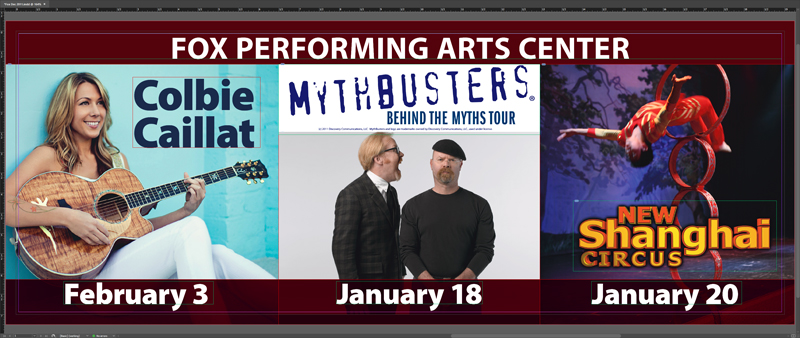
Figure 12
The finished artwork is at a size that both I and InDesign are very comfortable working with. (Incidentally, an ultrawide monitor really shines when you’re working with wide formats like this. I don’t know how I got along without one.)
Metric Measures
For non-U.S. users, calculations are almost embarrassingly easy. For a 10-meter (1,000 cm) width at 1/20th scale, enter “1000/20 cm” and you’re done, but you can probably do that calculation in your head faster than you can type it. Just be sure to add “cm” if that’s not your document default.
Trade show backdrops and other murals
At a typical trade show, exhibitors rent space in modules of 10 × 10 feet (3 × 3 meters), with premium pricing for the best spots. A simple single-unit backdrop will be 10 × 10 feet, which you can build at full scale in InDesign if you really want to. But 10 × 20 or 10 × 30 are just not going to fit.
Figure 13 is a 30 × 10-foot backdrop for an aircraft industry trade show. The client wanted a back wall for three companies who were set up in a 30 × 10-foot space: a single image spanning three backdrops.

Figure 13
I used a scale of 1:12, one inch to the foot, to keep things simple. (For a 10-meter backdrop I’d have used 1:10, for obvious reasons.)
The typical viewing distance for this kind of backdrop is about 10–15 feet, and in this case the public would be on the other side of a table set near the front of each section. This is also why the bottom half of the backdrop is essentially empty.
If you were still thinking about creating 300-ppi full-size images, you’d be looking at using an image 108,000 pixels wide and 36,000 pixels tall—a single 11- GB image. But we’re not making that mistake anymore! Applying our rule of thumb about distance and resolution, 150 ppi at 3 feet becomes 75 ppi at 6 feet, and just 37 ppi at 12 feet.
We needed an image 13,300 pixels wide to achieve 37 ppi, but we weren’t going to find a stock airplane image that size at a sensible price. And upsampling a lower-res image can only go so far without just becoming a mess. We went with an airplane’s view of a sky, because that would be tolerant of a lower resolution.
This is why it’s a “rule of thumb” about image resolution and not a “rule.” Any image that has no fine detail or regular pattern in it can be at a much lower resolution than you would need for a closeup of an automobile or the latest smartphone. Hard lines, smooth curves, and geometric patterns will show pixelation like crazy, but a distant landscape, a sky, or a soft-focus scene will not. To get nerdy for a moment: fractal edges like clouds or mountains, and soft images without much detail (a foggy day, for example), both tend to hide pixelation, so resolution can be lower without the pixels becoming obtrusive.
Everything else on the backdrop was vector data, sharp-edged at any size, so wasn’t a concern (Figure 14).
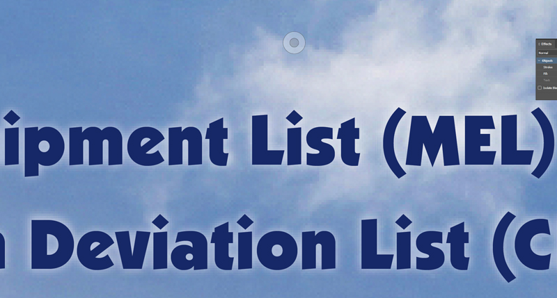
Figure 14
Oversized banners
The same principles apply to murals, giant banners, or anything else that falls under the general heading of “grande” format. (The “e” in grande is purely for dramatic effect, as far as I can tell, like “giclée” for inkjet or “venti” for a Starbucks cup size you will never find in Italy.)
Outdoor advertising banners (Figure 15) and murals (Figure 16) are always created at a smaller scale and higher resolution than the final product. Anything over about 6 feet (2 meters) wide, in fact, is usually easier to work with at a smaller scale than full size.
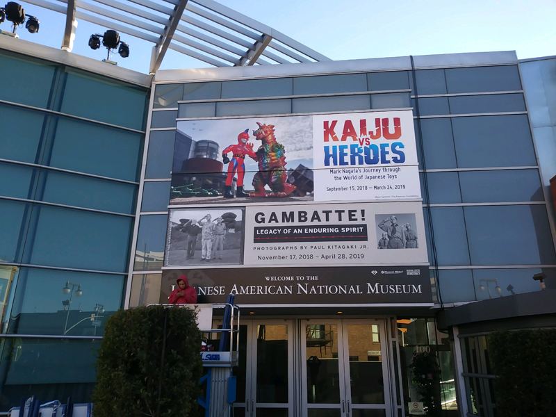
Figure 15

Figure 16
What about the PDF?
Different providers will have their own requirements and PDF profiles. The scale factor is taken for granted, since it is built into their specification. Nevertheless, it’s a good idea to communicate your intentions with the printer. If you’ve ever seen the movie This is Spinal Tap, you’ll remember what happens when measurements aren’t clear—your 11-foot Stonehenge may come back much smaller than expected.
If you are going to be working with a new provider, ask them for the PDF .joboptions file that has the correct settings for their production equipment. (If a vendor doesn’t know what you’re talking about, consider finding a company that’s more proficient.) A .joboptions file is how a PDF preset is stored on your hard drive. It will include color profile and image downsampling, as well as the publisher’s requirements for bleed and crop marks, so PDF export becomes a matter of picking the right PDF profile and clicking Export in the dialog box (Figure 17).

Figure 17
When Not to Scale
There is one circumstance where it can make more sense to work at full scale on a big layout: when you are creating information displays that are intended to be read at fairly close range.
We’ve all seen these at expos, at large conferences, or in museums. Typically, they have illustrations or images and large amounts of explanatory text set in 30-point type or thereabouts. Unlike a more usual poster or wall display, they have an intended viewing distance of a meter or less. At that range, you’ll want images to be around 100 ppi or better. Titles and headlines will be large, but not unmanageable.
Figure 18, created for a conference, is a typical example of this type of display. The printed item was wall-mounted on an 8-foot × 4-foot board.

Figure 18
The body copy is 32-point Myriad Condensed, easy to work with in InDesign. Because the graphics supplied by the client were in different formats and sizes, working at full scale made it simple to ensure the “Effective ppi” was within range—neither higher than need be nor so low as to be pixelated (Figure 19).

Figure 19
Part of the brief for this project included the mounting height of the board. Images nearest the average person’s eye level (about one-third down from the top) would be seen from the shortest distance, so those required the highest resolution. Lower resolution images, of which there were several, could be placed low or high on the display where they would not look bad.
The Bottom Line
When a project calls for a huge display piece, your work will go better if the layout and type sizes are comfortable to work with. Scaling correctly will save time in the long run and make your job easier.
In a nutshell:
- Work out a scale factor that makes your workflow as simple as possible.
- Read and follow the specifications supplied by the publisher where they exist.
- Don’t go crazy about resolution. The viewing distance determines the resolution you require, not arbitrary ideas about what it’s “supposed to be.”
- Above all, enjoy the design process and make your client happy.
Commenting is easier and faster when you're logged in!

Recommended for you

Designing Business Cards, Part 3
This article is the second in a series in which I’ll use business cards to...

Ten Essential Books on Typography & Design
Ilene Strizver shares her must-have list of books to inspire and inform you on a...

Create your own layer comps in InDesign
Frustrated that there are no layer comps in InDesign? Well, why not create your...