Best of the Blogs: November 4, 2011
Typography
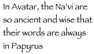
There are many opinions as to what constitutes “best” and “worst” typefaces. But this list of “the eight worst fonts in the world” has the distinction of being written by Simon Garfield, author of Just My Type. If you haven’t yet read Garfield’s book, this post on Fast Company Design will give you an idea of what you’re missing. Here’s Garfield on Papyrus: “Avatar cost more to make than any other film in history but it did its best to recoup whatever it spent on 3-D special effects and computer-generated blue people by using the cheapest and least original font it could find: Papyrus, a font available free on every Mac and PC.”
While you can find free fonts in every nook and cranny of the Web, spotting really good ones is like looking for a needle in a haystack. Thankfully, SpoonGraphics tracked down 20 good-looking and well-built fonts that you’ll want in your library.

The Font Bureau’s David Berlow is one of my favorite guys in typography, so I was delighted to tune into an interview with him on TypeRadio recorded at the ATypI conference in Dublin last year. Smart, perceptive, and funny, Berlow describes the birth of a font and discusses the future of type, among other things.
Do you like haiku?
Meditate on a typeface.
Enter the contest.
That wasn’t very haiku-like in its use of analogy and mystery. I’m sure you can do better in Veer’s font haiku contest. Until December 20, write a haiku about your favorite Veer font. Winners not only get a prize but will see their haiku set in that font by Veer’s crack design team.
InDesign
Speaking of fonts, Keith Gilbert on InDesignSecrets solves a mystery of fonts disappearing from the InDesign type menu.
It’s fun to apply special effects like transparency in InDesign, but getting that file to print may not be so, well, fun. While most of the printing glitches that arose in the early days of InDesign effects have been resolved, booby traps still lurk. For tips about how to make sure your effects-laden file prints, watch this Lynda.com video and follow the written suggestions by Mike Rankin.
InDesign is becoming the hub for producing materials for many media and delivery mechanisms, such as tablet computers. As this sneak peek from Adobe MAX 2011 shows, a future version of InDesign may be able to produce dynamic HTML files that easily adapt to even more modes of communication.
Photoshop
At its MAX conference in October, Adobe demoed a new Photoshop technology, still in development, that removes blur from images caused by camera shake. Questions have arisen about the authenticity of that demonstration, but the folks at Gizmodo say they’ve seen it and that Photoshop’s deblurring feature is very impressive. According to Gizmodo, Adobe is soliciting blurry images from photographers to further put the filter through its paces. Watch a video from MAX here. Find out how to submit a photo here.

Adobe also wants you to know about what it calls a “hidden gem” in Photoshop: automatic lens correction.
Turning buildings into letters is not something I’ve needed to do, but I can’t deny that the result of this PSD.tuts step-by-step lesson is pretty nifty. In creating this image, you’ll use a lot of different Photoshop tools, so following along is also a good way to expand your skill set.

Here’s a tutorial via Photoshop Lady about using Photoshop’s Liquify filter to play with fire.

There are many ways to color-correct images in Photoshop. Most pros use Curves; more specifically, a Curves adjustment layer that lets you work on a proxy to affect image color without changing the image pixels itself. As a result, it’s easily un-doable. Watch this video from PSD.tuts to see how to color correct a photograph with curve adjustments.
Levels is another important image-adjustment tool in Photoshop. And like Curves, it does take a bit of practice to use it well. Digital Photography School shows how to find your photo-enhancement footing with Levels.
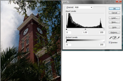
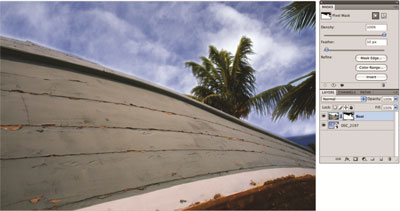
If you have overexposed photos with skies that look flat and washed out, learn how to fix them in this Tip Squirrel tutorial that includes both written and video instruction as well as files to download and experiment with.
Photography
This heartfelt story posted on Digital Photography School was written by a man who as a result of a serious car accident has endured great pain while losing much of his mobility. Read “Camera Therapy: How Photography Gave Me Hope Again”.
Jeff Carlson writes about another form of tenacity in “The Courage to be a Photographer” on the Photoshop Elements Techniques website.
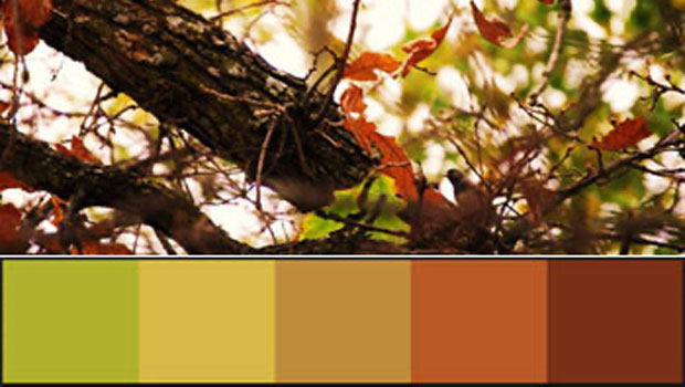
For many visually oriented people, fall is a favorite season — and with good reason, given its explosion of color. Wouldn’t it be nice to capture those colors in our designs? Noupe has analyzed photos of fall scenes to create color palettes suitable for print and Web design. The combinations are beautiful and definitely evoke this time of year. The color formulas aren’t included, however, so you’ll have to download the palettes and get the numerical values in Photoshop or some other application.

Hardware
Color management is one of those topics that you know is important but seems too daunting to tackle. However, calibrating your monitor and printer to ensure that the colors you see through your lens is what you’ll see on screen and what will print on paper is not as difficult as you may think. It requires a couple of tools and, above all, patience and a methodology. Beyond Megapixels breaks down color calibration for you, with articles that explain how to achieve color fidelity on your monitor and from your printer.

Even without color calibration, studio printers can be fickle creatures, giving you a stellar performance in the evening only to burp ink on the paper the next morning. The folks at Unplgged use their own printer meltdown as an example of what steps to take when your printer is acting up.
At least getting consistent output from a desktop printer can be achieved with a metaphorical kick. It’s not that easy with printing presses, as Gordon Pritchard of Quality in Print explains.
Creative Business
Crowdsourcing — the business in which a company invites the public to submit designs and services for a set fee from which the client picks the “winner” — shows no signs going away. It’s a hotly contested subject within the design community and one that we’ve covered at CreativePro.com (this forum post is especially lively). A Hongkiat post asks: Is it really intelligent to use crowdsourcing? Find out in “Crowdsourcing: Pros, Cons, and More”.

If you’re a creative professional, you may think that having a website and posting your portfolio are enough to attract attention. Add a modicum of self-marketing through social media sites and you’re all set, right? Not quite. Pikaland makes the case as to why artists and illustrators should blog, too.
Are your design skills feeling a little flabby? Is your creativity waddling from the weight of mushy thinking? Get into shape with Design Exercises to Get Your Creativity Ripped from PSD.tuts. You’ll feel like a lean mean design machine after doing these three 20-minute exercises.

Not to get all reality-TV on you, but if you watched the recently concluded season of Project Runway you saw contestant Anya experience a bad case of designer’s block. It happens to all of us at one time or another. If Tim Gunn’s not around to tell you to “make it work,” how do you bust through and start designing again? Web Designer Depot offers five simple ways to beat designer’s block. There’s hope: Anya ended up winning.
Finding a job in the design business requires more than just a good portfolio. David Airey asked four design firms from different geographic regions and with different specializations to spell out what they look for in applicants. It’s an interesting read for both aspiring and established designers. When describing conceptual ability, 160over90’s Jim Walls says, “I’m not talking about design flourish disguised as an idea. That’s just wallpaper. If you don’t know the difference, well, that’s another post, and it’s also how portfolio schools stay in business.” Ouch! Here’s the link to the first post. You’ll see click-throughs to the other three.

Miscellaneous
Prints made from wood type are magical. You’re probably aware of the Hamilton Type Museum that preserves these carved creations, but you may not have heard of Bill Jones, who creates new wood type for today’s printers. Felt & Wire provides an inside look at Virgin Wood Type and Jones’ two-handed pantograph.

Even as books begin to lose their connection to print and paper, a new generation of letterpress printers and papermakers has arisen. These revivalists owe a great deal to Dard Hunter, himself a revivalist of hand papermaking in the early 20th century who worked with many influential Arts & Crafts designers. The Friends of Dard Hunter society works to not only preserve the master’s work but also to connect hand papermakers around the world. Felt & Wire attended a recent gathering.
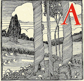
Here’s another tribute to paper from House Industries’ Rich Roat. En route to a speaking gig, Rich stopped at French Paper in Michigan and blogged about this family-run paper mill.

This article was last modified on August 2, 2021
This article was first published on November 7, 2011
Commenting is easier and faster when you're logged in!
Recommended for you

Study: Blending the Old with the New
We often hear the proverb “there is nothing new under the sun.” While one might...

Linotype's New Serif, Script, and Stencil Fonts
Malabar For the next 30 days, all customers who purchase any font licenses at Li...

Knowing Your Camera: The First Step for Getting Better Results in Photoshop
Understanding the abilities of your camera and Photoshop can help you produce be...


