


Photography
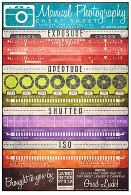
Many of today’s digital photographers never had to learn the mechanics of traditional photography and therefore don’t understand how, say, aperture works. This amazing Manual Photography Cheat Sheet, designed by Miguel Yatco, not only explains key settings but looks fantastic. Via Photojojo.
I once saw an accomplished photographer shoot frame after frame of a never-to-be-repeated ceremony without realizing he hadn’t removed the lens cap. These kinds of mistakes happen to everyone and were the impetus for “78 Photography Rules for Complete Idiots.” Some of the rules need to be read with tongue firmly in cheek, but it all rings true; for example, “A self-portrait in a mirror is better taken without flash”. Via Neatorama.
We often think that photography is very different than manual arts, such as painting. But the folks at Photofocus think otherwise, as explained in the post “Even If You Have No Talent For It – Drawing, Sketching & Painting Will Make You A Better Photographer”.

If your photo equipment is weighing you down—as it did for Photofocus’s Scott Bourne—and it’s too dated to be of much use to anyone, transform it! Photojojo shows some nifty ways to upcycle your old gear. If you come up with something clever, be sure to send project info to the folks at CRAFT, who tell us that July is Design and Photography Month.
Typography

While July 4 was the birthday of the United States, July 3 was another important anniversary that received far less attention: the 125th birthday of the Linotype machine. Find out more about Ottmar Mergenthaler’s revolutionary invention by previewing an upcoming documentary about Linotype typecasters and the people who still use them today. Thanks to isdgn for the referral. (Read more about the “eighth wonder of the world” in a previous blog round-up, in which I erroneously stated its anniversary was in May. Call that a Lino-typo!)

CreativePro.com has covered Hamilton Wood Type before, but I never imagined I’d refer to it in this context: Target is issuing a line of clothing featuring lettering based on and honoring Hamilton type. Read how the mega-retailer came to partner with the tiny type museum, via the PostFamily. Look for the duds starting July 11.
A couple of blogs posts about conceptual typography are interesting:

Marc Böttler played with wood blocks to create an alphabet in which things are not as they seem. Via Colossal.

The Behance Network points to an example of “anamorphic typography,” in which type becomes part of the architecture of interior spaces.
Web
FontFonter intrigues me. With this web application you enter a URL, choose which of 40 fonts you’d like to use, then replace the existing fonts and preview the result. It was developed by FontShop, so the type options are all from that foundry. I had trouble getting it to work properly, but there are a lot of variables to consider, including how the target site is built and which browser is being used. Danke, Swiss Miss.
An application like FontFonter would be useful when prototyping a site or considering a redesign. But be careful—any redesign is fraught with peril. Web Designer Depot offers suggestions for avoiding a redesign failure. By the way, the advice applies to most redesign projects of all media. Via Design You Trust.
Given the Web’s youth, it’s hard to believe that people are already wringing their hands over its future, but after reading Gavin Elliot’s piece I’m starting to understand that point of view. Elliot worries that the Web cannot thrive without Web-savvy talent and that not enough qualified people are entering the field to support its future growth. The Design Cubicle provides both commentary and link to Elliot’s essay.
Photoshop
Recently the American Media Association adopted a stance against unrealistic body images in advertising and in so doing pointed the finger at Photoshop. ABC News aired a piece that proposed Photoshop contributes to poor body image for impressionable teens and young girls. Adobe’s John Nack says that Adobe applauds the AMA’s position about idealized body image in media. He links to an ABC News feature about the issue and to product management director Maria Yap’s response.

The woman in this 1870s-era tintype probably didn’t get hung up on body image, but she might object to the age spots and creases on her face. See/read how a master retoucher restored this badly damaged tintype. Although Photoshop wasn’t a factor, it’s nonetheless fascinating to observe his thought process. Via BoingBoing. (By the way, if you click through to Kottke.org, you’ll see another retouched image that some would say is more authentic.
Here are three handy Photoshop tutorials worth checking out:
• “How to create vector masks in Photoshop” is a clear and straightforward how-to article about this important skill. Via Macworld.
![]()
• Learn how to create an icon of a radar screen. Via Line 25.

• For something that’s pure fun, follow this tutorial about making type look like Swiss cheese—or some varmint riddled with bullet holes. Via Tip Squirrel.
InDesign, Illustrator, and Acrobat
The introduction of new software, especially mission-critical ones like Acrobat, peeves existing users when they can’t locate “improved” features. As a result there’s lots of traffic on blogs and boards about changes to Acrobat Pro X. Thankfully, the collected wisdom of the blogosphere has the answers.

• Adobe replies to Where is the Typewriter Tool?
• Keith Gilbert answers Where is the TouchUp Text tool? Adobe chimes in on this one, too.
• Claudia McCue gets to the bottom of why the TouchUp Object tool doesn’t work.
Two threads on the Google InDesign Group touched on two questions that I’ve wondered about:
• What’s the fastest way to change the master-page size in a document that’s already laid out?
• What’s the best way to force a book to open on a right-hand page?
If you’ve had a hard time grokking GREP in InDesign, Adobe’s Caveat Lector blog tackles the subject.
![]()
Brush off your Illustrator skills to create this ribbon-style graphic logo found on the Spoon Graphics blog. The techniques learned here are applicable in many design situations.
Creative Business
Recent design school graduates and working designers alike can benefit from the advice that 10 pros offer to aspiring designers, posted on Design You Trust.

Color theory and harmony are of course taught in design school, but what about color communication? ColourLovers deciphers the color-communication gap between designer and client.
“Is there a place for you in the new design community?” asks Chuck Green on Page Plane. He then gives examples of how writers, designers, illustrators, photographers, editors, developers, and marketers are finding work that match their experience in new and unexpected places.
On the flip side of the coin, if your skills are lagging, Graphic Design has this cheery thought: “How to Catch Up in Graphic Designing—You Snooze You Lose!” It has the ring of truth.
Here’s a conundrum many of us would like to face: A designer is offered a new job that’s right up his alley, but then his current employer makes a sweet counteroffer. What to do? Read what posters advised and what the designer decided to do on Core77.

In a previous column, I showed pages from a pictorial journal recorded during the Typo Berlin 2011 conference by Eva-Lotta Lamm. It turns out that taking visual notes is a valuable design skill that can be learned. Core77 has started a sketchnoting section on its site. Begin with “Sketchnotes: the basics of visual note-taking”.
![]()
Design a company logo in 30 seconds? Just Creative Design shows how one company did it.

Regular readers of this column may have gleaned that I have a problem with “stuff”—that is, organizing and/or discarding it. Steven Heller, perhaps the foremost chronicler of design today, apparently has the same problem when deciding what to do with design stuff.
Design Miscellany

On a trip to Seattle, Gordon Pritchard of Quality in Print saw halftones everywhere.

For many designers, barcodes are a necessary evil. Imagine being able to break outside the barcode box! Drawn shows what’s possible.
Do you think that a printer with a 600dpi resolution is automatically superior to one with 300dpi? Macworld delineates which printer specs really do matter, and which ones don’t.

The Society of Professional Designers (SPD) compiled a second list of 10 Essential iPad Apps for Publication Designers.. Here’s the first list.
This article was last modified on August 2, 2021
This article was first published on July 7, 2011
Commenting is easier and faster when you're logged in!

Recommended for you

To Double-Space or Not to Double-Space…
Learn the history of the double word space…and whether or not it's a true type c...
Using Bleed for Print Design
Based on an article originally published in the DesignGeek e-zine. One of the fi...

Free WhatTheFont for the iPhone
WhatTheFont has long been available online for people who need to identify a cer...