
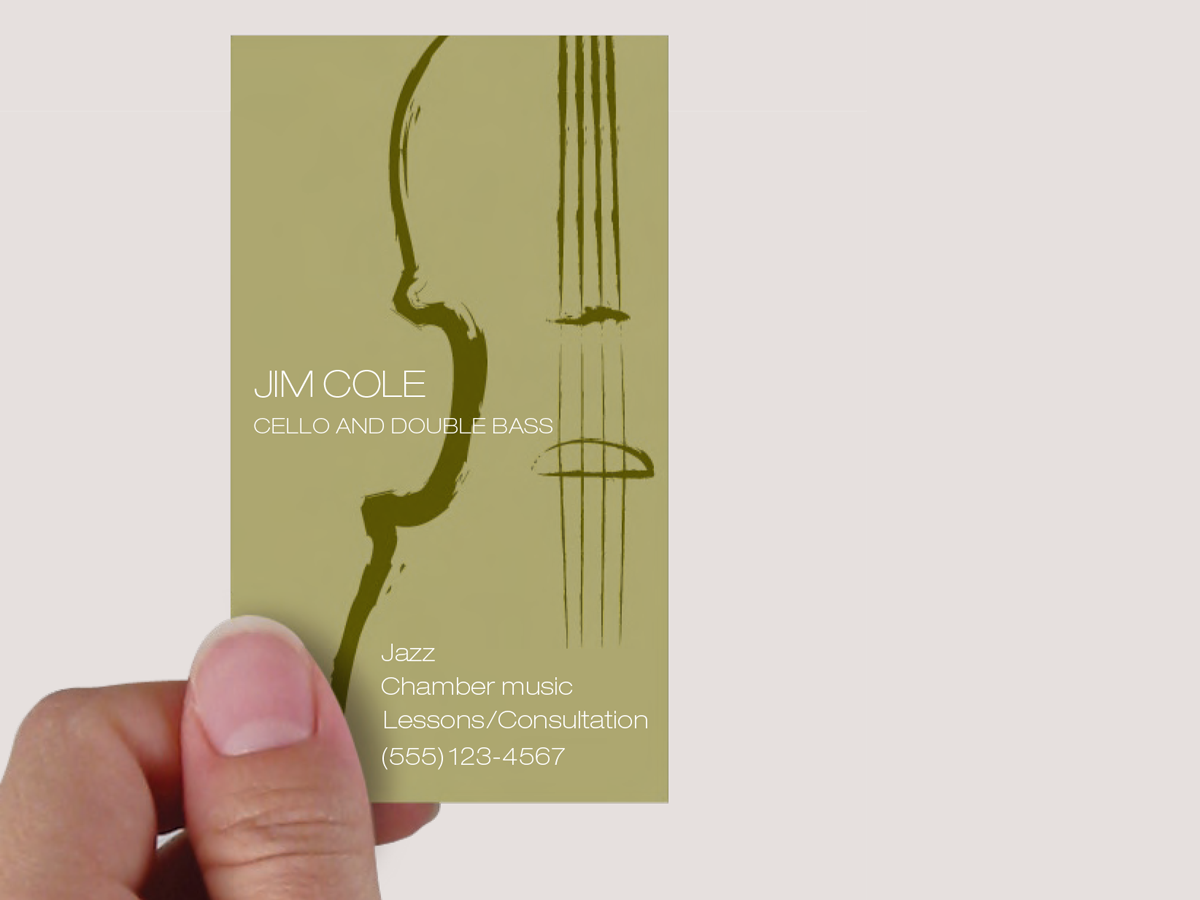
This musician’s business card gets a lot of visual atmosphere out of just a few elements. Set in faint tonal contrasts, the illustration dominates the space but does not overpower the card. It conveys the air of classical musicianship without being stuffy; it’s simple and masculine. To achieve all this, the designer had many decisions to make. This 18-page article from issue 44 of Before&After Magazine shows you how to turn a one-color business card into a visual statement.

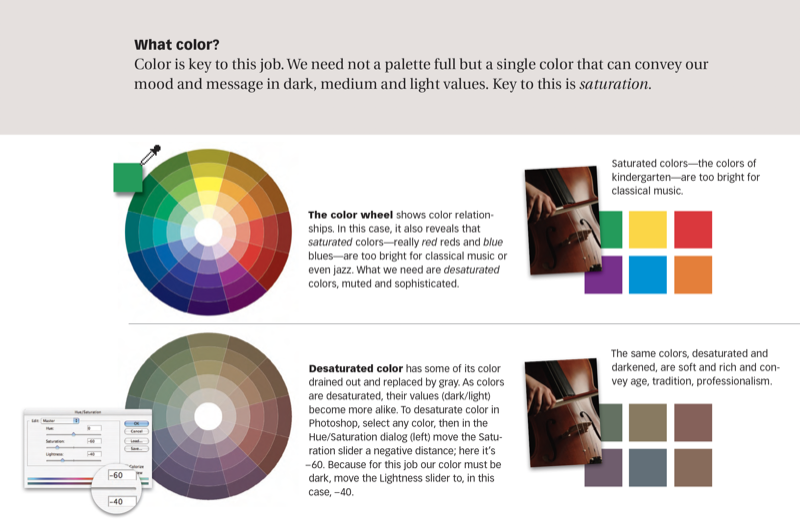
One ink on white paper yields three levels of tonal depth: dark, medium, and light.
© John McWade/Before&After Magazine, courtesy of Gaye Anne McWade.
Commenting is easier and faster when you're logged in!

Recommended for you

Before&After Design Tip: Multi-Caption Photo Tells Many Stories
Use more than one caption to unpack the detail in an image
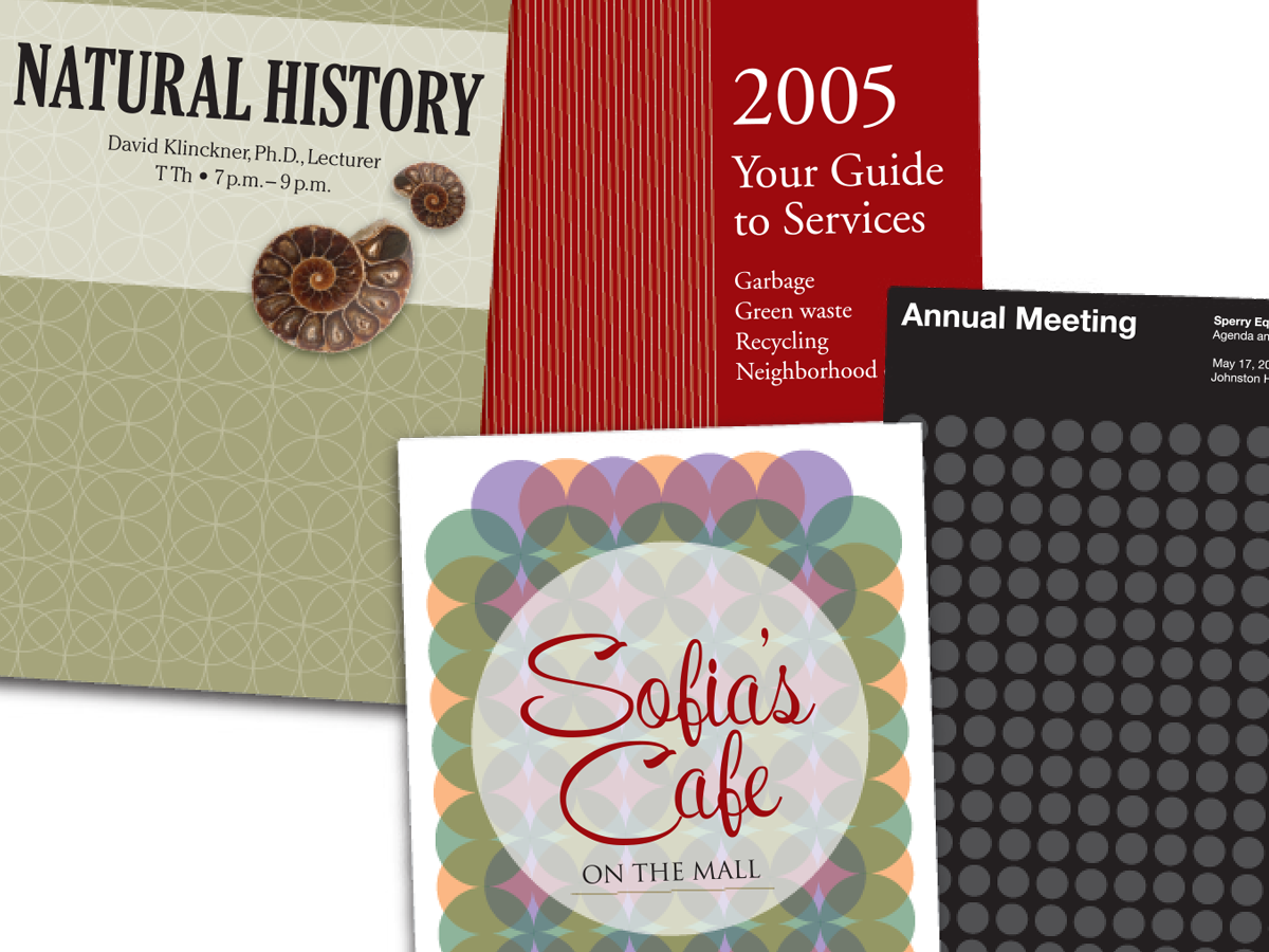
Before&After: Easy Cover Patterns
Using this step-and-repeat technique, you can make artistic covers in no time!

Get Many Images From One Original Photo
Did you realize that big photos have small photos hidden in the details—a collar...