

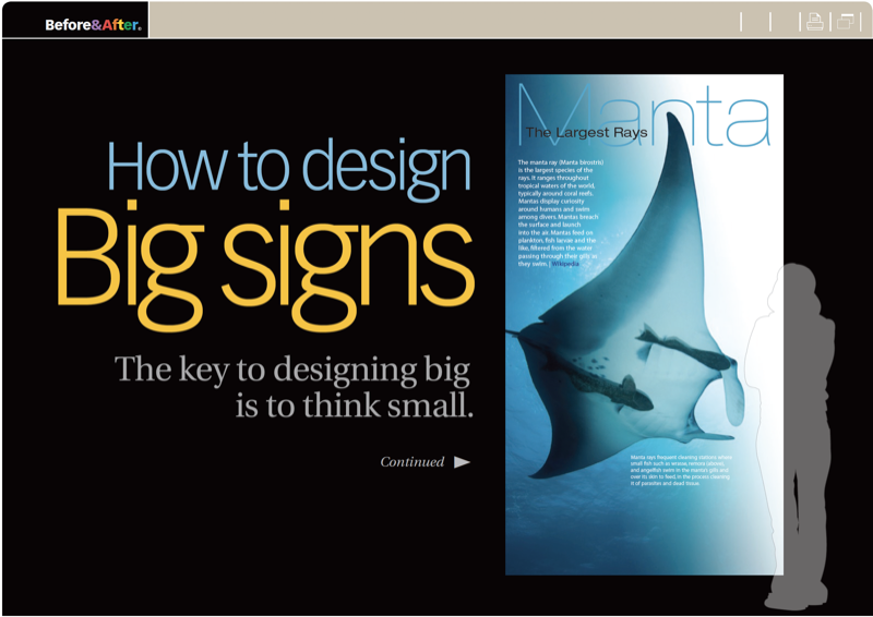
Big signs are everywhere—along freeways, on storefronts, at trade shows, in museums—but no matter how big they are, they share a paradox: At normal viewing distance, they appear small. The key to good design, therefore, is to treat a big sign the same as a tiny one. This 16-page article from issue 50 of Before&After Magazine shows you that the key to designing big is to think small, whether you’re making trade-show banners, billboards, wayfinding signs or wall posters.
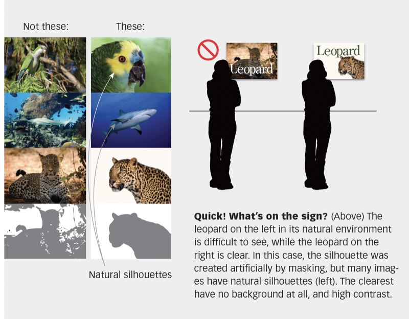
The key is to use one image, few words, simple typefaces, no overlaps (because you need clear silhouettes)—all to keep your design simple.
© John McWade/Before&After Magazine, courtesy of Gaye Anne McWade.
Commenting is easier and faster when you're logged in!

Recommended for you

Before&After Design Tip: Bring the Words Into the Picture
How to make descriptive graphics that are effective and clear

Before&After: You, Not Your PowerPoint slides, Are the Key to a Great Presentation
Learn the four basics of creating slides that don't make a documentary but inste...

Two Design Books to Stop You in Your Tracks
If I were a secret agent assigned to take down an evil graphic designer who was...