
Here’s a quick design tip on web advertising design from issue 44 of Before&After Magazine.
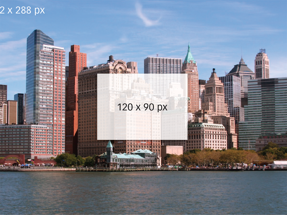
A typical advertisement is full of images and text. So how do you shoehorn, say, the city of New York into a tiny web ad? The space is so small, the resolution so low, and the typical Web page so cluttered with other messages that your microscopic cityscape will be lost. Instead, think simple, bold, and brief.
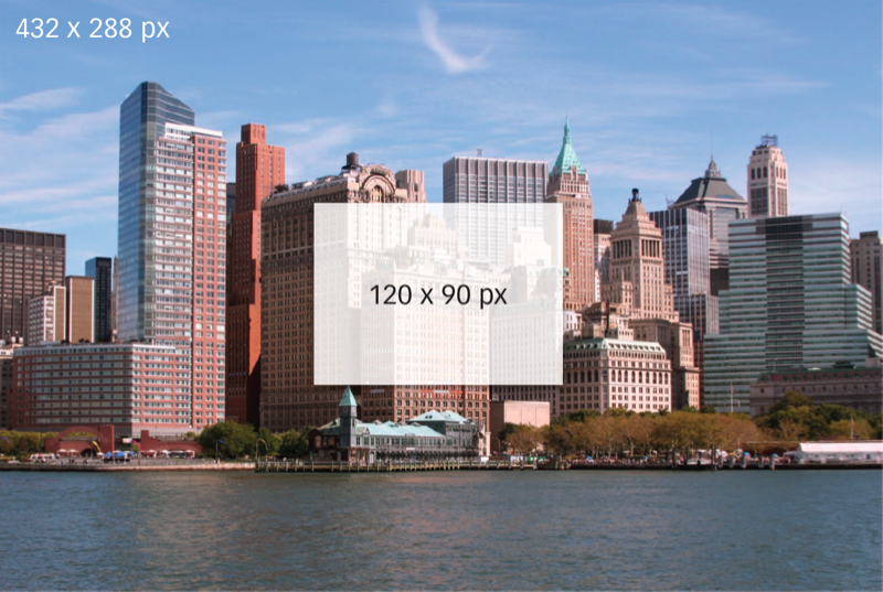
Use not the entire city but an icon that represents it-the Statue of Liberty, Empire State Building; you get the idea. Look for an iconic image, a simple shape, a bold color, a bold angle, high contrast—or, best, all of it.

Think simple, bold and brief The goal is to convey your message with the least amount of visual information. Think icons, symbols and objects. New York City: Statue of Liberty; health care: doctor in a lab coat; kitchen products: stack of bowls, and so on.
CreativePro members can download original content from Before&After Magazine, a beloved resource that taught a generation of newly minted digital designers how to design and communicate effectively with the written word. See our archive here.
© John McWade/Before&After Magazine, courtesy of Gaye Anne McWade.
This article was last modified on January 4, 2026
This article was first published on December 20, 2024
Commenting is easier and faster when you're logged in!

Recommended for you

Before&After: Gestalt Theory: Similarity
Elements of similar shape, color, or other attribute can seem to belong together...

Before&After: You, Not Your PowerPoint slides, Are the Key to a Great Presentation
Learn the four basics of creating slides that don't make a documentary but inste...
Before&After: Design a Mini Portfolio Card
Here's how we helped a photographer improve her portfolio card.