
Here’s a quick design tip on collateral from issue 41 of Before&After Magazine.
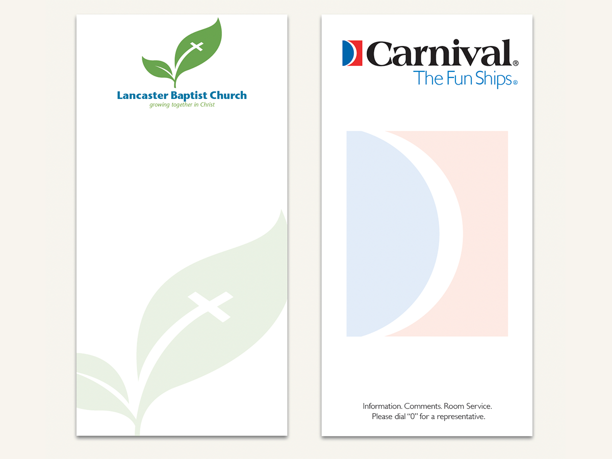
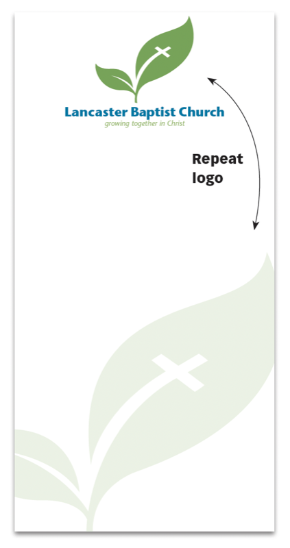
We’re not big fans of ghosted logos, which are normally overlaid by text, weakening (or obscuring) the image and complicating reading. But here’s a great exception: a 3½ in. × 7 in. notepad that shows off your logo and lets the reader cover it up—s-l-o-w-l-y spending time literally atop your image!
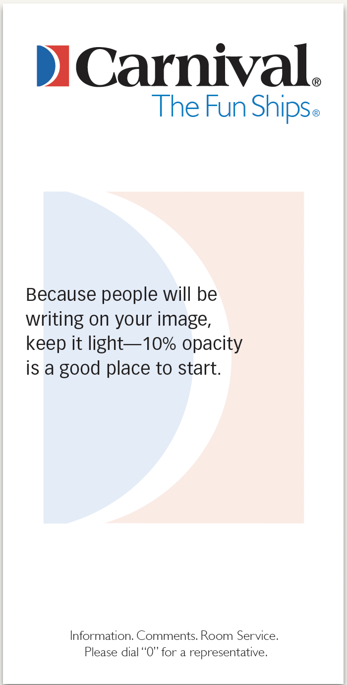
For branding integrity, run the logo normally at full strength, and make the ghost a duplicate.
CreativePro members can download original content from Before&After Magazine, a beloved resource that taught a generation of newly minted digital designers how to design and communicate effectively with the written word. See our archive here.
© John McWade/Before&After Magazine, courtesy of Gaye Anne McWade.
Commenting is easier and faster when you're logged in!

Recommended for you

Before&After Design Tip: Crop to Change a Meaning
Don’t throw a problematic image away. Crop boldly to make it work!

Before&After Design Tip: Bring the Outside in
Key tips for making the inside of a printed piece match the outside

Before&After: Design a Dual-Purpose Letterhead
A legal-size sheet can serve as your letterhead and provide a bonus, too.