
Here’s a quick design tip on photo cropping from issue 45 of Before&After Magazine.
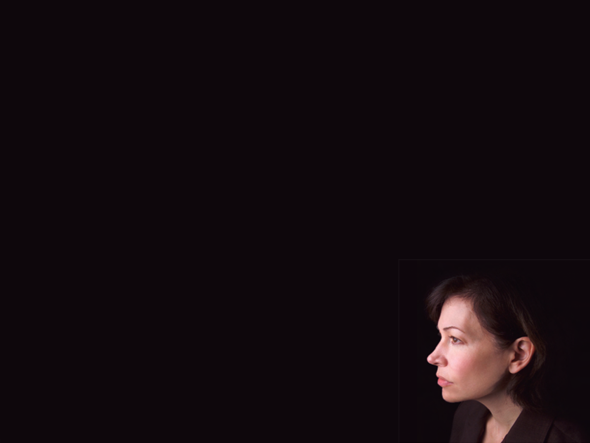
The size and placement of your image can have a dramatic effect on its impact. Here, placing a small portrait at the bottom of an empty field is all it takes to create a layout that perfectly illustrates its words.
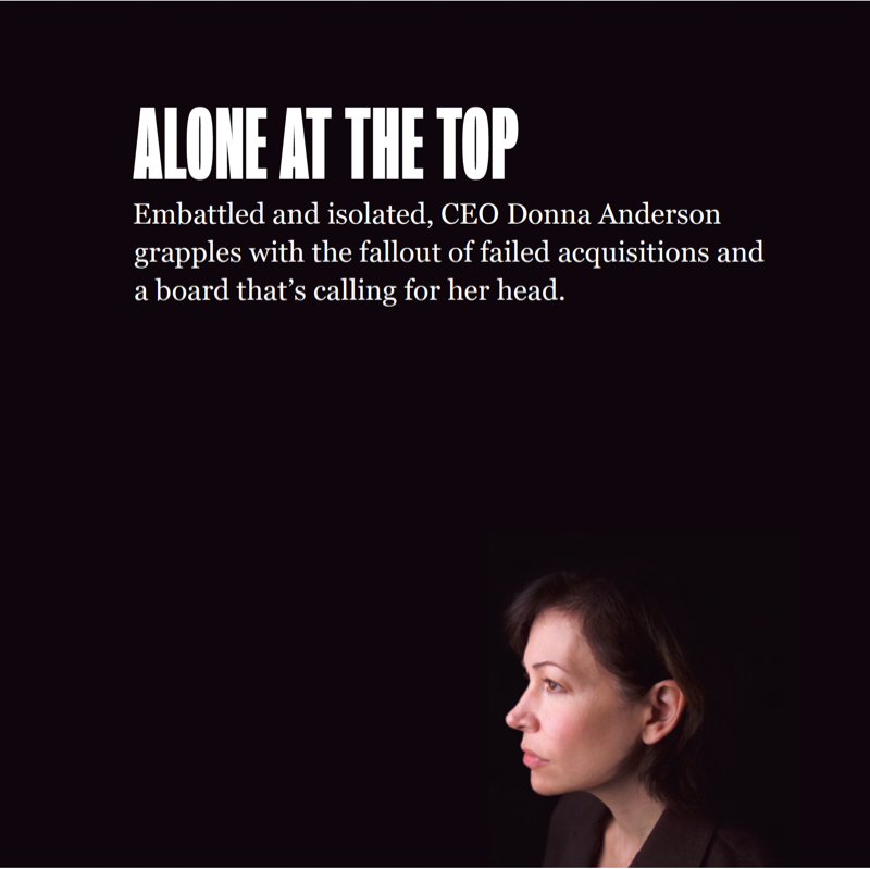
This layout makes it easy to see that empty space isn’t empty but has mass, volume and real power. The huge black field engulfs our unfortunate CEO and creates a sense of heaviness, isolation and distance. What makes this happen is her small size, extremely low placement and faraway gaze. Her dark suit is a bonus, fading into the background and leaving her somber expression in sharp contrast. Headline and text styles must be plain and in a neutral position (no tension) to not steal attention.
CreativePro members can download original content from Before&After Magazine, a beloved resource that taught a generation of newly minted digital designers how to design and communicate effectively with the written word. See our archive here.
© John McWade/Before&After Magazine, courtesy of Gaye Anne McWade.
This article was last modified on January 6, 2026
This article was first published on July 19, 2024
Commenting is easier and faster when you're logged in!

Recommended for you

Before&After: This Small Newsletter Reads Big
A publication with a half-size page is easy to design and creates a strong impre...
Before&After: Make Your Design Express Who You Are
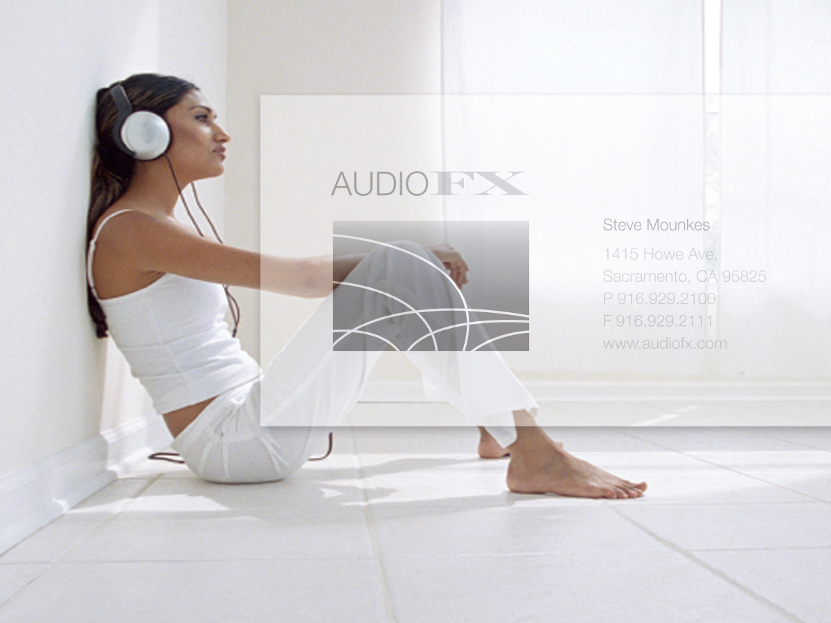
An audio retailer designs a card that floats on air.
Before&After Design Tip: Narrow Page Makes a Revealing Cover
Give your next report cover a bit of intrigue