
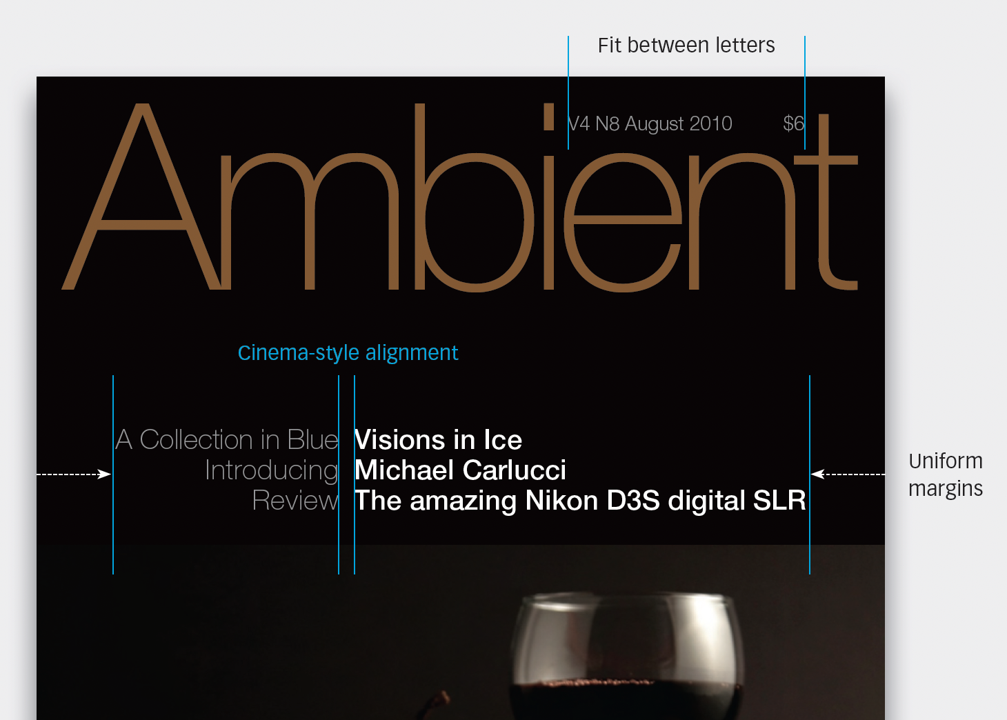
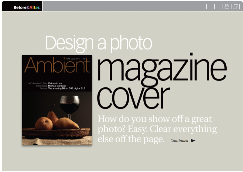
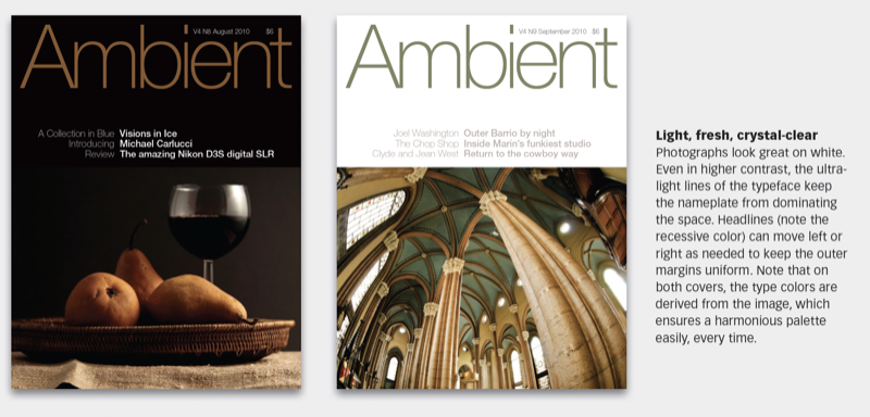
Photograph, headlines and colors change from issue to issue, but the structure does not. Repetitiveness will quickly establish a strong, coherent image. This 21-page article from issue 50 of Before&After Magazine takes you through the redesign of a photography magazine which draws inspiration from taking a great photo: by clearing everything else off the page.
Photograph, headlines and colors change from issue to issue, but the structure does not. Repetitiveness will quickly establish a strong, coherent image.
© John McWade/Before&After Magazine, courtesy of Gaye Anne McWade.
Commenting is easier and faster when you're logged in!

Recommended for you

Design Tip: Choosing Background Colors
Quick tips for choosing background colors to go with photos
Before&After: Design Like a Lazy Person
Design is easier if you segregate your page into two zones—image here, type ther...

Before&After: You, Not Your PowerPoint slides, Are the Key to a Great Presentation
Learn the four basics of creating slides that don't make a documentary but inste...