
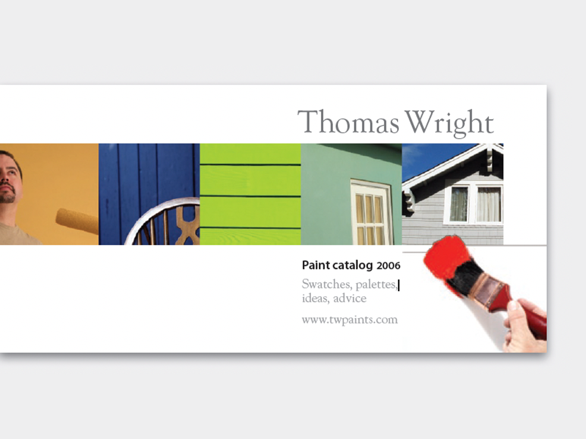
It’s out-of-the-ordinary, attractive, and easy, too—a single row of photos carries your reader from here to there. Put your copy on the right, and the reader’s eye will follow the path directly to it. This 12-page article from issue 42 of Before&After Magazine will instruct you how to use this easy method to make your message stronger: Turn your page sideways, and line up a half-dozen (or so) identically sized Photos, starting at the left edge..
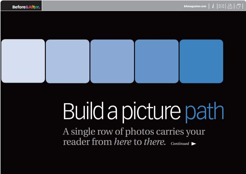
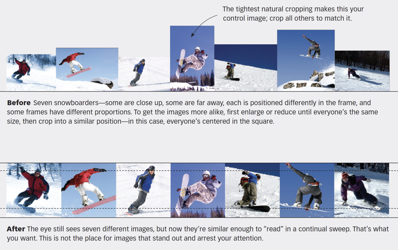
A picture path is most effective when its images are similar enough that the eye just glides along. Size, cropping and alignment are key
© John McWade/Before&After Magazine, courtesy of Gaye Anne McWade.
Commenting is easier and faster when you're logged in!

Recommended for you

Before&After Design Tip: Use Text to Frame Your Image
Text and photos must work together to convey a message

Before&After: How to Design Small Calendars
Create eye-catching calendar designs for wallet and desktop.
