

There aren’t many designers who would consider setting text colored with gradients that oscillate between pure red and blue. Yet that seems to be an effective way to make long passages of text more readable, according to the makers and users of a browser extension called BeeLine Reader.
Once installed, you can use BeeLine Reader to reformat a web page and apply gradients to all the text. The gradients are applied in such a way that each line of text starts with a different color, making it easier for your eye to jump to the right line, especially on mobile devices with small screens.
Settings allow to you choose from several themes. So you can opt for garish gradients of pure red and blue or more subtle gradations of gray.
A Stanford University study showed use of BeeLine Reader increased reading speed from 10–30 percent. It will be interesting to see if this idea catches on and starts appearing in mobile reading apps.
This article was last modified on January 8, 2023
This article was first published on October 7, 2013
Commenting is easier and faster when you're logged in!

Recommended for you

TypeTalk: The Case of the Mysterious Missing Fonts
Q. I’ve noticed some strange font behavior in some of my documents. Sometimes un...

Top CreativePro Articles of 2015
What a year 2015 has been for us at CreativePro.com and for you, our readers! Th...
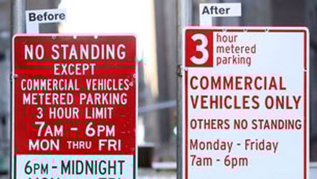
New York street signs get a much needed redesign
Drivers in Manhattan will soon see just how much impact good type design can hav...