


After the first installment of this series about type and typography, a reader asked me to write about punctuation: how to use it, space it, and position it. An excellent idea, I think, because it raises the important issue of how type and grammatical usage intersect. Type is a lackey to language. The subject is also a logical follow-up to my second installment, which addressed the question of doubling the word space after a period.
In typeset text, the sequence and positioning of characters result from a combination of typographic tradition — largely based on what works for the eyes — and copy-editing style, where meaning is king. Both are moving targets. For example, what’s wrong with the setting of this sentence ? That space before the question mark may look weird to you, but it’s not if you’re typesetting in French, where it’s the norm.
Even in English, there are many differences between how Americans and British use punctuation. Take, for example, the use of quotation marks. The Brits set off a quote with single quotation marks and reserve double quotation marks for quotes within quotes, as in:
Americans would set that the other way around, with double quotes for the main quotation and single quotes for the quote embedded within it.
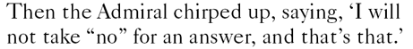
Then there’s the question of how that sentence-ending period is positioned. American typographic style is to always set the period within the quotation marks, be they single or double. The British have a different approach, which I have to say makes more linguistic sense, even if it’s not as pretty, typographically speaking.
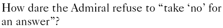
In British practice, the period goes inside the quotation marks only if that period is part of the matter being quoted. If the period is not part of the quote, it sets outside of the quotation marks, like so:

There’s a clear logic to this, because especially in academic prose, it could matter whether or not that period is part of the quote, as it could affect the quote’s meaning.
Nevertheless, the distinction is not made in American copy-editing or typesetting, and periods, commas, and semicolons always go before closing quotation marks regardless of context, like so:

The spacing simply looks nicer that way. And if the meaning may be distorted, you can always blame the author or the copy editor.
Question marks and exclamation points, though, do not follow this pattern. They should be set inside the quotation marks only if they’re part of the text being quoted, hence:
Speaking of copy-editing style, it’s the norm for periods, commas, colons, and semicolons to be set in italic if the word preceding them is so set. This isn’t universally practiced, but most copy-editing style manuals (for example, The Chicago Manual of Style) prescribe it.
If you find yourself setting type in the British manner, feel free to kern those periods that fall outside quotation marks so they snuggle up more closely to the quotes. Otherwise, the loose spacing of the period added to the word space that follows it creates an ungainly gap in the text. (Which brings us back to the topic of the previous column.)
Interestingly (to the likes of me, anyway), the kerning tables of American-made fonts tend to have an American bias in this regard, as they typically include adjustments for character pairs including . ” and , ” but not ”. or ”,. English fonts, or American fonts created by English designers, tend to include the complete set.
One last note about quotation marks: Although they’re sometimes used as a form of emphasis, this is generally better accomplished using italics. Exceptions include ironic expressions (e.g., a renowned “genius”) or common words used in new or uncommon contexts (as in, the “dimples” on a golf ball). When you’re citing a word as a word, italicize it (“most uses of the word usage are improper”).
Dashing To and Fro
The spacing of dashes is also a popular source of confusion, as is how they should be used in the first place.
Pity the poor em dash. Many people think it’s too wide. Many don’t like its tight spacing. Many don’t like either. The em dash has a specific grammatical use — to separate thoughts, much as parentheses do — but there’s a creeping popular insurrection afoot against its use.
Em dashes should be used closed up; that is, without any space before or after. For those who dislike the tight spacing of em dashes, feel free to kern open small spaces on each side. There are a few rare typefaces (such as Carter & Cone’s version of Matthew Carter’s ITC Galliard) that contain what’s called a punctuating em dash, which is somewhat narrower and has wider side bearings, creating a similar effect, as shown below.

The upper of these two samples is set in Bitstream’s version of ITC Galliard, whose em dash is of the so-called joining variety, which is the common standard. The lower sample is set using Carter & Cone’s version of the same face, which substitutes shorter, punctuating em dashes.
An em dash, by the way, can appear at the beginning or the end of a typeset line, an ambidextrousness lacking in an opening or closing parenthesis.
More and more often, en dashes — which are half the width of em dashes — are being used in place of their wider siblings. But en dashes are too narrow to play the dividing role well, so they’re generally preceded and followed by additional spacing to increase their impact. Popular as this is becoming, it’s wrong. I may be standing in the way of stylistic progress here, but I will stick with tradition for two reasons. First, the grammatical role of en dashes is to connect, not to separate. Use them for ranges of numbers — for example, pages 17–22, the years 1941–44 — or in open compounds: pre–Civil War. That’s the copy-editor’s argument.
But the typographer’s reason not to use ens in the role of ems is that they’re too small. Adding spaces doesn’t make them any bigger, it just fluffs them out. They’re still too wimpy. En dashes should be set closed up.
As with the en dash, the role of the hyphen, the baby of the dash family, is to connect, and it, too, is set closed up. The exception is where prefixes are used alone as part of a parallel construction, such as “pre- and postmodern.” You should never start a line with a hyphen, unless you’re using it as a bullet to introduce an item in a list, in which case it should also be followed by a word space:

Using two consecutive hyphens in place of an em dash is a typewriter convention, and you should avoid it at all times. Except maybe when setting Web pages, where trying to force an em dash to appear in an HTML page can cause some systems to erroneously display the HTML code for an em dash instead. For this reason, double hyphens have become an unfortunate Web convention as a stand-in for em dashes. [Editor’s note: Sorry, Jim!]
Clip and Save
While we’re on the subject, here’s a summary of how other common characters should be spaced, at least when following American typesetting conventions. Note that in weird computery constructions such as e-mail addresses and URLs, all bets are off.
Characters Followed by a Word Space:
 (a bullet, or any other symbol used to designate an item in a list)
Characters Preceded and Followed by a Word Space:
 (except when used in initialisms, such as A&P)
When used in formulas: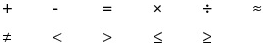
Characters Not Followed by a Space:
 (when used to indicate positive or negative values, such as +15°)
Characters Not Preceded by a Space:
Style and Type
There are any number of copy-editing and style manuals out there, and picking one to use base your “house style” on is a good idea. Having such an authority on hand solves a lot of arguments. Although many publishers offer their style guides for sale (the New York Times and the Associated Press come to mind) my favorites are the following:
- The Chicago Manual of Style, 15th Edition, The University of Chicago Press, 2003
- Words into Type, 3rd edition, Prentice Hall, 1974 (technologically out of date, but stylistically still right on)
This article was last modified on February 23, 2026
This article was first published on September 9, 2009
Commenting is easier and faster when you're logged in!

Recommended for you

TypeTalk: The Ins and Outs of F-ligatures
F-ligatures are special characters found in just about every professional font....

Scanning Around With Gene: The Speedball Pen
A speedball is a pen you dip in ink and use primarily for lettering. It was inve...

TypeTalk: Get to Know the Long s
This obscure character can bring an air of antiquity to type.