
Branding is the term used to describe the creation of an identity for a product, company, or business, which distinguishes it from others and makes it stand out to its potential customer. It is one of the most important elements in the success of a product or service. Graham Clifford is an award-winning London-born, New York based independent creative director who knows all about branding, as this has been the focus of his illustrious career for several decades.

A selection of the many logos designed by Graham.
This second-generation graphic designer and typographer was initially trained by his father. He then went on to work for some of London’s best creative agencies before NYC’s lure proved too strong, and the likes of Chiat/Day and Ogilvy came knocking on his door. A few years later, he opened his own design consultancy, collaborating with agencies and clients alike on all manner of projects for global brands.
Graham was elected to the Type Directors Club’s Board of Directors (a major honor that still makes him blush). He served for more than a decade, becoming both President and Chairman; he presently holds the title of Chairman Emeritus. His awards have included: One Show pencils, Communication Arts, Type Directors Club and Art Directors Club and a silver at Britain’s D&AD, as well as having judged all of the aforementioned shows.
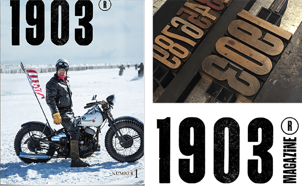
1903 is a magazine celebrating the culture of life on two wheels, and is named for the year William S. Harley and Arthur Davidson built their ?rst hog in a shed. Graham gave the masthead a handcrafted, turn of the century vibe in keeping with the name.
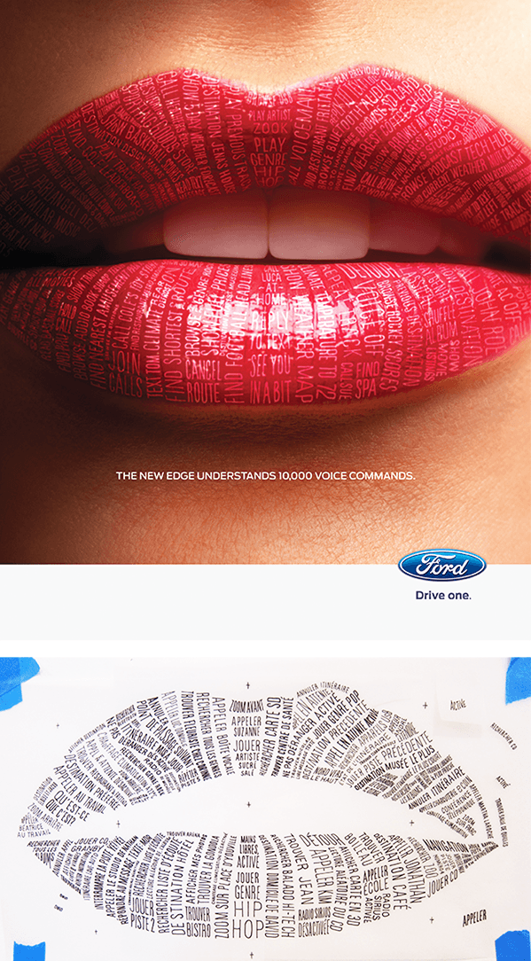
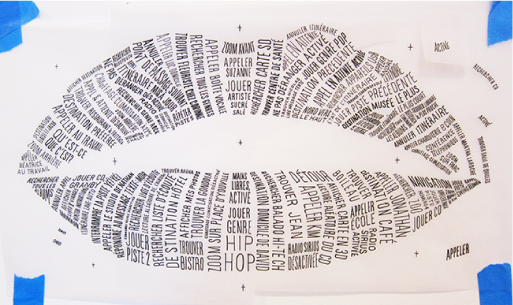
This is one of several labor-intensive ads designed to showcase the new MyFord Touch driver connect technology. Work in progress is shown below.

Die-cut dots ?oating free from their respective “i’s” reinforce this client’s namesake for truly independent creative thinking. The typewriter font is a nod to the tradition of his craft. Meanwhile, the business cards’ ?ourescent colored cores and edges help to highlight the otherwise white background.
We picked his brain about his experience with branding and type, and here are his answers:
How did you get into branding?
My background is from the creative ad agency side of the business. A large part of that job was creating the look and feel for major advertising campaigns. It seemed a very natural progression to go from short-lived campaigns to a more holistic expression of a brand. I started by working on smaller projects for friends and family and worked my way up, based on those successes to larger projects and bigger brands.
How important is a strong background in type to successful branding?
VERY important. Good typography is the cornerstone of good graphic design. What I like most about typography is that it is a discipline with a lot of rigor. By starting with a few basic assets; good fonts, a grid, and a color palette, we can start laying the foundations and creating a brand visualization. A strong brand identity is based on relevance, clarity, and consistency. Expressing a clear business strategy will be attractive and inspire confidence for folks inside the organization as well as the target audience.
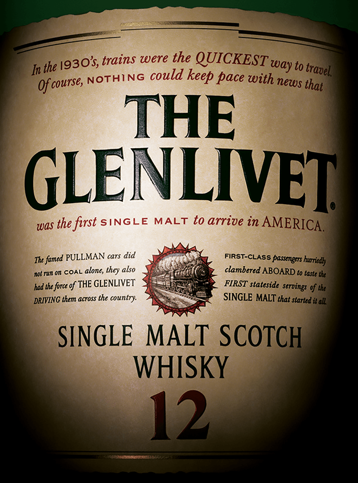
This nectar takes 12 or 18 years to mature, but the ads were given only a few weeks to complete. Crafting type and layout faithful to the original labels, the results were printed, embossed, foil stamped, die-cut, wrapped around the bottles and photographed.

This co-promotion between Stella Artois and Turner Classic Movies mixed behind-the-scenes facts of well-known ?lms with the exclusive 9-step pouring process of the Belgian elixir.
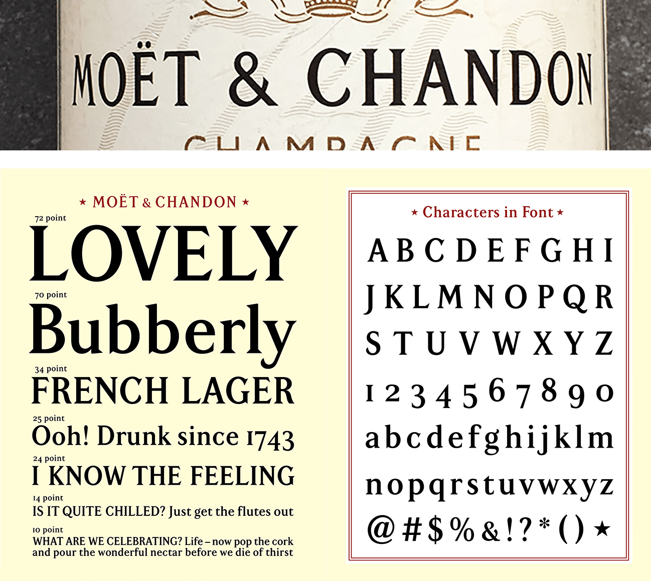
Kirshenbaum Bond wanted to infuse their campaign for Moët & Chandon with true branding sparkle by having Graham create a complete font from the logo’s custom-drawn letterforms – of which there were only ten caps.
Who was your most important role model or inspirational figure?
I have been very lucky to have worked with some great people in this business and learnt so much from them. But I probably learnt most and continue to do so from an old boss of mine in London, a copywriter by trade. Dave Trott trained at the Pratt Institute in New York City and had a sparkling creative career in London. In 2010 he wrote Creative Mischief, followed in 2013 by the release of his book Predatory Thinking: A Masterclass in Out-Thinking the Competition. In 2016, Trott’s third book One +One = Three was released. Check out his blog.
What was your favorite project?
My favorite project is always the one I’m working on at the present time. It was American poet Henry Wadsworth Longfellow who said “We judge ourselves by what we feel capable of doing, while others judge us by what we have already done.”
…most challenging?
There is ALWAYS a challenge with every project. Whether the challenge is the brief, the budget, timing, resources, implementation, client buy in, audience buy in… etc. That is what makes projects the most interesting. You have your process that you go through but there are always outside factors that need some creative resolution.
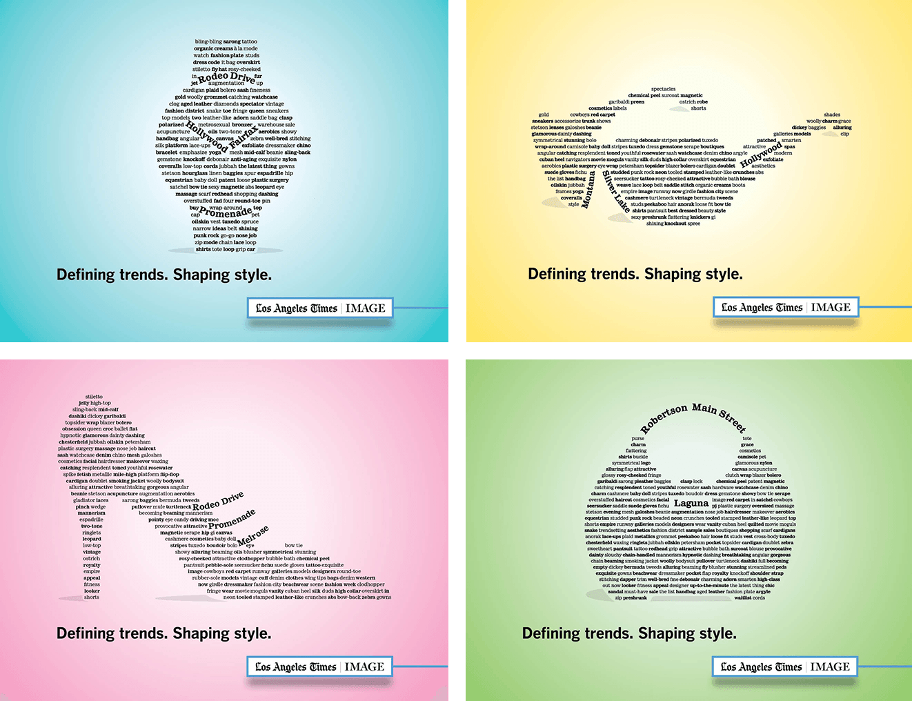
When the LA Times was looking to create typographic illustrations of fashion accessories for the launch of their new Image section in the Sunday edition, they gave Graham a call.

One day a year, New York City dwellers are encouraged to pick up a broom and help clean up their streets, playgrounds, and immediate living environs. Graham’s firm created these posters with antique wood block type using under-inking, grain and printing on newsprint, which helps impart the necessary gritty energy.

This agency is known for its no nonsense approach and hard-hitting creative solutions. With Sally Hogshead, Graham created an identity to reflect its name: an advertising factory, but a modern, accessible model.
Any advice for designers wanting to get into branding?
Lots of advice;
- Always start a project by defining a clear strategy, because better planning leads to better outcomes.
- Learn to write. We are visual people but that is easy, it is hard to write your ideas out rather than sketching.
- Read books. This is particularly helpful when it comes to presenting work. Think of your presentations as a story and take the client on a journey with you.
- Read the business pages of the daily newspapers. Understand the business challenges companies are going through and think about how design might solve those challenges.

When the Dos Equis “The Most Interesting Man in the World” ad needed some typographic styling, they turned to Graham. The campaign picked up a Lion award at Cannes, and sales picked up 17%.

Letterhead and ad for Working Class retail store.
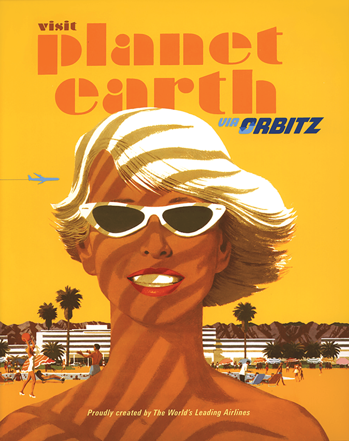
One of several travel posters designed for Orbitz. This led to weeks of researching, reviving and redrawing fonts from a bygone era – but, curiously, no actual traveling.
Any good stories?
Oh yes, plenty of good stories. One of my favorites was working with the musician Moby on the packaging for his Teany brand. We had three very distinct directions. Comps were created, we had a great presentation but he couldn’t decide on a direction. I was presenting to him in his loft in NoLita. All of a sudden he jumped up, grabbed the bottle comps and shouted “follow me!”
We marched down to his corner deli, he said hi to the owner and he walked over to one of the beverage coolers. They were packed with every beverage and color/design you could think of. He placed the three directions at different positions on the shelves. We stepped back, turned our backs to the cooler. He said turn around, and one of the designs stood out and the other two regressed into the sea of same. It taught me to think about the end user. It is too easy to design in a bubble and not think about the environment where your design will ultimately live.
Oh!! …and there was the time I was held at gunpoint by a group of army guerillas in the Democratic Republic of Congo. But you’d have to buy me a beer to get that story ;-)
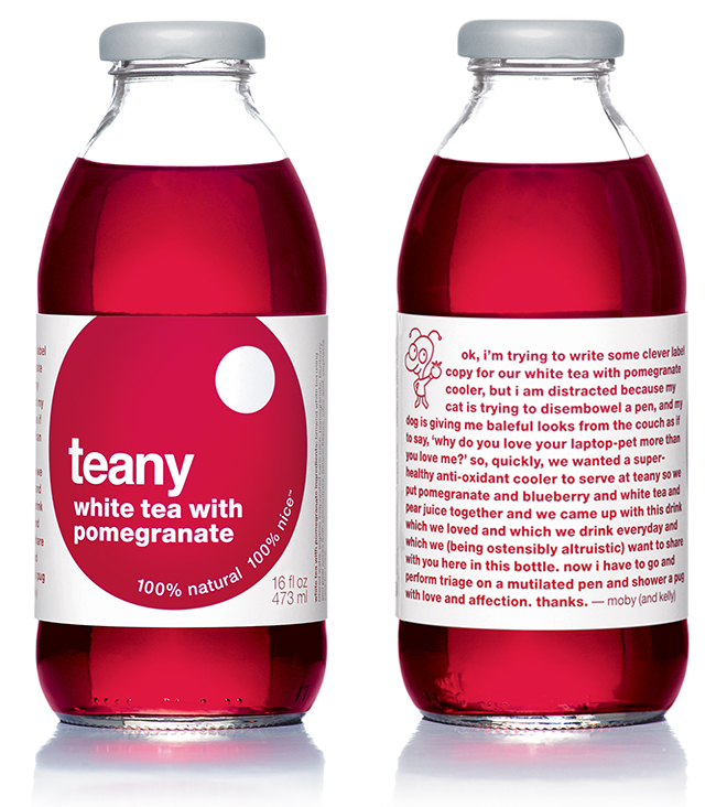
The packaging for Moby’s tea and fruit beverages features a quirky character and copy created by the musician himself.
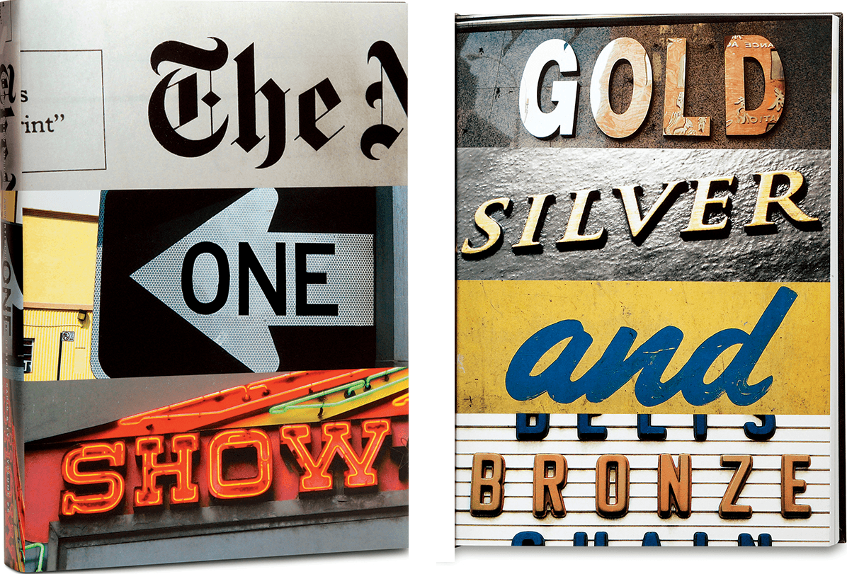
Cover and interior page from the One Show Annual. It went on to become the best-selling annual in the history of the One Club.
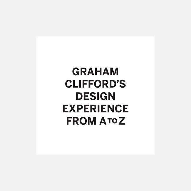
Graham has created brands for clients, from A to Z (almost).
This article was last modified on August 9, 2019
This article was first published on July 18, 2018
Commenting is easier and faster when you're logged in!

Recommended for you

Vintage Print Magazine Covers
Print magazine has been in business since 1940, showcasing creative excelle...

Variable Fonts: the Future is (almost) Here!
Ever since the demise of hot metal typesetting and the eventual rise of digital...

How to Make Multiple Social Media Posts in One Photoshop File with Artboards
Here’s how you can use artboards to make social media graphics perfectly s...