


Typographic ornaments used to be a design staple back in the days of metal type, but they’re not part of the standard modern page-layout kit. While there are scads of pi fonts with all kinds of oddities (see “Easy as Pi”), buying a new font for a couple of characters may not be the best use of your money. So fake it! Here are some recipes for a handful of common—and not so common—typographic ornaments and decorative rules that you can adapt to all sorts of design situations.
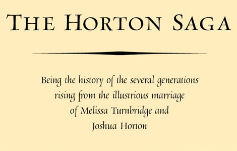
Figure 1 shows an ornament that you’ll probably recognize from books of yore. If it has a name, I don’t know it, but it’s easy to create by distorting a character from the Zapf Dingbats or Wingdings fonts.
Figure 1. The elongated shape under the title is simply a concave-sided diamond stretched to extremes.
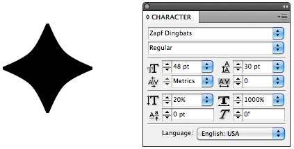
To distort a character this much, you have to manipulate both its height and its width. In Adobe InDesign, I started with the character shown in Figure 2 and in the Character palette reduced its height to 20% of normal and increased its width to 1000%. To get the same effect in QuarkXPress, select the dingbat, then choose Item/Convert to Text Boxes and choose Anchored from the pop-up menu. Use the Item tool to stretch the dingbat to the desired width.
Figure 2. Starting with the dingbat shown on the left, you can either distort its shape numerically in InDesign (using the Character palette values shown here) or, in QuarkXPress, you can convert it to an object and stretch it by dragging its frame handles.
Some fonts, such as Zapfino, include a handful of ornaments, a couple of which I used to create the retirement-party wine label shown in Figure 3. The calligraphic curlicues and the ducks are straight from the font, although I had to set the ducks on the left in their own frames so I could flip them into mirror images of the ones on the right.
Figure 3: The ducks and centered curlicues come straight from the Zapfino font. But I made the narrow border elements manually by distorting alphabetic characters.
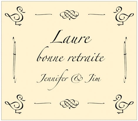
I created the narrow border elements using a technique similar to that outlined above. The vertical ones started life as a single Zapfino ff ligature set at 8-point, centered in its own text frame. Once I inflated its height to 600% and slimmed its width to 75%, I obliqued it slightly to get it looking vertical. Then I made a copy of it and flipped it horizontally to create a mirror image for the other side of the label.
The horizontal elements started out as an Arno Pro medial s (the antique form of the character that has ascending and descending parts), but for as unrecognizable as it’s become, I could have used an integral sign, such as the similarly shaped one from Symbol. In this case, once I slimmed the 10-point s by expanding its height to 400% and reducing its width to 25%, I rotated its frame by 90 degrees and made a copy, which I flipped. Once these were positioned at the top, I selected them both, copied and pasted them, and moved the duplicate pair into position at the bottom as a unit.
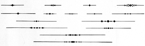
Figure 4 is from a 1932 type-sample book produced by a New England shop that set metal type using the Monotype system. The decorative rules may look a little dated, but they—or something like them that you cook up yourself—can still be useful.
Figure 4: You can duplicate these Monotype metal rules with little effort using common pi characters and rules.
I created the characters in Figure 5 using a series of characters centered on the measure.
Figure 5: You can create these Monotype-style decorative rules the way you string beads: Set the dingbats and then set a paragraph rule or underscore that runs through their centers.

On top, the same diamond that appears in Figure 1 has been stretched horizontally to a mere 200%. Then, using the Paragraph Rules dialog box from InDesign’s Paragraph menu, I added a 1-point “rule above” with an offset sufficient to center it vertically across the center of the diamond. To extend the rule left and right, I added negative-value left and right indents.
In QuarkXPress, use Custom Underline from the Style menu to specify your rule weight and an offset that will vertically center the rule. Control the length of the rule by adding spaces before and after the dingbat. This technique doesn’t work in InDesign because the program doesn’t take the spaces after the dingbat into account when it centers the expression, forcing the whole thing off-center to the right.
The middle rule in Figure 5 consists of two Zapf Dingbat diamonds flanking a bullet that I stroked and filled with white. Because these characters are different sizes, I used baseline shifts to center them all on the rule. The bottom sample uses double-headed arrows and bullets to flank a bullet that I stretched 250% into a bead shape.
The point of all of this is that you have a lot of shapes at your disposal in everyday fonts and that they’re plastic. Even common characters can be distorted into abstract decorative forms. So don’t hesitate—decorate.
This article was last modified on August 12, 2021
This article was first published on April 5, 2011
Commenting is easier and faster when you're logged in!

Recommended for you

How to Create Beautiful Tables: Controlling Row and Column Spacing
In this new series of articles we’ll be looking at several key techniques for ma...
Russian Constructivism and Graphic Design
Russian Constructivism was an artistic philosophy with a distinct design style t...

Scanning Around With Gene: Fair Use Goes to the Movies
This week, I planned to look at type designs in the movie “Citizen Kane....