

Like so many, I had a love/hate relationship with my father when he was alive, and this has lead to a healthy dose of psychotherapy and a rather strange fondness for Zagnut candy bars (see Figure 1). Here is a man who, at the dinner table and often in front of guests, did insulting imitations of Jews, Blacks, Mexicans, Gays, New Yorkers, our neighbors and anyone else who was different than him. He worked hard to bury his own Polish ancestry, and when my mother finally banished pickled pigs feet and sauerkraut from the house, he had little left except his highballs and excessive pride in his kids. But I must admit, he had great penmanship. And that behavior affected me in a wholly positive manner.
The further I explore the printing methods of the past, the more I realize how valuable a disciplined study of hand-lettering can be to successful communication in any era. During the time of hot metal composition, the type choices were extremely limited by today’s standards, as were the options for modification. As a result, good designers regularly hand-lettered distinctive headlines, logos and type illustrations. Some still do, of course, but on the whole the art of hand-lettering has been diminished, and along with it some of the personality and distinction that endears us so much to vintage design.
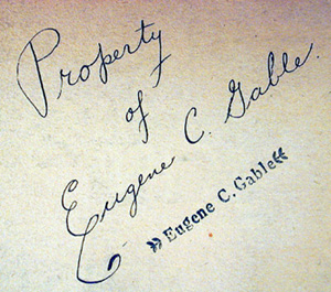

Figure 1: Even at the age of 13, my dad showed a flair for flourish, as shown in his signature at the time. Sadly, I inherited only his love of Zagnut candy bars.
My father’s skills at hand-lettering were moderate, at best, but he did teach me early on that you have to block out your text layout in advance and that readability is the most important goal of the letter artist. He was clearly influenced by a high-school study of mechanical drafting, which is still where many of the best type designers get hooked on letters. He put these skills to ready use throughout his career, whether it was making signs for the supermarket where he worked, or creating educational props for my school-nurse mother as she traveled around Los Angeles teaching children about the dangers of germs and the value of good lighting. (see Figure 2)
I never learned my father’s patience for detail, so I’m not a good letterer, but I do think I picked up quite a bit more from him than just second-hand smoke.
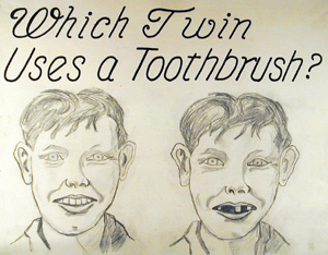
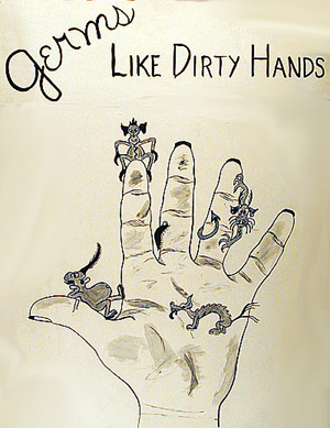
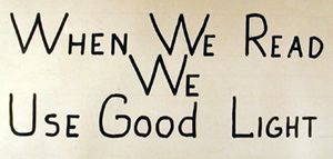
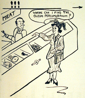
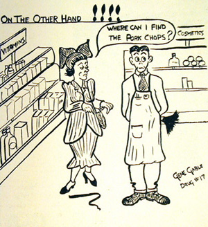
Figure 2: Whether drawing signs for my mother’s health education classes, or insider cartoons for the supermarket newsletter, my dad worked hard on his lettering, though not always successfully.
Creativity Always Begins with Technical Skill
High school drafting class may not seem like one of the best places to learn creative visual design, but I’m beginning to think that it should be a requirement for graduation. If nothing else, it would make letter carrier’s jobs much easier trying to deliver our hand-addressed mail.
At an estate sale I recently bought several drafting class exercise books belonging to Gary Johnson who in 1948 was a freshman in Mr. Dunkum’s Mechanical and Industrial Drawing I class at Berkeley High School. Mr. Dunkum, it seems, was a big fan of the letterform, and many of the exercises in his class were designed to hone student skill in clear communication and love of letters.
“The most important requirement for lettering is legibility; the second is ease and rapidity of execution,” Dunkum wrote. “From the start the student should remember that neat and accurate work is essential, that all lines, figures and letters must be clean cut and distinctive, and that the width of certain letters differ.” He insisted the students write out tidy maxims about the importance of lettering, and demonstrate their understanding of various lettering styles (see Figure 3). In my nephew’s high school drafting class today, the emphasis is on learning AutoCAD software and working the plotter.
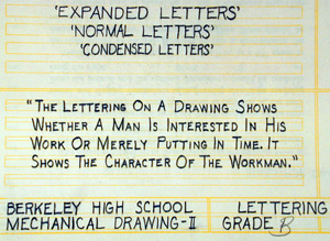
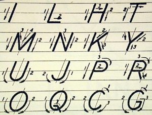
Figure 3: At Berkeley High in 1943, students of Mr. Dunkum’s mechanical drawing class were held to high standards. Here, poor Gary Johnson only got a B for these efforts.
Taking Letters One Step Further
A Drafting 101 knowledge of lettering is just a beginning, of course, as we learn from the excellent 1930s book The ABC of Lettering by Carl Holmes: “All the skill in handling tools you may ever hope to attain will avail you nothing if you do not know letter shapes and learn to display them. Carefully drawn layouts are the first step to success.”
“The only way that you can get more than an intellectual comprehension of letters is by the actual work of making them, ‘ Holmes goes on. “It is not only our privilege, but our obligation, to use any method of letter decoration, or display, which will supply interest, pleasure or shock, to win reading, and remembrance, of our message with less mental effort or to promote an easier comprehension of it by a more or less indifferent public.” He goes on to show many wonderful examples of distinctive hand lettering and the inking skills required to achieve this perfection.
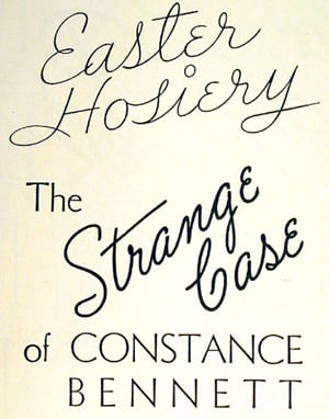
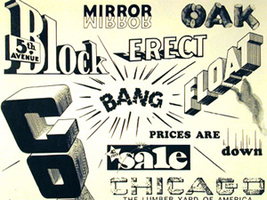
Figure 4: In his book “The ABC of Lettering,” Carl Holmes warns against getting too dramatic, but suggests you should seize any opportunity to get attention, regardless of the gimmick.
If we buy Holmes’ philosophy, the digital tools we have today are no substitute for the skills learned by letter drawing. Good design schools still teach hand-lettering, of course, but very few designers develop those skills beyond the graduation requirements.
When they do, the results are terrific, and prove again the value of composing not only pages, but words, too. I’m showing several examples of beautiful contemporary hand lettering, below (see Figure 5), and providing several links to valuable hand-lettering sites. May this inspire you to consider turning off the computer and getting out the old nib pen and a blank piece of paper. You may be surprised what you come up with.


Figure 5: There are hundreds of designers doing great hand lettering. Two who I admire are Raphael Boguslav (top) and Dan Cotton (bottom)
Links of Interest
For some great examples of hand-lettering, there’s no better place to go than to Raphael Boguslav’s Web site. He’s been hand-lettering award-winning material since 1951. You should also check out Dan Cotton’s distinctive work (see Figure 5 above).
A group of Denver sign painters started an informal group called the “letterheads” who can be found at their online community called Letterville, and also at another Website devoted to letter lovers}. There are some great examples of gold-leaf on these sites — another somewhat-lost art.
You can even take a hand-lettering class online from learntopaintsigns.com. Sign painters have always been among the best hand-letterers, by necessity. Some take the skill beyond reproduction, however, and into artistry.
I personally make a pretty big distinction between hand-lettering and calligraphy, although I can’t explain why or where the line is drawn exactly. There are, of course, many excellent sites devoted to calligraphy around the world. A good start is at The Society of Scribes and Illuminators, a British group devoted to the craft.
Read more by Gene Gable.
This article was last modified on January 11, 2022
This article was first published on October 2, 2003
Commenting is easier and faster when you're logged in!

Recommended for you

Corbis Acquires Roger Richman Agency
Corbis (www.corbis.com), a leading provider of complete visual solutions, today...

Illustrator’s Other Drawing Modes
If you use Photoshop, Illustrator, or InDesign, you ought to be familiar with bo...

Using Your Own Branding in Canva and Adobe Express
Using your own branded assets is now possible in both Canva and Adobe Express