


Typography
In the everything-old-is-new-again department, the photo-lettering pay-per-word style of typesetting has returned, thanks to House Industries. Terri Stone wrote about House’s new venture previously, but this post from PagePlane includes links to additional relevant information, including a diagram of a bygone PhotoTypositor.
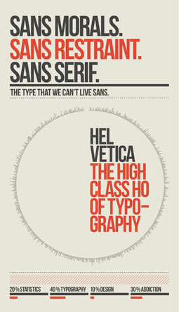
The readers of Design You Trust voted for their favorite Grotesk font, including DIN, Franklin Gothic, Helvetica, Interstate, and of course Akzidenz Grotesk. Download the set of three posters to see which font won.
Photography

Shooting photos at night requires higher ISO settings, but high ISOs coupled with slow shutter speeds generate image noise. What to do? You can start by reading Night Photography and Higher ISOs, from PhotoFocus via Jules Café.
If you’re interested in starting your photography business, Going Pro has tips for you. One piece of advice: Short-term compromises are fine, but don’t compromise your long-term goals.
And when you do start that business, don’t undervalue your services. According to Digital Photography School, you need to not only articulate why you’re worth what you charge, but also know when to walk away.
Photoshop
Photoshop has abundant tools for retouching photographic portraits—so many options that it’s tricky to know which ones to use. This seven-minute video from PSD Tutorials shows how to remove red-eye, use the Mixer Brush tool, and other photo-retouching necessities.

After honing your photo-retouching skills, take a look at these exemplary examples of retouching, courtesy of DesignM.ag.

The pixel-slingers I used to hang around with regarded Variations with scorn. No way could an application beat their gray matter when it came to making decisions about curves, levels, and saturation. Thankfully they never found out that I secretly used Variations in hurry-up situations. I’m relieved that Tip Squirrel finds Variations useful, too. Read how to get the most from this oft-maligned feature.
Drop shadows in Photoshop were once the trick du jour, but they seem to have fallen out of favor, possibly because the effect was too often applied in a heavy-handed manner. Method & Craft restore dignity to the drop shadow with a technique that yields a subtler effect.

If you’re interested in High Dynamic Range (HDR) imagery but want to avoid jumping through too many hoops, Digital Photography School has the answer. Learn a simple and fun way to create a realistic HDR image.
Web
Baseline grids aren’t just for laying out print pages. Web designers can benefit from them too, as this video from Method & Craft shows.
Those who design for the Web are all too aware of the need to adapt sites for display on smart phones, tablet computers, and so on. Rather than recreate sites for each type of device, wouldn’t it be nice to design once, display many? That’s the idea behind responsive design: “The responsive, flexible, or adaptive design… makes your new beautifully crafted design viewable on any device, regardless of its screen orientation or resolution.” Read more here, via Design You Trust.
“Content precedes design. Design without content is decoration,” said Jeffrey Zeldman in a talk entitled “What Every Web Designer Should Know—A Better You At What You Do.” Read a summary of the talk and learn how to distinguish yourself as a designer when everyone is using the term.
Page Layout
InDesign Secrets posted two nifty text-editing techniques. First, David Blatner shows how to delete text using the Find/Replace feature in InDesign. Next, Keith Gilbert reveals how to use notes to hide text in a layout. Why would you want to do that? Read and find out.
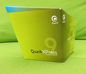
The release of QuarkXPress 9 comes with a bold new packaging concept for the software: an angular, trapezoidal, how-does-this-fit-on-the-shelf kind of thing. Planet Quark has the skinny on the unusual design.
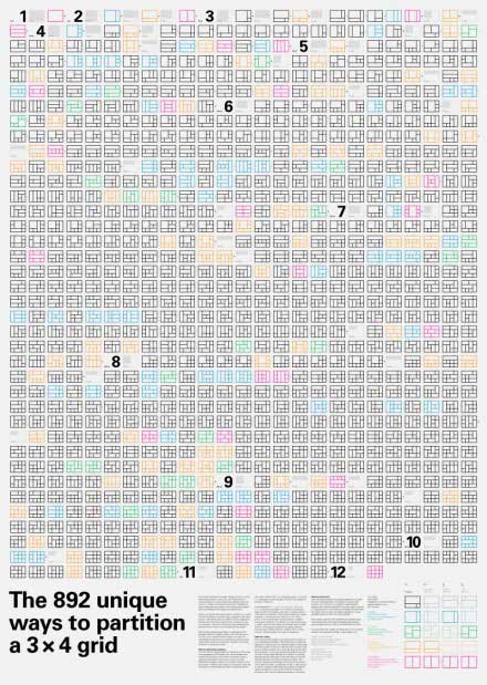
I’m including this one under the category of page layout, although the principles behind it apply to all disciplines. Underlying most design is the grid, a system that provides structure and rhythm to the page or screen. Combine a 3×4 design grid with computer algorithms, and you get 892 unique ways to partition the grid. Designer Hugh Dubberly created a print poster of all 892 variations of a 3×4 grid (his post explains the concepts behind the project as well). Design Observer also posted a video that cycles through all 892 variations in 100 seconds. It might inspire you to break out of the usual grid.
Illustrator
With the rise of CSS to create websites, there’s not much need to slice graphics. But Mordy Golding believes that slicing still has its place. In this post from Real World Illustrator, he makes a good case as to why slicing still matters in Illustrator.
Creative Business
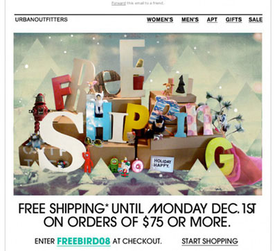
Social media may be the new marketing darling, but email newsletters are still an effective way to reach customers—as long as your missive is designed well. Noupe showcases some good-looking newsletter designs that are sure to capture attention.

Speaking of attracting attention: HongKiat posts 25 innovative resumes that will make any client or recruiter take a second look.
I’m loving this list of “50 things every graphic design student should know” because the advice applies not just to recent graduates but also to, well, everyone. For example:
#1. You are not the first.
#28. Never work for free.
#44. If you’re going to fail, fail well.
And here’s more advice, this time from those at the top of their game, namely the elite creative pros at Target. In this post on Fast Company Design, they share their top five lessons for managing a $35 billion brand. It sounds so simple…
I don’t have much to add to this Creative Freelancer blog post entitled “Too old to be a designer?”. Sigh.
When searching for a commercial printer, you may be swayed to contract with a shop advertising that it’s “environmentally certified.” But that designation doesn’t mean the shop is a greener printer. Wausau Papers’ Digital Space blog explains.
Miscellany

This story warms the heart: a 76-year-old Chinese man, who learned Photoshop at the age of 60, now restores the damaged photos of his countrymen for free. Read about the kind and generous BaoJun Yuan on Design Inspiration.
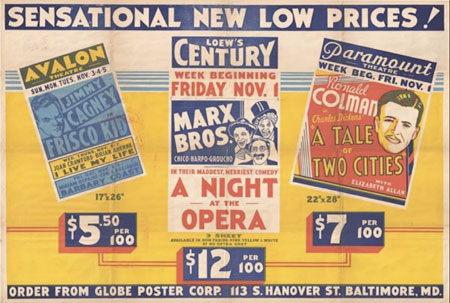
Artists like Etta James, B.B King, and Dizzy Gillespie had their publicity stills and concert posters printed at Globe Poster in Baltimore. The 80-year-old shop, once destined for the scrap heap, is now a part of the Maryland Institute College of Art. Listen to National Public Radio’s audio report about the printer and see a slide show of its posters.

The next time you eat a handful of M&Ms, consider the candy’s color palette. Those aren’t Pantone colors, but colors standardized by the Food and Drug Administration. Those blue M&Ms? That’s FD&C Blue No. 2 “Indigo Carmine,” according to idsgn.
If you use an inkjet printer, then you’ll be fascinated to know what’s in the ink you fork over so many ducats for. Would you believe 95% of that ink is water? Via Unplugged.
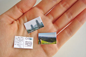
Do good things come in small packages? Ask your friends after you’ve made and sent them the world’s tiniest postcard. PhotoJoJo via CRAFT.
This article was last modified on January 18, 2023
This article was first published on May 5, 2011
Commenting is easier and faster when you're logged in!

Recommended for you

The Final Frontier of High Resolution Printing
When it comes to printing, what does the term "high resolution" mean t...

Typography Tips From the Pros
David Blatner asked eight type titans to disclose their dos and don’ts.

Scanning Around With Gene: Getting Your Kinks at Home
One of my favorite magazines, at least from a vintage perspective, is Popular Me...