
The Art of the Menu
Pamela Pfiffner explores the world of designing and producing restaurant menus.


This article appears in Issue 73 of InDesign Magazine.
When sitting down at a restaurant, most diners don’t think twice about the design of the menu. They want to know what the dishes are and how much they cost. A well-designed menu provides that information clearly and packages it in a graphically appropriate fashion. It communicates and entices while reflecting the personality of the restaurant. But there are a lot of, er, secret ingredients that go into that recipe. The right menu design can lead to a more enjoyable dining experience for customers and increase profits for a restaurant.
Tasteful Designs
Menus challenge designers with their compact format, strict typographic hierarchy, and legibility requirements. And the menu’s design must easily adapt to changes brought on by seasonal transitions, ingredient availability, or chef’s whim. How designers approach the task of creating restaurant menus is what inspired Armin Vit to create The Art of The Menu, a blog produced under the umbrella of Under Consideration, a design-oriented website founded by Vit and Bryony Gomez-Palacio. “Since I am constantly viewing and reviewing design work, there was a week or two where, by serendipity, I noticed a bunch of really cool menus, and I thought it would be cool if there was a blog dedicated to showcasing them,” Vit says. 

Canon Whiskey & Bitters Emporium, in Seattle, Washington, is a tippler’s paradise. To entice patrons to try its numerous cocktails and spirits, Canon hired David Cole Creative to create The Pacific Northwest’s Gentleman’s Companion, a 100-page tome of recipes for and lore about its offerings.
The type and graphics in this “gentleman’s companion” hearken back to an equally weighty Sears & Roebuck catalog. The Art of the Menu says:
“Nine months of development led to this 100-plus-page, hardcover cocktail book, which doubles as a menu at the bar. The intoxicating opus contains over one hundred cocktail recipes (classic and some new), authentic vintage liquor and bitters advertisements, notable sayings, and an award-winning list of vintage spirits. It looks like a lovely addition to any mixologist’s library.”
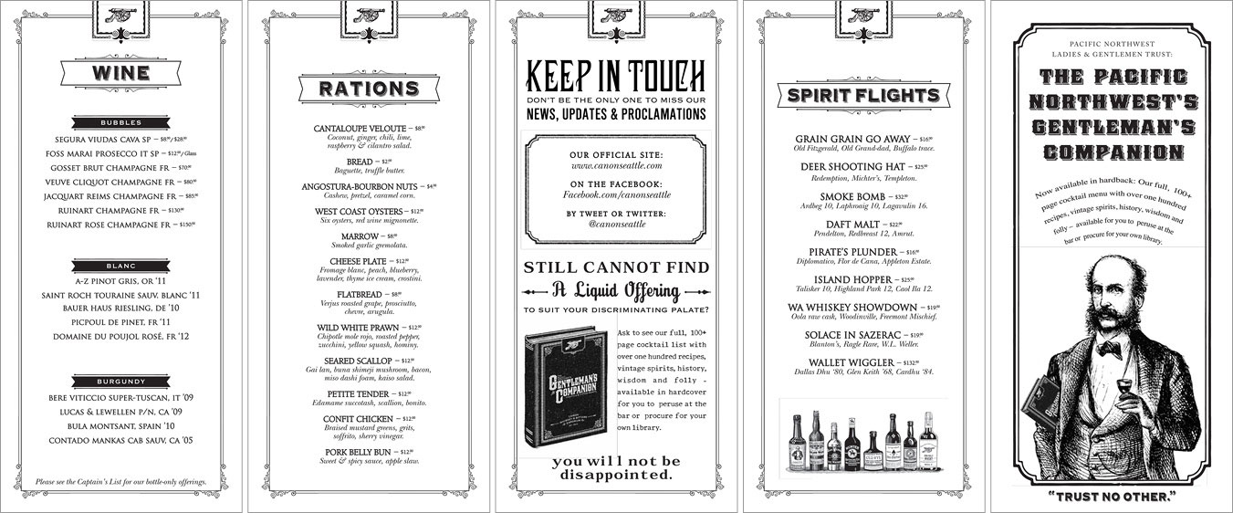
Canon soon discovered that keeping a 100-plus-page book up to date with menu changes and seasonal offerings is labor-intensive and prohibitively expensive. Cole created a smaller menu that can be adjusted and reprinted quickly and easily while retaining the look and feel of the bigger cocktail book. The Art of the Menu says: “Canon came to David Cole for menus designed to accommodate both seasonal changes and adjusted offerings. The solution combines great tactile appeal with a more cost-effective and less labor-intensive update to previous versions. Complete with custom-illustrated, antique-looking advertisements, Cole even found cover paper made from recycled beer mash, which flows effortlessly with the brand while complementing the emporium’s Angostura-stained tables and bar.”
Digging In
Capturing these intangibles is where most menu design starts. To get a feel for the enterprise, designers visit the physical site to assess the atmosphere, discuss (or sample) the food itself, and develop an understanding about how the menu can achieve the restaurant’s goals. For example, where items are placed on the menu can determine how well a product sells. DeRose says that studies have identified diner habits that a restaurant can use to its advantage, such as the arrangement of items on the page. “This requires the designer to have a conversation with the restaurant owner about what they sell the most of and what they have the greatest profit margin on,” says DeRose. “If we are serving the client well, we want more people to buy the items the restaurant can make the most money on, so we strategically place those items in areas where a patron is more likely to buy.

Six Degrees LA designed this menu for Magnolia House in Pasadena, California. The design makes good use of paragraph and character styles to make centered type readable. For the wine list, the tab leaders bridge the gap between description and price so there is no doubt as to which one goes with which. The Art of the Menu says: “Enclosed in a unique tweed cover, Magnolia House’s menu is accented with soft line drawings and sprigs of color.”

This menu for Outpost in Dallas, Texas, designed by FoundryCo., uses a grid structure to contain dish name, description, and price in a cohesive unit. The recurring triangle elements add clarity and rhythm. The Art of the Menu says: “For a tavern featuring spirits and sustenance inspired by the fusion of amaranthine American bar culture with fresh local ingredients, these menus are a modern take on old-fashioned tavern tactility. There is a balance between sophistication and accessibility in the simulated woodblock printing and distressed art deco decorative elements which have been updated with a contemporary thin-line treatment.”
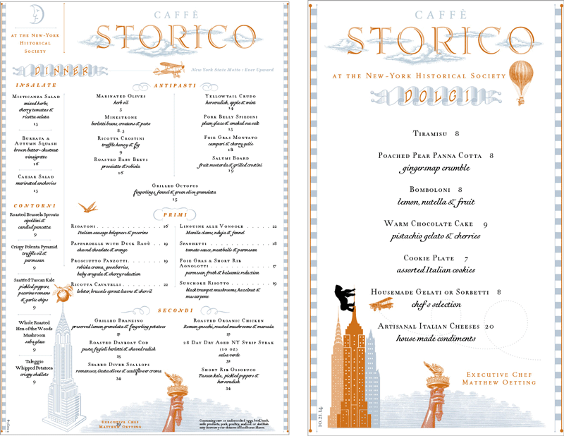
This menu for Caffè Storico in New York was designed by Roberto de Vicq, who many longtime Adobe watchers will remember as one of the talents behind the InDesign-produced booklet Words at Play and the creator of the poster celebrating John Warnock and his eponymous typeface. Known for his typographic skills, de Vicq makes complex formatting and styling look classical and ethereal. The Art of the Menu says: “Step onto cloud 9 at Caffè Storico, located in the New York Historical Society Museum. The menu features fantastical imagery floating through dreamy typography, establishing a halcyon atmosphere beyond the bounds of time.”
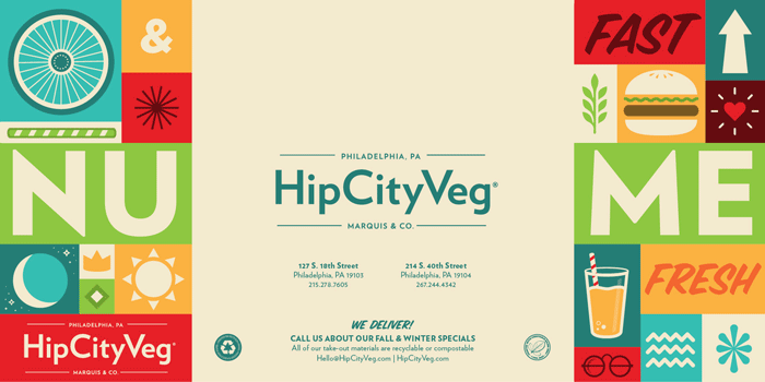
“HipCityVeg [in Philadelphia, Pennsylvania] is an all-vegan fast food joint,” says designer Mike Smith. “I was just aiming to make something that was extremely approachable. Something that was vegan but didn’t feel vegan at all. I wanted to make something that guys would feel comfortable going into and not say, ‘oh, I’m just here for my girlfriend.’ It’s a burger joint. I wanted it to feel like one. Bright, bold, and fresh.”
Because menus are meant to be handled, physical format and tactility are important as well. Smith says that he researches new printing and folding options before commencing design. “Figuring out any sort of fold is usually my top priority,” he says. “As long as I can read it without flipping things over to find a secret drink menu, or having some crappy insert for ‘The Specials’ fall out onto the floor or something, then it’s a good menu.”

For the HipCityVeg menu typeface, Smith chose Hoefler & Co’s Verlag, a derivation of a font developed for the Guggenheim Museum.

Smith says that when he’s designing a menu, the first thing he does is research and select types of folds. For HipCityVeg, he used a gatefold layout that requires the diner to interact with the menu by opening it yet that keeps the relevant information on one page.
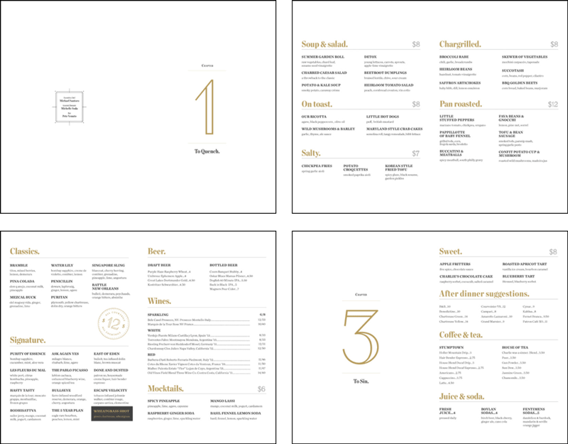
The menu for Charlie was a sinner. is presented in the form of a book. “Charlie was a sinner. is an all vegan small plates/bar,” says Smith of the Philadelphia-based restaurant. “I was trying to capture a turn-of-the-century vibe with a little bit of mysteriousness to it.”

Because Smith wanted the menu to feel like “an old book,” he used literary devices like a title page and chapter openers to create logical groupings of food and drink. Adding vintage line illustrations of flora enhances the timeworn aesthetic.
“I used Chronicle Condensed from Hoefler & Co. for a majority of the brand because of its quirky romantic vibe. It feels slim and sexy,” says Smith. Other fonts used were Numbers and Packard Antique.
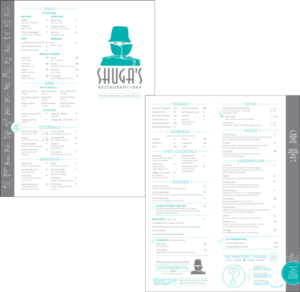
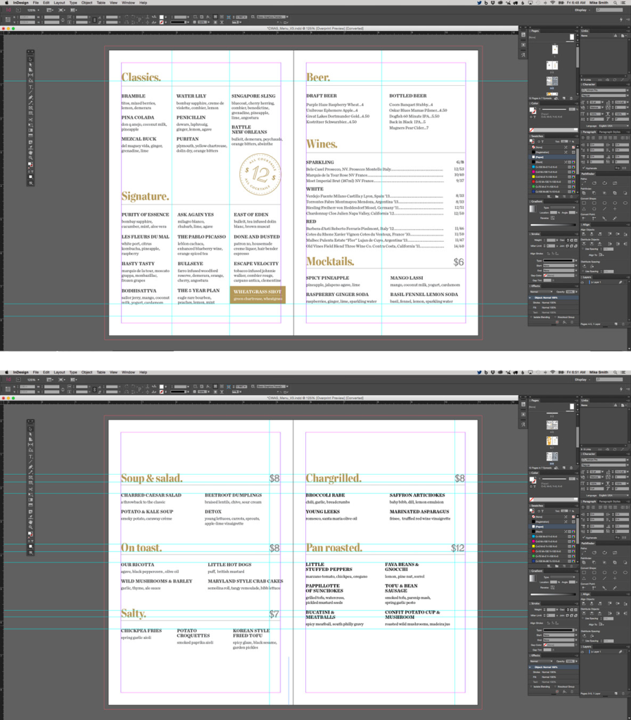
For Shuga’s, an intimate bistro in Colorado Springs, Colorado, Fixer Creative designed a slim menu with an off-center fold. The exposed tab provides a space for diagrams that show how to fold Shuga’s iconic origami birds. The Art of the Menu says: “Shuga’s is not just a restaurant, it’s an experience. Intended as a map, of sorts, for regulars and newcomers alike, this charming, yet cheeky, menu manages to say, ‘You must be new here,’ without a trace of disdain.”
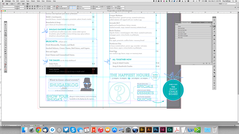
Precise positioning of prices is critical not only to avoid diner confusion but to provide visual cohesion. For Shuga’s menu, DeRose relies on InDesign’s table tools to align numbers with the text and with each other.

In creating the typographic hierarchy, DeRose relied heavily on InDesign’s character styles. Section titles and prices are Futura, and item names and descriptions are Georgia.
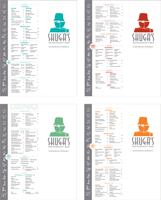
Shuga’s menu changes quarterly, so Troy DeRose updates menus with different colors for each season. Partner Sara DeRose adds, “This is a boutique restaurant that is a local favorite, and while it has signature dishes that always stay on the menu, the chefs come up with new dishes, bring back old favorites, and highlight seasonal food about four times a year. They called on us to update some design elements as well as change up their dishes, which often requires changes to the overall layout of the menu, such as adding a section of hot drinks in the winter.”

Tag Collective designed this menu for Zito’s Sandwich Shoppe in Brooklyn, New York that manages to recall delis of old while projecting a thoroughly modern feel. Dotted and double-lined rules add graphic punch. The art of the menu says: “We see a lot of crazy type combos on AotM, but this casual script, condensed sans, and sculptured logo make for a great plate.” Another Art of the Menu posting for this menu simply says: “The goomba of sandwich aesthetic.”
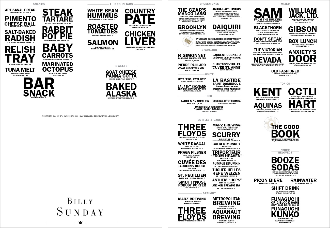
Patric King of Chicago’s House of Pretty designed these menus for Billy Sunday, a cocktail bar in the Logan Square neighborhood with an ever-changing cocktail menu. The typography was designed for the web first, utilizing jQuery’s SlabText plug-in to create big, bold typographic blocks, and was hand-set later in InDesign for the bar’s printed pieces.
The Recipe for a Great Menu
If you are contracted to design a menu, Vit offers these words of advice: “Avoid doing things that are hard to update or even hard to replicate. If menus start breaking down, tearing, or disappearing, can you easily do new ones? In terms of the actual menu content, it’s all about clarity: tell me the name of the dish, tell me what it has if the name doesn’t explain it, and tell me how much it costs, all in a single bundle of information I can follow along in dim light.” In the end, the effect of good menu design is subliminal. On the other hand, poorly designed menus can leave a bad taste in your mouth. “I’ve dined at restaurants where the menus are too big, are hard to handle, and clutter up your table. I’ve seen menus full of effects and extraneous design elements that cheapen the experience,” says DeRose. “Both make me think the company didn’t think about my experience at all. If they didn’t think about my experience dealing with the menu, what does that say about the food I’m about to eat?”
Commenting is easier and faster when you're logged in!

Recommended for you

Women Type Designers
How women emerged from the shadows of the past and left their mark in the world...

Behance Artists Spotlight
Behance portfolios aren’t just a place for you to showcase your talents an...
InDesign Magazine Issue 135: Use With Caution
We’re happy to announce that InDesign Magazine Issue #135 (July 2020) is now ava...