
Animating PowerPoint Charts and Tables
Techniques and hacks to bring your presentation data to life


This article appears in Issue 28 of CreativePro Magazine.
PowerPoint’s built-in animation tools are rather easy to use for basic chart animations such as bringing in a series of columns on a column chart. (For tables, you’re pretty much stuck with animating in or out the entire chart, but we’ll get to that in a bit.) If you want to extend the animation capabilities of PowerPoint for charting, you’re going to have to get your hands a little dirty and break some rules, but the results will impress and most likely lead your audience to wonder whether you’re really using PowerPoint at all.
Basic Chart Animation
Let’s look at a basic entrance animation for a column chart in PowerPoint (and it must be a true PowerPoint chart rather than an image).
After selecting the chart, head to your Animations tab, where you can select any desired entrance animation—for example, click Wipe (under Effect Options, leave the default Direction setting of From Bottom). You’ll see a quick preview of the animation applied: The entire chart wipes up as one object. If you want something a little more granular, go to the Animations pane and click the expand arrow under Effect Options to reveal your Sequence options. You can change the Sequence options in the Effect Option pull-down menu to By Series, By Category, By Element in Series, or By Element in Category. It is also here in the Animation pane that you’ll see how each grouping and/or item has its own entry. And from here, you can edit each animation as needed—for example, you can have the first four categories
come in separately on clicks, but the rest come in all at once (Figure 1).

Figure 1. Use PowerPoint’s standard animations to bring in elements of a native chart.
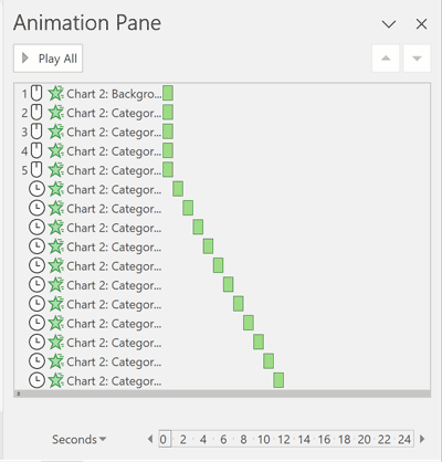
Figure 2. The Animations pane (Windows) gives you a true animation timeline, which makes adjusting timings far easier than in the macOS version.
Morph and More Detailed Control
The basic animation detailed above will keep your data editable and is often what you are looking for. But if you want to take things further with finer control and even animate between two different charts, you’re going to need to break your chart apart into shapes. If, for example, you want to use the Morph transition to grow/shrink one chart to another, converting your chart to shapes is the only solution, as Morph doesn’t currently support live charts. For example, let’s look at how to morph a column chart with data from 2011 to a column chart with data from 2021 across two slides. First, create both of your charts, one per slide, format them as you like, and make sure they are equally sized. Copy your first chart, and move the original onto the pasteboard to get it out of the way. Leave it stashed there in case you need your original data later. Right-click the slide, choose Paste Special, and select Picture (SVG) (Figure 3) to paste your chart back on the slide as an SVG. Note that you may need to resize your new SVG, because it will be smaller (macOS) or larger (Windows) than the original chart. Repeat the above steps with your second chart on the second slide, and resize things so that the two SVGs match each other perfectly.

Figure 3. To prepare for breaking a PowerPoint chart into individual shapes, first copy or cut it, and then use Paste Special to paste it back onto the slide as an SVG.
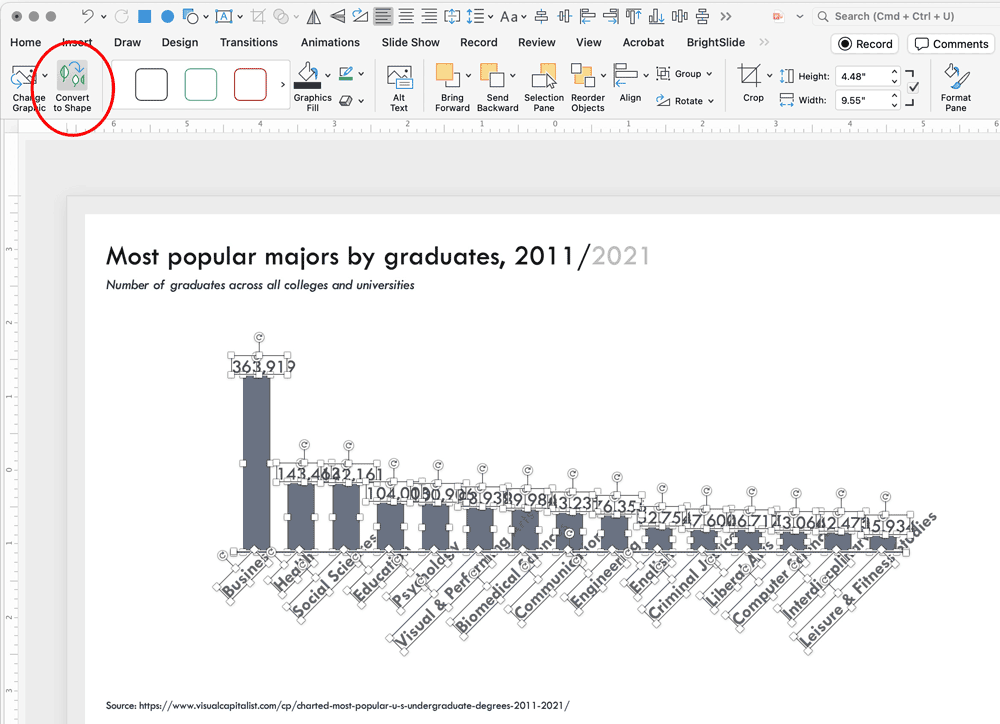
Figure 4. Use the Convert to Shapes tool under the Graphic Format tab to break your SVG apart into a group of individual shapes, then ungroup the group.
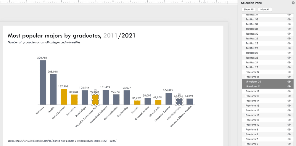
Figure 5. Use the Selection pane to force pairs of shapes across slides to morph to each other by labeling each with the same name preceded by a double bang (!!).
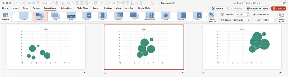
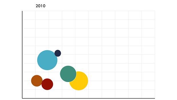
Figure 6. If you create a series of bubble charts, you can break them apart and apply Morph transitions to create an interactive-like visual timeline of changing data.
Compound Paths
Occasionally when you convert a chart to an SVG and ungroup it, you don’t end up with individual shapes, but rather a compound path. A compound path is a series of individual shapes that are combined into a single defined shape, and they cannot be ungrouped in PowerPoint. This will create problems when you want to animate or morph individual pieces of this shape. In Adobe Illustrator, it’s relatively straightforward to release the compound path into individual shapes, but in PowerPoint, we have to get a little tricky and use the Merge Shapes tool. To release a compound path, draw and place a large rectangle completely behind the compound path shape. Select the rectangle, then Shift-click to select the compound path in front. Under the Shape Format tab, go to Merge Shapes and select Fragment to break apart your compound path into easy-to-work-with pieces (Figure 7). You can delete the helper rectangle now.
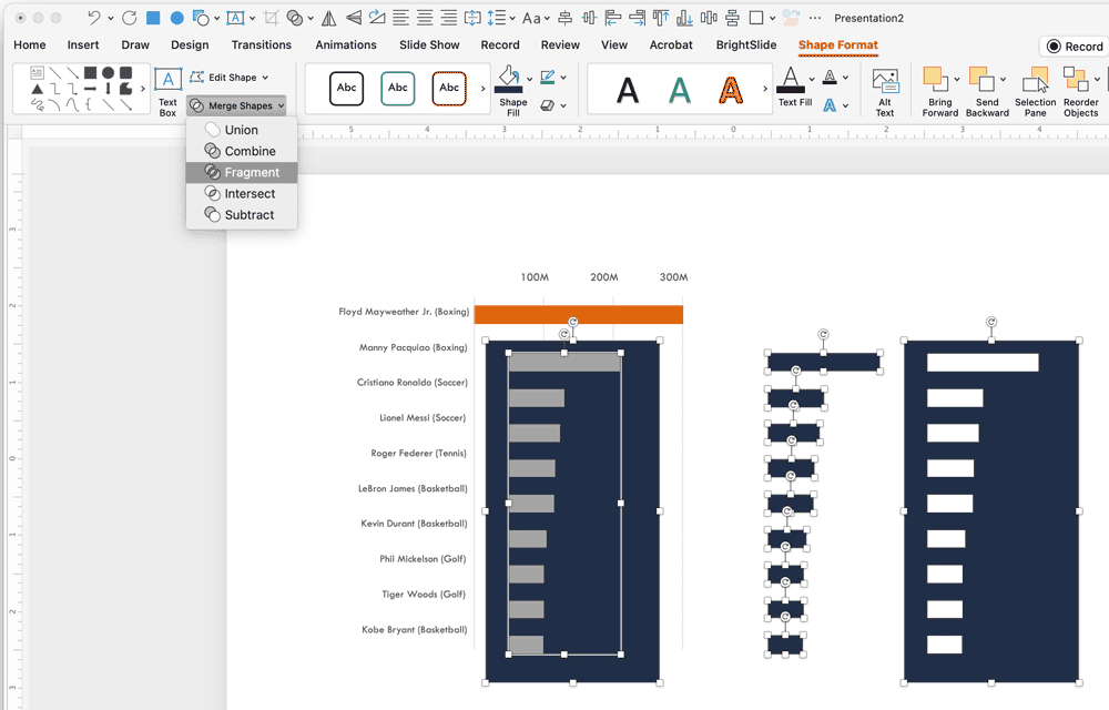
Figure 7. If, after converting your SVG to shapes, you find that part of your chart is actually now a compound path, you can use the Merge Shapes tool: Fragment to release the compound path into individual shapes that you can more easily work with.
Animating Tables
If you apply an entrance animation to a table, the entire table will animate in all at once as there’s no control for animating in rows, columns, or cells. Although there is an add-in from PPTAlchemy that will animate in parts of a table for you by placing shapes on top of your cells that are later animated out, the easier route is to simply break your table apart into smaller individual tables, rows, columns, or even cells, and then animate those pieces as desired. Breaking a table apart like this used to be a terribly time-consuming endeavor, but now you can do it with a single click by using the always amazing Brightslide PowerPoint add-in, which is cross-platform and completely free. To break your table apart, right-click it and select BrightSlide: Split Table, and then select Split into Rows, Split into Columns, or Split into Cells. In a split second, BrightSlide will convert your table into more manageable pieces that you can then animate in using PowerPoint’s normal tools (Figure 8).
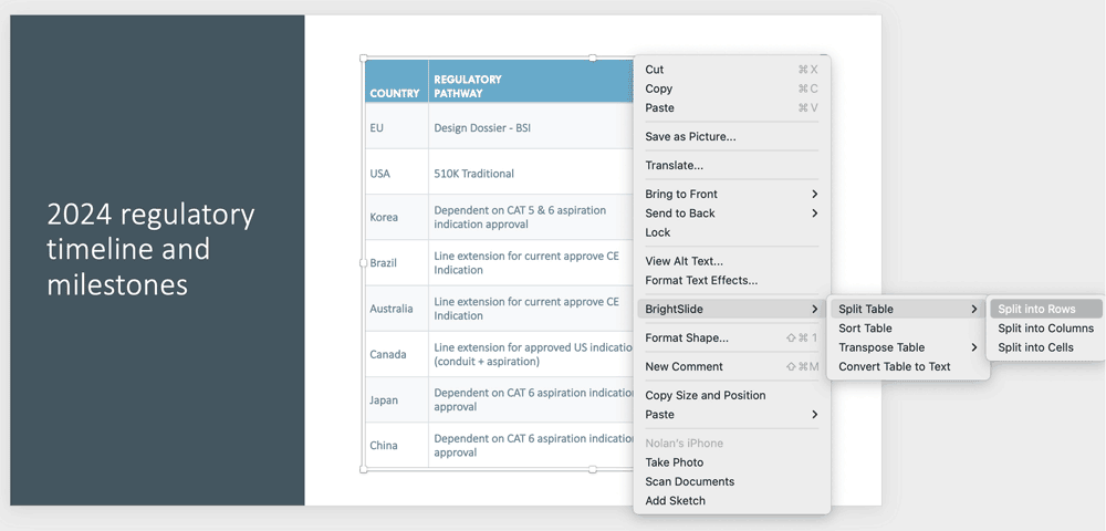
Figure 8. If you have the BrightSlide add-in installed, you can right-click any table and split it into rows, columns, or even cells.
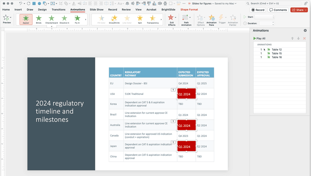
Figure 9. By splitting a table into cells using BrightSlide, then layering certain cells over an original copy of the table, you can emphasize those certain cells by formatting them, and then animating them in.
Bringing Your Data to Life in PowerPoint
For most presentation designs, I recommend using a light touch with animation. Use it only if it helps tell your story (rather than adding it for the “cool” factor, which fades very quickly after a few slides). But when it comes to data, very often the sheer amount of information in a chart can be initially overwhelming to an audience. Using PowerPoint’s built-in chart animation features can help a presenter tell a complicated story clearly, by breaking charts and tables apart to achieve more engaging and effective results.
Commenting is easier and faster when you're logged in!

Recommended for you

InDesign Magazine Issue 79: Tablet App Solutions
We’re happy to announce that InDesign Magazine Issue 79 (November, 2015) is...

Extensis Launches Next Generation Font Menu for Microsoft Word and PowerPoint
PORTLAND, Ore.—February 18, 2015—Extensis® today announced Suitcase Attaché™, a...
Creating Paragraph Styles in PowerPoint
Learn how to create text styles in PowerPoint that can be applied, edited, and g...