
Accessibility Tips for Presentation Designers
Use these quick, no-stress fixes to make your slides more accessible.


This article appears in Issue 44 of CreativePro Magazine.
Walls of tiny text, cluttered slides, garish color combinations—ugh! They’re barriers that prevent you from connecting with your audience in the ways that matter.
When your slides are hard to understand, see, or navigate, part of your audience gets left out. Some people live with low vision, hearing loss, or cognitive differences. Others struggle with screen glare, noisy rooms, or old devices with slow internet connections. You don’t always know exactly what your audience needs, but you can make sure as many of them as possible can engage with your content.
Even better, you don’t need to overhaul your workflow to do it. A few small choices—bigger and more concise text, clear structure, alternative text, and easy navigation—will make a huge difference.
Whether you use PowerPoint, Google Slides, or Keynote, the tips and fixes that follow will help you design slides that people can actually see, understand, and use.
Solving Visual Issues
Given the visual nature of presentations, vision-related barriers—whether permanent and medically based or temporary and environmentally based—can severely limit audience engagement with your message. By adding alternative text (alt text) to describe key image elements and paying closer attention to typography, color, and contrast choices, however, you can ensure everyone gets the information they need more easily.
How to write better alt text
Some individuals with no or low vision use screen readers to navigate documents. Screen readers, in turn, use alt text to describe meaningful visual elements and enhance understanding of the full document.
In other words, you need to write alt text for visuals that are important to the message you’re trying to communicate, such as:
- Images
- Icons
- Charts
- Diagrams
- SmartArt
- WordArt
Make alt text
contextual and to the point. You don’t have to write a detailed description of everything contained within an infographic or screenshot, for example; just describe the main takeaways.
Be as specific and succinct as you can. How would you quickly describe the item to someone over the phone? Usually, a few words are enough. If your slide contains objects that don’t further the story (shapes, lines, some images, anything that’s there only to make it look good), mark them as decorative, because screen readers ignore decorative objects. (For more tips on writing effective alt text, see Issue #11.)
Adding alt text and decorative status in PowerPoint
PowerPoint offers several ways to add alt text and mark objects as decorative. For example:
- Right-click an object and choose View Alt Text.
- In the Alt Text pane that appears docked to the right of your window, add your alt text or turn on the toggle to mark the object as decorative (Figure 1).

Figure 1. The Alt Text pane offers quick tips for effective descriptions.
You can also click the Accessibility: Investigate button in the status bar at the bottom left of the program window to open the Accessibility tab on the ribbon and the Accessibility pane. On the ribbon, you can click Alt Text to open that pane, or click Mark As Decorative to ignore an element. Meanwhile, the Accessibility pane will show you any suspected issues in your slideshow.
In the Windows version, you can add alt text directly from the Reading Order pane, as well:
- On the ribbon in the Accessibility tab, click Reading Order Pane.
- A warning sign next to a layer name means alt text is missing. Click the layer’s red check box to mark the element as decorative, or double-click the layer name to add alt text (Figure 2).

Figure 2. In the Reading Order pane, you can quickly mark elements as decorative or add alt text.
Google Slides alt text options
By default, Google Slides assumes visual elements are decorative. To change this, add alt text: Right-click the element and choose Alt Text, or choose Format > Format Options. Either way, type your image description in the Alt Text panel that opens. You can also click Advanced Options to add a title that will appear as a tooltip for the image.
Adding alt text in Keynote
In Keynote you can add alt text to images and videos only:
- Select the element.
- Click Format (top right).
- Click the Image/Movie toggle button.
- Add your alt text to the Description box at the bottom of the panel.
Note: Typing decorative in the Description field does not mark elements as decorative. Instead, screen readers will announce, “Decorative, image.”
Text contrast
The contrast between the color of the text and its background can make or break a presentation. Blues, oranges, and greens are notoriously difficult to work with, and poor contrast can be exacerbated further by screen glare and projecting presentations on a large screen. The optimum ratio for text contrast is 4.5:1, and several tools can tell you your slide’s contrast ratio, as well as how to improve it.
For PowerPoint, the built-in Accessibility Assistant helps you find and fix color and contrast issues. On the ribbon’s Review tab, click Check Accessibility to open it, then click Hard-To-Read Text Contrast for a description of the problem and suggested color alternatives that will meet the minimum contrast ratio. Click a color to apply it (Figure 3).

Figure 3. The Accessibility Assistant pane lists the type and number of issues found in your slides (left). Click an issue for a description of the problem and suggested fixes (right).
PowerPoint also includes a High-Contrast Only toggle in its color picker. Turn it on to hide colors in the picker that would provide insufficient contrast (Figure 4).
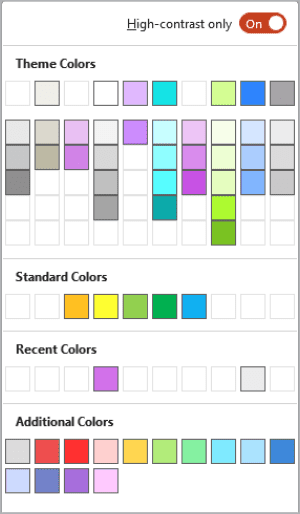
Figure 4. The PowerPoint color picker with the High-Contrast Only toggle on
Plus, the free BrightSlide add-on for PowerPoint includes a color contrast checking tool. To generate a slide with a report of safe color combinations, go to the File & Masters section of BrightSlide and choose Colors > Color Contrast Report (Figure 5).

Figure 5. A BrightSlide Color Contrast Report slide
You can determine the contrast between an object’s text and fill color. Select it and right-click it, then choose BrightSlide from the bottom of the context menu to see the contrast ratio (Figure 6).

Figure 6. BrightSlide enables you to check the contrast ratio of an object or between two objects.
Google Slides and Keynote do not offer contrast checking tools, but you can find free alternatives online.
AreMyColorsAccessible.com is an easy and beautiful tool you can use to check your contrast. Enter the hex codes of your text and background colors, and you’ll get a pass/fail grade for various text sizes, as well as an overall contrast ratio. Adjusting the Hue, Saturation, and Lightness sliders lets you quickly check other options.
For a report similar to BrightSlide’s, try Eight Shapes Contrast Grid.
Typography
Choosing a usable text size that works with recommended color contrast ratios is super important. What is the smallest size you should use for a 4.5:1 ratio? For Microsoft products, it’s 12 px (which equals 16 pt); anything smaller won’t be legible (Figure 7).
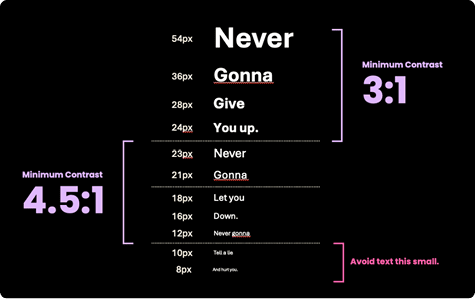
Figure 7. Minimum text contrast ratios and their associated font size ranges
You can get away with a 3:1 contrast ratio if your text is 24 px or larger. (Check out “Accessible Typography Essentials” in InDesign Magazine Issue #149 for more tips.)
Don’t rely on color alone
People who have issues differentiating colors will likely struggle with slides that rely on colors to convey information and meaning—especially colors with little contrast. Check your slides in grayscale for a close approximation of color-impaired vision.
In PowerPoint, simply click Inspect Without Color on the ribbon’s Accessibility tab. If the grayscale version is difficult to read or understand, you need to fix it (Figure 8).

Figure 8. Compare the three color slides with their grayscale versions. Is meaning lost? How might you fix them?
Sometimes that fix may mean enhancing contrast, and sometimes it may mean changing your design entirely. (“Seeing the Benefits of Accessible Color” in InDesign Magazine Issue #149 offers more advice.)
Solving Cognitive Issues
Cognitive issues are probably the most common challenge your audience will experience—whether it’s from dyslexia, ADHD, lack of sleep, a hangover, or worrying about a sick relative.
Don’t do that to your audience. When it comes to cognition-related design, less is more. Don’t overload your slides. Make each element count.
Typography
Make typography your ally:
- Choose a legible, easy-to-read font. Sans serif fonts are the best, especially at smaller sizes.
- Avoid uppercase text, or use it very sparingly. Because we read words as shapes first and as strings of letters second, using all capital letters creates a series of uniform rectangles (Figure 9). Trying to decode these slows down everyone in your audience, especially those who are already struggling with executive function that day.
- Line height and line length affect how far our eyes have to travel when reading text. Try to keep your lines less than half the slide width, and play with the line height until it feels right. Use too little height per line for the text size, and the lines become overcrowded, which adds to cognitive overload. Use excessive height, and eyes have to jump too far when returning to the beginning of the next line. A good place to start is to set your vertical line spacing (leading) between 120% and 145% of your type size. As your line length gets wider, plan to use more leading.
- Stick with left-aligned text (or the opposite if you’re communicating in a right-to-left language). Centered text is fine for a couple of words, but don’t center whole paragraphs. Avoid justified and distributed text (Figure 10).

Figure 9. Words in lowercase and uppercase create very different shapes, but the uniform blockiness of all capitals can slow comprehension.

Figure 10. Compare the readability of text that uses left, center, right, justified, and distributed alignment (which force-justifies the last line and letterspaces text).
Links
Make sure that the purpose of each link can be determined from the link text alone. This doesn’t just make it more readable, it also fills a specific WCAG success criterion.
If you’re required to use full URLs, put them on the notes page instead of the slide. Why? Screen readers announce the text on the page. If you put a really long URL on screen, it will announce every single character in that URL.
Solving Hearing Issues
If your audience can’t hear your presentation, how much can they get out of it? While you could just speak louder or ask the road construction crew outside to jackhammer more softly, subtitles and transcripts are a more effective solution.
If your presentation includes video or audio, you can easily add subtitles, provide a transcript, or link to a transcript. With Google Slides and PowerPoint, you can even offer live subtitles while you speak. (Fun fact: PowerPoint will not live-caption swear words. Ask my very tolerant family how I know.)
To set up live captioning in PowerPoint:
- Go to the ribbon’s Slide Show tab.
- Click Subtitle Settings, then select your spoken language and the desired language for your subtitles (Figure 11).

Figure 11. Live subtitle options in PowerPoint
To set up live captioning in Google Slides:
- Start presenting.
- Hover over the bottom-left corner to reveal the three-dot options menu.
- Set your caption preferences (Figure 12).

Figure 12. Setting live captions in Google Slides
Solving Mobility Issues
If you’re designing a presentation for delivery on a tablet, kiosk, or other touch screen, be sure to account for tremors, arthritis, and similar mobility issues that make accurate tapping and typing difficult.
Make your tap targets large enough, so users aren’t repeatedly stabbing at the screen when trying to navigate your information. I’ve found 42 px × 42 px is a good size, and smaller than 24 × 24 is too small.
Slides that Work for Everyone
Good design practices make presentations more accessible. When you make small changes—clean typography, high contrast, captions, and wisely used color—you create slides that work for everyone. You don’t have to overhaul your workflow to make a big impact; just take the time to check your slides before presenting.
Your audience will thank you—even if they don’t realize why.
Commenting is easier and faster when you're logged in!

Recommended for you

PowerPoint Mac vs. PC: A Top 15 list
In recent years PowerPoint has made big strides towards cross-platform parity, b...
How to Create an Iris Transition in PowerPoint
Learn how to create a cinematic transition in a presentation by customizing buil...
How to Create Morph Transition FX in PowerPoint
Learn how to create dynamic transitions between slides or individual objects in...