
Accentuating Paragraphs With Borders and Shading
How to use borders and shading features to make your designs pop by adding a colored box behind a paragraph or a line around it, in any version of InDesign.

This article appears in Issue 113 of InDesign Magazine.
Applying a shaded or colored box behind a paragraph, or a line around it, is a brilliant way to add visual interest to body text, as well as helping to draw attention to key items of text, like pull-out quotes and facts. But until recently, creating these effects has been tedious or difficult. In this article, I’m first going to show you how you can add paragraph borders or shading using Adobe InDesign CC, and then I’ll show you how to do it the “old school” method, if you’re still using CS.
Once you know the basics, you’ll find there’s no limit to the range of effects you can achieve!
Applying Borders and Shading in CC
I’ve created a layout for a travel magazine that could do with a bit of livening up. Pulling out individual paragraphs and headers in color and decorative borders is going to be just the ticket.

MAGAZINE BEFORE:
There are no obvious problems with this layout, but it’s looking a little bland. Time to inject some color into the design.
Access the Paragraph Borders and Shading Dialog Box
Place your Type tool (T) cursor in the paragraph you’d like to apply the effect to. Up in the Control panel, you’ll notice the Shading and Border checkboxes, which are to the right of the bulleted list options (Figure 1).

Figure 1. Find the Shading and Border options in the main Control panel.
You could just turn on one or both of these checkboxes, but that won’t give you much control over the effect. Instead, Alt-click or Option-click the Shading Color icon to the right of
the checkbox (Figure 2).
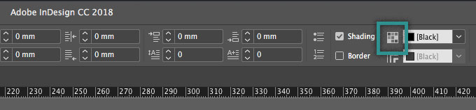
Figure 2. Alt-click or Option-click the icon to bring up the borders and shading dialog box on screen.
Then you can choose one of the two tabs at the top of the dialog box (Border or Shading) and turn on the checkbox there.
Apply Shading to Your Paragraph
I’m going to start with adding a background fill color, so I’ll choose the Shading tab. In the Paragraph Borders and Shading dialog box, you’ll see a range of options for editing the shading effect. Make sure the Preview option is checked, to allow you to see the results as you work.
The first feature to adjust is the color of the effect. Choose from the range of swatches available in the Color drop-down menu (Figure 3).

Figure 3. Adjusting the color of your shading is the first step towards creating an aesthetically pleasing result.
Note that this means you need to make the color swatch first; you can’t choose a color on the fly inside this dialog box.
You can also adjust the tint of the color. As I’m already using a pale color swatch, I’ve opted for a 100% tint (Figure 4).

Figure 4. Play around with the tint of the color to build or reduce color intensity in your layout.
In the same way that you can adjust the corner options of shapes (Object > Corner Options) in InDesign, you can also tweak the size and shape of the corners of your paragraph shading. To soften the effect, I’ve switched to a Rounded Corner (Figure 5).

Figure 5. Rounded corners have a softening effect on shading, while sharp corners look more graphic. Or why not add a more interesting shape, like an Inverse or Fancy corner? Note that the very small radius makes for a very subtle corner effect; you may want to increase that value.
Adjusting the Offsets of the shading to an equal width (here, 2 mm, for example) allows you to create padding around the text (Figure 6).

Figure 6. Increase the margins around the edges of your type by editing the Offsets.
Alternatively, you can achieve a more interesting and offbeat effect by switching off the link icon (the one that looks like a chain) in the center of the Offsets options and increasing or decreasing individual offsets. Here, I’ve increased the Right offset to extend it to the spine of the layout (Figure 7).
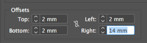
Figure 7. Irregular offsets can add an
interesting and on-trend look to your shading.
You can also fine-tune the position of the edge of the shading by selecting options from the Top Edge and Bottom Edge pop-up menus. For example, the Top Edge menu is usually set to Ascent, which means the shading is measured from the top of the tallest ascender in the text font. Choosing Leading from the Top Edge pop-up menu is usually more precise—if the paragraph leading is set to 13 points, then you know the top edge of the shading would extend exactly 13 points above the first baseline in the paragraph (plus any offset, of course). In this case, I’ve opted for a Baseline alignment for the Top Edge (Figure 8), which brings the edge of the shading down just shy of the top of the text.

Figure 8. Experiment with the position of the shading edge by adjusting the Top and Bottom Edge values.
You can also change the Width settings of the shading. The Text setting applies shading across the line of text—extending only as far as the text in the frame—whereas Column will extend the shading to the edge of the column (usually the width of the text frame). Here, I’ve opted for Column, to create a clean, rectangular style for the shading.
In some situations, especially if you have increased the offset values or if your text frame is some non-rectangular shape (such as an ellipse), the shading may extend past the edges of the text frame. Normally that would be okay, but if you don’t like it, you can turn on the Clip To Frame checkbox.
Apply a Border to Your Paragraph
Alternatively, you can apply a border to your paragraph, or double up with both a border and shading, as I’m going to do in this example. Borders are a fantastic way of adding decorative interest to paragraphs and work especially well for pull-out quotes.
As before, place your Type tool cursor in the paragraph. Alt- or Option-click the Border Color icon to the right of the Border checkbox to open the, you guessed it, Border area of the dialog box (Figure 9).

Figure 9. A vibrantly colored border is a great way of drawing a reader’s attention to a particular paragraph.
From here, you can adjust the Weight and Color of the border (here, I’ve gone for a punchy pink swatch).
As with the shading feature, you can adjust the Corner Size and Shape. As before, I’ve chosen a small rounded corner to soften the border (Figure 10).

Figure 10. Rounded corners have a softening effect on borders too, creating a professional look.
And you can adjust the Offsets to add some padding—space between the text and the stroke (Figure 11).

Figure 11. Increase the offset values to push the border away from text, creating a pleasing result.
By adjusting the Type of the Stroke, you can achieve a wide range of decorative effects (Figure 12). I’ve gone for a Straight Hash pattern, to add texture and interest to the border.

Figure 12. There is a long menu of Type styles to choose from, from dotted to dashed, as well as more quirky styles. Mix up the Type of your borders across a layout to create an eclectic, quirky look.
Doubling up a border and shading on your paragraph can look great, and by adjusting the Offsets of both the border and shading you can create a more interesting, dynamic effect than you would otherwise achieve by aligning them perfectly (Figure 13).
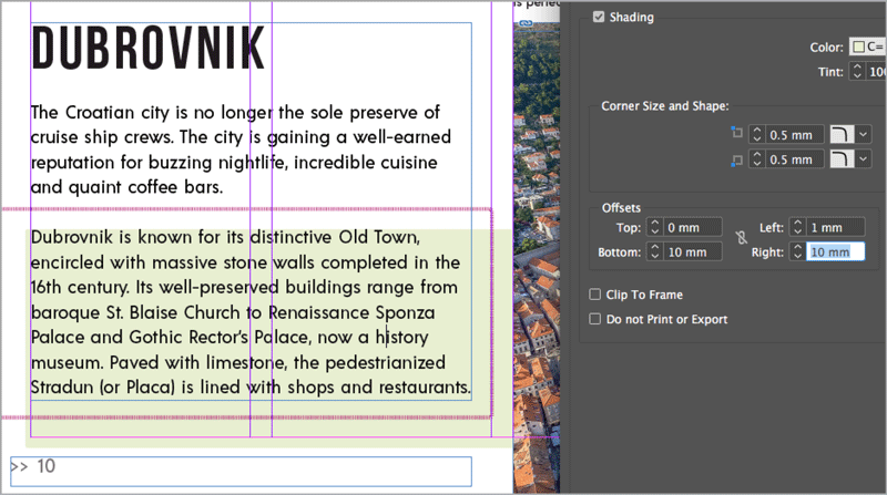
Figure 13. Allowing the border and shading to misalign is a fun way of creating more of an offbeat look that looks fantastic on magazine layouts.
How to Use Shading to Highlight Headers
If you want to inject an instant dose of color to a header or subheading, InDesign’s Shading feature is a quick-fix solution. This adds an on-trend effect that helps make headers really pop.
Set your Type tool cursor in the header you’d like to apply the color to. Alt-click or Option-click the Shading Colors icon in the Control panel to open the Shading panel of the Paragraph Borders and Shading dialog box.
From the Color menu, choose a swatch that contrasts against the type, and adjust the Tint to create a softer effect. You can switch the Corner Shape and adjust the Corner Size to change the outline of the shading.
To create the off-kilter effect here, switch off the link icon in the center of the Offsets options, and ensure the Top, Left, and Bottom values are set to between –2 and 2 mm, to keep the shading close to the type. Finally, decrease the Right Offset value (here to –44 mm) to create the asymmetrical effect (Figure 14).
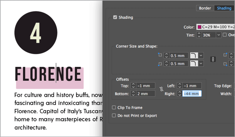
Figure 14. It may be a small adjustment, but adding shading to this header allows it to really stand out and command attention.
Applying Borders and Shading in InDesign CS
Even though the Borders and Shading feature in InDesign CC is super-handy, there are ways of achieving the same effect(s) in earlier versions of InDesign. Here I share two solutions for adding borders and shading to your paragraphs if you’re sticking with CS6 (or even earlier versions of CS). For even more ways to add borders and backgrounds to paragraphs in older versions of InDesign, see Mike Rankin’s article “5 Ways to Box a Paragraph” in Issue 66.
Solution 1: Use the Rectangle Tool
It may seem a bit of a cheat’s solution, but you can achieve the same background shading effect by using InDesign’s shape tools. Select the Rectangle tool (M), and drag to create a shape across your chosen paragraph (Figure 15).
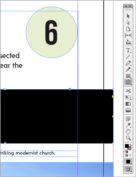
Figure 15. The Rectangle tool is the obvious candidate for creating a regular shading effect, but why not try the Ellipse or Polygon tool to create a quirkier backdrop to your text?
Adjust the Fill color of the shape, and then right-click and choose Arrange > Send to Back (Figure 16).
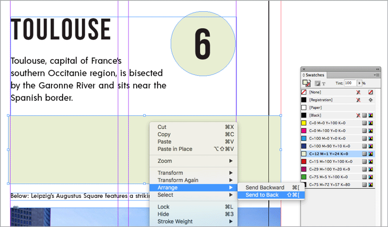
Figure 16. Send the shape to the back of the layout to bring text forward.
Or choose Object > Effects > Transparency and set the blend mode of the shape to Multiply (Figure 17). Of course, this transparency trick only works if the background color is a solid white.
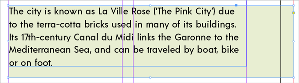
Figure 17. Use the Multiply blend mode to reveal text underneath a filled frame.
You can add a border effect to the shading by adjusting the settings in the Stroke panel (Window > Stroke), and adjusting the stroke color of the shape from the Swatches panel (Figure 18).

Figure 18. Pull out your border in a contrasting color to the shading and text to make the effect really pop.
I recommend you group the shape and text frame together by right-clicking and choosing Group from the contextual menu to avoid moving them around separately as you work. (You might be tempted to anchor the colored frame into the text story, but there’s a problem: InDesign always places anchored objects over the text. So, this can work—especially if you’ve set the transparency to Multiply, as I mentioned above—but it’s not foolproof.)
Solution 2: Create a Paragraph Style
Our second solution allows you to repeat the same shading and border formatting across multiple paragraphs by adding thick strokes behind every line of the paragraph. It’s a little tricky to get right, but it can work in some situations.
Begin by placing your cursor inside the paragraph you’d like to initially apply the shading to. In the Paragraph Styles panel (Window > Styles > Paragraph Styles), choose New Paragraph Style from the options menu (Figure 19).
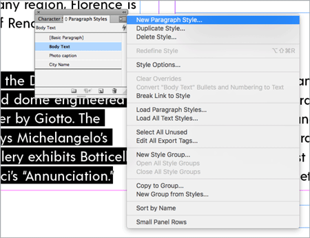
Figure 19. Choose New Paragraph Style from the Paragraph Styles menu.
Name the style (here, I’ve called it Shading Style 1). Then, click on Underline Options, toward the bottom of the window’s left-hand menu. Turn on the Underline On checkbox, and adjust the Weight of the underline to make it as generous as, or more so than, the leading of the text.
Keep the Type to its default setting (you want to maintain the solid look of the shading). You can adjust the Offset, Color, and Tint of the underline as you like (Figure 20).
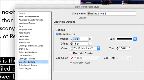
Figure 20. Adjust the options for the underline to expand its weight of the underline and create a highlighter effect. If you make the underline thick enough, it becomes like background shading.
You may also want to add a final line at the bottom of the paragraph in order to fill out any gaps. To do that, click on Paragraph Rules in the window’s left-hand menu. Turn on the Rule On checkbox, and mimic the Color and Tint settings of the Underline Options. You can make the Weight more generous if you wish (Figure 21).
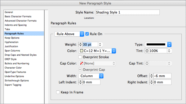
Figure 21. You’ll also need to apply a Paragraph Rule to activate the underline effect.
Click OK to exit the window and apply the style to the paragraph (Figure 22).

Figure 22. Place your Type tool cursor into a paragraph and click on the new paragraph style to apply it.
Getting the Most Out of InDesign’s Borders and Shading Feature
If you’re a CC user, Borders and Shading is a nifty little feature that can help you instantly liven up your layouts. It’s particularly useful for adding extra style and flair to editorial design. Its flexibility and ability to adapt to paragraph length is an added bonus, allowing you to edit text to your heart’s content, without needing to revisit the border and shading options.
If you’re using CS6 or earlier, there’s no need to miss out on the style that borders and shading can bring to the table. Even though it’s a little less flexible than CC’s improved version, you can still mimic the look by using the Rectangle tool or by creating an underlined paragraph style.

Figure 23. Adjust the alignment of text from either the Control panel or the Paragraph panel. Setting text to Justify All Lines ensures a completely uniform block of shading.

MAGAZINE AFTER:
Adding shading and borders to paragraphs is a fantastic way of injecting more color and interest to body text, as well as helping to break up text-heavy layouts like this travel magazine spread.
Commenting is easier and faster when you're logged in!

Recommended for you
Designing Business Cards, Part 1
Designing with photos effectively goes far beyond choosing a nice image. Every p...

Designing a Restaurant Menu
How to use InDesign to create a menu for a restaurant or cafe that’s attractive,...
Futuristic Fonts
Andrea Leksen and Charles Fadem explore the realm of type that evokes space, tec...