


A Different Kind of Design Competition

Excerpted from Designing Design.
The 2008 Beijing Olympics won’t begin until August, but preparations have been underway for years. That groundwork hasn’t been limited to building the competition grounds — establishing the 2008 Olympics’ visual identity has been just as important.
In this excerpt, designer Kenya Hara shares his entry for the competition. The round symbol is made up of pictograms that represent a variety of sports, each of which can be broken out at the individual sport’s events.
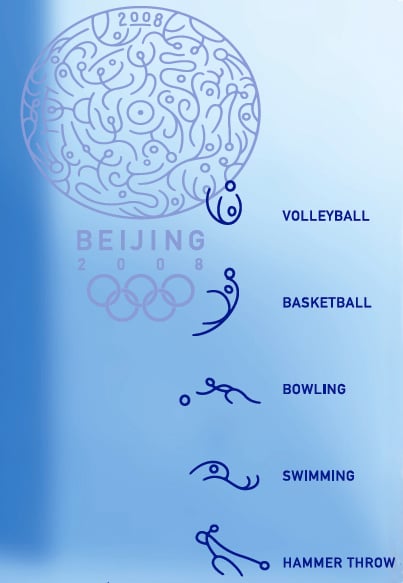
Hara’s design, which won an honorable mention, functions on many levels.
To read this excerpt as a PDF file in your Web browser, click “Game On.” You can also download the PDF to your machine for later viewing.
To open the PDF, you’ll need Adobe Acrobat or Adobe Reader. We highly recommend Adobe Reader 7.0 and above to view this PDF. To download Acrobat Reader, click below:
https://www.adobe.com/products/acrobat/readstep2.html
To learn how to configure your browser for viewing PDF files, see the Adobe Reader tech support page.
Excerpted from Designing Design by Kenya Hara. Copyright © 2007. Used with permission of Lars Müller Publishers.
This article was last modified on January 5, 2023
This article was first published on January 7, 2008
Commenting is easier and faster when you're logged in!

Recommended for you

This Week in InDesign Articles, Number 33
It’s a brand new InDependent Week! Time is short this week, but I figured...

A Celebration of Hand Lettering
The last time I wrote about signage in the developing world (Go on a Type Safari...

Introducing The Design + AI Summit
Learn how you can put the power of generative AI tools to work for you at The De...