
Showing results for cézanne con9 com cyan0 cézanne con9 com cyan20 canyon cézanne cézanne con9 com cyan con9 com cayman cezanne cezanne cezanne cezanne com ( com ( cyan-
P22’s Cézanne is one of the most intriguing script fonts in recent years. It defies the stereotype of the typical font because of its striking look of natural hand lettering. Designers often choose Cézanne for this reason alone. The elongated crossbar of the ‘t’ and the waving baseline are only two of the features that make it such a distinctive face. Cézanne appears just about everywhere, including dozens of CD covers, coffee shop and restaurant facades, menus, packaging, book jackets and even in scrap booking accents. As a result, Cézanne is one of the most popular fonts in the P22 library.
Designers consider Cézanne ideal for various projects. However, one of the drawbacks of its great popularity is that Cézanne may have become too recognizable and possibly not as irregular as one would wish for in a handwriting font. For example, when duplicate letters appear next to each other in a word written in Cézanne, they look identical in all instances. Longtime P22 collaborator James Grieshaber took these concerns to heart and resolved both issues by using the dynamic OpenType format.
The result of Grieshaber’s efforts is Cézanne Pro, an expansive suite of options that allows for several-as many as six versions of each letter. There are hundreds of automatic substitutions programmed into the font but designers can also hand-select individual letters for just the right look.
P22 Cézanne Pro includes full western and central European character sets and Cyrillic for typesetting in dozens of languages. It features several types of numerals (lining, oldstyle proportional, tabular, superscript, subscript and fractions), ligatures, snap-on swashes, and word glyphs (the, of, le, and, etc.). This new Cézanne Pro OpenType font includes over 1,000 glyphs and “smart features” that will automatically substitute letter combinations to create an even more natural handwriting effect than was possible with its predecessor.
More and more applications are taking advantage of OpenType features. Users of, for example, Adobe’s Creative Suite and the upcoming Quark Xpress, can take Cézanne to a whole new level. For those who cannot yet use OpenType features, PostScript and TrueType versions of the Cézanne alternate fonts are available. These can be manually intermixed with the original Cézanne to create effects similar to those in the OpenType version or they can be used on their own to achieve the familiar yet “not quite Cézanne” look.
P22 Cézanne Pro brings new flexibility to a proven face, one that thousands of designers worldwide have found irresistible. P22 — not your typical type.
For more information on P22 Cezanne Pro: www.p22.com
P22’s Cézanne is one of the most intriguing script fonts in recent years. It defies the stereotype of the typical font because of its striking look of natural hand lettering. Designers often choose Cézanne for this reason alone. The elongated crossbar of the ‘t’ and the waving baseline are only two of the features that make it such a distinctive face. Cézanne appears just about everywhere, including dozens of CD covers, coffee shop and restaurant facades, menus, packaging, book jackets and even in scrapbooking accents. As a result, Cézanne is one of the most popular fonts in the P22 library.
Designers consider Cézanne ideal for various projects. However, one of the drawbacks of its great popularity is that Cézanne may have become too recognizable and possibly not as irregular as one would wish for in a handwriting font. For example, when duplicate letters appear next to each other in a word written in Cézanne, they look identical in all instances. Longtime P22 collaborator James Grieshaber took these concerns to heart and resolved both issues by using the dynamic OpenType format.
The result of Grieshaber’s efforts is Cézanne Pro, an expansive suite of options that allows for several-as many as six!-versions of each letter. There are hundreds of automatic substitutions programmed into the font but designers can also hand-select individual letters for just the right look.
P22 Cézanne Pro includes full western and central European character sets and Cyrillic for typesetting in dozens of languages. It features several types of numerals (lining, oldstyle proportional, tabular, superscript, subscript and fractions), ligatures, snap-on swashes, and word glyphs (the, of, le, and, etc.). This new Cézanne Pro OpenType font includes over 1,000 glyphs and “smart features” that will automatically substitute letter combinations to create an even more natural handwriting effect than was possible with its predecessor.
More and more applications are taking advantage of OpenType features. Users of, for example, Adobe’s Creative Suite and the upcoming Quark Xpress, can take Cézanne to a whole new level. For those who cannot yet use OpenType features, PostScript and TrueType versions of the Cézanne alternate fonts are available. These can be manually intermixed with the original Cézanne to create effects similar to those in the OpenType version or they can be used on their own to achieve the familiar yet “not quite Cézanne” look.
P22 Cézanne Pro brings new flexibility to a proven face, one that thousands of designers worldwide have found irresistible. P22- not your typical type.
For previews and more information, visit: https://www.p22.com/products/cezannepro.html
dot-font was a collection of short articles written by editor and typographer John D. Barry (the former editor and publisher of the typographic journal U&lc) for CreativePro. If you’d like to read more from this series, click here.
Eventually, John gathered a selection of these articles into two books, dot-font: Talking About Design and dot-font: Talking About Fonts, which are available free to download here. You can find more from John at his website, https://johndberry.com.
Maybe you can’t judge a book by its cover, but in a bookstore we judge most of them first by their spines. With most new books—not the ones lying out on tables or prominently displayed with their covers out, but the ones lining the shelves—the spine is all we see. The beautiful, dramatic cover, upon which great effort and sometimes even expense may have been lavished, never gets seen if a browsing book buyer doesn’t reach out and pull the book off the shelf.
Given this cruel dynamic of the marketplace, you might expect that book publishers and the designers they hire would devote a lot of attention to what the spine looks like. But it seems to be the rare designer who gives the question much thought at all.
Standing up and Standing Out
As a book designer who is also a book buyer and reader, I’ve thought about this a lot—and in the course of my professional life I’ve been able to put some of my thoughts into action. I know that when I scan the shelves of my favorite bookstores, it’s the simplest, most dramatic, most legible book spines that stand out.
Obviously, since most books are shelved vertically, the ideal direction for the type on the spine is horizontal, so that the words are the right way up when viewed by the browser’s eye. And if the book is fat, the spine is wider and there’s more space for the designer to work with. Sometimes the designer can use some of that space to frame the title and the author’s name.

The spine of this comprehensive Italian dictionary from 1949 is striking and easy to read.
But few books are thick enough to allow this kind of spacious display. In most cases, the type is turned at right angles to the viewer’s eye, in order to run along the vertical spine. In North America, the normal direction is from top to bottom; in Europe, it’s usually bottom to top. (This means that in North America, in a pile of books stacked face up, all the titles are easy to read; in Europe, it’s the pile of books stacked face down, with no front covers visible at all, where the titles on the spines are easy to read. The biggest practical effect is that readers browsing the shelves in a European bookstore crick their necks to the left, while those in North America crick theirs to the right.)
Since the type is not aligned with the way we see, it has to be even clearer than it would otherwise. Crowded, cramped type gets lost in the clutter. No matter what the front cover looks like, capital letters make the best use of the narrow spine (no ascenders or descenders to extrude into the limited space). A little extra space between the letters—even more than you’d give them in a horizontal line—helps them stand out and be read.
Crisp letterforms (in this case, Big Caslon caps), if they’re not too cramped, can stand out even when they fill the space on the spine.
Clarity in Complexity
Most of what I’m going to show is my own work, since this is the easiest approach and perhaps the most honest. But one example I’d like to include is the spine of a trade paperback edition of “Virtual Unrealities,” a collection of short stories by science-fiction writer Alfred Bester (published by Vintage Books). The designer, Evan Gaffney, uses the space in a unique way. The intrusions of amorphous blue photographic details in strict rectangles, and the swirling clock-face image, reflect the design of the front cover (and the back); they also tie this book in with others in the uniform series of Bester reprints, each of which features a different dominant color. The complexity of this spine draws a browser’s eye in; the well-spaced type of the author’s name and the title make it clear what this is. (Even the letterspacing of the subtitle, in caps and small caps—which would normally not be a good idea—works here, given the size and the vertical nature of the spine.)
Clear typography within a complex composition is hard to pull off, but it works in this Vintage paperback.
Clarity and simplicity tend to stand out and also to please the eye. But which element is most important? Which should be emphasized? You have to think about what will catch the browser’s attention—the title, the name of the author, the publisher’s logo, or something else entirely. In the case of the Alfred Bester book, it’s Bester’s name that will sell the book; he’s known as one of the classic writers of science fiction. In the case of a book I designed for the University of Washington Press, “Answering Chief Seattle,” by Albert Furtwangler, the author’s name was not well known, but the subject—Chief Seattle—is famous in the Pacific Northwest, and a title like “Answering Chief Seattle” ought to pique the intended reader’s interest. So, in my design, the title is what stands out.
If the title is what will catch readers’ interest, emphasize it.
Using Space
In one of my early book designs, a sequence of poetic prose by Sam Hamill about following in the footsteps of the haiku master Basho (published by Broken Moon Press), my cover design was bold and simple, but on the spine I was timid, and I hadn’t thought enough about what a book spine had to do. I chose very small type, and set it within the empty space of the spine. The type got lost there, rather than standing out against its ground.
The small type on this spine easily gets lost.
Years later, in a volume of collected poems for White Pine Press, I got to give Sam Hamill a much more inviting spine to his book. I knew that some readers of poetry would seek out books by Hamill, so his name had to stand out; but I also wanted to attract others, so the most striking emphasis (white type on a dark blue background) was given over to the intriguing title, “Destination Zero.”
Larger type for Hamill’s “Destination Zero” amends my earlier timidity.
Sometimes neither the author’s name nor the book’s title is a guaranteed reader magnet. Poet Arthur Sze is well respected among certain circles of poetry readers, but he’s hardly a household name. And the title of this book for Copper Canyon Press, “The Redshifting Web,” is a particularly awkward combination of words to do anything with on a book cover or spine. But I had an attractive piece of artwork that lent itself to being wrapped around from the front cover onto the spine, giving a natural division to the area of the spine. So instead of running a simple author/title line down a blank spine, I chose to blow up Sze’s single-syllable last name large enough to dominate the top section. Then I reduced the title until it fit within the artwork. The point was to be intriguing enough to make browsers stop and pull the book off the shelf.
This design emphasized the poet’s last name but used a wrapped-around illustration to help catch browsers’ eyes.
Too Colorful?
Color is an important factor in book spines, but contrast is even more important. The most “typographic” colors are black and white, and I usually try to stick to these for type. The best second color is one that’s light enough not to drown out black type, but dark enough that you can reverse out white type and still read it.
Sometimes using a color combination from the front cover, or even from the artwork, is effective. It’s easy to get carried away, though. On the spine of Jane Miller‘s “Memory at These Speeds” (Copper Canyon), I made the mistake of using a blue for the author’s name against a dark orangey-red, with a light yellowish orange for the title. The title stands out, but the blue and red fight each other, in an electric effect, and Miller’s name is hard to read.
The choice of type color could have been better with this design for Jane Miller’s “Memory at These Speeds.”
Spine Space, the Final Frontier
Capital letters aren’t the only possibility for a book spine. And italics can sometimes be very effective, even though they slant down from top to bottom on a North American spine, farther from the browser’s horizontal orientation. For Eleanor Wilner‘s collection “Reversing the Spell” (Copper Canyon), I thought the title itself would draw the most attention, so I made it prominent. The spine was wide enough that I could give the author’s name horizontally, in contrast to the title.
The title warranted the focus in this design, but the different orientation of the author’s name helps it remain easily readable.”
The same technique of combining vertical and horizontal type worked on the spine of the first complete edition of Thomas McGrath‘s book-length poem, “Letter to an Imaginary Friend” (Copper Canyon). I probably played down McGrath’s name too much (I should have used a contrasting or complementary typeface that was stronger, for his name), but the title stands out (the small caps are not faked; the typeface actually has “small caps” that are nearly as tall as the capital letters) and the spine was wide enough that I could use a cropped version of the very personal, inviting photo of the author. You don’t often get to use a person’s face on a book spine.
This design also emphasizes the title, but the width of the binding allowed the flexibility to add the author’s photograph.
The opposite problem comes when you’ve got a very narrow spine, for a very thin book. Heather Allen‘s “Leaving a Shadow” was one of the shortest books I’ve ever designed, an almost archetypal “slim volume of poems” (again, for Copper Canyon Press). The cover was a duotone, in black and silver, of a photograph with type against it. On the spine, there was no room for anything fancy; I simply used all the space, and all the variations at my disposal, setting the author’s name in black and the title in white, both in letterspaced caps in a crisp typeface, against a pure silver background.
Books with thin spines can be especially challenging.
Details, Details
Why spend so much time thinking about a subject that almost no one, including book designers, gives much thought to? Because this, like so many neglected details of design, actually has a big impact on which items in the marketplace get noticed—and bought. The spines of books ought to be pleasing, so that book buyers will enjoy having them on their shelves once they’ve read them; but the first thing a book’s spine has to do, in the real world, is attract the reader.
In part one of this two-part look at Arizona Highways magazine, I poked fun at the “grandma” quality of this publication and was thrilled to hear from a number of readers that Arizona Highways made an impact on them and their career choices. And of course. the magazine does remain quite vital today, with over a million readers and a host of offshoot products and services, such as photography and art workshops.
Still, this magazine is like a great government building that has been updated enough over the years to be fully functional, though not so much as to lose all of its original charm. Yet you can’t help wishing time would go back a few decades and you could experience the glory of this institution during its heyday.
A Photographic Platform
Arizona Highways, like Life or Look magazines, became a platform for the emerging art of photography. The rugged terrain and striking weather of Arizona attracted great nature photographers who, along with the Native-American residents, essentially defined the look of the “Old West.”
Even when it was printed entirely in black and white, Arizona Highways featured large photographs. This Ansel Adams photograph, taken in 1942, is of the White House Ruin, Canyon de Chelly National Monument. To see larger versions of this and all of the images, just click on the images on this page.
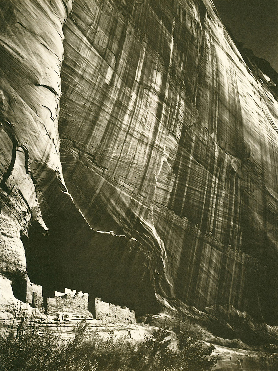
Arizona Highways didn’t just print great photos and artwork; it took great pride in high-quality reproduction. Working with the printer W.A. Krueger Company, the magazine’s editors and technicians pushed the limits of both offset and letterpress printing technology. For the image above, for example, Arizona Highways boasted the use of special high-resolution halftone screens and a “24-inch Goerz Altar lens on premium ortho chromatic films.” Below is one of my favorite black-and-white photos, “Summer Scene White Mountains,” by Esther Henderson.

Another Ansel Adams work, this one a more rare color photograph, appeared in the April 1961 issue. Titled “The Thirsty Land,” the photo was used in a feature about the Roosevelt Dam.
A Matter of Scale
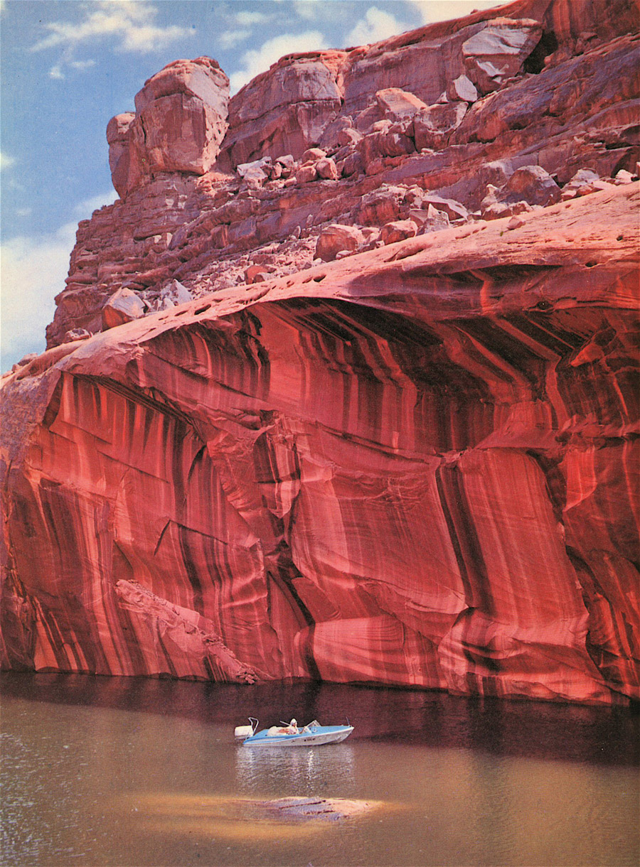
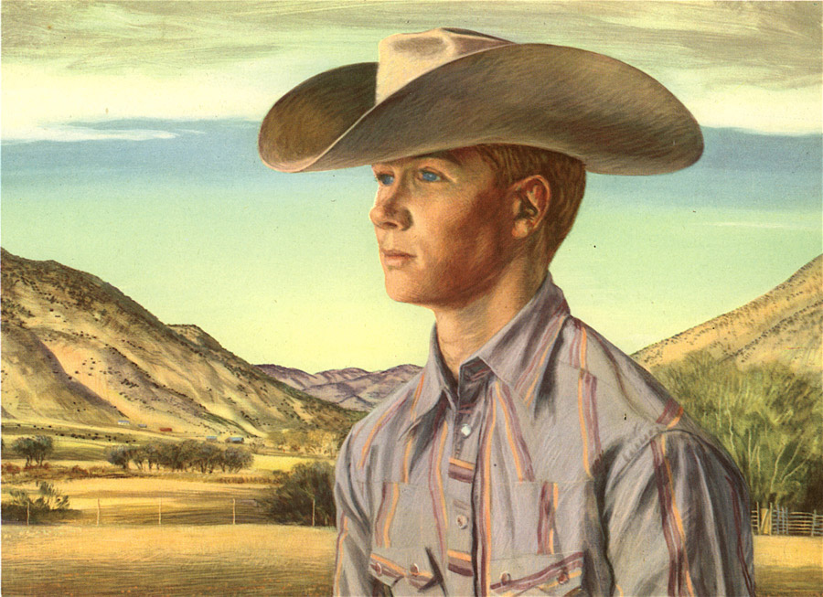
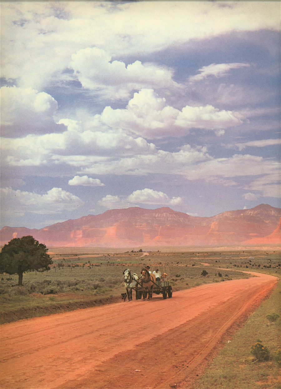
One of the hallmarks of Arizona Highway’s photographs is the depiction of scale — in most cases, the large scale of Arizona landmarks. By placing a human in strategic parts of the frame, photographers communicated on two levels. First, you note the expanse of the image, then suddenly you catch the human reference. Here, starting with “On the Reservoir, White Mountain,” by Velvae Miller in 1959, is a series of great scale examples:

September 1961, “In Arches National Monument,” by Josef Muench:

October 1959, “Grand Falls on the Little Colorado,” by Thomas s. Cash:

Unknown month in 1959, “Devil’s Bridge,” by W.G. Carroll:

November 1963, “The Empty Land,” by Louis and Virginia Kay:

January 1964, “Nature’s Rock Painting,” by Josef Muench:
Nature Up Close
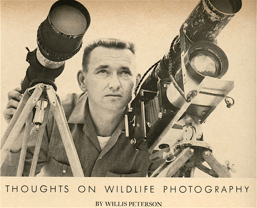
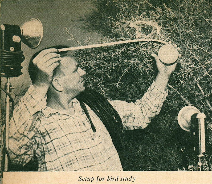
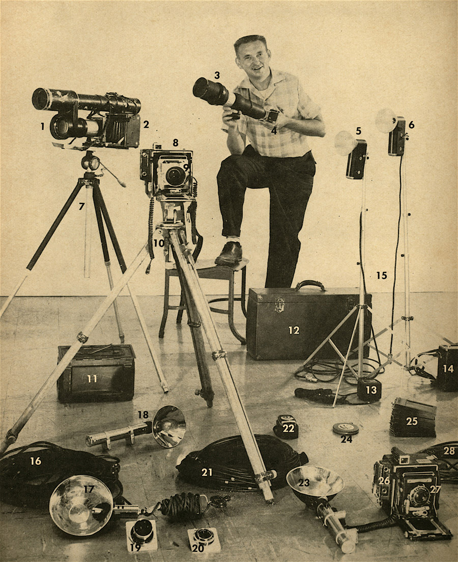
Many pages in Arizona Highways have been filled with close-up nature photography and details on capturing good nature shots. Here are a number of photos taken by Willis Peterson, a frequent contributor, and several pictures of him working in the field and in the studio.


Defining Native Southwest
Arizona Highways’ depictions of Native Americans living in and around Arizona seemed relatively respectful. By covering many festivals, reservations, and schools, the magazine tried to show authentic but not-too-cliché images. Here, for example, is a 1969 shot by Ray Manley titled “Apache Maidens, Beautifully Dressed.”
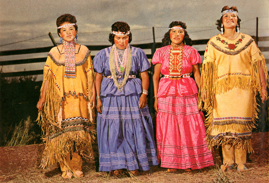
And here, a painting by young Navajo artist James King in 1978, followed by two images from a spread of Navajo portraits in the same issue.


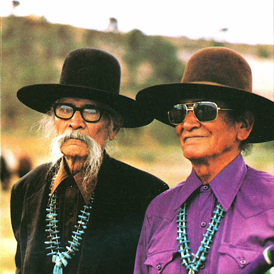
And a regular contributor was artist DeGrazia, whose images of Native Americans are synonymous with Arizona history. This image is from 1961.

Art in all its forms was represented over the years in Arizona Highways. Here from July 1959 is a terrific image by B. Yazz, picturing an antelope head. It’s followed by “Wallflowers and Flutterbye’s” from artist Diane O’Leary.


And one of my favorites, a portrait of Gerald Marr by Peter Hurd, done in egg tempera.
Man Meets Nature
Despite a fondness for wide-open spaces, the editors at Arizona Highways regularly featured the people and commerce of Arizona as well as the beauty. Here, taken with a shutter speed of four seconds, is the stunning image “Devotion,” taken by photographer Dave Davis in 1959.
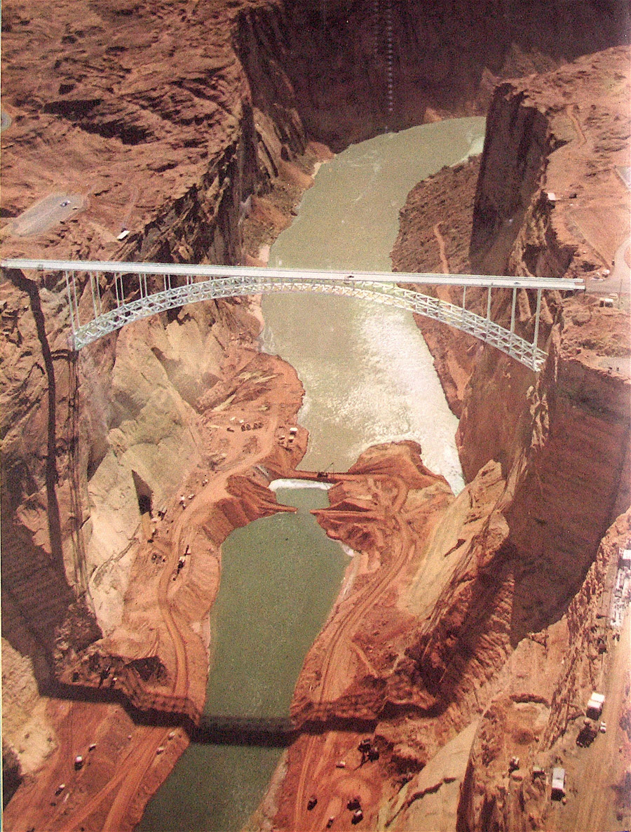
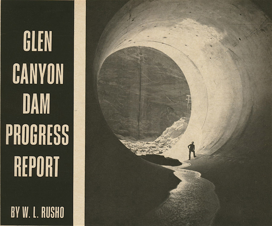
Images such as these from photographer R.L. Rusho chronicled the building of the Glenn Canyon Dam between 1961 and 1964.


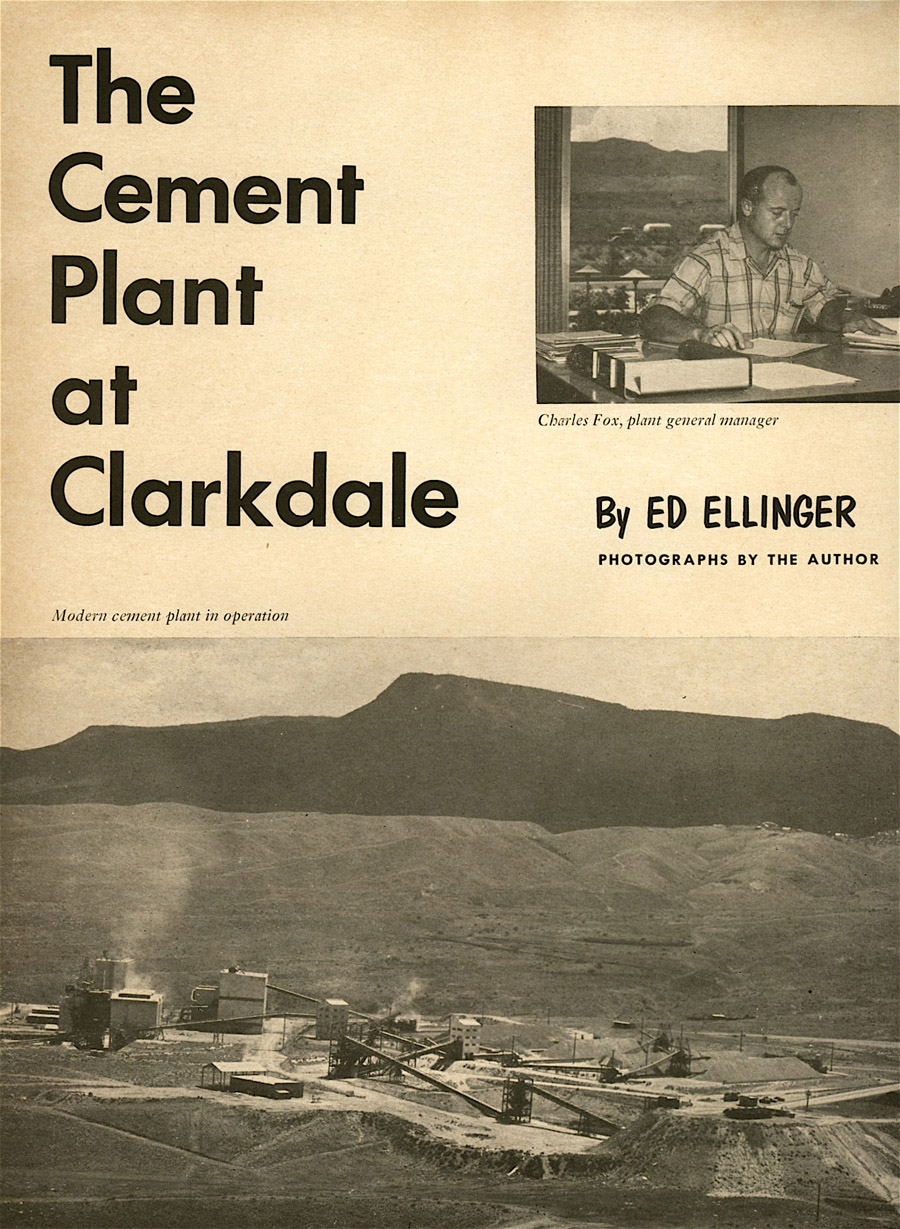
And while the idea of a feature spread on a cement plant may seem underwhelming, in Arizona Highways, you could be sure it would be massive in scale.
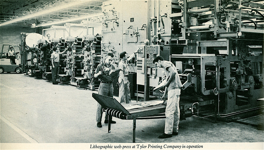
And here is a 1963 behind-the-scenes shot from the Tyler Company printers when they opened a new plant in Arizona to produce the magazine.
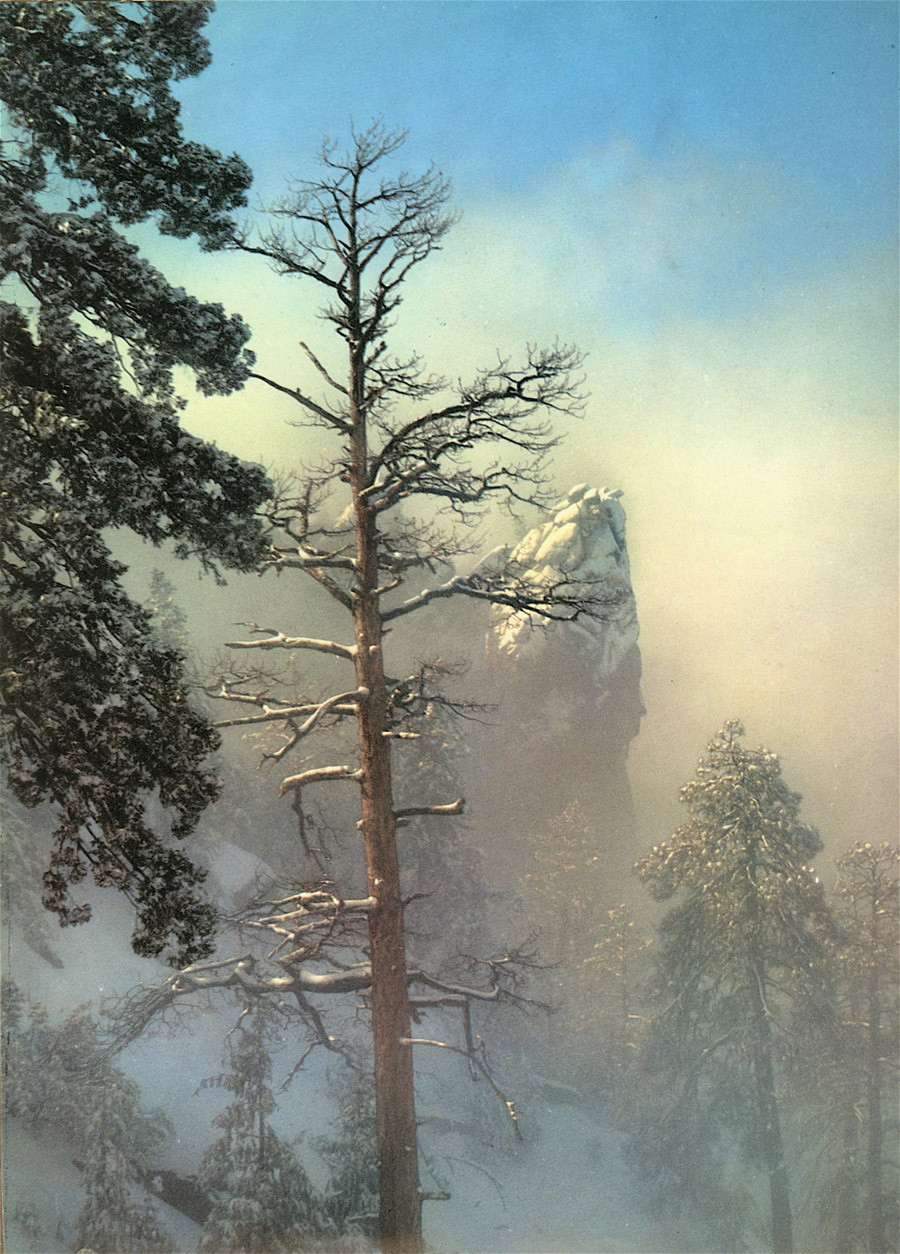
But it is and was the nature photography that made Arizona Highways famous. Here are just a few of the many images I felt compelled to scan while going through a couple years of bound copies of the magazine. The first two are from Josef Muench in 1959 and 1962:
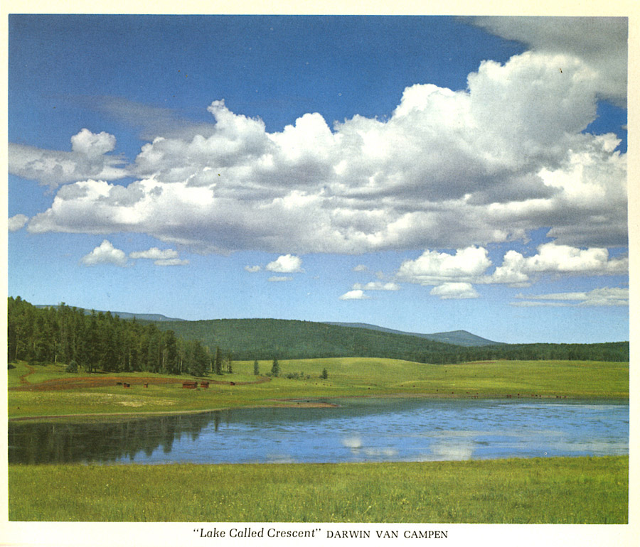
And three from Darwin Van Campen:


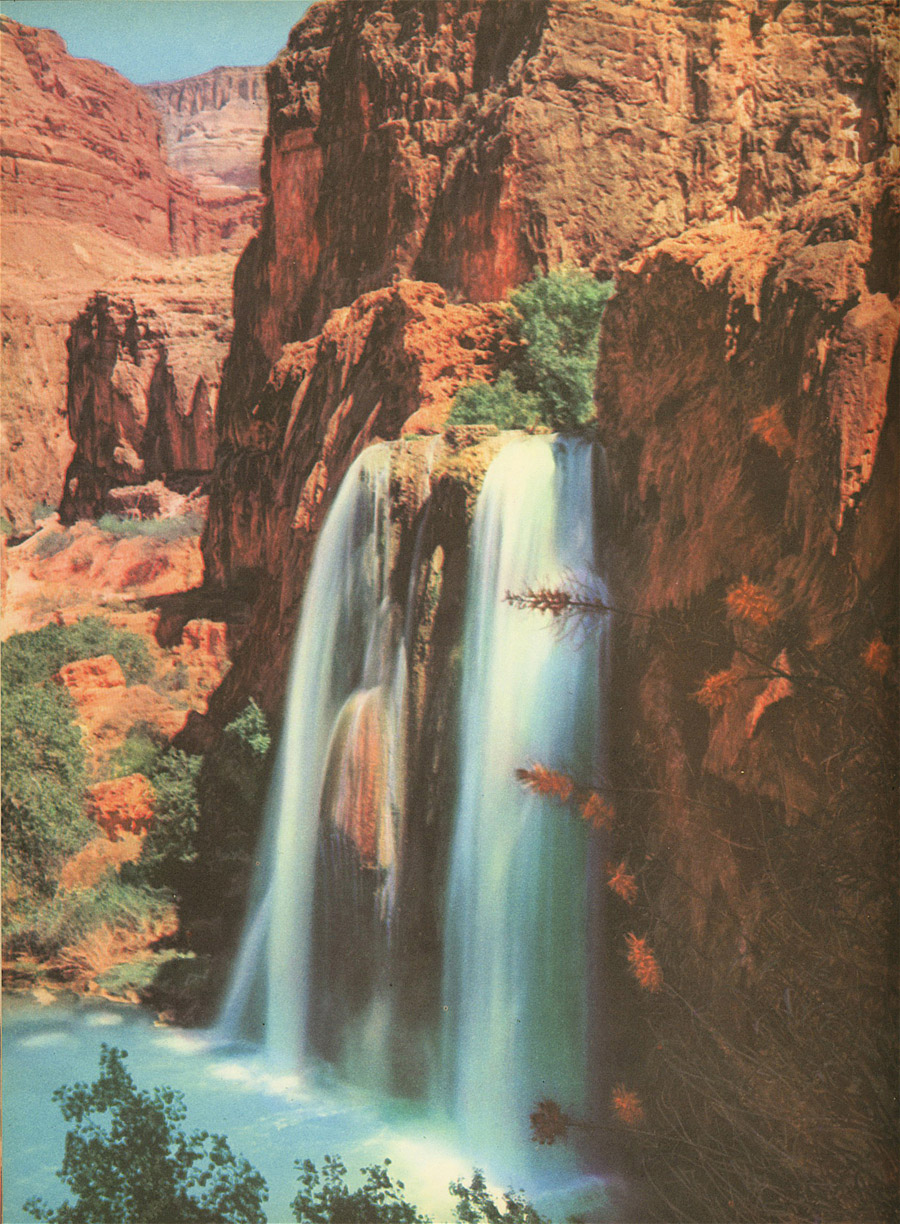
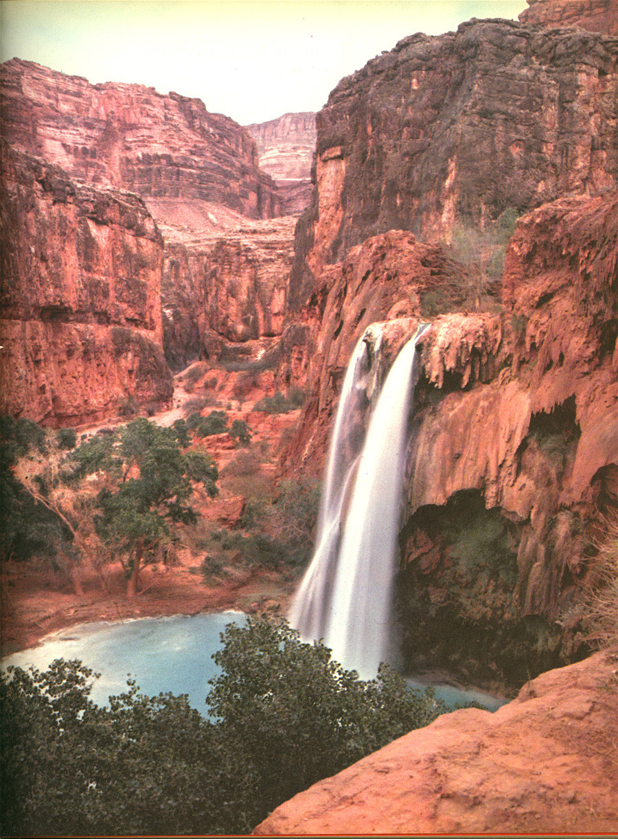
Water is a big part of the Arizona landscape. Here are four beautiful images from (in order) Joseph Wamper “Where the Canyon Narrows,” Bill Pottenger “Havasu Falls,” Dick Dietrich “Toroweap Point,” and “Cruising the Lake” by photographer Glenn Embree in 1964.


A Picture for Every Season
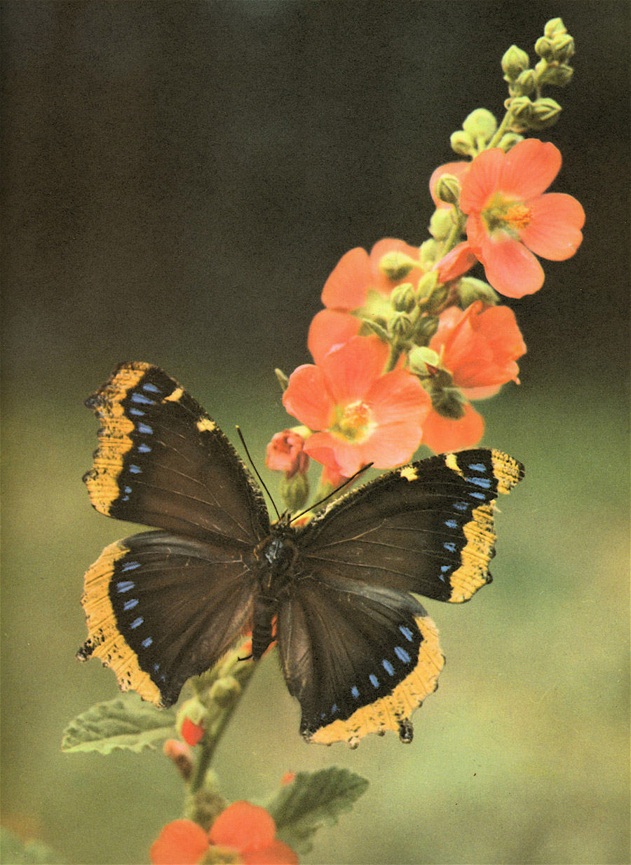
And finally, here is a random assortment of some of my favorite Arizona Highways images showing the drama and beautify of the seasons. First, a 1984 view of monarch butterflys by George D. Lepp:

“Spring Comes too Soon,” by Art Riley:

“Strolling Through Autumn,” from October 1964, by James Tallon:

“A Winter’s Farwell – Near Kingman,” by Ed Delgado:

“Through the Rising Mist,” from Esther Henderson:
And finally, just to give you a taste of the detail Arizona Highways goes through to document images for photography sake and education, here’s a stunning 1953 image called “Canal Scene” by Daniel S. Zuder:
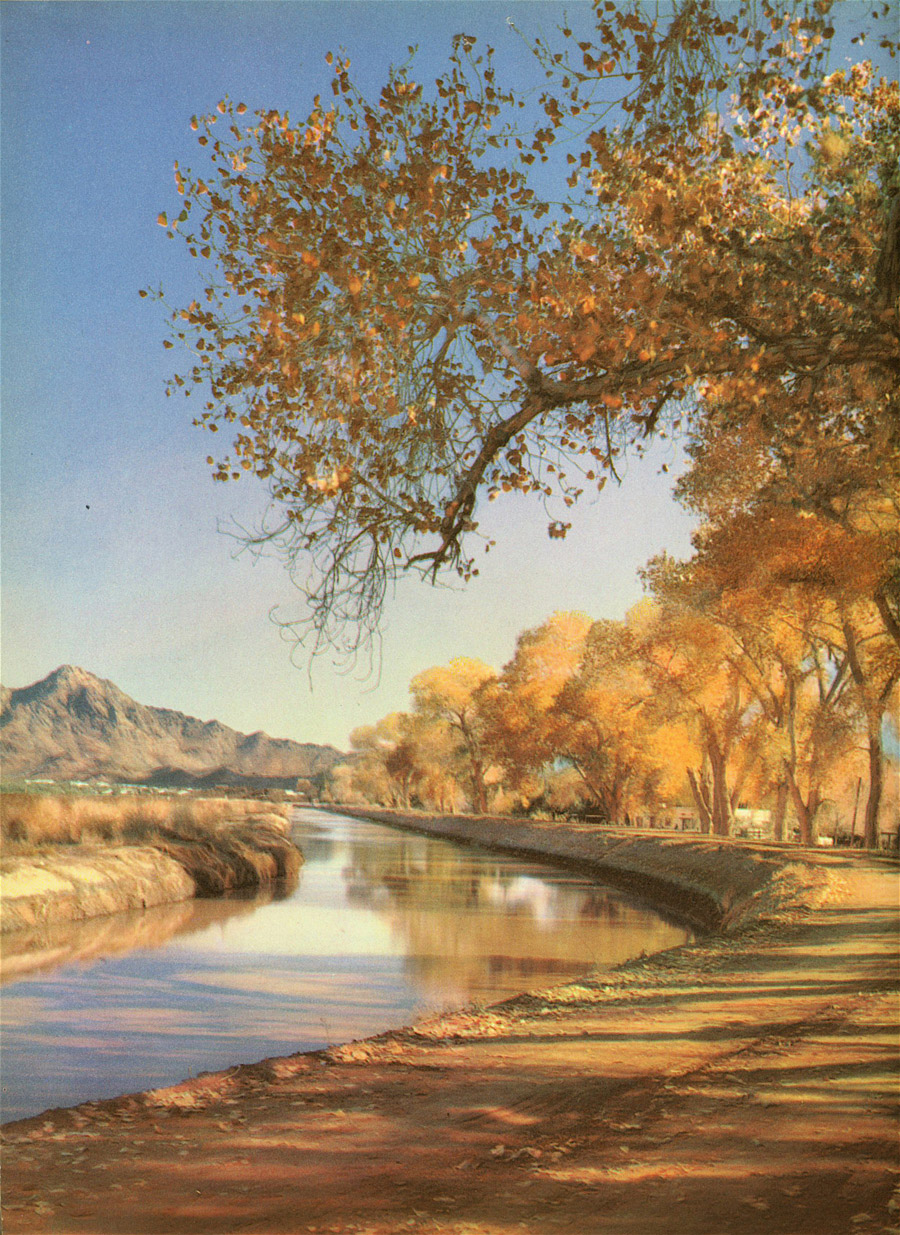
That image was accompanied by these specs: “1953 4×5 Graphic View Camera, mounted on an Otto tripod, 135mm f4.5 Rapax Shutter with lens board extension to fit opening for camera; Eastman Kodak Extachrome film type B, 4 ½ seconds at f.32. Scene: Arizona Canal near Central Avenue, Phoenix. To the east and in the distance is the west part of Squaw Peak.”
Now if only they could make a Photoshop filter with those specs!
From the beaches of the eastern seaboard to the Great Plains, and from the wetlands of the south, to the towering sequoias of the west, America and its pristine parks have always been hailed as top destination sites for photography enthusiasts and their families. Canon U.S.A., Inc. and the American Park Network continue to help define the relationship between photography and the great outdoors with the introduction of a free photography workshop program on select dates throughout the summer in Yosemite, Grand Canyon and Yellowstone National Parks. These programs will be artfully hosted and instructed by a select few of the world renowned Canon Explorer of Light photographers including Adam Jones and Lewis Kemper, along with other Canon-selected photographers such as Rob and Ann Simpson. What’s more, the Canon Photography in the Parks Photo Contest* returns this year to offer photographers the chance to display their work and win prizes in the categories of landscape and wildlife photography in the parks.
“Photography affords an entirely new perspective of the natural world that surrounds us every day, both in our national parks, and in our own backyards,” stated Yuichi Ishizuka, senior vice president and general manager of the Consumer Imaging Group, Canon U.S.A. “As a global organization, Canon understands its responsibility for the impact it makes on society and the environment. Canon is guided by the philosophy of Kyosei – ‘all people regardless of race, religion or culture, harmoniously living together and working into the future.’ Through our involvement in the parks, we hope to strengthen Canon’s commitment to conservation.”
The Canon Photography in the Parks Photo Contest
From June 1st to September 29th, photographic enthusiasts are encouraged to submit their favorite photographs from an American park to the Canon Digital Learning Center. Winning photographs in the categories of landscape and wildlife will win a trip to the participating parks of their choice, along with a full suite of Canon photographic equipment. By logging onto the Canon Digital Learning Center at www.usa.canon.com/dlc, potential winners will not only have the opportunity to submit their photos, but can also peruse the Web site to explore the various educational resources that Canon has to offer for novices and advanced photographers alike.
Photography in the Parks Workshops
With the help of the Canon Explorer of Light program, Canon’s elite roster of the most influential photographers in the world, park visitors will have the opportunity to participate in free daily guided visual photographic journeys. Additionally, Canon will loan participants top-tier digital camera equipment to capture those awe-inspiring sights at no additional cost. Aspiring photographers will learn the tips and tricks to taking great outdoor photos and experience hands-on training using some of the same equipment that professional photographers use. Evening programs are also offered, providing visitors the rare opportunity to spend time with the Explorers of Light, view stunning imagery, ask questions, and receive prints and a CD of their own photos.
“It’s rare that we get the chance to share our passion for photography with people that are so eager to learn,” stated Adam Jones, professional photographer and Canon Explorer of Light. “As far as wildlife and landscape photography goes, these three parks are among the best locations the Earth has to offer. I look forward to teaching the tips and tricks I’ve used that will help to create photographs that can compete in the Canon in the Parks Photo Contest.”
Schedule of Seminars
Yosemite National Park: June 15-29, 2007
Grand Canyon National Park: July 9 – 29, 2007
Yellowstone National Park: August 6 – 12, 2007
Additional Programs and Sponsored Events
The workshops and photo contest are just a small part of the sponsored education and activities that Canon offers. The Canon Digital Learning Center provides a wide variety of classes across the country with renowned photographers. There are also tutorials available on-line for beginners to learn their way around a digital SLR camera to unlock the creative control that SLR photography affords.
About Canon U.S.A., Inc.
Canon U.S.A., Inc. delivers consumer, business-to-business, and industrial imaging solutions. The Company is listed as one of Fortune’s Most Admired Companies in America and is on the 2006 BusinessWeek list of “Top 100 Brands.” Its parent company, Canon Inc. (NYSE:CAJ), is a top patent holder of technology, ranking third overall in the U.S. in 2006†, with global revenues of $34.9 billion. To keep apprised of the latest news from Canon U.S.A., sign up for the Company’s RSS news feed by visiting www.usa.canon.com/pressroom.
About Canon U.S.A.’s Environmental Programs and Alliances
An educational and research program, Eyes on Yellowstone, made possible by Canon, assists with scientific research and breaks new ground in conservation, endangered species protection and the application of cutting-edge technology essential to managing park wildlife and ecosystems. www.ypf.org and www.windowsintowonderland.org and www.greateryellowstonescience.org
The Canon National Parks Science Scholars Program develops the next generation of scientists in the fields of conservation, environmental science, and park management, and is the first and only program of its kind to encourage doctoral students to conduct innovative research on scientific problems critical to national parks. www.canonscholars.org
Canon Envirothon is North America’s largest high school environmental education competition in which more than 500,000 teenagers are involved in a year-long learning process that combines in-class curriculum with hands-on field experiences. www.envirothon.org
About American Park Network
American Park Network is the leading publisher of visitor guide magazines for national and state parks for more than two decades. With more than 20 editions, reaching 20 million people, American Park Network guides are the definitive information source for anyone planning a national park vacation. Through a carbon offset partnership with the National Forest Foundation, this year American Park Network became the world1s first carbon-free publisher. www.AmericanParkNetwork.com.
In this episode…
- News
- Why objects and text sometime just … disappear
- Obscure InDesign Feature: Split Window to Compare Layouts
News and special offers from our sponsors:
>> Ajar Productions is the developer of the phenomenal in5 add-on for Adobe InDesign, which lets you export interactivity from InDesign to different formats, that actually work. in5 supports all of InDesign’s native interactivity—like animation, buttons, object states, audio and video—and in5 adds additional interactivity to InDesign, like 3-D Flip Cards, Responsive Layouts, Parallax, and more. Create websites, digital magazines, mobile apps, animated banners and presentations, by simply using InDesign, no coding involved! Learn more and download a free trial of in5 at in5.us.
>> Cacidi Systems has been developing solutions for Adobe InDesign users since InDesign began! They offer a number of plug-ins and workflow system for content integration and efficient marketing production. We especially love Cacidi Charts, which has been updated and leveled up for InDesign 2020 and 2021. No more need to jump into Illustrator or Powerpoint; create gorgeous charts right in InDesign. Free trial available!
Links mentioned in this podcast:
- Register now for CreativePro Week 2021
- When Stuff Disappears: A Collection of Mysteries Solved:
- Split Layout Tricks:
-
All About Alternate Layouts: https://creativepro.com/indesign-how-using-alternate-layout/
-
Palo Duro Canyon: https://palodurocanyon.com
-
Pantone 286: https://www.pantone.com/color-finder/286-C
- InDesignSecrets…
Olympus rewrote the rule book again for how powerful a point-and-shoot camera’s zoom can be with the launch of the new 26x optical zoom SP-590 Ultra Zoom. Its extremely versatile zoom lens can capture extraordinary images at virtually any distance — from a delicate flower close up to wide-angle photographs of friends posing before the vast Grand Canyon, or even images shot from the back row of the stadium that look like they were taken courtside.
The SP-590UZ is a $449 investment in your imaging future that is well worth making. It offers the advanced manual controls that experienced photographers demand and find on a digital SLR (single lens reflex). At the same time, users can easily set the camera to operate like a simple point-and-shoot with automatic scene modes. It offers the compact body of an ultra zoom with the flexibility of high-performance optics usually found in interchangeable lenses for DSLR cameras, a 12-megapixel image sensor, Dual Image Stabilization, Face Detection, Ultra High-Speed Sequential shooting and a bright 2.7-inch LCD.
“The SP-590UZ brings subjects closer with the world’s most powerful optical zoom, and the zoom is just one of many elements that set this camera apart. Macro to wide-angle there are no compromises,” said Nadine Clark, product manager, Olympus Imaging America Inc. “Because of its compact size and an impressive zoom range, it’s the ideal choice for travelers and everyone who enjoys the great outdoors.”

Capturing It All — Near, Far and Wide
Optical precision is the foundation for creating quality images. The bright, f2.8-5.0 lens provides the equivalent of 26-676mm focal length. Users can get close to the action with the compact 26x super telephoto zoom and at the same time, the wide-angle (26mm) lens captures more in each frame. Its super-macro capabilities capture the subtlest details. The compact lens construction combines aspherical lens elements and extra-low dispersion (ED) lens elements to deliver edge-to-edge sharpness and clarity. Whether it is capturing fast-action sports or everyday snapshots, this sturdy compact body with a wide-angle and telephoto lens provides the versatility to get the job done.
12 Megapixels for Superior Image Quality
The SP-590UZ has a 12-megapixel sensor that enables consumers to achieve consistently sharp and vivid images when producing large-format prints or cropping/enlarging a portion of an image.
Unleash Your Creativity with New Artistic Scene Modes
Olympus’ ultra zoom cameras have been known for being the perfect, versatile solution for dual households; providing flexibility and manual controls for experienced shutterbugs, while being as easy and approachable as a point-and-shoot for novice or even first-time users. The SP-590UZ takes this to a new level with pre-capture scene modes: Multiple Exposure, Soft Background Focus and Beauty Mode. The new features enable creative effects to be made inside the camera as the images are captured! The new creative features were adopted from Olympus’ recently announced E-30 DSLR camera.
Multiple Exposure, in the new SP-590UZ, empowers consumers to take two separate photographs and overlay them to craft one unique image. Create a masterpiece for Mother’s Day with a beautiful image of the kids overlaying her favorite landscape. Use the new Soft Background Focus mode on your next trip to a National Park. It enables you to slightly blur the beautiful vista, lake or canyon in the background to accent the majestic wildlife in the foreground.
Beauty Mode lets you soften shadows and smooth wrinkles or blemishes on your subject’s face — all in the camera and as you capture the image! Additionally, subtle edits can be made post-capture using the Beauty Fix mode. Choose “Clear Skin” to smooth a person’s complexion, “Dramatic Eye” to slightly emphasize the eyes, and “Sparkle Eye” to brighten and enhance the contrast of the iris and pupils. You can also apply all three edits at once. Have fun customizing your brilliant images without a PC and costly image editing software.
Your Images on HDTV
Gone are the days of friends and family huddling around a camera’s LCD to see the pictures you just snapped. Now, you’ll be the hit of the party or any family function when you proudly display your brilliant images on high-definition televisions. Simply connect the new SP-590UZ to an HDTV with an HDMI™ cable, which can be purchased separately at any consumer electronics store.
Versatile Memory
All Olympus digital point-and-shoot cameras accept xD-Picture CardTM media. Starting with products available in August 2008, they also accept microSD memory cards to capture images. The new SP-590UZ offers the flexibility to use either xD-Picture Card or microSD memory cards, which is just one more advantage of Olympus point-and-shoot cameras.
Dual Image Stabilization
Dual Image Stabilization enables users to take crisp, clear pictures in virtually any shooting situation — adjusting for camera shake and a moving subject. Olympus’ mechanical Sensor-Shift Image Stabilization keeps images sharp by adjusting the image sensor to compensate for camera shake, which often occurs when zooming in on your subject and in low-light conditions when shutter speeds are slower. Digital Image Stabilization freezes the action with high ISO sensitivity and fast shutter speeds that prevent blur caused by a moving subject.
Ultra High-Speed Sequential Shooting and Pre-Capture with TruePicTM III Image Processor
The Olympus TruePic III Image Processor makes it possible for the SP-590UZ to capture images at incredible speeds. The inclusion of Pre-Capture technology, which works in conjunction with High-Speed Sequential Shooting, enables users to capture the action before and after fully pressing the shutter button. Pre-Capture begins working as soon as the focus is locked, automatically archiving frames in the camera’s buffer memory prior to the shutter release — virtually guaranteeing that you’ll get the shot even if the user’s reaction time is slower than the action. Perfect for situations where timing is essential, such as photographing a tennis player serving, children playing or a whale breaching.
Olympus’ enhanced TruePic III Image Processor produces crystal clear photos using all the pixel information for each image to deliver superior picture quality with more accurate colors, true-to-life flesh tones and faster processing speeds. TruePic III also captures sharp images at high ISO settings, minimizing image noise or grainy photos traditionally associated with shooting with high ISO.
Full Manual Control
The Manual, Aperture Priority and Shutter Priority modes give users versatility and control for optimal performance in any situation. Users can express their creativity — adjusting the f-stop for detailed portraits with softened backgrounds, or slowing the exposure speed to create the blurred effect of motion, or just sit back and let the camera do the thinking through the use of the automatic settings. Manual focus is also available for users who want to have full control.
Face Detection
Face Detection tracks up to 16 faces within the frame and automatically focuses (Face Detection AF) and optimizes exposure (Face Detection AE) quickly for sharp, brilliant portrait pictures. Now, your subject’s face is in focus whether it is in the center of the target area or not.
Wireless Flash Compatibility
Wireless flashes can help photographers cast the best light on their subjects and capture great images. For this reason, the SP-590UZ is compatible with the Olympus FL-50R and FL-36R wireless electronic flashes that are designed exclusively for digital photography. When these flashes are used in combination with the SP-590UZ, wireless multi-flash photography is possible. The SP-590UZ can control up to three wireless flash groups independently, with multiple flash units in each group.
Large HyperCrystal™ II LCD
The SP-590UZ boasts an advanced HyperCrystal II LCD. It reproduces true colors with a dynamic contrast ratio of more than 180 percent and a color reproduction performance of more than 160 percent compared to HyperCrystal LCD, providing a preview that is more true to the final image.
Shadow Adjustment Technology
Shooting outdoors in bright daylight can be tricky because of the extreme contrast between dark shadowed areas and bright sunlight areas. While the human eye is capable of detecting the nuances between dark and light and all the details in between, image sensors traditionally have not been quite as sensitive. The SP-590UZ addresses this challenge head-on with a new Shadow Adjustment Technology, which compensates for extreme contrast where the shadow areas are underexposed and lack visible detail. With the new technology, users can preview and capture images that have the same contrast as seen with the naked eye.
Perfect Shot Preview
The SP-590UZ features a Perfect Shot Preview mode that enables users to preview and select various photographic effects (such as zoom, exposure compensation, white balance and metering) on a live, multi-window screen before snapping the shot. Perfect Shot Preview enables users to see precisely what the image will look like when adjustments are made, ensuring users are capturing the exact image they want. It is an ideal way for novice users to learn about the effects of different photography techniques.
Perfect Fix In-Camera Editing
Olympus’ Perfect Fix feature offers quick solutions for unanticipated image quality issues, which may be caused by several adverse conditions. Shadow Adjustment Edit can be used to adjust any underexposed areas and Red-Eye Fix can be used to reduce the effects of red-eye sometimes caused by a direct flash. Additional in-camera editing functions can be quickly accessed right in the camera by the touch of a button; features available include resizing, trimming, black and white, and sepia.
29 Shooting Modes
The SP-590UZ offers new features, including, Multi-Exposure, Soft Background Focus and Beauty Mode. A new Bird Watching mode is also great to capture the unpredictable movements of wildlife. The new camera offers a total of 20 pre-set scene modes. To activate, simply select the desired mode for multi-fireworks, portraits, landscapes, night scenes, fast-action and more.
OLYMPUS Master 2 Software
OLYMPUS Master 2 Software provides the ultimate in digital imaging management. An intuitive user interface makes downloading to your computer quick and simple, and images are easily organized by folders or albums and searchable by date in Calendar view. A direct link makes uploading your images and videos to YouTube™ easier than ever. Additionally, with one-click editing tools, such as red-eye removal, images can be touched up before printing or emailing. Online support, templates, firmware upgrades and other user services are just a mouse-click away. Use the optional muvee™ Theater Pack to create professional quality slide shows and DVDs from your pictures using any of several built-in templates. Additionally, create scrapbooks, greeting cards and other fun prints using the optional ArcSoft® Print Creations plug-in.
Availability and U.S. Pricing
The SP-590UZ will be available in March 2009. It will also include: Neck Strap, WIN/Mac USB Cable, Audio/Video Cable, four AA Batteries, MASD-1 (microSD Adapter), Manual, Warranty Card and OLYMPUS Master 2 Software CD-ROM.
SP-590UZ Estimated Street Price: $449.99 (U.S.)
He’s hardly the stereotypical computer hacker — some hormone-addled, ultra-nerd 15-year-old who kills Saturday nights by breaking security codes. In fact, judging by the photos and bios posted on numerous Web sites, including www.freesklyarov.org, Dmitry Sklyarov is a gainfully employed Ph.D. student, a father of two, and an all-around good guy who’s being unfairly jailed and prosecuted by the U.S. Department of Justice.
And Adobe was apparently to blame — until last week, at least, when the company revoked its support for the prosecution of Sklyarov, the Russian cryptologist who developed a PDF password-pummeling application for the Russian company ElcomSoft. Though by now it’s jumped to the other side of the fence on this issue, Adobe originally called the FBI’s attention to Sklyarov’s software and to his presence in the U.S. Sklyarov was subsequently arrested, the fury of those who oppose the Digital Millennium Copyright Act (DMCA) was unleashed, and what will likely prove a pivotal test case for the law is now on the docket. Barring a miracle, we’re not going to hear the end of this for a long, long time.
Who, What, Where, and When
For those of you who have been in Bora Bora for the last few weeks (or just driving your U-Haul away from San Francisco, having sworn off technology when you left your Palm Pilot at your dot-gone desk), let me fill you in: On July 16 the FBI arrested 26-year-old Sklyarov in Las Vegas, where he was speaking at the Def Con 9 hackers conference. He found flaws in the security of PDF-based e-books, but instead of pointing them out to Adobe and helping them improve the security options in Acrobat, Sklyarov developed a product for ElcomSoft to exploit the weakness. The Advanced eBook Processor cracks passwords, thereby allowing licensed PDF-based e-books to be distributed for free, regardless of any protections that might have been encrypted in the file.
Adobe, as you might imagine, didn’t like the idea and eventually pressured ElcomSoft into taking the product off the market in the U.S. under threat of a lawsuit; its efforts were the basis of the Sklyarov’s arrest by the U.S. government. Sklyarov is being held without bail on charges of violating the DMCA by “trafficking in a product designed to circumvent copyright protection measures,” according to a statement from the U.S. Attorney’s office. He faces a potential $500,000 fine and up to 5 years in jail.
Why?
I’m not a big fan of Mr. Sklyarov. I don’t appreciate the software he developed, or the attitude by his supporters that Adobe is a brutish bully and he’s an innocent victim of corporate and governmental exploitation. (The Boycott Adobe site brandishes a clever but extreme twist on the Adobe corporate logo: a hammer and sickle in the middle of a red Adobe-like “A”.) I’m not saying the DMCA is perfect, but it’s the best protection we have at the moment against digital copyright violations. And it seems pretty clear to me that Sklyarov and ElcomSoft violated the DMCA, which states, “no person shall manufacture, import, offer to the public, or otherwise traffic in any technology …[designed to circumvent] a technological measure that effectively protects a right of a copyright owner.”
Moreover to my way of thinking, the product Mr. Sklyarov helped develop is just plain wrong. There’s an analogy being drawn that seems apt: Image that a locksmith discovers that the lock on your front door can easily be picked, using a paperclip bent in just such a way. Instead of notifying you that the lock should be changed, the locksmith begins selling paperclips pre-bent for the purpose, along with instructions for using it, thereby facilitating illegal entry and theft. The analogy is hardly perfect, but the comparison is valid: Sklyarov helped make a product that breaks e-book passwords, which facilitates copyright violation.
I know there is a contingent of people who believe that outlawing Mr. Sklyarov’s lock-picking kit is an assault on free speech, but that’s really a stretch in my mind. And many who are upset about Mr. Sklyarov’s arrest paint the scenario as that of a big, bad corporation — Adobe, of course — persecuting a high-minded individual who dared to stand his ground. Nothing personal, Mr. Sklyarov, but it just doesn’t wash: After all, Adobe is giving away the eBook Reader; ElcomSoft stood to profit from its Advanced eBook Processor software.
About Face
As far as I can see, wrongs on both sides have been righted, at least by the involved corporate entities: ElcomSoft took the product off the virtual shelves, and Adobe has backed down. First Adobe held that the software was a threat to copyright holders, but then it reversed itself: Adobe has by now gone so far as to say that ElcomSoft’s software could do good things, too, like allow e-books to become accessible to visually impaired readers. One has to wonder: If the software doesn’t really violate copyright law and can actually do good deeds, why make ElcomSoft pull it? The reversal was as blatant a PR move as could be on Adobe’s part, propelled by purely selfish business reasons (threat of a boycott in a weak economy). But who cares? Adobe has seen the light and has asked the government not to prosecute.
So why is Ashcroft’s office refusing to let it go? Probably because it wants to make an example of Mr. Sklyarov to all those so-called Liberals-with-a-capital-L who oppose the 1998 DMCA. But prosecuting Mr. Sklyarov is what we call “negative reinforcement” in parenting circles, and it’s a big no-no. The preferred method of discipline is to reward good behavior, and ElcomSoft ultimately did the right thing, by ceasing to sell the Advanced eBook Processor.
I bristle at hackers like Sklyarov, and at the whole argument that somehow because intellectual property is now available digitally — from MP3 music clips to DVDs to e-books — we should be allowed to share it freely. Frankly, I think Sklyarov is less a principled academic with high-minded convictions about intellectual property and more an opportunist who’s using our free-market economy and our tolerance of free speech for his own ends.
But the longer the government drags this out, the more it puts Sklyarov on a pedestal not just for the copyright counter-culture but also for the mainstream public. And making an example out of one individual — and not even the founder and president of the ElcomSoft, who was also at Def Con 9 — sends the wrong message: that those who would safeguard digital-media copyrights are as petty as the hackers are. I’m all for protecting copyrights, but let’s do it maturely, responsibly, and with a level head.
For more information and points of view on this topic, visit the Electronic Frontier Foundation, the Association of American Publishers, Planet eBook, eBookWeb, and www.anti-dmca.org.
dot-font was a collection of short articles written by editor and typographer John D. Barry (the former editor and publisher of the typographic journal U&lc) for CreativePro. If you’d like to read more from this series, click here.
Eventually, John gathered a selection of these articles into two books, dot-font: Talking About Design and dot-font: Talking About Fonts, which are available free to download here. You can find more from John at his website, https://johndberry.com.
So what’s it like actually using OpenType fonts in your work? Is it easier? Harder? Does it make a difference?
OpenType, in case you lost track of the latest type technology, is a cross-platform font format co-developed by Adobe and Microsoft that offers the potential for extended character sets and other typographic niceties built into the core font. Not all OpenType fonts have extra refinements built in, but those that do (Adobe markets these as “Pro” fonts) can make life much simpler for the type user. Instead of needing to load a separate font to access old-style figures, for example, you can just choose the appropriate character in your application (providing the application is OpenType savvy).
I’ve recently started putting an OpenType font family to work, in the most pragmatic environment possible: the production of a book. Not only am I using OpenType fonts, but I made the decision to switch to the OpenType version of the typeface in the middle of production, after having created the first set of galleys for the book in a non-OpenType version. Despite the extra work and the risk of changing font formats in midstream, I thought that production would end up being easier, and that the book’s files would have a longer life for potential future editions, if I used the new, rather than the old, font format. So far, I haven’t been disappointed.
Minion Pro
The typeface was Minion, Robert Slimbach’s workhorse old-style type family, which looks a bit like an updated and more dynamic version of Bembo. Minion was inspired by a number of different roman and italic types from the Renaissance; the design grew out of Slimbach’s researches in the Plantin-Moretus Museum while he was going back to original sources to develop the Adobe Garamond family. Minion, however, despite its suggestions of Bembo, is not based on any specific 16th-century types; it’s Slimbach’s interpretation of that style of typeface.
Minion has been available for about a dozen years now, and it has gone through three distinct phases. It was first issued by Adobe in 1990, as one of the early Adobe Originals, in a type family that consisted of three weights in roman and italic, with all the typographic refinements necessary for a book text face: small caps, old-style figures, accents, a full set of f-ligatures, and a handful of nicely drawn ornaments. Several years later, when Adobe was promoting “multiple master” technology as the next big thing in type, Slimbach turned Minion into a family of multiple master fonts with three axes: weight, width, and optical size. (Minion was, as I recall, the first typeface to come out with an optical size axis—meaning that the details of the letter design changed subtly from the 6-point master, at one end of the axis, to the 72-point master at the other end. Each master design was fine-tuned to look best at a specific size.) Now that Adobe has turned away from multiple master technology and embraced OpenType as the wave of the future, the refinements of Minion multiple master have been adapted to the huge potential character set of OpenType, and the Minion family has been expanded into Minion Pro, which includes both Greek and Cyrillic alphabets in the same OpenType fonts as the Latin-alphabet designs.
(Any typeface can be turned into an OpenType font, and many have simply been directly converted, by Adobe and other font vendors. But Adobe came up with the “Pro” name for fonts that make use of OpenType’s potential for including a wide range of typographic refinements in a single digital font—refinements like extended sets of accented characters, expanded sets of ligatures and alternate characters, and complementary designs for multiple scripts.)
Setting Text Type by the Pound
The book I’ve been working on is a very large book of poetry, the Complete Poems of Kenneth Rexroth (to be published this fall by Copper Canyon Press). I designed both the cover and the interior, and I’m handling the production of the pages—the typesetting, in other words. (There is no art, except on the cover.) Since I have used Minion quite a bit in designs for Copper Canyon—including an earlier, much smaller volume of Rexroth’s love poems—I settled on Minion for this book. For several years, I have been using Minion multiple master, because it was so easy to make specific versions suitable for particular uses. I had previously created a specific “instance” for use in 11-point text: an optical size that was actually slightly smaller (because I wanted the letters to appear a little sturdier than the 11-point master), a width very slightly wider than the regular width, and a normal weight. I used this instance for the text of the new book.
Although all the typographic refinements were present in the Minion type family, it took a certain amount of manipulation to use them. I would do a search-and-replace for numerals, for instance, changing all the 0’s, 1’s, 2’s, etc. from the lining (cap-height) numerals of the main font to the old-style (lowercase) numerals of the Expert font. Similarly, I had to search for the combinations that ought to use f-ligatures—and I had to do it in a logical order (search for ffi and ffl first, before searching for ff, fi, or fl; and don’t forget to check the “match case” box!). I had set up paragraph styles and character styles using these fonts, and I applied them throughout what turned into a nearly 800-page book.
I was doing both design and production in InDesign 1.5. One of the current advantages of InDesign over QuarkXPress is that InDesign has support for OpenType fonts built in. All you have to do is check an option on a menu, for instance, and InDesign applies ligatures to your text, if the font has them. In an ordinary Type 1 font with an Adobe-standard character set, the only ligatures that will appear are the fi and fl ligatures; in a Pro font, however, all the f-ligatures will be used, and possibly others as well. (InDesign 2.0 gives you several levels of ligatures to choose from—and some of the Pro fonts have quite a collection of alternate and joined characters.) Changing all the numerals to old-style figures is also just a matter of checking an option, as is switching from lowercase to small caps.
The book was so huge that in the first galleys I had left most of the numerals unconverted and the ligatures unchanged, to be dealt with in the second round of production. Between the first and the second galleys, however, I realized that if I were using Minion Pro, I wouldn’t have to do all that searching and replacing: I could just build options like using ligatures and old-style figures into my styles, and automate the whole process. And the newly standard text version of Minion looked very good on the page. (The Minion Pro Opticals package includes four different optical sizes, from “caption” through “display”—not quite the infinitely fluid range of Minion multiple master, but a very useful selection nonetheless.)
So I switched. I bought the Minion Pro fonts, and as I made the corrections and changes from the proofread first galleys, I converted all the fonts from the multiple master version to the OpenType version of Minion. The most tedious part of this was editing my styles, replacing the multiple master fonts I had specified with OpenType fonts instead. (Since I had based most of my styles on a few core styles, most of my changes could simply ripple through. But there are always a few hand-done refinements that need to be changed by hand.) Because of the new way OpenType handles small caps, I found that sometimes I’d end up with a few places where InDesign was trying to find a Small Caps & Old-Style Figures font within the Minion Pro font family—and of course it didn’t exist. When I opened the files again, InDesign would tell me that there were fonts specified that it couldn’t find; luckily, it was easy to convert them globally to the right fonts. The time spent doing this was substantially less than the time I would have spent applying ligatures and old-style figures, even with an efficiently organized search-and-replace procedure.
That Would Be a “Yes”
So far, as I said, I’ve had no complaint, and I’ve found that using the OpenType fonts—at least in InDesign—speeds up my production work, by making it possible to automatic the kind of typographic refinements that used to require extra time and effort. (Because I’m the sort of designer I am, I always go to this trouble. But not everyone does. Anything that automates quality in typesetting for the wider world of production will mean better, more readable type—especially in text—and an easier, more pleasing experience for the ultimate users: the readers.)
It seems to me that the fonts take less time to download, too, when I’m printing laser proofs, although I haven’t actually measured this. The only technical glitch I’ve run across is that my system didn’t seem to like having both the multiple master and the OpenType versions of Minion active at the same time; this wasn’t a big problem when I was converting from one to the other, but if I had to be working simultaneously in files that used both versions, it would be a limitation. (There may be a way around this that I simply haven’t noticed.)
But I’m not really trying to do a lab test here, with benchmarks and quantifiable results. I’m just reporting on a single real-world example of OpenType fonts in action.
So far, I’d say, so good.