
Showing results for ±90 14401299 com but65 8½ 14401299 com but65 2022 2016 ±90 14401299 com but65 14401299 com 205 980 0056 2022 com ( com ( 2016-12-02 2016-12-02 205-980-0056 90 14401299 but65 8 but65 2022 90 14401299 but65 14401299 com 205 0056 2022 14401299 14401299 2022 2016 14401299 14401299 205 980 0056 2022
 This article appeared in Issue 2 of CreativePro Magazine.
Every autumn, the Adobe MAX conference brings a wave of major upgrades across Creative Cloud products and services. Adobe then supports the new releases on the conference side, with three days of sessions that are educational, inspirational, and, of course, promotional.
The traditional way to process Adobe MAX is to look for the list of what’s changed in your favorite application, such as Photoshop. Increasingly, it’s just as important to step back and look at where Adobe is steering Creative Cloud as a whole, because the implications resonate through nearly all Creative Cloud desktop and mobile apps, typically affecting the ones you use the most.
A Quick Recap of the 2022 Releases
Let’s first review some of the key changes in the 2022 releases in Creative Cloud applications that are more familiar to CreativePro readers.
Photography and digital art: Adobe Photoshop and Adobe Fresco
In the 2022 release of Adobe Photoshop, what might save you the most time is the Object Finder enhancement to the Object Selection tool. You no longer have to drag a selection marquee around a subject. Simply hover the pointer over potential subjects, and Object Finder highlights them individually (Figure 1). Click when the subject you want is highlighted, and Photoshop creates a precise selection of it. Modifier keys let you click to select multiple subjects, and a Mask All Objects command instantly generates layer masks for every subject detected.

Figure 1. When Object Finder is active in Photoshop, target an automatically found object by hovering the pointer over it; click to convert a highlight into a selection.
Several of the Neural Filters were improved, including Colorize. The marginally useful Depth Haze is now the more useful Depth Blur, which helps visually isolate a detected subject by blurring what’s in front of and behind it.
Landscape Mixer, Harmonization, and Color Transfer (Figure 2) are new beta Neural Filters similar to the existing Style Transfer filter: They apply aspects of the appearance of one image to another. For example, Landscape Mixer can make a grassland in one image look like a desert in another image. Harmonization addresses the compositing challenge of making one layer’s colors consistent with the color grading in a background layer.

Figure 2. Color Transfer, a beta Neural Filter in Photoshop, lets you apply the colors of one image to another.
Many mobile apps are simplified versions of a desktop app, but Adobe Fresco stands on its own as a fully featured digital illustration tool distinct from Photoshop and Illustrator. For 2022, Fresco adds Perspective Grids (brush strokes snap to them) and motion, so you can easily animate your hand-drawn digital art.
Photography: Adobe Camera Raw, Adobe Lightroom Classic, Adobe Lightroom
For the 2022 releases of Adobe’s photo-processing applications, the standout feature is the Masks panel (Figure 3), the new home for greatly improved local adjustments. The entire local adjustment workflow is redesigned for better precision, control, and organization, and it adds two AI-powered options previously seen in Photoshop: Select Subject and Select Sky. These new options make it much more likely that you can complete corrections in Camera Raw or Lightroom, instead of having to convert and manage a copy of the image as a Photoshop document that takes up much more storage space. However, they don’t do any compositing—that’s still Photoshop territory.

Figure 3. The Masks panel is a serious upgrade for local adjustments in Camera Raw, Lightroom Classic (shown), and Lightroom.
In Lightroom, if you need great results in a hurry you can now consult Recommended Presets. The built-in tutorials are now augmented by the new Lightroom Academy, which assists rapid learning. Like the existing Daily Inspiration section, Community Remix is another way that Lightroom connects its users to each other, allowing you submit your image to see how others might edit it.
Graphic design: Adobe Illustrator and Adobe InDesign
In the 2022 release of Illustrator, the 3D effects are improved, including a new ray-traced rendering option, and you can apply Substance 3D materials (Figure 4). Illustrator also adds Share for Commenting; if you have already used Share for Review in InDesign and Acrobat, you already know how this works.

Figure 4. Illustrator improves its 3D features and adds support for Substance 3D materials.
If you’ve sampled shapes, patterns, or colors using the Capture app on mobile or the similar Capture extension in Photoshop, you can now do it in InDesign as well by choosing Object > Extract from Image (Figure 5). If you use a Retina (macOS) or HiDPI (Windows) display, InDesign now lets you make user interface elements easier to read by scaling them.

Figure 5. In InDesign, you can sample color themes, shapes, and type from images by using the Extract from Image command.
Video and visual effects: Adobe Premiere Pro and Adobe After Effects
The 2022 releases of Adobe video applications respond to emerging needs. It’s increasingly important for social media video to show captions for folks who watch on their smartphones with the sound muted. The 2022 release of Adobe Premiere Pro includes an improved Speech to Text feature (Figure 6), which automatically transcribes dialogue to editable text. You can convert that text to open (visible) captions, and then style it to match your branding. A new Simplify Sequence feature makes it easier to clean up the parts of a sequence that you no longer need, but which clutter the Timeline panel.

Figure 6. In Premiere Pro, automatically transcribe dialogue and convert to captions using improved Speech to Text.
After Effects now features multi-frame rendering, which can render multiple frames in parallel more quickly than the usual one-after-the-other method. A new Speculative Preview option (Figure 7) renders frames in the background when you aren’t actively editing. Adobe also modernized the Render Queue, including support for notifications: When a render completes, it can send a Creative Cloud notification that appears on your desktop or mobile device, or even your smartwatch, depending on how you set it up.

Figure 7. In After Effects, the growing green line in the timeline shows preview frames being rendered in advance around the current frame, during idle time.
What’s Driving the 2022 Creative Cloud Releases
It’s natural to first look at changes by application, especially if you work mostly in one or two Adobe applications. Creative Cloud is a system intended to integrate many applications and services, however, so it’s important to consider the larger priorities Adobe is advancing throughout Creative Cloud. They drive the changes that actually happen to the individual applications.
New hardware, new code
Adobe flagship applications, such as InDesign, Photoshop, Illustrator, and After Effects, got their start 20 to 30 years ago. Of course, they’ve all been brought forward to stay compatible with the numerous changes in the macOS and Windows operating systems. But it’s taken longer to fully optimize them for the hardware advances of recent years, such as the increasing number of CPU and GPU cores, as well as Retina/HiDPI displays.
This work continues in the 2022 release of Creative Cloud desktop apps. Adobe replaced the Photoshop graphics engine with a modern one called Native Canvas, which makes better use of current graphics hardware. A new type engine provides unified support for languages and scripts worldwide. And a new Technology Previews preference setting (Figure 8) supports HDR displays, such as the Liquid Retina XDR displays on the new MacBook Pro models powered by the M1 Pro and M1 Max processors. The new UI scaling feature in InDesign takes better advantage of Retina/HiDPI display resolution.

Figure 8. A new Technology Previews preference in Photoshop supports precise color management on a true HDR display.
The dual-core and quad-core CPUs in older computers have given way to CPUs with 10, 12, or even 64 cores today. The extra cores can get more work done in the background without slowing down your foreground tasks. The new multi-frame rendering and speculative previewing features in After Effects put those additional cores to work, so you can play back your edits more quickly. And, the long-awaited Apple Silicon-native version of After Effects is now available as a public beta.
Collaborating anywhere, with anyone
Adobe continues to unify and advance collaborative workflows in the cloud, which you may have noticed with the earlier introduction of Share for Review online features in Acrobat and InDesign. Cloud-based review has many benefits. You don’t have to manage sending and receiving large documents though email or storage services, and no reviewer has to install software. Everybody gets a link, and they can do the review with the actual document in a web browser, while you sit back and get notifications when they make comments.
Adobe is expanding the Share for Review experience to more apps. That’s why Photoshop and Illustrator now include Share for Review/Share for Commenting features in their 2022 releases, and the experience is consistent with Acrobat and InDesign. These review features are also in the iPad versions of Photoshop (Figure 9) and (in private beta) Illustrator, so they also work consistently across desktop and mobile apps.

Figure 9. In Photoshop for iPad, the Share option works the same way as it does on a desktop computer. You can enable an option to allow comments.
Collaborative reviews of video projects are different because of the nature of video and audio, so the Share for Review workflows don’t really fit video applications such as Adobe Premiere Pro. To address this, Adobe acquired the widely praised frame.io web-based collaborative platform. Not much is known yet about how exactly frame.io will integrate with Creative Cloud or how the Adobe acquisition will affect the non-Adobe video applications that integrate with it.
Document review tends to happen later in a project, but collaboration is also important at the beginning when a team is working out ideas. To facilitate that, Adobe has rolled out Creative Cloud Spaces and Canvas, both as private betas. A Space is an online area where Adobe cloud documents and other assets can be stored for a team, and a Canvas is a place where members of a group can compose those assets into ideas, everything from a mood board to a draft design.
Creativity on any platform
Popular platform-independent solutions, such as Google Docs and social media apps, created an expectation that it should be easy to look at and edit a document on whatever device is at hand, whether it’s a desktop or laptop computer, tablet, or smartphone. The days when a new application was desktop-only or desktop-first are receding, and Creative Cloud applications follow that trend. Up to now we’ve seen a little bit here and a little bit there, but with the 2022 release of Creative Cloud, the long-term Adobe vision is becoming clearer.
The way Lightroom added the new masked adjustments feature is an example of enabling creativity anywhere. This feature was made available simultaneously on Lightroom desktop, tablet, and phone apps, as well as Lightroom Classic, though not yet in the Lightroom web app. To be able to apply precise AI-based subject masks on a computer is one thing; it’s a little more remarkable to be able to do it on your smartphone while standing at the bus stop… and then to see those edits sync right back to your computer where you can perfect them.
More Adobe applications are following the lead of Lightroom, which lets you edit on desktop and mobile devices as well as within a web browser. Web browser versions of Photoshop (Figure 10) and Illustrator are available in beta. But set your expectations properly: These web-based versions are based on the Photoshop and Illustrator mobile apps, so they don’t have all of the features of the desktop apps.

Figure 10. A new beta version of Photoshop runs in a supported web browser.
Why does Adobe think web-based apps are useful? The initial feature sets of the web betas provide clues. Getting feedback is much easier if reviewers need only a web browser to open and comment on a review document, instead of having to install a specific application that they might not even have a license for. So a primary focus of the new web apps is to support Share for Review in a web browser for more document formats. Also, the initial browser requirement of Google Chrome signals the possibility of using Creative Cloud web apps on Chromebooks, extending Creative Cloud to a new hardware platform. (Microsoft Edge is also supported, and support for more web browsers will be added.)
It may be safe to assume that these are not the last Adobe applications that you’ll be able to use in a web browser. The question is which ones we’ll see next.
Accelerating your work with machine learning
The Adobe machine learning engine, Adobe Sensei, continues to be a rich source of new capabilities. This will only continue as more desktop and mobile devices integrate hardware acceleration for machine learning, such as the Neural Engine in Apple devices (using Apple CoreML) and the Tensor Cores in NVIDIA GPUs (using Microsoft Windows ML).
Machine learning is the foundation of such new Adobe features as the convenient Object Finder and surprising Neural Filters in Photoshop, the Select Subject and Select Sky automatic selection features already in Photoshop and now added to Lightroom and Lightroom Classic, and the Speech to Text feature in Adobe Premiere Pro. Adobe Stock increasingly uses machine learning to help you find media, such as in the new Find Similar Audio feature (drop an audio track into search, and it looks for similar-sounding audio for you to license).
Extending into the third dimension
Adobe is expanding 3D support across Creative Cloud apps. One of the biggest steps was the recent acquisition of Substance 3D, a suite of applications that tackle different aspects of 3D authoring. That happened before MAX 2021, but it signifies a push into better support of 3D and augmented reality (AR) workflows, as 3D and AR become increasingly important for everything from gaming to online retail sales.
The effects of this effort are currently uneven across Adobe applications. Illustrator added the ability to apply Substance 3D materials in its 3D panel, and After Effects recently upgraded its 3D controls. Photoshop is deprecating (dropping support for) its current 3D feature set, however, because its code is too old to take advantage of today’s graphics hardware. Plus, Adobe has not yet announced how Photoshop 3D support will be modernized. Will it be an overhauled version of the current 3D features, a different feature set, or an integration with Substance 3D?
An issue many users currently have with Substance 3D is that it is a separate subscription, not included with the Creative Cloud “All Apps” plan.
Seeing Through the Creative Cloud
The Adobe vision for Creative Cloud might seem unclear at first. But if you step back to get a better view of the changes across the 2022 releases of Creative Cloud applications, it’s easier to see the larger Adobe strategy across apps and platforms. How you respond to this depends on how well your priorities are aligned with Adobe. If you mostly work in one desktop application on your own, you might wish that development was more focused on application-specific features on the desktop. The more your work depends on rapid work-anywhere iteration and delivery on the latest desktop and mobile hardware, or collaboration with colleagues, the more the 2022 release of Creative Cloud will support your work.
In October 2022, the annual Adobe MAX conference returned with both live and online sessions, rolling out the latest Creative Cloud apps and services. When I covered MAX last year, I noted that three of the themes driving new features were collaboration, creativity, and machine learning. This year Adobe doubled down on all three of those themes. The reasons for that have become even clearer over the past year.
Last year I reviewed new features first, and then trends. This year, I think it’s important to flip that around and first talk about the industry trends motivating Adobe toward the feature sets they’re adding simultaneously across multiple Creative Cloud apps and services.
Major Shifts for Production Workflows
The foundations of digital production have shifted significantly since the early versions of Photoshop, Illustrator, and InDesign. As with continental drift, those shifts may have been imperceptible from year to year, but over a larger time scale they’re quite visible.
Traditional project workflows
In the 1980–1990s, the pioneers of digital creative production worked on desktop computers that stored their working files. When ready to hand off, files were delivered on disc media, by courier or express mail in the beginning, then later by uploading to local file server, FTP server, or to a file sharing service such as Dropbox.
Many working pros (myself included) still use that workflow today. You can recognize this traditional process in several ways. It’s a serial process, “turn-based” as gamers would say: One person completes their work and sends the files to a waiting next person, who completes their work.
This workflow is familiar to long-time industry veterans, so it’s still entrenched in many of today’s teachers, courses, and training materials.
Emerging project workflows
The workflows now taking hold can seem like the inverse of long-held traditions. Instead of requiring a desktop application and computer, you work from a cloud server using a web browser or a mobile app. Going cloud-based pushes this further: Instead of sending files manually when finished, changes are continuously uploaded as you make them. Instead of team members waiting their turn, multiple team members can edit parts of the same project simultaneously, sometimes seeing others’ changes as they happen — what gamers would call a “real-time multi-player” process. And this is no longer exotic or rare; students commonly do it in Google Docs and Apple iCloud apps. Designers do it in Figma (Figure 1), which Adobe decided to acquire recently, for $20 billion in cash and stock.

Figure 1. Figma is designed around rapid design iteration within a workgroup.
Wider Access to Essentials
Not long ago, essential tasks such as color correction, object selection, and background removal required Photoshop, a desktop computer, and training in manual selections and masks. In recent years all of those requirements have fallen away.
There are now many inexpensive alternatives to Photoshop that can make common adjustments such as color correction and can mask objects on layers. Now that affordable devices are now powerful enough to run features powered by what’s called machine learning or artificial intelligence (ML or AI), it’s practical to automate more advanced tasks such as creating a selection of a complex subject outline in an image.
You used to have to be a Photoshop whiz to quickly remove an object or background, but machine learning now lets you do it in one click. You don’t even need an application to do it: ML-automated background removal is now built into operating systems such as Apple macOS 13 Ventura and iOS 16, and ML-automated content removal runs the Magic Eraser built into the Google Pixel smartphone.
Background removal is just one example. Similar formerly skilled features in other fields such as page layout and video editing are being automated by machine learning.
Creative Clouds Gathering
There’s no doubt that production workflow changes and more capable consumer-level editing technology raise questions about major Creative Cloud applications.
With each annual upgrade, the main Creative Cloud applications regularly grow in power and capability; by now many have only limited direct competition in terms of their full feature sets. The applications also grow in size: The typical installation size of Photoshop CS3–CS6 was around 550–650MB, and today, Photoshop 2022–2023 occupies around 5GB — almost ten times as much storage space. As the feature set grows, so does the learning curve; it’s increasingly challenging for a student to digest the deep and wide feature sets of the major Creative Cloud apps. And yet, it’s been difficult to imagine what circumstances would change all of these trends — until now. What’s happening now is that we’re finally seeing how traditional Creative Cloud applications could be challenged. The evidence is in the moves Adobe recently made to adapt its applications and services for emerging workflows.
On the Creative Cloud side, you’ve doubtless noticed the numerous ways that Adobe has tried to adapt to emerging workflows, such as cloud documents that can sync desktop work with mobile apps, and share features for review and collaboration. These efforts help, but there are issues. Many traditional Creative Cloud users, trained on serial local desktop workflows, resist the numerous prompts to move files and workflows to the cloud. And for good reasons; their clients and organizations may be heavily invested in the workflows they’ve refined over 20 to 30 years.
From another direction, people trained in emerging cloud-based multi-user cross-device workflows find that the traditional Adobe applications are not sufficiently adapted to that new, agile way of working. Many of these users simply pick up new tools designed from the ground up for emerging workflows…tools that are not from Adobe. These tools tend to be cloud-based, multi-user, with collaboration built in, and often affordable and with a free tier.
To defend against more affordable options simple enough to produce great results quickly, such as Canva, Adobe unified its cloud-based Adobe Spark family into Adobe Express (Figure 2). But the biggest move Adobe made in the past year was to acquire the cloud-based, collaborative rapid design tool Figma. You can speculate on the reasons why — maybe to acquire the technology faster than it could be developed in house, maybe to remove rapidly rising Figma as a competitor, maybe to keep it out of the hands of another large company — but you can get a sense of the priority Adobe assigns to having a position in emerging workflows that they decided the Figma acquisition was worth $20 billion, about one-fifth of the market value of Adobe. Another reason designers like Figma is that, being developed 30 years after Illustrator and Photoshop, its tools meet current needs well while being simpler and easier to learn.

Figure 2. Adobe Express offers quick results with a low cost and learning curve.
With all of this Adobe activity going on outside the traditional Creative Cloud applications, some of it perhaps unnoticed by many veteran Creative Cloud users, how did those trends shape Adobe MAX 2022? That’s the next question to answer.
Driving to the MAX: 2023 Creative Cloud upgrades
With all of that background in mind, it’s easier to understand why certain patterns of new features have recently appeared across applications.
Adobe machine learning, branded Adobe Sensei, seems to be a rich source of new and enhanced features for several Creative Cloud applications where new features have been less common in recent years. New ML-based features lower the learning curve for challenging tasks.
Cloud and collaboration features are increasingly integrated, particularly related to the Share button you may be noticing at the top of more application windows.
If some features promoted at MAX already seem familiar to you, that may be because some were already released in recent updates. In other words, MAX 2022 was not just about announcing new features, but also about reviewing what’s changed since Max 2021. Let’s take a look at the new (and new-ish) features in specific applications.
Adobe Photoshop 2023 (version 24)
Adobe Sensei machine learning powers several enhancements in Photoshop, including an improved Object Selection tool that recognizes more types of objects such as landscape elements, water, and architecture, for even faster selections.
One-click Delete and Fill (Figure 3) replaces a selection using Content-Aware Fill when you click the Object Selection tool to select an object and then press Shift-Delete.


Figure 3. In Photoshop, even though the glasses aren’t solid or opaque, the Object Selection tool isolates them, then Delete and Fill covers the hole with surrounding content in one step.
A new Neural Filter, Photo Restoration, improves scans of damaged photo prints. It includes an effective Scratch Reduction option. This filter is labeled as in beta — good enough to use, but not yet considered complete.
Outside of machine learning, Photoshop also includes other enhancements:
The Materials panel lets you use Substance 3D materials in Photoshop, both as nondestructive layers and as brush presets.
In addition to the existing Share collaboration feature, Share for Review (Figure 4) is now available as a beta feature. The difference is that Share allows multi-user editing, and Share for Review is for review comments only.

Figure 4. In Photoshop, the Share button now offers Share for Review (beta).
Content Credentials (beta) has been updated and, if you enable it, it’s integrated into features such as Export As. Content Credentials is an industry-wide effort to create tamper-evident history and attribution that helps identify who modified an image, intended to discourage misinformation such as fake images.
In the public beta release of Photoshop, a new Illustrator-like gradient editor promises to free us from the stack of dialog boxes normally needed to edit a gradient. The public beta also tests a Live Gaussian Blur filter, a preview of how Adobe might modernize its filters in Photoshop and other applications.
Adobe InDesign 2023 (version 18)
Although available only in a public beta, the introduction of InDesign cloud documents holds the same potential that cloud documents brought to Photoshop and Illustrator: Cloud documents can enable syncing with mobile devices, and multi-user editing and review. Not all of those benefits are realized with InDesign at this time (there’s no mobile or web version of InDesign yet), but if Photoshop and Illustrator cloud documents point the way, we might see those happen.
InDesign 2023 adds support for the HEIF, HEIC, WEBP, and JP2K graphics file formats. Text copied from Adobe Illustrator can now be pasted editable and with formatting. And when duplicating a spread, you can now add the duplicate after the current spread, not just at the end of the document.
InDesign 2023 also includes a Technology Preview of Auto Style and Style Packs (Figure 5), features under development which work together. Auto Style analyzes text and automatically assigns paragraph styles to them after working out the content structure using the now-familiar theme of machine learning. What styles does it apply? Auto Style draws upon Style Packs, which are predefined sets of styles you can download.

Figure 5. In InDesign, Auto Style identifies content structure and applies the Style Pack you choose.
Auto Style is designed to cut the time it takes to apply the correct styles to large amounts of plain text. Experienced designers may not be thrilled with the default Style Packs, but they can design their own Style Packs. Note that if you apply a Style Pack that uses fonts not available on your system, it automatically activates them through Adobe Fonts.
Adobe Illustrator 2023 (version 27)
The marquee feature in this Illustrator release is Intertwine (Figure 6), which finally makes it easy to create a shape that weaves or knots within itself, such as a braided cable. No more chopping up paths and layering the results just to weave some objects!


Figure 6. In Illustrator, Intertwine lets you weave objects nondestructively.
Text copied from InDesign can now be pasted editable and with formatting.
The Quick Actions buttons you may have seen in Photoshop are now also in Illustrator. Quick Actions present useful features relevant to the selected object, and can be a great way to learn about features that may be hidden deep in menus or panels.
If you create a 3D object using the 3D and Materials panel, you can now export it to some 3D file formats, and expand it to wireframes for editing as a 2D graphic.
Adobe Lightroom Classic 12, Lightroom 6, and Camera Raw 15
Building on the useful masks introduced to their Camera Raw editing applications last year, at MAX 2022 Adobe added more options, such as object selection and people selection. Machine learning makes both quick and easy. Object selection (Figure 7) doesn’t have to be precise, you can either roughly paint over or drag a selection rectangle around an object, and machine learning will figure out the outline and create a mask for you.


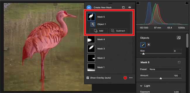
Figure 7. With Select Object in Camera Raw, roughly brushing over the bird results in a tight, precise mask.
If you create a People mask, and then select one of the people recognized in the image, you can then select which body parts you would like to create a mask for (Figure 8). Are you trying to retouch just the face, excluding eyes and lips? Mask done.


Figure 8. In Camera Raw, Select People lists recognized people, and lets you choose which people parts to mask.
The ML-enhanced masks are the basis for new adaptive presets. For example, an adaptive preset for eyes will find the eyes in different images for you.
Spot removal also got a major upgrade by reworking the old limited, slow Spot Removal tool into the much faster, higher-quality Content-Aware Remove tool.
These enhancements save a lot of time and trips to Photoshop. Some new features are not yet available on all desktop, mobile, and web variants of Lightroom and Camera Raw. For example, Camera Raw 15 now includes Curves in masked adjustments, but that enhancement is not yet available in Lightroom or Lightroom Classic.
Adobe Premiere Pro 2023 (version 23)
Some enhancements to Premiere Pro are relatively minor but useful, such as being able to specify inner and outer strokes for graphics, easier alignment for titles, and being able to edit multiple titles at once in the Timeline panel.
What may have more impact on workflows are an assortment of performance improvements. Motion graphics now take advantage of multi-frame rendering, and GPU acceleration now applies to 10-bit AVC Intra formats and Lumetri scopes. (In previous versions, calculating Lumetri scopes could cause video playback to stutter; with GPU acceleration both now play smoothly.)
Since MAX 2021, Adobe integrated the recently acquired collaborative online service frame.io (Figure 9) into both Premiere Pro and After Effects, simplifying frame-accurate online review of video projects.

Figure 9. The frame.io panel allows frame-accurate cloud-based review of video projects.
Adobe After Effects 2023 (version 23)
After Effects gets its own low-key but high-impact enhancements. The one getting the most attention is being able to easily choose any layer as a track matte (Figure 10). Using track mattes used to involve a complex layer setup, particularly if you wanted multiple layers to use the same track matte. Now you can have just one track matte layer, and many other layers in the composition can use it.


Figure 10. In After Effects, use the familiar pick whip to set a layer as a track matte for any number of other layers.
Some would categorize that feature and several others under modernization, which is welcome, but also tend to get the reaction “they should have done that years ago.” Other new features like that include being able to encode to the popular H.264 format in the Render Queue (instead of having to send a composition to the separate Adobe Media Encoder), reorganizing Composition Presets to better match video formats in use today, and adding the first new Animation Presets in many years.
Many will appreciate restricting keyboard navigation among keyframes and markers to selected layers only, when adding the Shift key to the traditional J and K shortcuts. Before the Shift enhancement, J and K could jump to keyframes on many layers other than the ones you want to focus on. You can now also color-code keyframes and select keyframes by color.
The After Effects public beta introduces several key features. A Properties panel reduces the need to keep other panels open, as in Photoshop and other Creative Cloud apps. Support for OpenColorIO and ACES color management, to support high-end professional video workflows. And most intriguing of all, being able to import 3D objects and use them with existing 3D features. For example, you could export a 3D object from Illustrator, bring that into an After Effects composition and fly around it in 3D.
Adobe Bridge 2023 (version 13)
If Adobe Bridge is at the center of your workflow, you might notice that Bridge is rarely discussed at MAX. Well, wake up and pay attention, because this time, without any fanfare, Bridge turns out to be one of the more radically updated Creative Cloud apps.
Mac users can breathe a sigh of relief that Bridge is now Apple Silicon native — one less reason to keep running the resource-consuming Rosetta translation environment for Intel-based software.
But what will affect every Bridge user is the overhauled user experience. There isn’t space to cover it in detail here, but here’s the short version: The way panels and their keyboard shortcuts work is now quite different (Figure 11). If you most frequently use Bridge with Photoshop, InDesign, Illustrator, and Lightroom Classic, the changes may seem quite alien, and you may have to relearn how Bridge panels work and retrain your muscle memory. The changes are consistent with long-established workspace conventions in Creative Cloud pro video/audio applications, so for those Adobe users, Bridge might be familiar and intuitive.

Figure 11. The Bridge 2023 workspace looks and works more like workspaces in Creative Cloud pro video apps.
For example, for many years you could hide the side panels in a Bridge application window by pressing Tab, which maximized the center panel only. Now you can maximize any panel by hovering over it and pressing ` (accent grave), which is a wonderful feature from the Adobe video apps. But it’s wonderful only after you get used to it.
If you are a heavy user of Bridge, I recommend reviewing the help files for Bridge 2023, and it may also help to study videos and articles of panel management in Creative Cloud video/audio apps.
Around for Another Lap
Adobe MAX 2022 sends us around the track for another year, as digital production continues to change from year to year, and from decade to decade. How well will existing Creative Cloud applications be adapted to emerging workflows? How will recent Adobe acquisitions such as frame.io, Figma, and Substance 3D be further integrated into Creative Cloud? We will see when we come around to the upgrade starting line again at MAX 2023.
This article from CreativePro Magazine is for members only. To continue reading, please log in above, or sign up for a membership today! Thanks for supporting CreativePro!
Yes, dear reader: It’s been six decades since adman Martin K. Speckter announced to the world that what we needed was a single piece of punctuation to do the job of both a question mark and an exclamation point. It was the spring of ’62 when he proposed what came to be known as the interrobang.

Interrobang in Palatino Linotype
Birthdays are a perfect time to reflect on the past and contemplate the future. So let’s consider our friend the interrobang. It it useful? Is it anachronistic? Is it tattoo-worthy?
Wait—what is this interrobang you speak of?
If you know, you know. But if you’re in the dark, don’t feel bad. The interrobang is an obscure punctuation mark that experienced a flutter of fame in the 1960s when it was introduced. But these days, it’s mostly admired (and sometimes even employed) by a small group of people who probably all answer to the description “creative.”
You can read more about the interrobang right here on CreativePro. You can listen to this great episode of 99 Percent Invisible. And you can dive into Keith Houston’s thorough explanations of this quirky mark on his excellent Shady Characters website or his book of the same name. But here are the quick, major facts:
- Martin Speckter, who headed up his own New York ad agency, proposed the new mark in the March–April 1962 edition of an advertising typography magazine he edited called Type Talks.
- The interrobang was supposed to work for the sorts of exclamations that express a question—particularly rhetorical—or a sense of doubt.
- Speckter worked with his art director, Jack Lipton, to create a few potential designs and invited the magazine’s readership to propose their own designs and names.
- Interrobang is a mashup of interro- (as in question) and bang (a nifty way to say exclamation point). Other names considered were exclamaquest, rhet, and quizding.
- The interrobang was made available on a special switchable keys for certain Remington and Smith-Corona electric typewriters in 1968 and 1969, respectively.
- Despite early interest, the interrobang never really got a foothold. Today, though it does enthrall a handful of fans, it barely survives on the fringes of our written communications.
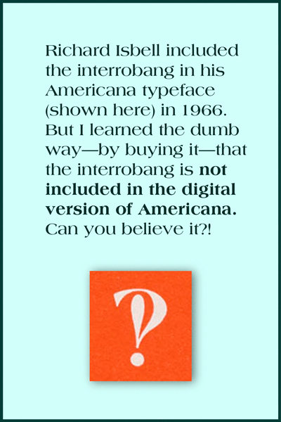
This is the interrobang shown in American Type Founders’ promotional collateral for the typeface Americana.
Let’s take a closer look at the interrobang’s origin story.
After reading everything I could get my hands on about this two-in-one punctuation mark, I made three conclusions about the interrobang.
1. It was deadline-inspired.
There’s a great 2018 episode of the Netflix series Explained that’s dedicated to the exclamation point. The show includes an interview with Penny Speckter, Martin’s widow, in which she recalls the provenance of the interrobang.
We were at dinner [in a restaurant] one night, and he [Martin] was lacking four pages [for Type Talks, the magazine he edited]. And all of a sudden, he thought of the interrobang. So he called the art studio that we used, and he said, “Is anybody … around who can draw?” And we went over. We were there until about three o’clock in the morning and he came up with a number of versions of the interrobang.
In other words, Mr. Speckter had an impending deadline, and the mother of invention, Necessity, drove him to come up with a topic for a typography article. The alleged need for the interrobang—the “inelegance” of a side-by-side exclamation point and question mark—was probably more of a good hook than a bad problem.
2. It was PR-nourished.
Speckter was a Madison Avenue man, and he’d worked in the ad biz for decades. He’d been in Army public relations during World War II, and then he went on to work for Bozell Jacobs and start his own agency. Before his long PR and advertising run, he was a staff reporter for the Omaha World-Herald. So it’s fair to say that he knew the world of publicity inside and out.
In 1962, his company, Martin K. Speckter Associates, had Dow Jones on its client roster. The agency regularly promoted publications like the Wall Street Journal, the National Observer, Barron’s, and the Dow Jones News Service.
So is it a coincidence that the Wall Street Journal picked up the interrobang story immediately after the Type Talks article ran?
According to Keith Houston, Penny Speckter called the Wall Street Journal’s early coverage of the interrobang “a complete surprise.” She insisted that “back in 1962, journalism was much purer than it is today” and the editorial staff “barely spoke with the advertising side.”
But I don’t think it’s a stretch to imagine Speckter simply making certain that the right people at the paper knew about his new punctuation mark—and what a compelling article it would make. I know he made a convincing pitch to Joseph Kaselow of the New York Herald Tribune, because the resulting article began this way:
Note came to us the other day from Martin Speckter reading: “There’s a fascinating article in the attached copy of Type Talks Magazine. It is written with verve, dash and a touch of scholarly roguishness which will, no doubt, have high appeal when this year’s nominations for the Nobel Prize are studied.”
Funny, sure—but also effective.
3. It was advertising-centered.
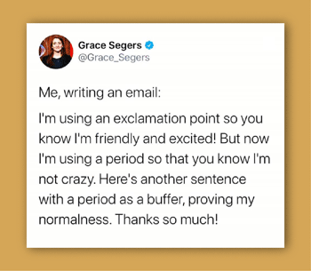
These days, we tend to be cautious in our use of the exclamation point. We don’t want to come off as shouty or unbalanced. I think this tweet sums up the common attitude perfectly:
But at the time when the interrobang was born, the exclamation point got a whole lot of play, particularly in advertising. Just look at this ad from 1962. Essentially every! Sentence! Is! Exclamatory!

You can imagine why in 1962, the average ad agency might feel compelled to punch up its many rhetorical headlines (à la Can you believe it?) with a big bang.
Martin Speckter thought the interrobang would be embraced by the advertising industry and catch on in the world beyond. But it turns out that advertising and real life are not quite the same.
Troubles in interro-dise
The interrobang has never been easy to use. Even though it eventually got included in a couple of fancy typewriters and a metal typeface in the 1960s, these were rarities. Most of the time, typing an interrobang meant superimposing a question mark on top of an exclamation point (or vice versa). And if you needed to print an interrobang, an illustrator or lettering artist generally had to custom-craft something for the job.
But fast-forward to today, when we could technically have an interrobang in every typeface, in every app, for every situation. We could, but we do not. Even the typeface on this very page (Merriweather) lacks an interrobang.
This is largely because demand is so very low. Why should type designers bother creating a glyph that no one ever uses?
Additionally, the interrobang is an awkward little beast that’s almost impossible to include in real-life text without calling attention to itself. It often looks like a beefed-up P or a drunk pilcrow (¶). It’s virtually impossible to design for real workability.
Steven Matteson of Matteson Typographics says that when the interrobang was conceived, no one considered “how poorly it would render in bold weights of type.” Even in regular text weights, he says, “it can blot up, causing an annoying dark spot on a page.”
Type designer Laura Worthington says, “I only have the interrobang in one or two of my fonts, because it’s such an incredibly difficult character to design. For anything bold, it starts fill up in on itself. What do you do with that little counter space? How tall do you make it?”
Treacyfaces’ Joseph Treacy says that design difficulties combined with nearly nonexistent need translate into disappointing results. “Many well-known foundries, knowing that interrobang will always be an obscure bauble but mostly unused, just don’t spend time actually solving the design problem. They just crash the two characters together as the ! and ? were drawn and stop there. Unfortunately, the results are predictably unusable. And often, even bland to unrecognizable.”
You can see what he means. Here are most of the selections available on my own computer. (These are the ones I think of as having a vertical orientation. Keep reading for some admirable variations.)

I’m a member of the fanned club.
One way to combine a question mark and exclamation mark is to let them share a dot but lean apart just a bit so they each have enough room to express themselves properly. This can’t work in every typeface, but I do think it’s the best-looking option, and I believe it would make a great go-to emoji.

An “early version” of the interrobang, as it appeared in an article by Allan Haley in Typeworld in 1980 (July).
Keith Houston refers to this style as “disjoint”; Joseph Treacy has suggested “splayed” and “fanned.” I like this last term best, not only because it’s so easy to associate visually with a fan or a hand of cards, but also because “fanned” hints at its potential popularity.
Christian Schwartz has designed several charming fanned interrobangs. Joseph Treacy notes that this approach “produces a better result that also recaptures some of the emphatically fun, ‘luncheonette’ handlettered sign art styles of the ’20s through the ’40s.”

Here are a couple of interrobangs doing their thing in Schwartz’s Fritz and Amplitude typefaces (released in 1997 and 2003, respectively):

Schwartz gave so much thought to his interrobangs, he even came up with a new hybrid in Amplitude. Maybe we could call it the questocom:

Anyway, if a good-looking fanned interrobang were always within easy reach, I could actually see wanting to include it in my writing every now and then.
That “easy reach” thing is only a dream at the moment, though.
Hunting down the elusive interrobang
The interrobang doesn’t have a home on our keyboards, alas. I typically look the thing up on Wikipedia and attempt some copying and pasting. Which often leaves me with something like this:

Even if you can get an interrobang to appear in your text, it’s unlikely to be available in whatever font you’re using. In more casual communications, however, aesthetics aren’t crucial, and you can settle for a one-design-fits-all interrobang.
The emojinterrobang
On my Mac, if I pull up my emoji keyboard and type “interrobang,” I get these choices:

That upside-down fellow on the right might be good if you were writing Spanish. It has a terrific name: gnaborretni. (Get it? That’s interrobang spelled backward.)
The emoji panel on my iPhone doesn’t include any “real” interrobangs, for some reason. But I’ve set up a shortcut in the text-replacement section of my system preferences so every time I type a question mark and an exclamation point together, I get the interrobang emoji.
Except … that doesn’t work in the very Google doc where I’m writing this. Have I mentioned that the interrobang is terribly tricky to use?
Could it live as a ligature?
Type designer David Jonathan Ross pointed out to me that the interrobang could be regarded as—and programmed as—a ligature. The same shortcut I use to quickly get an emoji in my texts (!+?) could be included within well-designed typefaces. Using his own unpublished font, he created a demonstration:

Neat, right?
The ligature could (and probably should) be discretionary. But ligature status might bring this punctuation mark out of the shadows a bit.
Happy birthday, interrobang!
At sixty, the interrobang remains something of a recluse. It will probably never be widely used in highfalutin journalistic and literary endeavors, but it could prove useful and gain traction in personal communications—texts, tweets, and the like. It could enhance or even politely replace the common term “WTF.”
Those who admire this unusual punctuation mark will continue to do so. Such enthusiasts are all around you. They use the word “interrobang” to name their design studios, advertising firms, and music albums. They form interrobang appreciation societies and Facebook groups. Some even make the mark permanent, like copywriter Justin Blackman, who shared this photo of his forearm.

How about you? Are you a member of the interrobang fan club? If you do use interrobangs, how do you go about doing so? And what kind of reactions do you get? Do tell!
All trademarks belong to their respective owners.
Bibliography
Consuegra, David. 2011. Classic Typefaces: American Type and Type Designers. Allworth Press.
Contributors to Wikimedia projects. 2002. “Exclamation Mark – Wikipedia.” Wikipedia, the Free Encyclopedia. Wikimedia Foundation, Inc. June 24, 2002.
———. 2003. “Interrobang – Wikipedia.” Wikipedia, the Free Encyclopedia. Wikimedia Foundation, Inc. September 19, 2003.
Explained: Exclamation Mark (!): . 2018. Netflix – Watch TV Shows Online, Watch Movies Online. Netflix.
Garfield, Simon. 2012. Just My Type. Avery.
Haley, Allan. n.d. “X-Height: FontHaus’ Online Magazine?: The Interrobang Is Back.” Wayback Machine. Accessed June 21, 2022.
Houston, Keith. 2013. Shady Characters: The Secret Life of Punctuation, Symbols, and Other Typographical Marks. W. W. Norton & Company.
“Interrobang – 99% Invisible.” n.d. 99% Invisible. Accessed June 16, 2022.
“Interrobang – The Passive Voice.” n.d. The Passive Voice – A Lawyer’s Thoughts on Authors, Self-Pub and Traditional Publishing. Accessed June 25, 2022.
Jay, Alex. 8AD. “Tenth Letter of the Alphabet: Creator: Martin K. Speckter.” Tenth Letter of the Alphabet. 8AD.
Kaselow, Joseph. 1962. “Along Madison Avenue with Kaselow.” New York Herald Tribune, April 1, 1962.
“Martin K. Speckter.” n.d. Academic Dictionaries and Encyclopedias. Accessed June 25, 2022.
“Martin K. Speckter, 73, Creator of Interrobang – The New York Times.” 1988. The New York Times – Breaking News, US News, World News and Videos. February 16, 1988.
“Miscellany ? 81: Toward a Taxonomy of the Interrobang – Shady Characters.” n.d. Shady Characters – The Secret Life of Punctuation. Accessed June 17, 2022. .
“MYRTLE SPECKTER Obituary (2020) – New York, NY – New York Times.” n.d. Legacy.Com. Accessed June 20, 2022. .
Nordquist, Richard. 2008. “Definition and Examples of the Interrobang.” ThoughtCo. ThoughtCo. August 15, 2008.
Omaha World-Herald. 1962. “We Should Have an Interrobang!?,” May 27, 1962.
Quinion, Michael. n.d. “World Wide Words: Interrobang.” World Wide Words. Accessed June 25, 2022.
Stinson, Liz. 2015. “The Secret History of the Hashtag, Slash, and Interrobang | WIRED.” Wired. WIRED. October 21, 2015.
Strizver, Ilene. 2009. “TypeTalk: InterroBANG | CreativePro Network.” CreativePro Network. September 3, 2009.
The Economist. 2014. “The Rise and Fall of the Interrobang | The Economist.” The Economist. The Economist. October 1, 2014.
“The Interrobang, Part 1 of 2 – Shady Characters.” n.d. Shady Characters – The Secret Life of Punctuation. Accessed June 20, 2022.
“The Interrobang, Part 2 of 2 – Shady Characters.” n.d. Shady Characters – The Secret Life of Punctuation. Accessed June 20, 2022.
“TypeTalk: Standard vs. Discretionary Ligatures | CreativePro Network.” 2014. CreativePro Network. August 13, 2014.
“You Call That a Punctuation Mark?! The Interrobang Celebrates Its 50th Birthday – The Millions.” 2012. The Millions.
In this episode…
- News
- Adobe InDesign 17.2.1 update patch released
- CreativePro Week May 9-13, live in DC and online
- CreativePro Events: https://creativepro.com/events
CreativePro Magazine: https://creativepro.com/issues/ - CI-HUB Prize Raffle: https://ci-hub.com/creativepro/
Deadline is May 2 2022! Details on that page
- Field Guide to Non-Printing Highlights (there are more than you think!)
- Obscure InDesign Feature: Float in Window
Sponsors for this episode:
>> Microsoft and Adobe! Both of these fine companies are CreativePro partners and will be represented at CreativePro Week 2022. Adobe is flying in a group of Adobe CC engineers from India, and MS Office product manager Stephanie Horn is doing a session on using video in Powerpoint.
Links mentioned in this podcast:
- You can use CC Libraries in Word and PowerPoint: https://creativepro.com/using-cc-libraries-in-word-and-powerpoint/
- Cool tip: “How to Make an Object Style That Resizes Objects from the Center (or Any Other Reference Point) in InDesign”
https://creativepro.com/how-to-make-an-object-style-that-resizes-objects-from-the-center-or-any-other-reference-point-in-indesign/ - What’s new in 17.2.1: https://helpx.adobe.com/indesign/kb/fixed-issues.html
- Andreas Michalski from CI-HUB, our guest from the last podcast episode
- Company site https://ci-hub.com
- Enter their raffle here: https://ci-hub.com/creativepro/) for free tickets to CreativePro Week and free subscriptions to CI-HUB! Deadline for entries is May 2, and they’ll contact the winners on May 3, 2022
- Composition Highlights:
https://creativepro.com/field-guide-to-composition-highlighting/
https://creativepro.com/why-is-my-indesign-text-highlighted-in-blue/ - What Anne-Marie taught David in this episode (how to quickly jump to the active InDesign document’s location on your hard drive):
https://creativepro.com/indesign-how-to-video-find-file-size-location/ - 3 Minutes Max tips:
https://www.youtube.com/watch?v=580PSVBohDI&list=PLFof_0NMmT7Uwyy6bc1Uo5OlfBUEtU2Li

We’re thrilled to share the full agenda for The Design + Accessibility Summit, the essential HOW-TO event for design professionals who need to master accessibility.
Sessions include:
- Accessibility, Square One, Lindsey Engelhardt
- InDesign’s Accessibility Superpowers, Chad Chelius
- Making Color Accessible, Colleen Gratzer
- Accessible Type, Bevi Chagnon
- Screen Readers 101, Karen McCall
- Alt Text, Caroline Desrosieres
- Building Accessible Infographics, Dax Castro
- PowerPoint Accessibility, Stephy Hogan
- Accessible Video, Audio, and Other Media, Carie Fisher
- And more…
Registration includes up to four full days of educational sessions, each followed with a live Q&A with the speaker, plus networking, speaker handouts and resources, and one year of on-demand access to rewatch session recordings.Make a difference to your audience by learning how to create documents that are accessible to everyone.
Let’s call this one The Wish List Edition. First rolling out to users on July 25, Illustrator 26.4 is a version that ticks off some ancient items on the wish lists of users everywhere. Adobe’s developers have added an actual list feature (for bullets and numbering), as well as a History panel, and some smaller things in the 3D and Materials area.
Let’s take a look at the details of these functions, and what they can—and can’t—do for us.
Making a List
The Bullet & Numbering feature has sparked many discussions about how “InDesigny” Illustrator should get. Are lists really necessary or will this encourage people to do things like layout catalogs in Illustrator? For a long time I’ve agreed with those who said Illustrator should not try to be InDesign Lite. Yet, at the same time I’ve seen packaging designers who need to use Illustrator struggle with the program’s limited text abilities. Ultimately, I was glad to see lists coming to Illustrator because I can see the need not only for packaging, but other areas as well, like infographics.
The Illustrator developers have not copied InDesign’s way to make lists. Instead, it looks like they have been inspired by the way Microsoft Office software does it. But at least the Bullets & Numbering feature is easy to find, located in the Paragraph panel (the inputs also appear in the Control and the Properties panel when text is selected). You can also use it from the Text menu (and the contextual menu when working with text).
You can format a single selected paragraph, all the paragraphs in a selected area, or all the paragraphs in a text frame by clicking on either the Bullets or the Numbered Lists button (Figure 1).

Figure 1. Turning text into a bulleted and a numbered list
Once the text is a list, we can modify the list formatting. There’s a pop-up offering several numbering styles and four different bullets, so you can style lists differently. Each level in your lists can have its own style (Figure 2).

Figure 2. The popup has basic formatting for the bullets respectively the numbering.
Undo a list
In order to convert a list item back to normal text, click on the pressed list button in the Paragraph, Control, or Properties panel.
Additional list options are found in a dialog box that you open by clicking on the More Options button (three dots). Because these options are in a modal dialog box, the process can be rather complicated – particularly when formatting multi-level lists. In order to move the cursor to another list item, you have to first close the dialog box, put your cursor into a different list item and then re-open the dialog box, and so on (Figure 3).

Figure 3. Both types of lists are formatted using the same Bullets & Numbering dialog box. Switch between them using the tabs at the top of the dialog box.
The list formatting is very basic. You can’t apply character styles to the bullets or numbers, or even change their color. Instead numbers take on the list item’s character styling. The four bullet types cannot be changed at all – at least not without a workaround that we’ll come to in a moment.
First, let’s take a look at a different method for creating lists. There are some trigger characters that create list entries when typed at the beginning of a paragraph: *, #, >, + followed by a space (which is important). Illustrator then creates a list entry, keeping the character as its bullet. This is the only way of using those characters as bullets (Figure 4).

Figure 4. Bulleted lists with special characters
Typing multi-level lists
Levels in your lists can be created by setting the Level number in the Bullets & Numbering dialog. You can also just place the cursor before the list item and type a Tab in order to increase the list level. Type Shift+Tab to decrease it.
Now let’s come to hacking list formatting. If you want to format your bullets (or numbering) differently than the following text, you need an additional space before the actual list item. The smallest space Illustrator can use, is a Hair Space. Any formatting applied to that space will also be applied to the list bullet or number (Figure 5).

Figure 5. Hacking lists with spaces: you can get creative and apply color, font size, baseline shift or a completely different font. With the * list bullet and Zapf Dingbats you can get the pointing finger for that cheeky Seventies list.
Note that this behaviour is an option that you can find in Preferences > Type: Automatic Bulleted and Numbered lists while typing. If you don’t want Illustrator to create a list every time you start a paragraph with one of these triggers, you need to turn it off.
The space-formatting hack was inspired by a design Jean-Claude Tremblay shared in the Illustrator Prerelease group. His artwork took the technique a bit farther.
When using the space hack, you will also need to adjust the list positioning – and maybe you will want to change the indents for your basic lists anyway. Just like InDesign, Illustrator uses Left Indent and First line indent for the positioning. You can use negative indent values to move your bullets (and even your text) outside the text object bounds (Figure 6).

Figure 6. Using the indents to align lists with the space hack and multi-line list entries. Start with the First Line Indent to adjust the spacing between bullet and list entry. Then adjust the position of the whole line. Multiline list items, which are hacked, need additional indents via the paragraph panel.
The Alignment option aligns the bullets (and more importantly the numbering) to Left, Center, or Right. Unfortunately it doesn’t work reliably (Figure 7).

Figure 7. Lists with left- and right-aligned numbering.
The general paragraph indents are applied cumulatively to list indents, which can work against you when formatting lists using Illustrator’s paragraph styles. Paragraph styles in Illustrator are irrational – especially when you are used to InDesign’s reasonable way of styling. In Illustrator all paragraph styles are children of the [Default Paragraph Style]. Every option that is not specifically set up in your custom paragraph style will be inherited from the [Default Paragraph Style]. No settings are mandatory in Illustrator’s custom paragraph styles (and therefore none are set by default).
Tip: Unlike InDesign, when when you outline text containing lists, Illustrator keeps the bullets and numbering!
Coming Undone
If you’re in the habit of moving objects with the arrow keys, you’re familiar with having to press Ctrl/Cmd+Z dozens of times to get back to the state before you started the move. This can be quite boring and eats up your time. Things like this are why people have been asking for a History panel to be added to Illustrator. Happily, this item has now been checked off from the wish list. Just don’t confuse the History panel with the Version History panel (which only works with Cloud documents).
Illustrator can remember up to 200 steps in the new History panel – depending on your computer’s memory and your settings in Preferences > Performance under History States. The panel doesn’t provide any advanced options such as snapshots (Figure 8).

Figure 8. The History panel – in order to go back to a specific state, just click on it.
Clicking on a state in the History panel will display it. Later steps will not be deleted immediately, so if you didn’t hit the correct step in a long list of “Pen, Pen, Pen” drawing moves, you can still go back or forth.
You can create a new forked version by clicking on Create New Document From Current State, go back to the source document, and return to your latest edit.
Or you can continue working at the state you went back to. Only then the later steps will be deleted.
Tip: History is only kept until you close the file. After that, what’s gone is gone.
Putting the Vector into 3D & Materials
3D & Materials is a work in progress and what has been missing all the time is its connection to Illustrator’s core: the vector paths. With this new version not only can you export wireframes with one click, but you can also render and expand the mapped artwork to vector paths (as long as you applied vector artwork and there is no gradient in it).
Strings attached: Gradients
Using gradients as image maps in 3D effects has always caused a conversion to pixels because it’s impossible for Illustrator to automatically render the lighting of a gradient using solid colored vector shapes.
Mapping artwork to a 3D object was introduced in version 26.2 (March 2022) and works via symbols. You drag the symbol from the Materials section of the 3D And Materials panel onto the object and then drag it around to position it. With complex objects you have to fiddle around a little in order to find the face of the object where you want the map to appear (Figure 9).

Figure 9. Dragging artwork onto a complex object with multiple faces. Applying a label and some stickers to a packaging is straightforward, but precisely arranging them is not possible.
Flat surfaces work best. On curved surfaces the mapping often does not work at all, e.g. this globe won’t look correctly when you rotate it (Figure 10).

Figure 10. Mapping a globe
Once the map has been applied, the Render As Vector option in the Render settings pop-up now applies to the map as well. The vector rendering will not reflect your lighting settings, though (Figure 11).

Figure 11. Render settings pop-up: left: correct lighting situation; right: rendered as vector
You can hide the actual object to show only the mapping, which is a setting in the Materials section of the 3D And Materials panel. This functionality allows you to perform some interesting distortions that cannot be achieved otherwise, and has always been an important component of the “Classic” 3D effect. Unfortunately it doesn’t cooperate now when you render mapping as vectors (Figure 12).

Figure 12. Rendering with Invisible geometry and rendering as vector
When working with 3D, Illustrator users expand the effect to color it with gradients. To expand the 3D effect to wireframes, go into the Object section of the 3D And Materials panel and then click on Expand as Wireframes in the Quick Actions section. Illustrator expands the object itself as well as vector artwork mapped onto them. Unfortunately after expanding some edges of the object might be missing and the Invisible Geometry option doesn’t work either (Figure 13).

Figure 13. Expand to wireframe tends to omit curved edges. It renders mapped artwork as vector without explicitly checking that option.
Expanding a full color 3D object
Of course you can also expand the rendered object. After applying the Render settings from the popup, choose Object > Expand Appearance. You will get a mixture of raster images and vector artwork.
Last but not least
The color applied to a 3D object is now preserved when exporting it as an OBJ. This allows you to save a step when using those files in 3D software and they are also easier to tell apart.
Summing it Up
The July 2022 Release of Illustrator brings some long awaited features, but it looks a bit unfinished. It’s almost like Adobe wants us to continue to prerelease process of testing and sending feedback in order to figure out which refinements are really needed in the industries where people are using these new features. Lists will probably always be less sophisticated than in InDesign, but users should at least be able to configure and format the bullets and numbers without having to fake them.
Not being an avid supporter of a History panel I’m curious to learn if it meets peoples’ expectations. The 3D and Materials function is still far from being able to replace the “Classic” 3D effects in workflows that involve output to vector and/or mapped artworks. It looks promising so far with some new functionality it brings to the table and I appreciate the ongoing commitment to improve it. But there is still a lot of work to do. I’m looking forward to the refinements, which I hope are coming soon.
Ah, spring! Time to open the windows, breathe in that fresh air, and brace yourself for allergy season.
Okay, not everything about spring is pleasant, but it is a time for new beginnings and also some spring cleaning. It’s a great time to look at the tools we use—and seek out new ones. So, in the spirit of spring, here are some items that will introduce you to new fonts, help you clean out your cluttered InDesign files, find new images and colors, and learn more about the history and future of design.
FontXChange
In this episode of The Amazing Race… to Remove My Type 1 Fonts, the clock is ticking to find a solution to replace all the old fonts we’ve collected over the past two decades.
The hero in this story is Fontgear’s FontXChange, an app that converts fonts from one format to another (Figure 1). It’s the perfect solution that will allow you to keep using your old PostScript Type 1 fonts after March 2023 (when they will no longer work in Adobe products) by converting them to OpenType.
Don’t think FontXChange is a one-trick pony, though, as it can also convert font files between their macOS and Windows versions, including Type 1 fonts for those apps that will continue to support them. FontXChange can also convert these font types to any of four flavors of web fonts, with the option to generate a sample HTML file for testing.

Figure 1. FontXChange can convert your fonts to and from OpenType, TrueType, and Type 1 (both Windows and macOS).
Electrónica
Who doesn’t love a bold, futuristic display font? And if that typeface is also full of simple and clean lines? Sign me up!
Electrónica by Graviton Font Foundry emits a sci-fi vibe, but doesn’t go overboard with it (Figure 2). This multipart font offers four styles for free (including a stencil and an inline form) that you can mix and match to create eye-catching headlines or logo text.
To make that task easier, check out Tony Harmer’s video on working with multipart fonts.

Figure 2. You can combine Electrónica’s inline and outline fonts to fun effect.
SVG Gobbler
If you’ve ever seen a webpage of cool SVG graphics and wished for an easy way to download them, SVG Gobbler is the answer to that wish!
This extension for Chrome and Firefox searches out the SVG content on any webpage. From the results, you can choose to download or copy the SVG, export as a PNG, or even view and copy the underlying XML code. You can also choose to download all of the page’s SVG files at once (Figure 3).

Figure 3. SVG Gobbler can find all SVG files on a web page and give you an interface to download or work with them.
Keep in mind the extension will also find any linked art on the site—logos, navigational icons, and other webpage elements—as long as they are in SVG format. The extension could save time if, for instance, you needed to quickly grab a client’s custom navigation elements from their webpage.
SVG Repo
SVG Repo has a library of more than 300,000 SVG graphics, all free for commercial use and nearly all without any attribution necessary. Many of the graphics are grouped within fun collections, such as Flat UI, Happy Trees, Tropical Fruits, and Colorful Weather vectors (Figure 4).

Figure 4. A sample of SVG Repo’s free Flat UI vectors and icons ready to download
You can also search by keyword and drill down into the results by searching only for monocolor, multicolor, outlined, or filled. That filtering comes in very handy when you’re looking for five icons of similar styles.
A History of Arab Graphic Design
If you’re on the lookout for new sources of inspiration, why not set your sight further afield to other regions of the world? In A History of Arab Graphic Design, authors Bahia Shehab and Haytham Nawar—both professors at the American University in Cairo—take us on a dive into the graphic design field in the region (Figure 5). With graphic design being relatively new within the Arab world, it’s really no surprise that this book is the first to cover its history.

Figure 5. Calligraphy samples from A History of Arab Graphic Design
The book delves into Arab art and culture pre-1900 as the foundation of the region’s graphic design identity. Arab calligraphy plays a large part in that, and many of the book’s images feature lovely examples of this fine art. Also featured in the book’s 360 colorful pages are examples of art, ranging from ancient mosaics to illustrated manuscripts.
A Collection of Cleanup Scripts
Keeping your InDesign files clear of debris—in the form of unused swatches, unfilled frames, or unapplied styles—can take up valuable production time. Lucky for us, some scripters out there understand our pain and have created automated solutions to help us with the chore of cleanup.
Luis Felipe Corullón is one such scripter, offering free scripts that excel at clearing the proverbial cobwebs from an InDesign file.
Remove All Styles and Swatches zaps styles and swatches from your document, as the name suggests (Figure 6). Double-click the script, select Styles and/or Swatches—keeping in mind that choosing Styles will remove paragraph styles, character styles, and object styles alike—then click OK. All previously styled text and objects will retain their formatting, but have no link to a style. This works in the same way as Break Link to Style in the various styles panels.
![Screen shot of newspaper page with character styles, paragraph styles, swatches panels open, all showing highlights of [None] or [Basic Paragraph]](https://creativepro.com/wp-content/uploads/2022/03/infocus-fig06.png)
Figure 6. After running the Remove Styles and Swatches script content has no links to paragraph, character, and object styles.
Warning: When a swatch is removed, all objects colored with that swatch will be reassigned to the default Black color swatch.
Remove Empty Style Groups instantly removes any created style groups that don’t actually contain any styles.
Remove Empty Frames and Pages lets you remove any combination of empty text frames, empty graphics frames (not unassigned shape frames, though), or empty pages and spreads. You can have the script remove those items across just the current spread or the entire document.
Comma Base
The Comma Base type family, from Martin Majoor, creator of the Scala and Nexus typefaces (Figure 7), marks the first offering from his recently formed, self-named type design foundry. It is available through Adobe Fonts, or you can license it from Fontspring.
Majoor describes the chameleonlike typeface as being the best of both worlds: Technically a sans serif typeface, it features angled edges and contrast, more like a serif face.
The entire Comma Base family is made up of 16 styles, ranging from hairline to ultra, each with an italic pairing. Some of the lighter styles even take on hints of a brush script.

Figure 7. Type sampler for the Comma Base font
Powered by Design
With the subtitle “An Introduc-tion to Problem Solving with Graphic Design,” Renée Stevens’ Powered by Design takes a look at how graphic design fits into the real world and affects those who interact with it (Figure 8). So, in addition to fundamentals such as typography and design hierarchy, the book examines weightier topics like accessibility and ethics.

Figure 8. Powered by Design shows how design translates to real-world use.
Stevens lays out the concept of design as visual communication, then follows up with real-world examples. Chapters describe the relationship between color and mood, activating across senses (keeping accessibility at the forefront), and how to tell stories and solve problems with design.
Fonts Ninja
Have you ever been scrolling through a website when you encounter a typeface that just speaks to you and you know you need to use it in your next project? It happens to me frequently, so I’m hoping I’m not alone!
In these instances, I used to peek into the webpage’s source code using my browser’s developer tools. But I’ve recently found an easier way: Fonts Ninja (Figure 9). This handy tool can be run as a standalone app or via a Chrome browser extension.

Figure 9. Fonts Ninja lets you inspect fonts in use on a web page.
While on any web page, use the browser extension to identify fonts as you move your pointer over them. A small box will pop up with the font name and weight, along with size, line spacing, letterspacing, and color.
Click on text anywhere on the page, and a larger panel gives you a place to type out your own text in the font, as well as view and copy the color as hex values.
The panel also lets you book- mark the font, while clicking its info button will bring up a new panel showing how to acquire it. In addition, you can view the different weights and stylings available.
The free browser extension works in conjunction with the desktop version ($29 a year) to provide additional functionality. One example: For fonts from foundries Fonts Ninja has partnered with, you can install a trial version of the font, so you can work with it and license it if you decide to use it.
Equalize Borders and Shading
InDesign’s Paragraph Borders and Shading function has been around for a few years now, and one thing that constantly trips me up is that each has control over similar functions. For instance, corner shape and text offset exist in both sections of the dialog box, and you might decide that you’d like them each to match.
While InDesign doesn’t give you the magic button to do that, Id-Extras offers a script that does.
The Equalize Borders and Shading script works when you have set either border or shading options—or both—and created a paragraph style with these options. (Note that if you haven’t assigned a style, absolutely nothing will happen when you run the script… a fact I learned the hard way.)
If you’ve set the options and assigned a paragraph style, select the frame and double-click the script. The dialog box pops up and asks if you want to equalize using the border or the shading properties. When you make your choice, all the common properties equalize to your choice, and your paragraph style is updated to reflect this (Figure 10).

Figure 10. A paragraph with separate borders and shading settings (top) can have those settings synchronized with the Equalize Borders and Shading script (bottom).
Happy Hues
Happy Hues is a color inspiration site that shows your chosen colors within the context of the page design itself. Front and center is a button that automatically changes the site’s colors to another of its 14 ready-made combinations, or you can click one of the palettes shown on the left to manually select one.
Either way, the page reloads using a new palette of colors, with a handy breakdown of which elements were assigned which color (Figure 11). Click an individual color’s description to instantly copy its hex color code to the clipboard.
The tiny, colorful site provides some handy color terms and a brief overview of the psychology of color. I do wish there were a lot more color combinations to choose from or a way for users to experiment with their own color palettes, but it offers something that is often missing on other color picker sites: simplicity that just lets these happy hues speak for themselves.

Figure 11. You can apply any of 14 color palettes to the Happy Hues site.
Adobe InDesign Classroom in a Book
Peachpit’s Classroom in a Book instructional series is a staple for folks learning Adobe software, with the latest versions focused on the 2022 versions of the Adobe apps (Figure 12). Adobe InDesign Classroom in a Book by Kelly Kordes Anton and Tina DeJarld is designed to get you up and running in the app, covering topics in workbook style.

Figure 12. Classroom in a Book is now available for Adobe InDesign 2022.
The project-based format includes 15 step-by-step lessons on such subjects as typography, graphics, color, pages, and exporting interactive PDFs. You can follow the book straight through or jump around.
The book comes as an ebook (in EPUB, PDF, and MOBI formats) or a 450-page paperback edition with downloadable lesson files. A web edition includes the text of the book and interactive quizzes and videos. You can purchase bundles that combine the book and/or the ebook with the web version.
Suit Icons
Suit Icons is a playing card-inspired font full of icons you can use for all manner of games, card-based and otherwise.
The creator, a user on the boardgame enthusiast site BoardGameGeek who goes by Septyn, envisioned the font being used within fantasy-based games as well as for prototyping future games.
The font evolved as a DIY project in the BoardGameGeek forums, with input from other users. Septyn supplies a character map that includes Windows alt codes for each of the 192 glyphs (Figure 13).

Figure 13. A selection of icons available in the Suit Icons font
The font’s icons include the expected hearts, spades, diamonds, and clubs, as well as medieval symbols, chess pieces, royal-looking crests, and geometric shapes. As a Dr. Who fan, my favorite is the TARDIS thoughtfully placed on the question mark key. True Whovians will know why.
Spring Forward
Even if you’re not a gardener, spring is a great time to sharpen your tools—and seek out new ones—so that you can create and design, unhindered by the dusty and dull.
I hope that spring brings you new ideas, new ways of looking at design, and new-to-you InDesign goodies.
When I was asked to make a list of some of the sessions at CreativePro Week 2022 that I’m most looking forward to, I thought, “sure, no problem, that’ll be easy.” With so much great stuff for creatives on the agenda, how could I go wrong? It turned out to be a little harder than that—for the exact reason I thought it was going to be easy! With so many amazing speakers talking about so many important topics, I was shaking my head as I scrolled up and down the list. I could make a case for any one of them to be an absolute do-not-miss. But, in the end I went with my gut reactions, picturing that I was in the conference hall in Washington, DC and the doors to all the sessions were about to be locked. Which ones would I drop everything and run to get into? So, lace up your sneakers: here’s the list of 7 CreativePro Week sessions that I think are sprint-worthy!
10 Essential Photoshop Productivity Tips
 Julieanne Kost
I have been a Julieanne Kost superfan for as long as I can remember. I’ve learned more practical Photoshop knowledge from her than anyone else. Don’t get wrong—I love flashy cool effects, too, but what gets me sitting in the front row of her sessions are the useful everyday tips and techniques that make working in Photoshop much more productive and pleasant. Julieanne doesn’t just know Photoshop; she knows Photoshop users—what we struggle with, and how to help us. I always come away from her sessions with a bunch of notes for things to try out ASAP, and usually end up wondering how I got along without them. She never disappoints.
Quality Selections and Masks in Photoshop

Jesús Ramirez
Jesús Ramirez is a Photoshop rock star because he has the ability to produce stunning work and show you how to accomplish the same things yourself with style and ease. Like all amazingly talented people, he makes the incredible look easy. But more importantly, he gives you the confidence to take on any task in Photoshop, believeing that it’s going to come out awesome. And there are few tasks more fundamentally important than making selections and masks. I’ve been using Photoshop for more than 25 years but when I watch Jesús, it seems fresh and new again. I wouldn’t miss this one for all the pixels in Adobeland.
Favorite Tips from InDesignSecrets and DesignGeek


Anne-Marie Concepción and David Blatner
What more could be said about these two folks? It’s not just that they know just about everything there is to know about InDesign, it’s that they share it with everyone in such a relaxed, fun, human way. The cheerful back-and-forth banter is my favorite, as they take turns showing each other incredibly obscure but incredibly useful stuff. I guarantee there will be audible gasps of amazement in the audience. If you’re someone who uses InDesign every day, the things you learn in this session alone could return your investment on the show.
Amazing Infographics

Tony Harmer
I never miss a session by Tony Harmer because he personifies the joy of creativity that got us all started in this business. He’s lived the life of a creative pro for so long and knows the tools so well, that he could do a session in his sleep. But his sessions are the exact opposite of sleepy—always brimming with the excitement of discovery, yet delivered with the voice of precision and experience. I don’t know how he does it but I’m sure glad he does. It’s that combination of art and science, data and design, that makes him the perfect person to watch on the topic of infographics.
CC Collaboration with Files, Libraries, and Cloud Docs

Bart Van de Wiele
This is such an important topic, and it’s being covered by the perfect speaker for the job. It’s no secret that that’s Adobe has been pouring the majority of their resources into Creative Cloud features and services in recent years. They’ve put a ton of thought and effort into figuring out how to support collaborative creative workflows. And as an Adobe insider, Bart Van de Wiele is uniquely positioned to show us how to take full advantage of Creative Cloud. He knows the tools inside and out, and how they all connect. He truly cares about helping folks learn how to do their work better. He’s also really tall, so you can see him clearly from the back of the hall, which is important since his sessions are always packed.
Wow-worthy Type Projects

Nigel French
To paraphrase a very old commercial, when Nigel French talks about type, people listen (maybe it’s the English accent). Whether he’s showing you how to lay out a 1000-page book, or create amazing special type effects, he brings the same impeccable taste and craftsmanship to the topic. The projects he shows are inspired (and inspiring), yet always understandable and achievable by us mere mortals. He breaks down the elements of great type so you can easily see what’s going and incorporate it into your own work.
Why You Can’t Live Without Adobe Bridge
 Russell Viers
When I spoke at these events, I swore I wanted it in my contract that I would never directly follow Russell Viers on stage. It’s like following Elvis. Even if you’re great, you can’t help but pale in comparison. Russell is a force of nature and when he holds forth on a topic like Adobe Bridge you will learn a ton—not just the hows but the whys—and be excited to try it all out as soon as possible. Russell is a huge believer in Bridge and I bet he’ll make you a believer in it, too. He’s also the funniest presenter I’ve ever seen and the most unflappable. Never mind a specific piece of software, Russell’s sessions make me feel excited about my career. Miss him at your peril.
See You in DC
I hope to see you Washington, D.C. this coming May 9–13. Click here to learn more and sign up now!
It’s hard to believe, but it’s 2022 already! Time to set goals with the best of intentions and think ahead to all you want to accomplish in the coming 365 days. That could mean branching out in a new design direction or finding ways to streamline a workflow. Maybe this is the year all the pieces will fall into place so you can work smarter, not harder. Whether you’re one to set intentions or not, a good first step into the new year is to add some shiny new tools to your InDesign bag of tricks.
Helpful Add-ons
What InDesign user doesn’t love finding a script that instantly performs a task that’s way too repetitive or has too many steps? I’ve recently discovered a couple of new-to-me scripts during some lively discussions on the CreativePro Discord server. Sometimes I don’t even realize I have a need for a script, until I learn of its existence—and then I wonder how I ever got along without it.
Package Selected Pages script
If you’ve ever needed to create a new document from a selection of pages in your current document, you know the pain the Package Selected Pages script alleviates. Say you need pages 1 through 7 and pages 11, 18, and 23, including all of the links used on those pages. This script from Luis Felipe Corullón creates a packaged file—complete with options to include an IDML and a PDF file—but just for the selected pages. In addition, you can choose to set a custom name, force the package folder to open after creation, and even clear the pasteboard in the process!
Setup script
The Setup script created by Keith Gilbert changes many of your InDesign preferences—for both the document and application—with one simple click. I say simple, in that it only takes one click to execute, but be warned there is no one-click undo. To use the script, you’ll most likely want to customize the preferences it sets to suit your needs. Keith explains how to do that in this article.
Text Count script
If you need to keep track of word count in your InDesign document and you need more than the Info panel can give you, take a look at Text Count from DTP Tools. As part of their cloud-based subscription suite, Text Count relays character, word, and line count information in real time, as you work (Figure 1). In addition to providing a count for type you’ve already input, it can also estimate capacity within empty frames, based on styles, language used, and other factors. If you need to provide any of these counts—for a client as a freelancer, for example—Text Count can generate reports that you can easily share.
Figure 1. The Text Count panel
Fonts and Type
As a designer, can you ever have too many fonts? I suppose it’s possible, but to keep your designs from stagnating, you need to augment your type library from time to time. Here are some worth consideration.
New Adobe fonts
The Adobe Fonts service often welcomes in new foundries and type designers, and I check the blog regularly to see what’s been added. I admit I tend to be drawn to the unusual newcomers, especially in the display fonts category. Here are just a few that recently caught my eye.
Macula
Macula is a multipart font that also embodies a classic optical illusion to twist your glyphs and your mind. Its different forms—lined, background, and shading to name a few—can be colored separately, then layered to expand the typeface’s looks (Figure 2). Check out Tony Harmer’s video to see his trick for editing text created with these types of fonts.

Figure 2. Stack Macula’s multiple parts for a layered look.
Desire
I had way too much fun when I activated this font (Figure 3), inventing holiday cards I never intended to send! At first glance, the base font reminded me of a straightforward, condensed Bodoni-esque serif. But what caught my eye was the amazing variety of ligatures, glyph alternates, and even tiny catchwords—644 alternates and 98 ligatures to start with! You can choose from no flourish at all to all the flair you could ever want on a glyph. Now if you’ll excuse me, I’m off to create signage for my non-existent ye-olde-timey ice cream shoppe!

Figure 3. Using some of Desire’s many text alternates
Glodok
Glodok is a fat display serif that defies categorization. Is it retro? Is it futuristic? Both? It would be at home headlining a 1920s magazine, being a tagline in a 1960s car ad, or featured on an illuminated billboard in a slick sci-fi movie (Figure 4).

Figure 4. Glodok’s timelessness
Out with the old, in with the new
When Adobe announced the planned end of support for Type 1 fonts, it sent a lot of folks into a panic. To be honest, I have some fonts from the last century still floating around my computer that will soon be worthless. One thing you can do to continue working with these relics is convert them to OpenType format and continue working with them. Fontlab’s TransType is the proverbial Swiss Army knife to get that particular job done. In addition to font conversion, the app features tools for fixing fonts, tweaking tracking and kerning information, and even adding effects.
Document and Layout Tools
Whether you need a head start on your layout or a helping hand with picking a color scheme, there are always utilities and tools to boost your process.
StockLayouts
StockLayouts.com has been around for a long time, providing quality products to use in your workflow. I hadn’t checked them out in a while, and when I did it was like visiting an old friend. The curated collection of templates covers popular print and digital layouts, and each one is available in multiple file formats, such as Illustrator, Word, and Pages, in addition to InDesign. Unlike many templates, StockLayouts’ offerings include the sample photos and graphics, giving you an advantage. So if you find a template for a farmers’ market, for example, you don’t have to spend the next hour searching for photos of barns and color-coordinated produce. Purchases can be made per template or via a subscription, where you can download a set number of items within a specific timeframe.
Brandmark Color Wheel
This color picker of sorts uses AI (that’s artificial intelligence, not Adobe Illustrator) to create color palettes from images. The Brandmark Color Wheel offers up a lot of sample designs—drawn from diverse categories such as anime and Soviet-era posters—but you can also upload an image of your own (Figure 5). Picking one of the previously mentioned categories recolors your design in that style. Adjusting the Color and Hue sliders changes up the images and the available palettes. No matter which designs you start with, clicking the generated design gives you a color palette with appropriate hexadecimal values.

Figure 5. Samples of illustrations based on a chosen color and hue
Markzware OmniMarkz
You may be familiar with Markzware’s conversion tools, which allow you to convert your InDesign files to PDF or QuarkXPress files to InDesign. The company has combined those tools into the mega-conversion tool OmniMarkz, which converts many DTP files to other formats. In addition to conversion, OmniMarkz lets you peek inside the files and get an inventory of the file itself (Figure 6). This feature displays data about colors and fonts used, image and page info, and document creation and modification dates. In addition, there is a preview function (also available as a free standalone utility) and the whole bundle can be had via an annual subscription or perpetual license.

Figure 6. The OmniMarkz report feature
The Noun Project
The Noun Project has long been a wonderful repository of vector icons which have become ubiquitous, from interface elements to print design to a global language of sorts. I don’t know about you, but I can get lost wandering through the wonderful world of icons, scrolling through pages of them, until I find the perfect one. Lucky for me, The Noun Project has a free plug-in for Adobe products to make searching for and placing these icons into a document a piece of cake. Even if you don’t have a paid membership you can use the plug-in to browse and place. For $40 a year, however, you get access to the entire icon collection, and you can even re-color them right from the plug-in (Figure 7).

Figure 7. The Noun Project panel inside of InDesign
Diverse Stock Imagery
We humans come in all shapes, sizes, and colors, so why not reflect that wonderful fact in your work? One easy way to break out of the white, thin, heteronormative, able-bodied box is to make use of the following stock photo sites, which embrace diversity in all its flavors and present real people in everyday situations.
Body Liberation Photos
The images on this site don’t feature typical models, but rather show everyday folks doing everyday things. From plus-sized yoga instructors to LGBTQ+ families to ethnically diverse tech and office workers, the images encompass a wide spectrum (Figure 8). The images—which include illustrations as well as photos—are curated into specialized groups and you can search the keyword index for helpful terminology. You can license images with credits from a subscription or credit bundle, as well as just plain old US dollars.

Figure 8. A typical stock image offering from Body Liberation
Diversity Photos
The aim of Diversity Photos is to give designers and others the ability to find “images that look like the audience they need to communicate with.” The images—which feature people across a wide spectrum—can be purchased for $50 an image, either à la carte or as part of a subscription package. Diversity Photos’ Creative Empowerment Program re-invests in the communities the images represent through financial resources, mentorship, and industry guidance.
WOCinTech Chat
The WOCinTech Chat Flickr feed features—as the name suggests—images of women of color in tech fields (Figure 9). Although the group that started the collection has disbanded, the curated images live on in their Flickr albums. The photos are free to download and use, with attribution under a Creative Commons license.

Figure 9. A sample image from WOCinTech’s Flickr album
Stocksy
Stocksy.com provides both images and video footage and bills their offerings as “art forward with no filler.” You can search not only by criteria such as location and age range, but by specific ethnicity and gender. Items on Stocksy are purchased individually and photos range from about $15 up to $125.
Gettin’ Geeky
Feel like you’ve learned all you can about InDesign? Want to wade into the really geeky InDesign waters and do more with the program? Have I got a few options for you! Whether you like to learn from the written word or you’re more of a visual learner, these offerings from CreativePro will feed the more techie side of your designer’s mind.
JavaScript for InDesign
We all know that InDesign lets us do amazing things, from design and layout to automation of repetitive tasks. But there is so much more to the program than we as mere design mortals can access. A lot of InDesign functionality can be reached only through the magic of JavaScript. Lucky for us, InDesign magician Peter Kahrel has written JavaScript for InDesign to let us in on the sorcery. Within its 140+ pages, he breaks down the basics of JavaScript, how it accesses so much of InDesign’s hidden functionality, and how to write scripts that unleash that magic. This book provides JavaScript keys to the metaphorical InDesign city.
GREP in InDesign
While we’re on the subject of InDesign geekery and Peter Kahrel the InDesign sorcerer, I’ll let you in on another great book of his, GREP in InDesign (Figure 10). Known in certain circles as the InDesign GREP book—and I would heartily agree with that moniker—Peter’s book covers a wide gamut of GREPness (which is totally a word). Available as a paperback, PDF, or Kindle version, the book starts off basic and ends up going into the more technical and in-depth GREP expressions. The glossary alone makes this how-to book worth a read.

Figure 10. GREP in InDesign by Peter Kahrel
GREP for InDesign course
Maybe you’d rather watch videos to be gently introduced to GREP. I present to you CreativePro’s “GREP for InDesign” course, presented by someone named Erica Gamet… Oh! That’s me! This one-hour introduction to the world of GREP serves up bite-sized videos that are under eight minutes each. From learning what GREP is, to where it lives in InDesign, to stringing together your first simple GREP expressions, this video course gives you the building blocks you need to put GREP to work for you. The course includes a quiz at the end of each chapter and a certificate of completion when you finish.
Enjoy the New Year
Here’s to discovering new tips and tricks, helpful new scripts, and geeky insider InDesign knowledge in the new year. It might not solve any of the world’s pressing issues, but doing things a little smarter or quicker in InDesign is a great way to kick off 2022!