



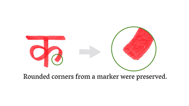
Rob Keller took almost three years to design the Vesper typeface. He chronicles the process in the article “The Making of Vesper” on the excellent blog i love typography.
Vesper began as a student project and was informed by Kellers’ fascination with the Devanagari alphabet and non-Latin typography. His experiments in Devanagari lettering and calligraphy are reflected in Vesper’s stylistic features.

Read “The Making of Vesper” here.
This article was last modified on August 13, 2021
This article was first published on December 29, 2009
Commenting is easier and faster when you're logged in!

Recommended for you

The 1923 ATF Specimen Book and Catalogue is Reborn Digital
A classic typographic resource, the 1923 edition of the American Type Found...

Font Fetish: Neutraface No. 2
Back in 2002, House Industries and Christian Schwartz released the Neutraface fa...
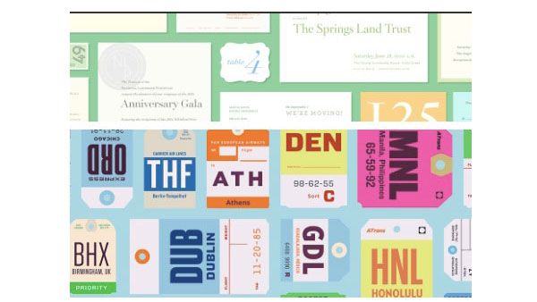
A Designer’s Font Playground
Hoefler & Co. recently launched a font playground of sorts: Discover.typogra...