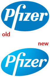
Logo for Maker of Little Blue Pill Gets a Makeover

The motto of the venerable and successful Siegel+Gale branding company is “Simple is smart.” It followed that slogan to the letter in its recent retooling of the logo for pharmaceutical company Pfizer:

What do you think of the changes to the logo? Is it better, worse, or about the same? To speak up, click one of the Comments buttons above or below this article.
For an excellent analysis of the revamped logo and Siegel+Gale’s more radical changes to other aspects of Pfizer’s brand, see Armin Vit’s article “Pfizer Moves Pforward” on the UnderConsideration Web site.
This article was last modified on December 14, 2022
This article was first published on November 6, 2009
Commenting is easier and faster when you're logged in!
Recommended for you
Will Adobe Be the New Seybold? Momentum in Print Scheduled for January 2006
On the heels of Seybold’s abandonment of its conference programs-once the...

Understanding the Stacking Order of Paragraph Rules
Understand how underlines, rules, borders and shading interact when you combine...


