Alphabet Soup: A Tasty Font Foundry

You’re probably familiar with Michael Doret’s work without even knowing it. If you have seen his logo for the New York Knicks, or one of his many covers for Time Magazine, then you’ve witnessed the power and dynamism he brings to the art of hand-drawn letterforms. Doret’s font foundry Alphabet Soup shows that his background in lettering brings a unique perspective to type design. We’re proud to offer the collection at FontShop.
Metroscript
Virtually years in the making, Metroscript is an outgrowth of a lettering style that Doret has used in his design work dozens of times, usually for connecting words such as “and the”, “from”, etc. This style has been described as a “baseball” or “sports” script — which is true — but its applicability is really much wider than that.
Created in OpenType, Metroscript is chock full of features that will expand its usability, such as six tail styles with variable lengths; letters that know when they’re at the beginning or at the end of a word or following a certain other letter — and change accordingly; dozens of special characters, swashes, ligatures, accents, plus literally dozens of stylistic alternates, swashes, and ligatures, all fitting together in a way that makes each word seem as if it was lettered by hand. These extras are all built into the full-featured Metroscript OT font, and also as separate fonts for applications that are not OpenType-aware.
Download Metroscript PDF Manual. Download Metroscript Alts PDF Manual.

PowerStation
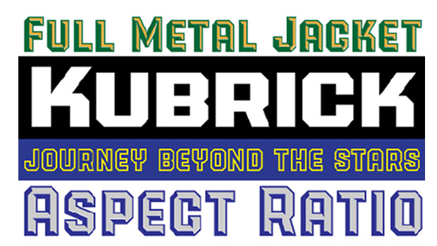
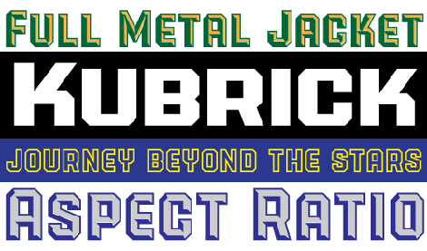
A few years ago Doret needed to devise some letterforms for Hershey’s Chocolate. The design of Powerstation Block was the direct outgrowth of this project. When he initially decided to flesh out this “chocolate chunk” of a typeface into a family of usable fonts, he felt that the next in the family should be one in which the illuminated facets became more dominant — giving it a lighter feel — and so PowerStation Wedge was born. Doing a straight, solid version and then a thick, outlined version followed by wide versions of all of the above seemed only natural.
But why stop there? Doret wanted to give this extremely graphic display font even more flexibility and usefulness by adding a two color capability. This was achieved by creating “layerable” versions of the four faceted designs — i.e., PowerStation Block Low, which is the base solid font, and PowerStation Block High, which contains the highlighted facets. By pasting the High over the Low and colorizing them differently, one can easily achieve virtually limitless color effects.
Download PowerStation PDF Manual.

Deliscript
Although the initial idea for Deliscript Upright and Deliscript Slant was inpired by the neon sign in front of Canter’s Delicatessen in Los Angeles, the design soon took on a life of its own — and its own distinctive look. Unlike most “retro” fonts, Deliscript is not a retread of an older design that had been lost or forgotten, found, and then recreated. Like its sibling Metroscript, it is a completely new and unique design created from the ground up. It may have historical antecedents, but despite the “déjà vu” feeling it may provoke, it’s as new and fresh as anything else out there.
Alternates, ligatures, and variable-length tails are all built into the full-featured Deliscript Regular and Italic OT fonts. Separate fonts are included for applications that are not OpenType-aware.
Download Deliscript PDF Manual. Download Deliscript Alts PDF Manual.

This article was last modified on September 5, 2025
This article was first published on September 23, 2009
Commenting is easier and faster when you're logged in!
Recommended for you

Freudian Glyphs: The Sigmund Freud Typeface
Let’s “kick” off the week with a cool new font-related Kickstarter project. This...

TypeTalk: Supersize My Font Families, Please!
Q. I notice an increasing number of font families containing an unusually large...

GO: A Kidd’s Guide to Graphic Design, by Chip Kidd
Mention the name Chip Kidd to most designers, and you will inevitably get a rais...


