
I was heartened to receive a lot of responses to last week’s column on album art. It’s clear that many of us link our favorite cover designs with our favorite music, which is understandable since we tend to judge many forms of art holistically. In the days of full-size albums, at least, it was almost impossible to disassociate the content of the music from the content of the cover art.
In last week’s column, I also asked you to send your favorite album covers to gene@creativepro.com. You obliged with terrific examples of wonderful designs, but keep ’em coming (no smaller than 450 pixels wide and no larger than 1200 pixels wide). I realize that few people have scanners large enough to scan an entire album at once, so please feel free to use your digital camera and do the best you can. For any materials larger than 8.5″ x 11″, I tend to use a copy stand and a digital camera set on macro.
Remember, I’ll choose one person at random and give that winner a customized assortment of Scanning Around with Gene material.
Contemporary, But Not Adult Contemporary
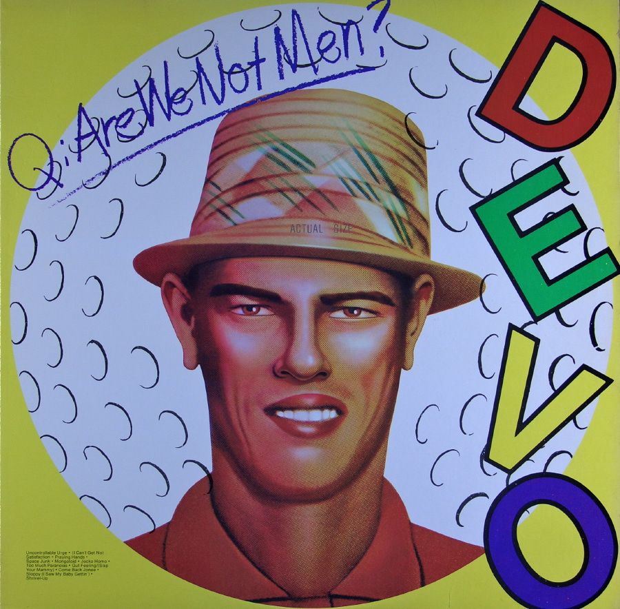
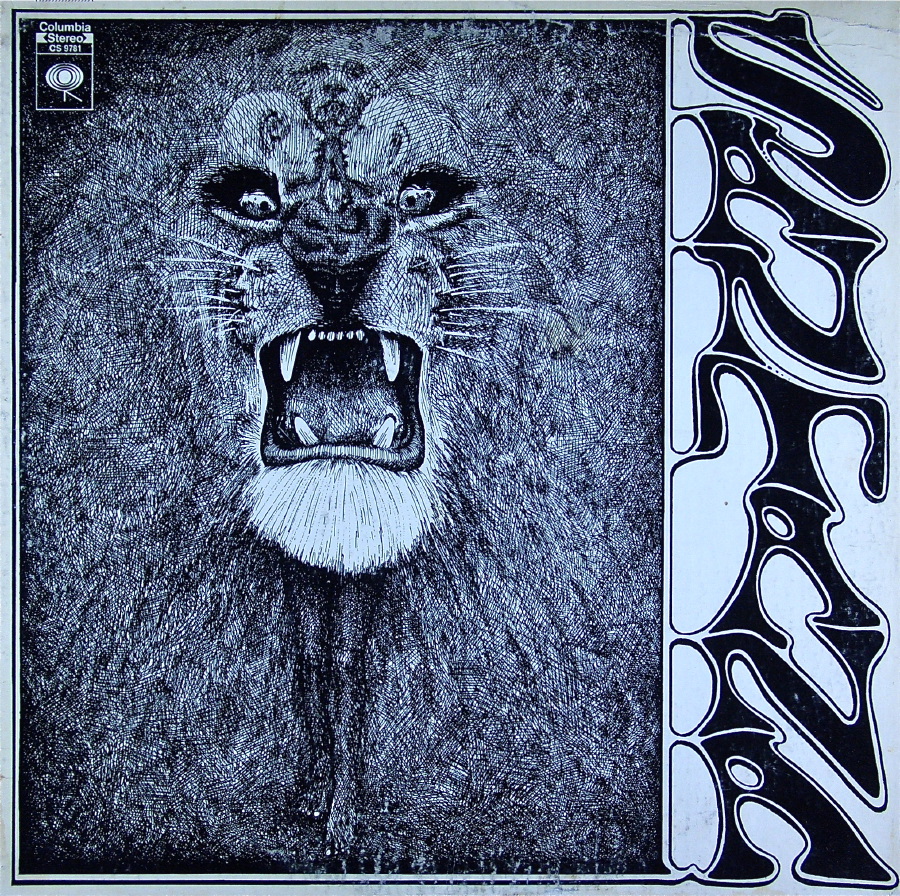
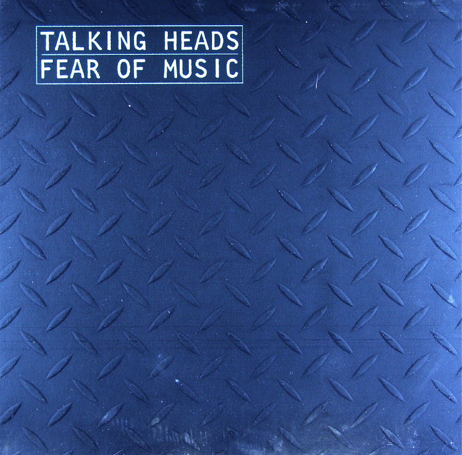
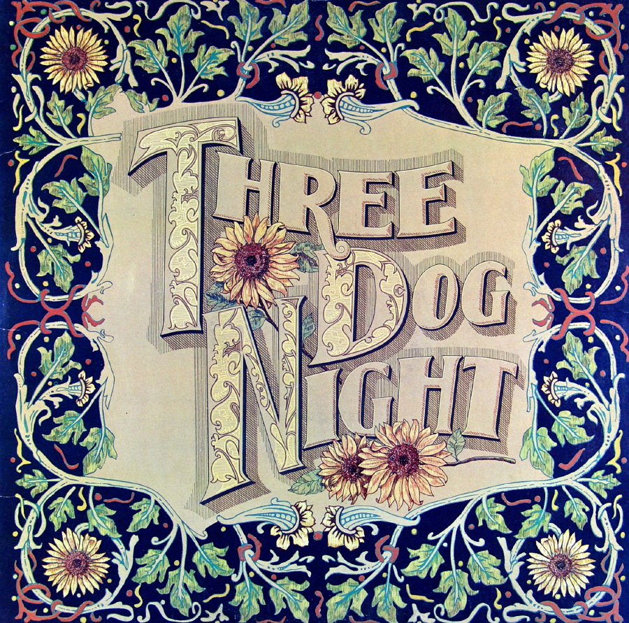
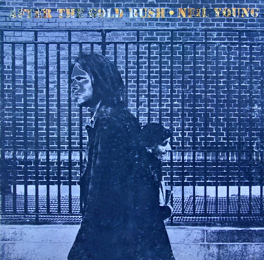
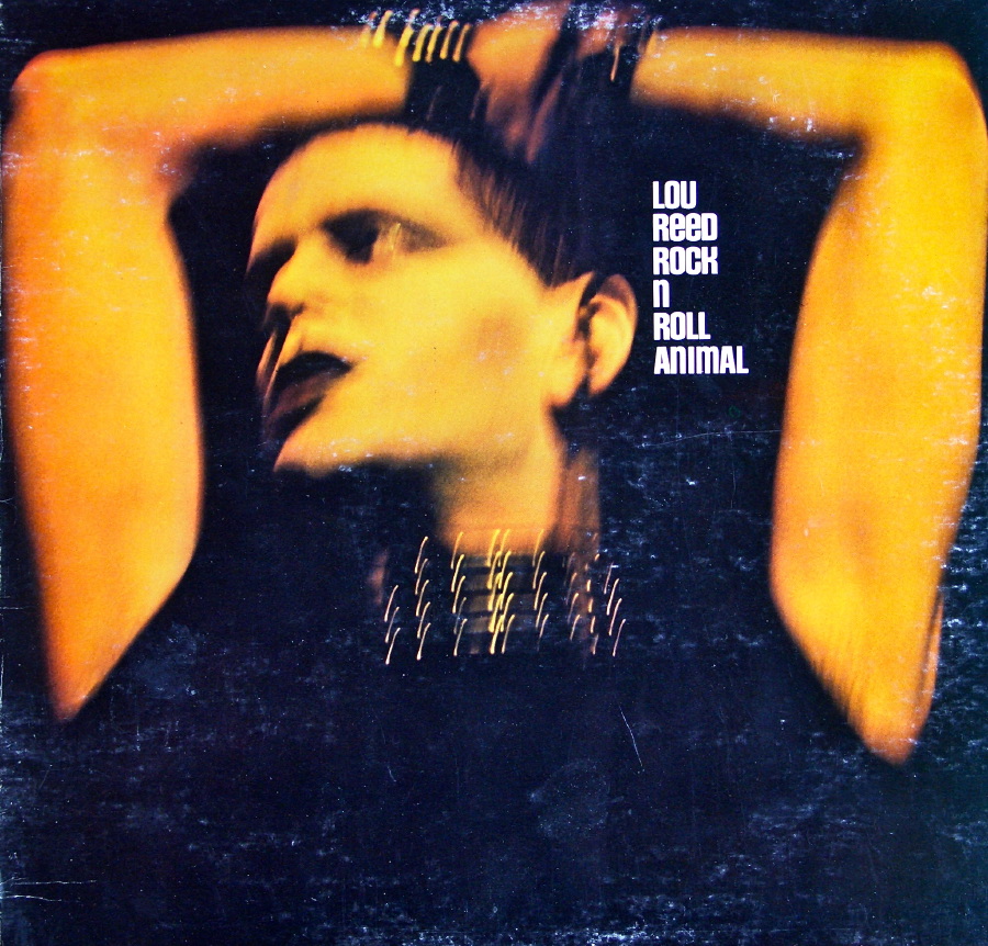
As promised, this week’s column features my more contemporary albums. It’s been difficult for me to define categories, so I’ll start with a couple of my all-time favorites, like these from Devo, Santana, and the Talking Heads. The texture on the Fear of Music album is terrific and is one of the great album cover designs ever. Click on any image for a larger version.
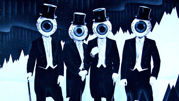
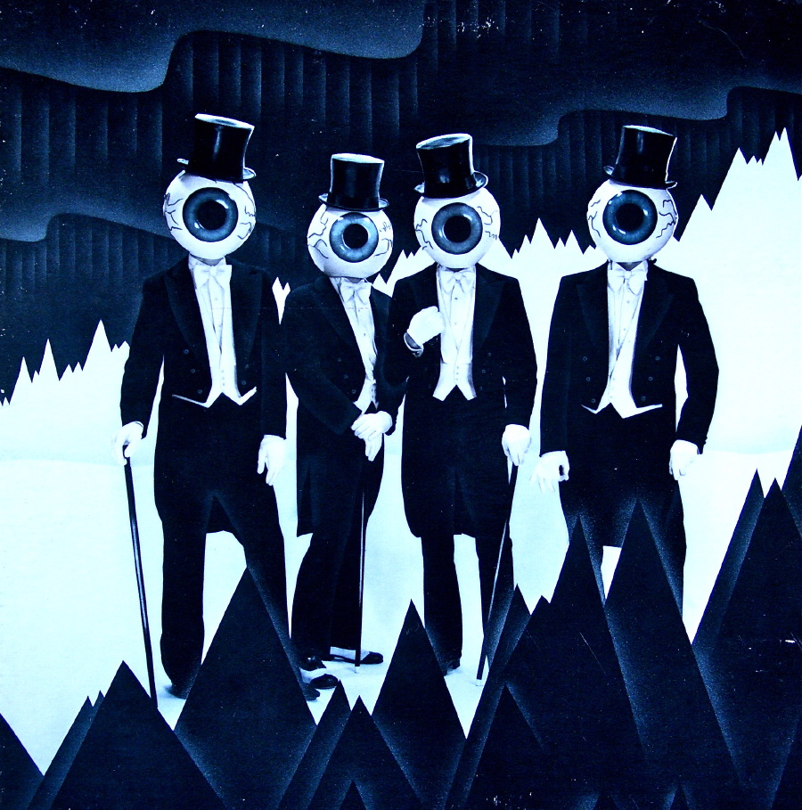
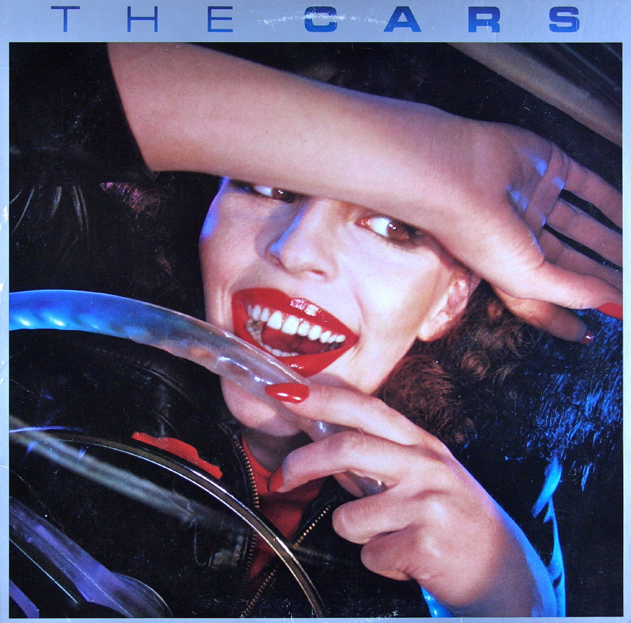
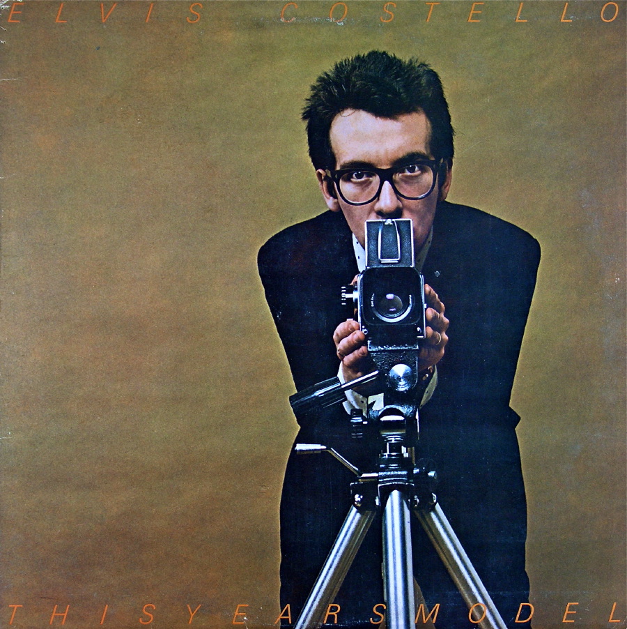
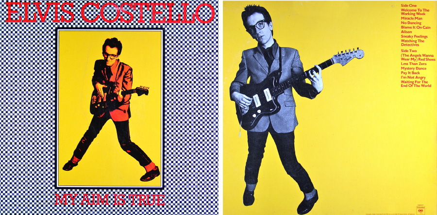
And how can you not like these from the Residents, the Cars, and Elvis Costello?
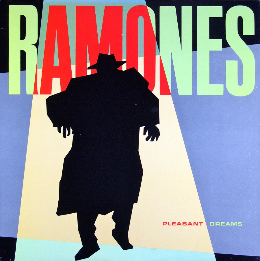
The Ramones are one of my favorite bands, and I love all their album covers. But I’m a big fan of photographs of the artist, so I’ve selected a variety to show here, including the album End of the Century, when the band got new hairdos and a new producer named Phil Spector.

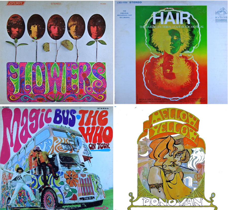
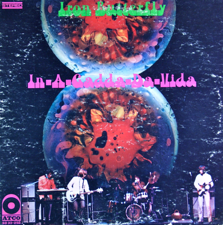
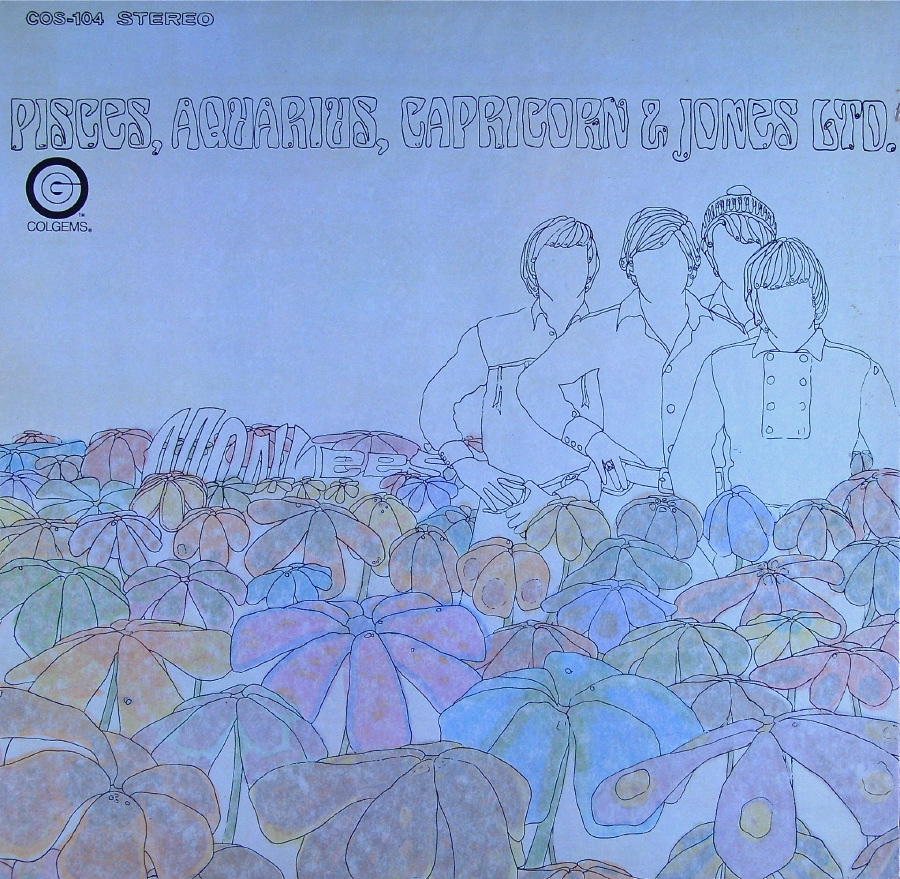
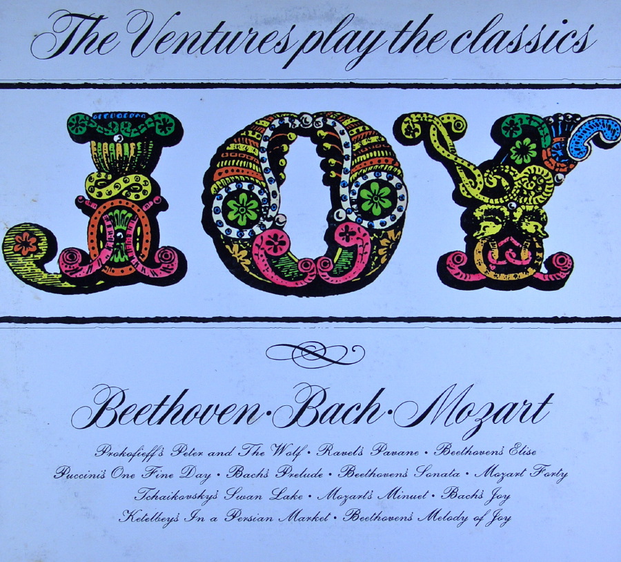
1960s psychedelia is another favorite, and here are a number of great examples of that colorful era. The last album in this group supposedly takes its title from a drug-induced slurring of the words “in the Garden of Eden.”


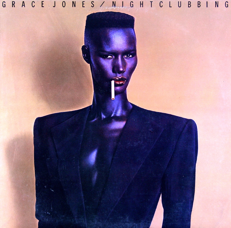
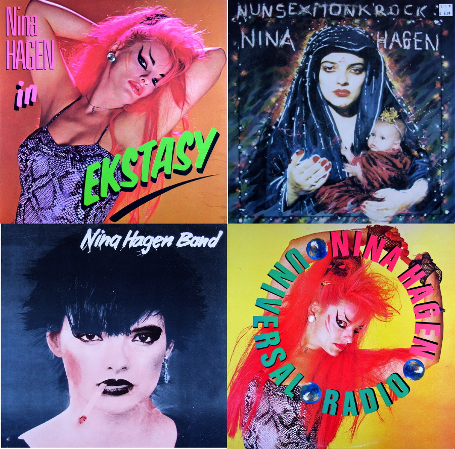
As far as strong women rockers go, you can’t beat Grace Jones or Nina Hagen. I love Nina, especially since she looks different for nearly every record. Her music is as interesting as her looks.
And I love the Tubes and just about every album cover design they did. Here are but two examples.

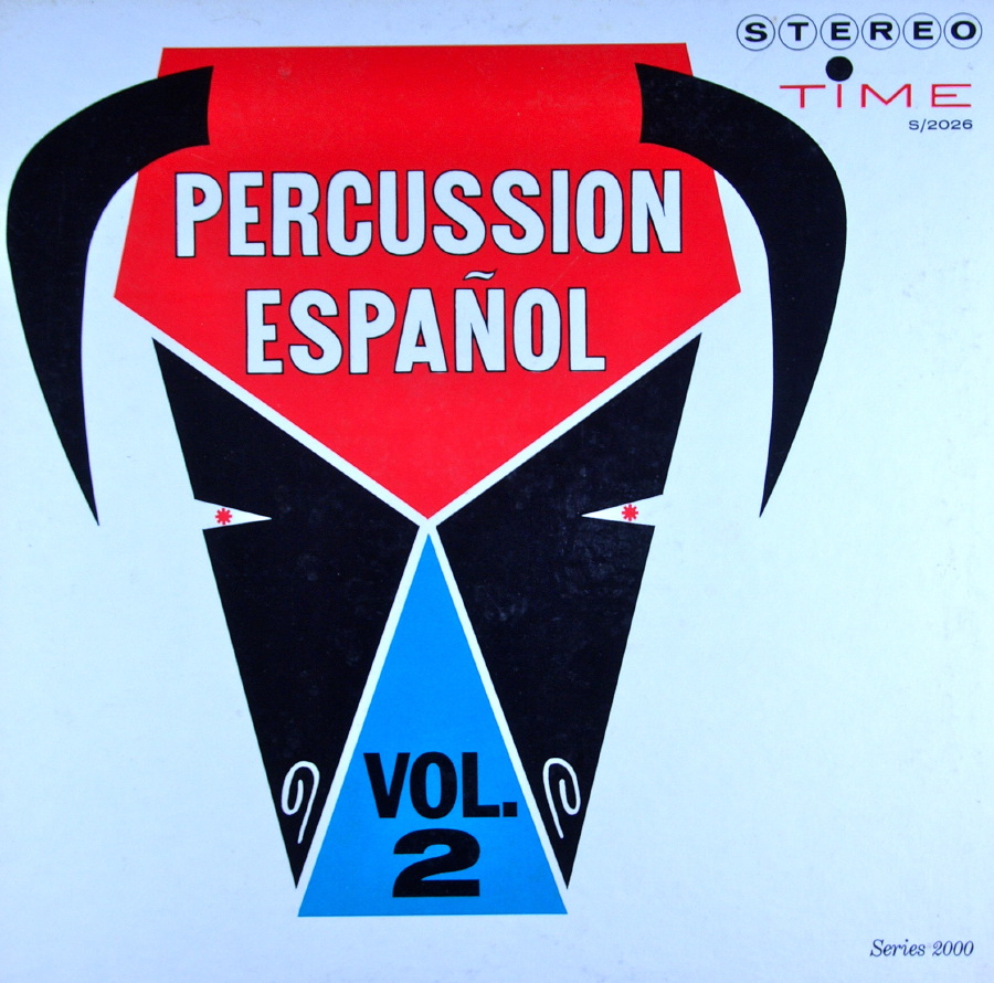
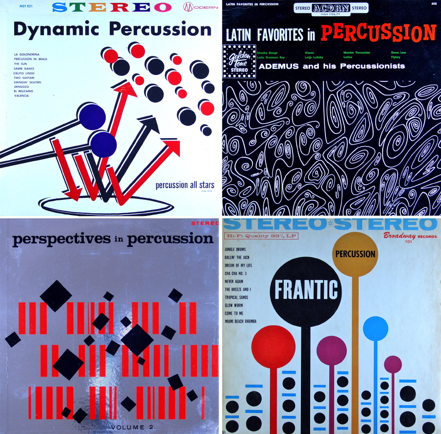
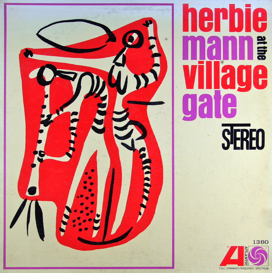
I’m not sure what it is about percussion that brings out the geometry in album cover designers, but it seems to be a common theme. These are just a few examples of percussion-oriented recordings from the ’60s and ’70s.
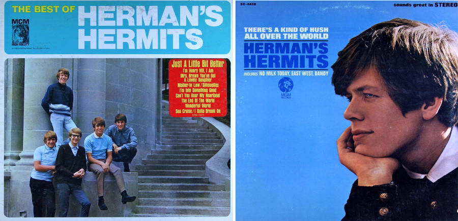
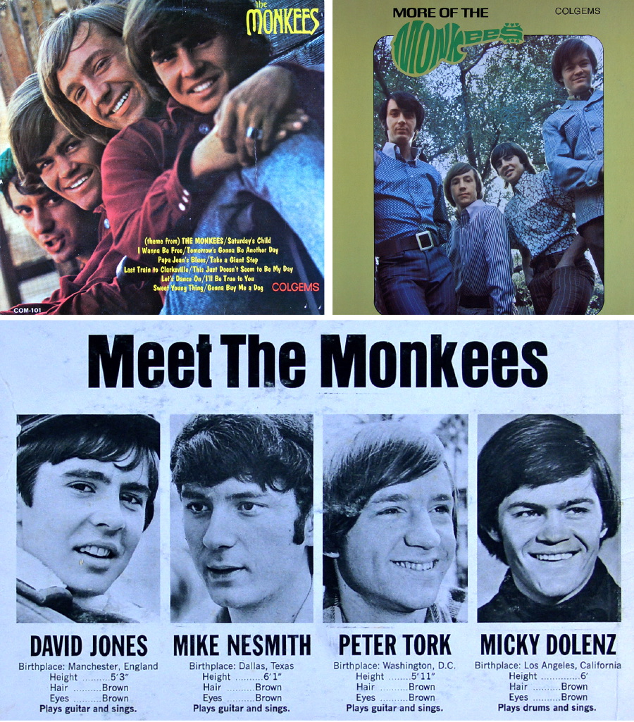
Before a lot of women got into rock, almost all the bands were “boy bands,” and there were few more boyish than Herman’s Hermits and the Monkees. I will admit to having a soft spot in my heart for those seemingly innocent times, which of course were not very innocent at all. Even the Monkees got a little psychedelic toward the end.
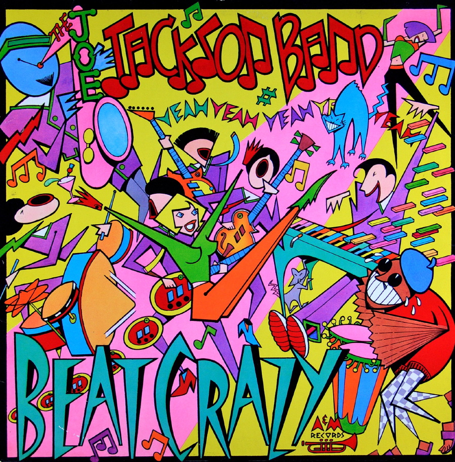
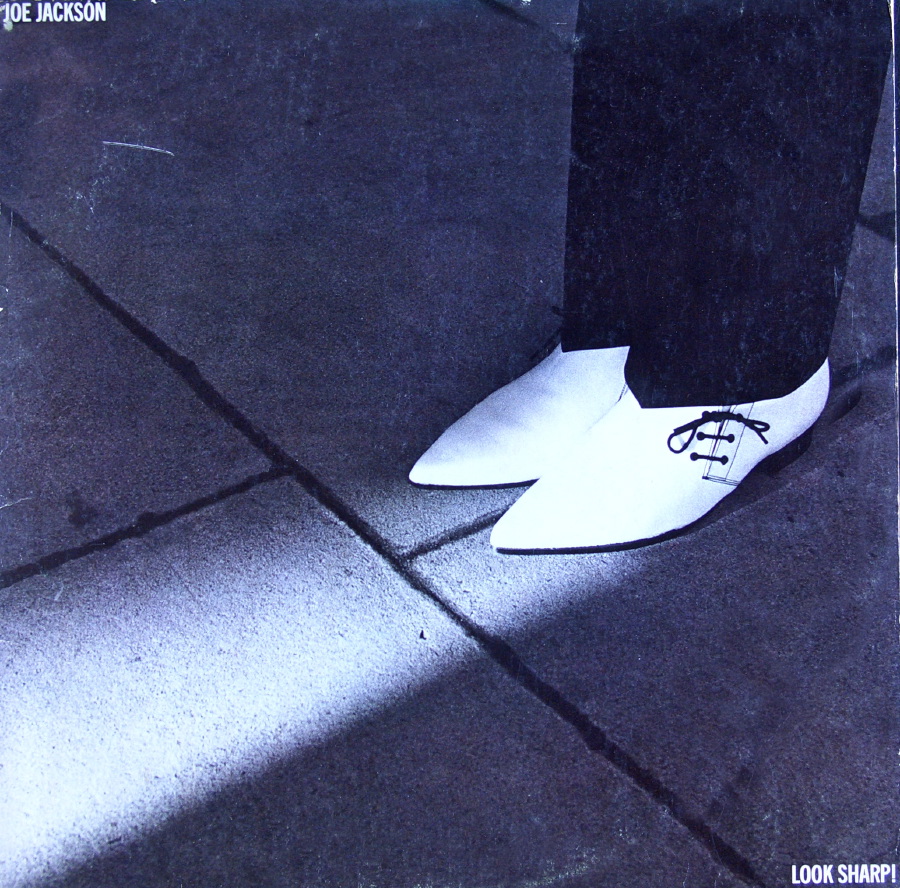
I’m a big Joe Jackson fan, and these are two of my favorite albums and designs from him. You have to love the idea of and execution of the concept Look Sharp, which Joe always does.
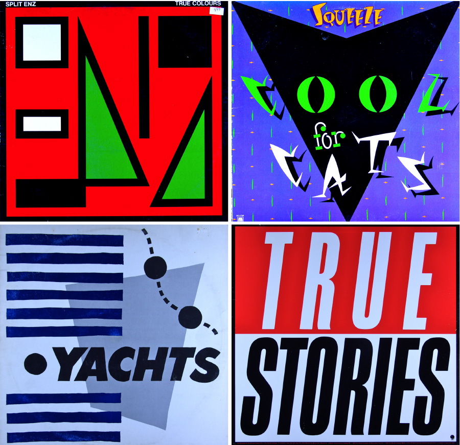
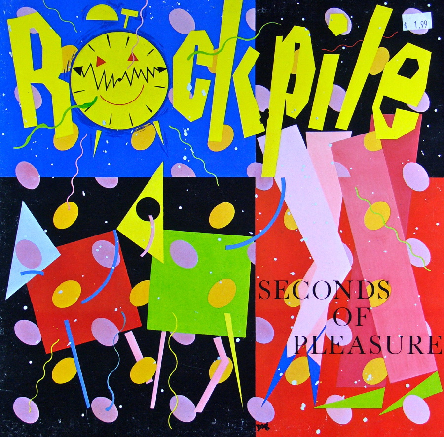
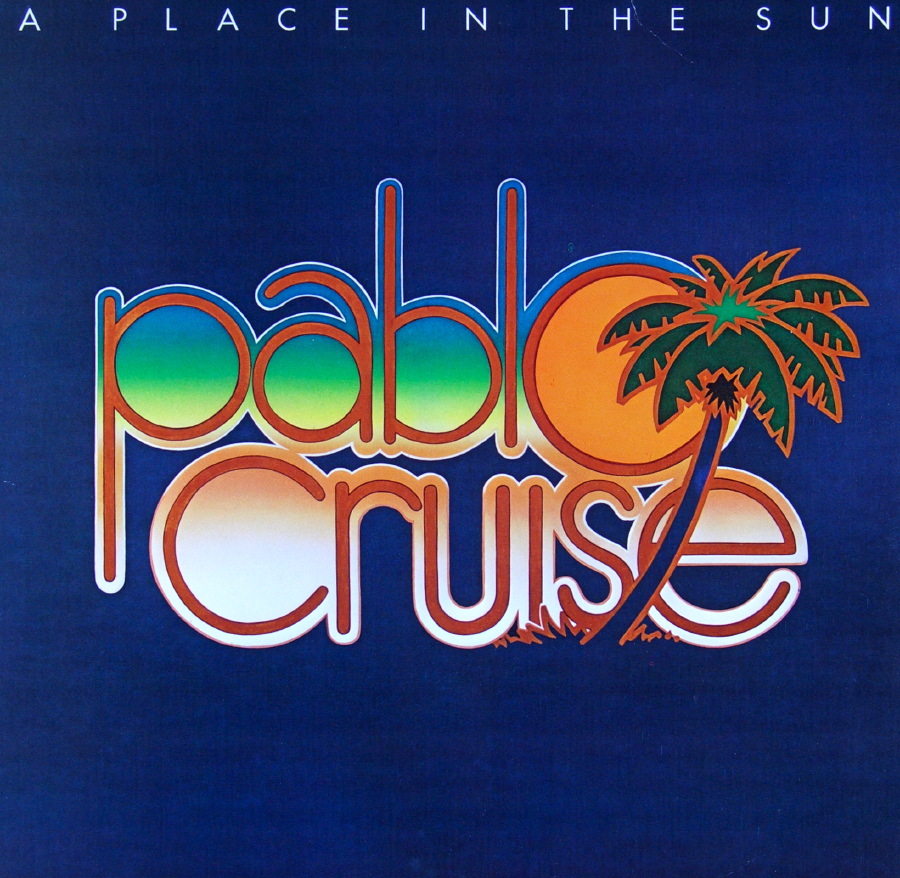
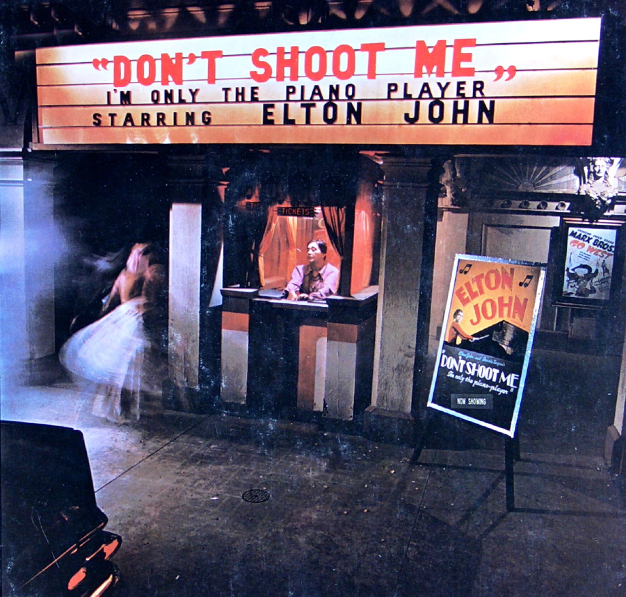
You can see the effect that the smaller format CD had on album design by the time most of the following records came out. Art got bigger, bolder, and designs more simple.
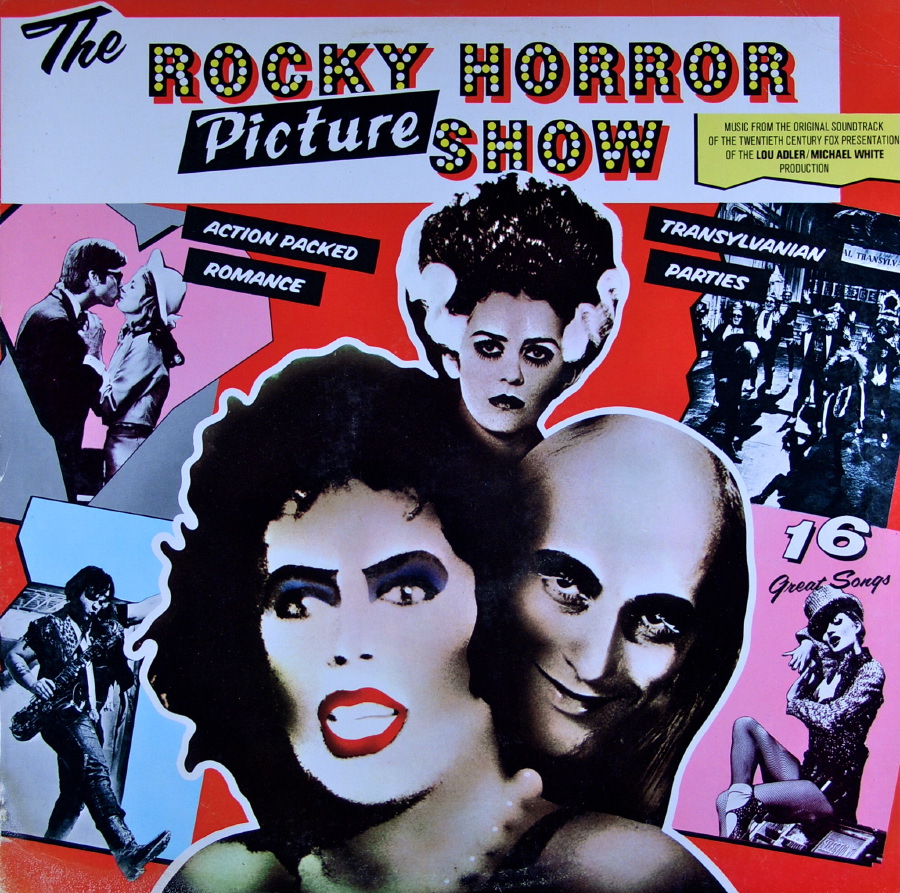
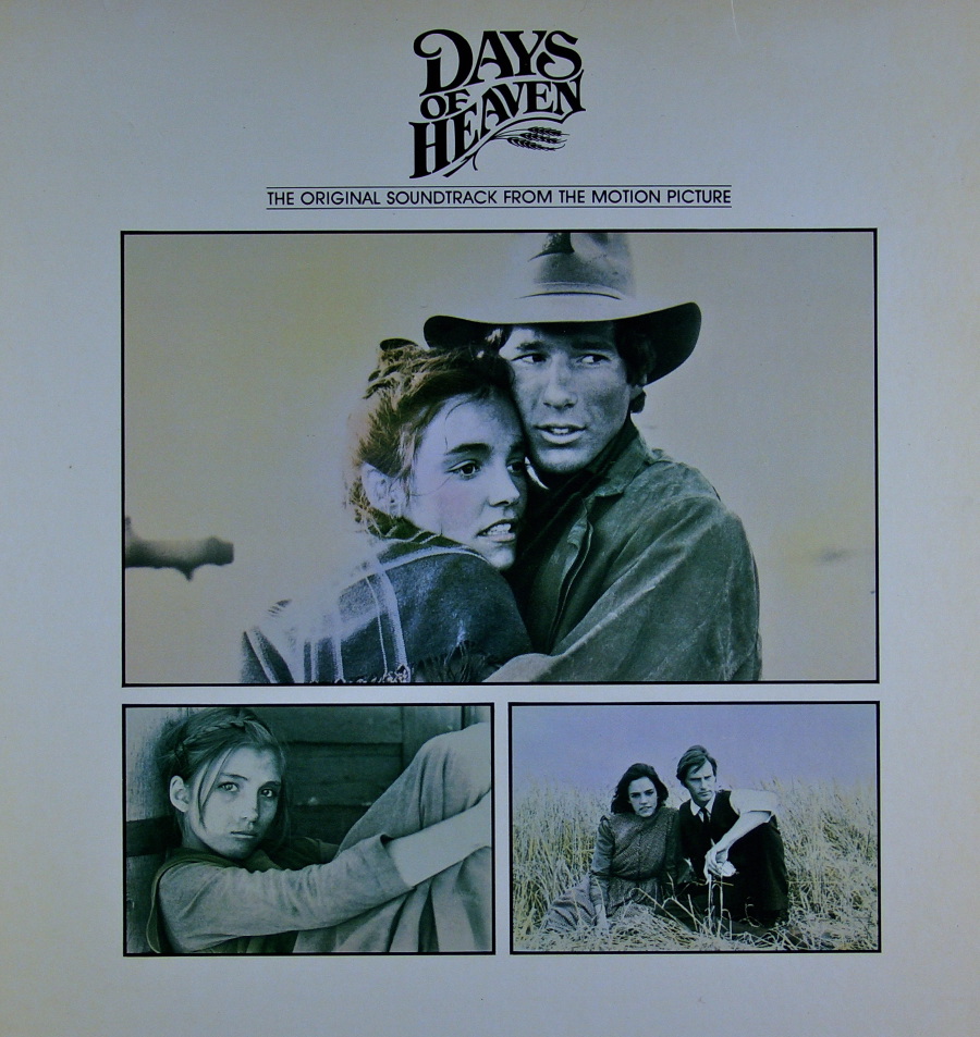
The movie (and play) Rocky Horror Picture Show resulted in a very memorable cover design. I’m also including the cover for the soundtrack to the movie Days of Heaven simply as a way to plug that terrific film and outstanding score (which won an Academy Award).
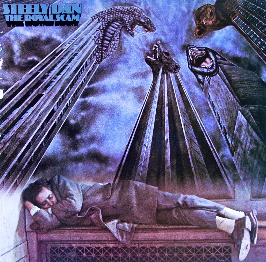
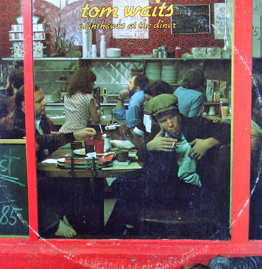
While I’m not a huge Steely Dan supporter, I had a college roommate who was obsessed by the band, and so the album The Royal Scam is etched in my brain. I am a big Tom Waits fan, so I had to include Nighthawks at the Diner, which is classic Waits.
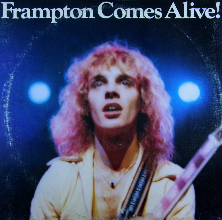
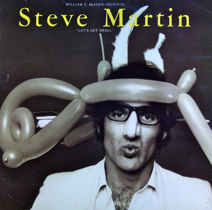
If you grew up anytime in the ’70s, you remember Frampton Comes Alive and Steve Martin’s comedy album Let’s Get Small. Both are classics even if you don’t care for the content.
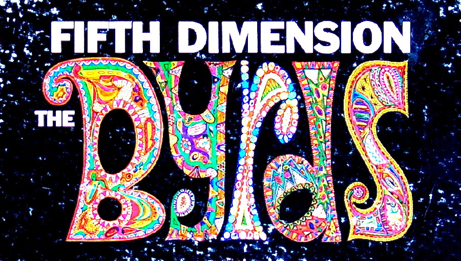
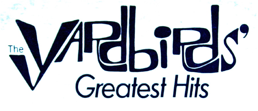
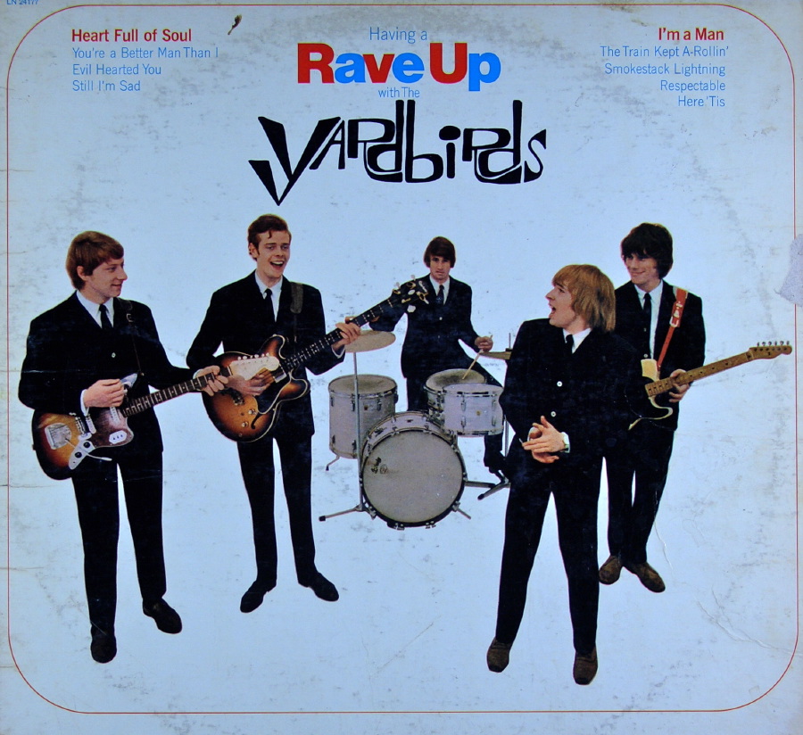
And I love those artists, particularly from the ’60s, who emphasized a creative logo design. Here are several examples of turning type into a distinguishing part of the artist’s identity.
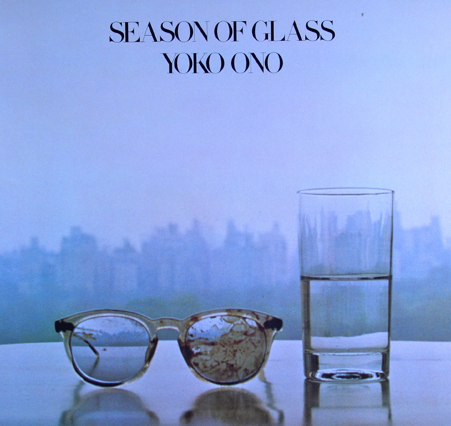
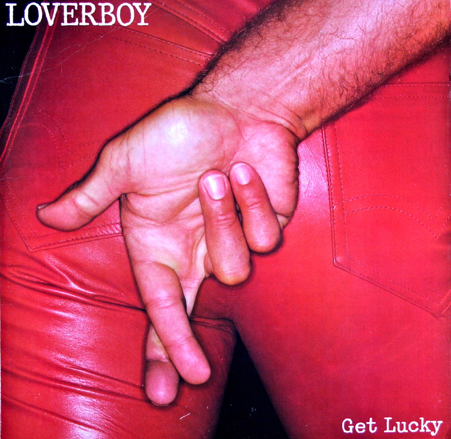
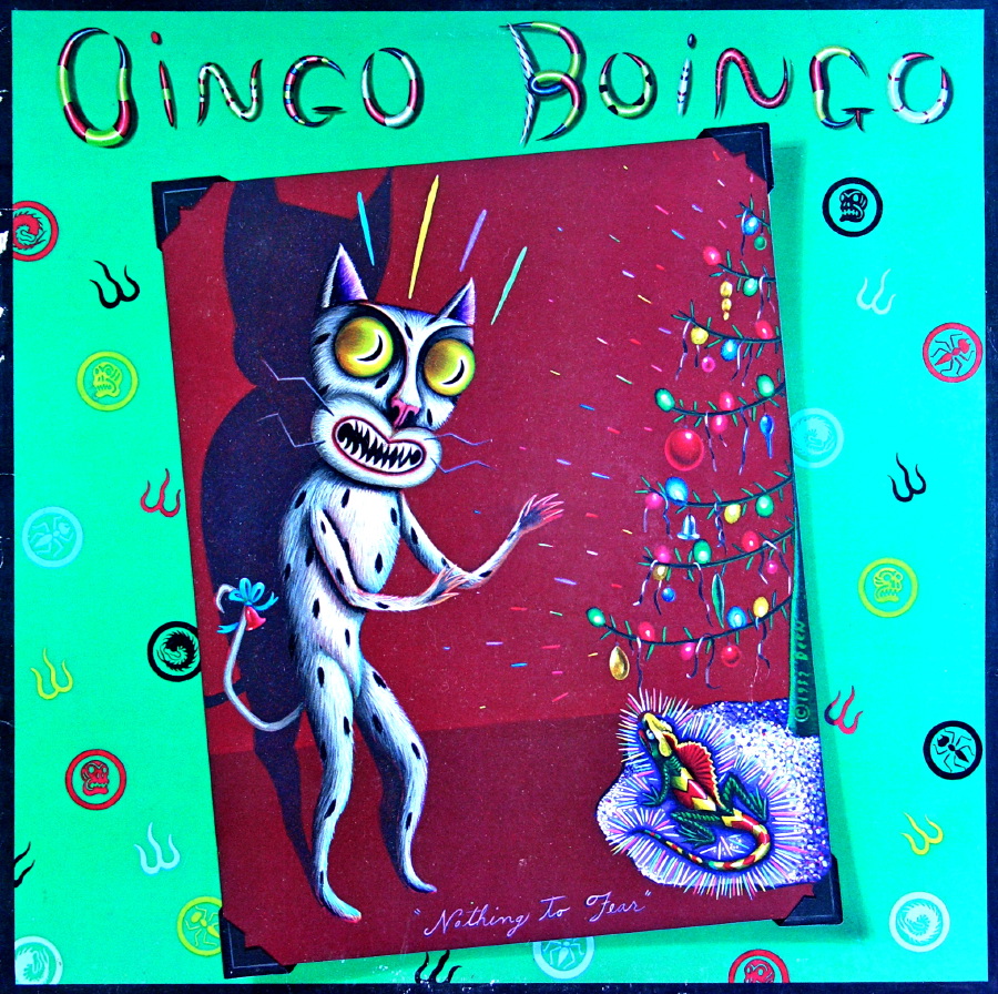
These days many record cover designs are meant to shock, as is the music contained therein. But not that long ago some of the designs below would have been considered controversial. The first, from Yoko Ono, received a lot of criticism since it uses the image of John Lennon’s glasses from the night he was shot and killed.
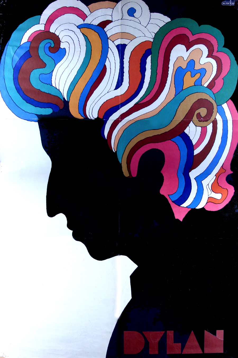
The remaining images don’t really go together — I just had to include them for old time’s sake. I’ll end with the terrific Milton Glaser poster from Bob Dylan’s 1966 album.
Now that I’ve gone through all my records again before giving them to the Salvation Army, I’ve decided to hold a few back. Not because I expect to listen to them, or even put them on the wall. I’m going to use my neighbor’s large laminating machine to turn the covers into placemats.
Next week I’ll show some of the designs sent in by CreativePro.com readers, and I’ll announce the winner of my big Scanning Around with Gene Giveaway!
This article was last modified on March 24, 2021
This article was first published on April 3, 2009
Commenting is easier and faster when you're logged in!

Recommended for you

Markzware Announces FlightCheck Professional v6.10 Upgrade
Markzware, the inventor of preflight and data-conversion software leader, today...
ALAP Releases XPert Align, XPert Layers, XPert Print
A Lowly Apprentice Production, Inc. (ALAP), a leading developer of extended tech...

Free Photoshop Filters Webcast
It can be a lot of fun to experiment with Photoshop’s many filters to crea...